Project Updates
-
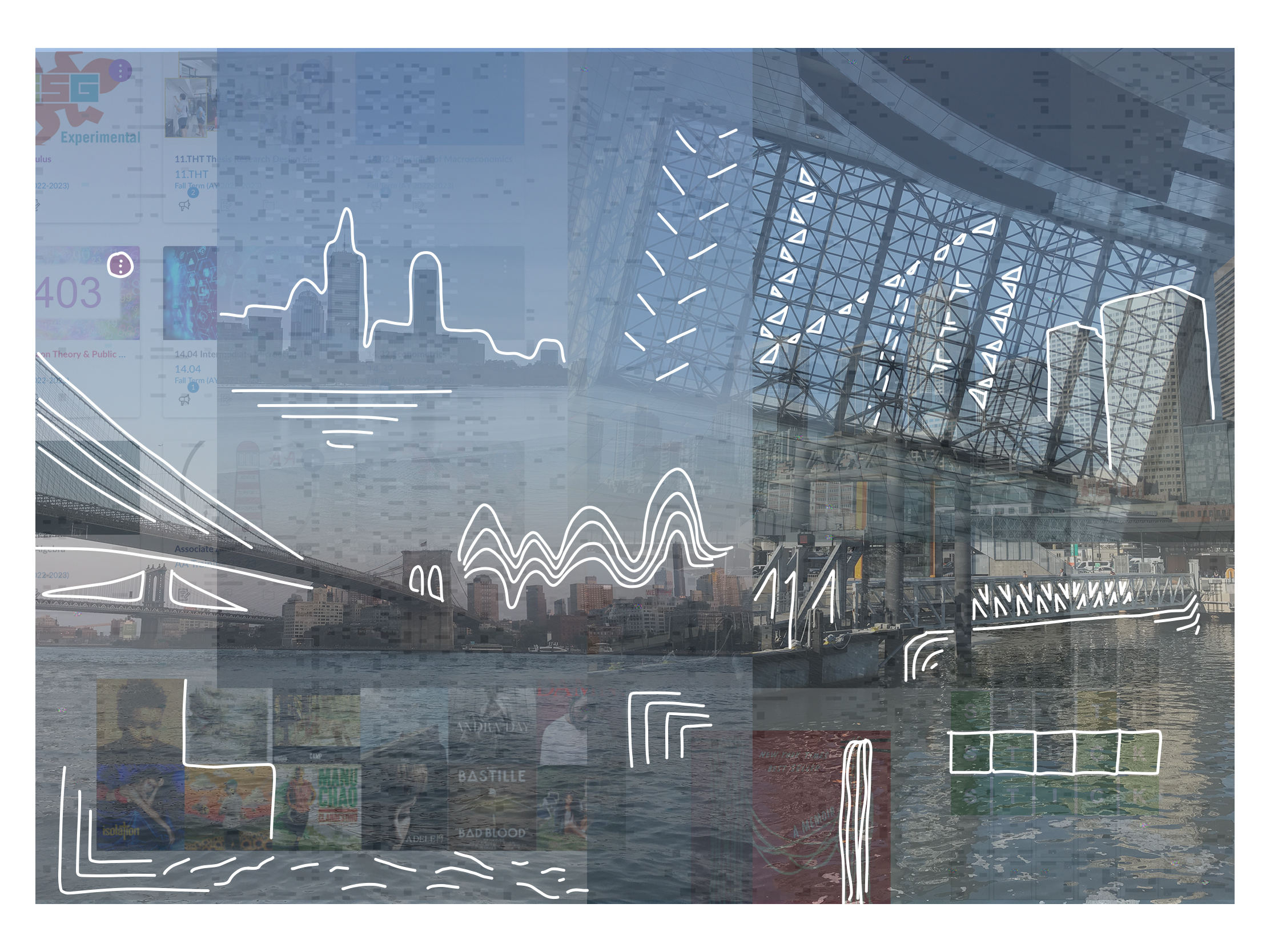
Final Presentation - MIT Music Map
Presentation: https://docs.google.com/presentation/d/1OFVvXgha9uVYgLBmCJpvrA2svO7HufLcM8sSS0X6kWs/edit#slide=id.p
Paper: https://drive.google.com/file/d/1yC-cztda8T-F0BJYDzbSmNaFaMdORps7/view?usp=sharing
Project web page: https://trudypainter.github.io/mit-music-map/
-
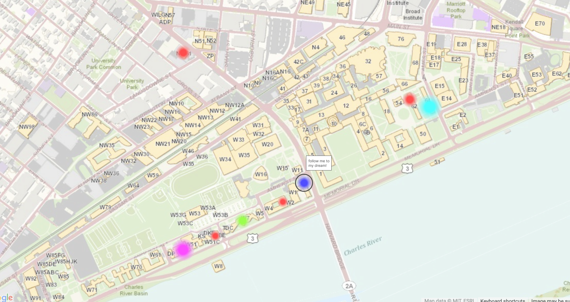
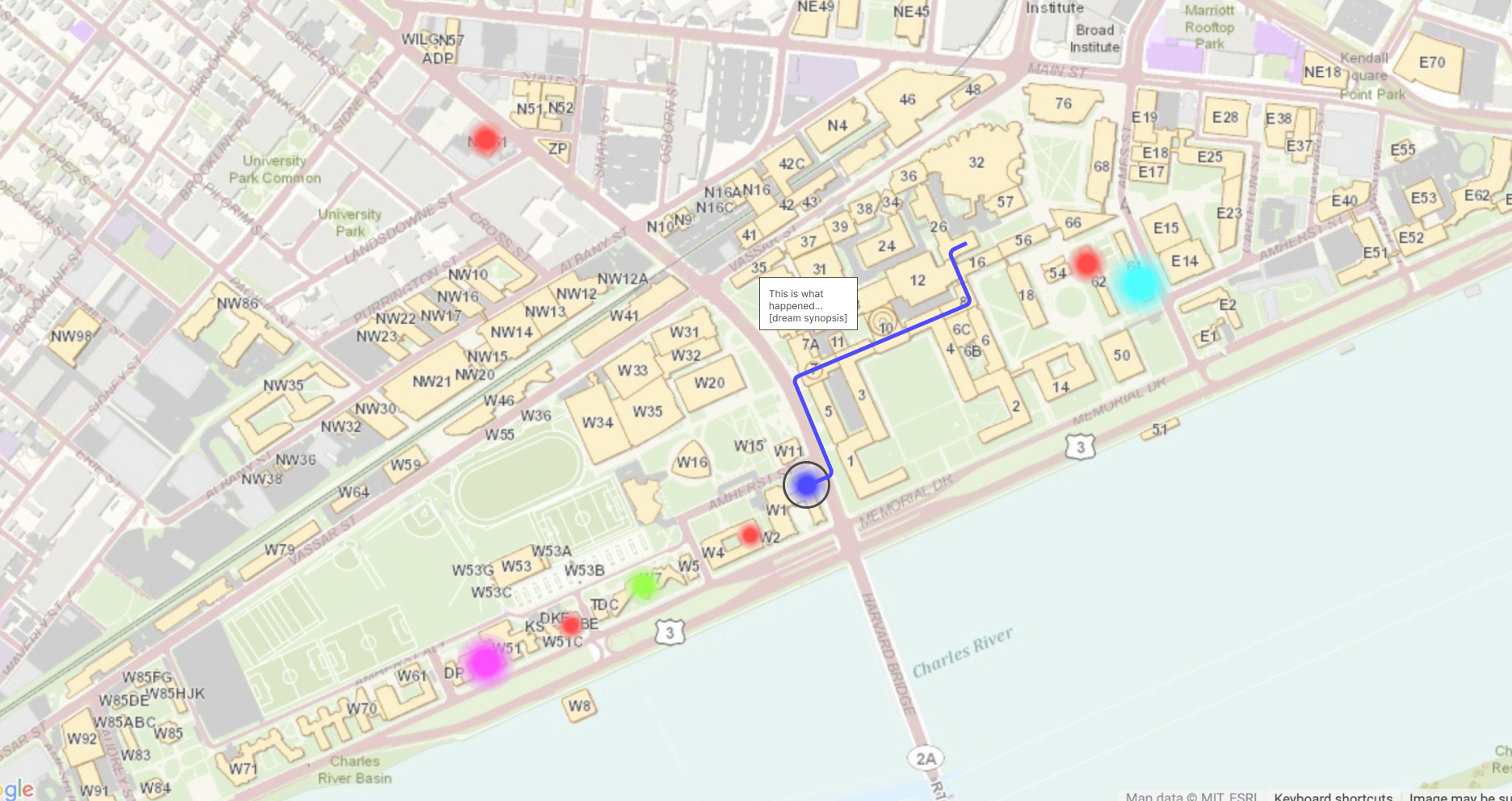
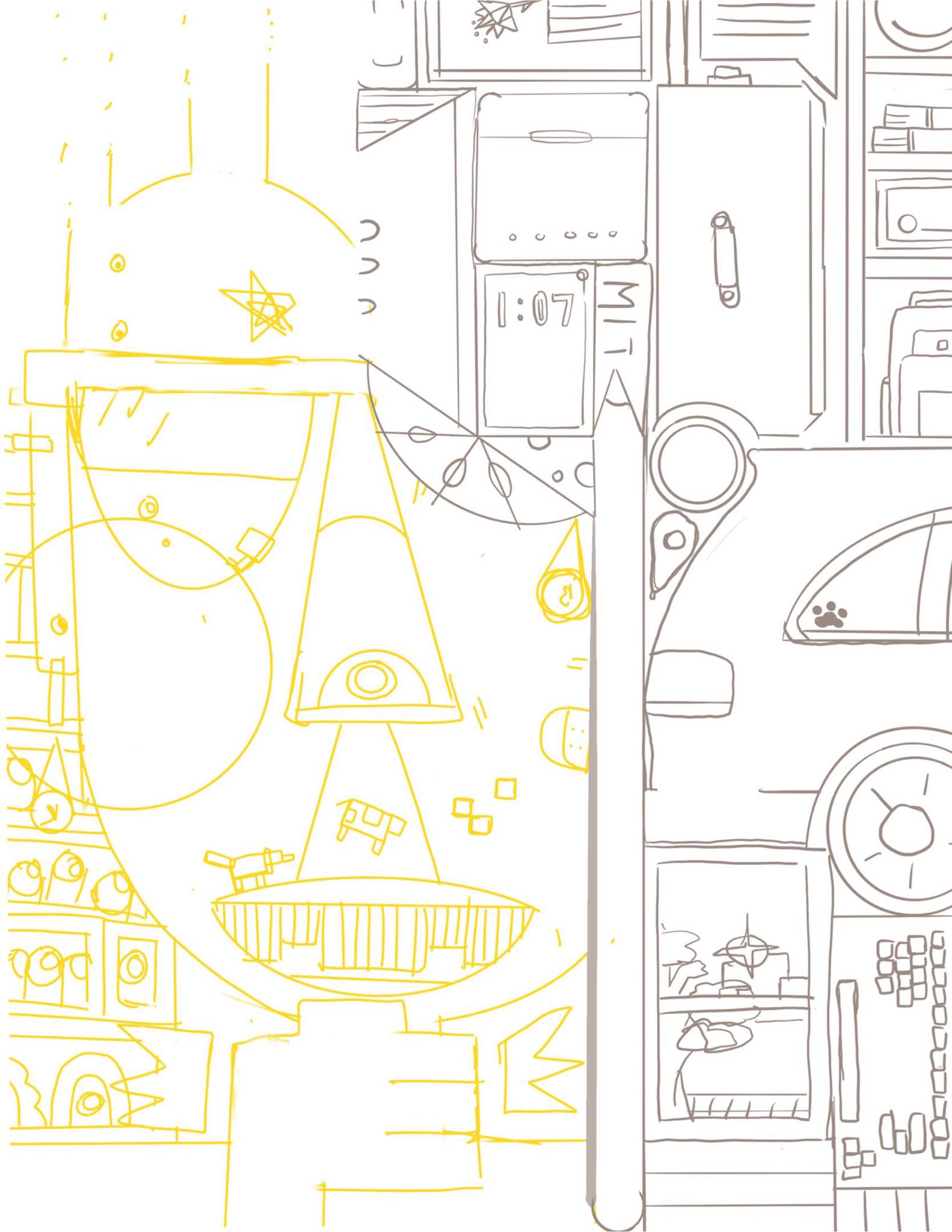
Final Presentation - MIT Dream Map
The final presentation for MIT’s Dreamland can be found here.
The final version of our website can be found here. The password is “dream”.
The final paper can be found here.
-
Final Project - Chelsea, Mikel, & Meenu
-
MIT Dream Map (Draft Presentation)
-
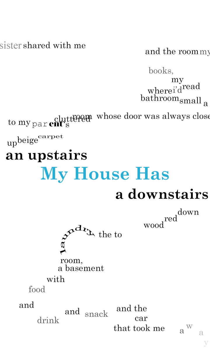
Design Project 3 - Meenu Singh
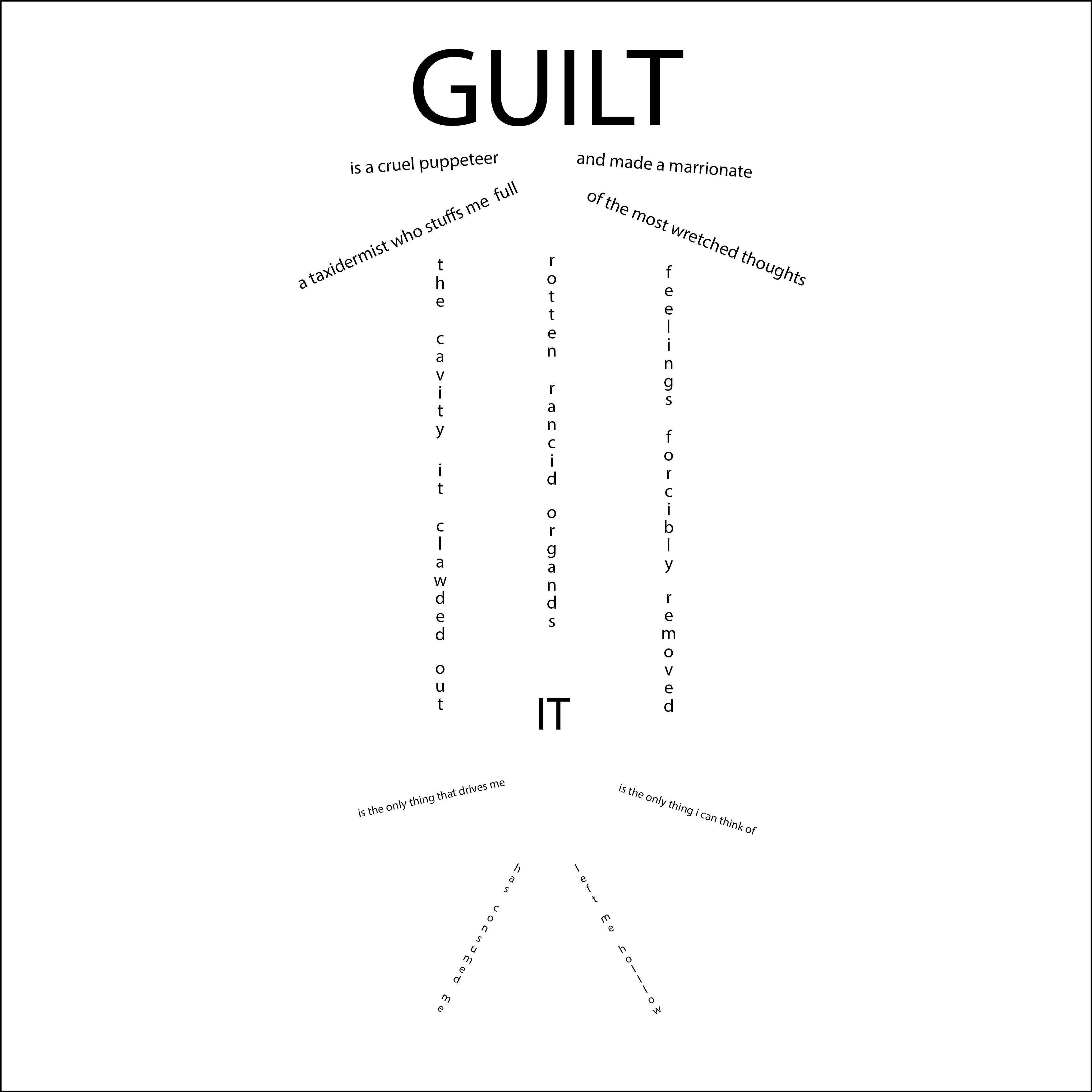
Link to Animated Poem: Guilt
I wasn’t able to present in class so I have provided an explanation of some of the design choices + my thought process while animating this poem.
Modifications to the poem itself prior to animation include giving the arms and legs more of a curved shape in order to give the appearance of a puppet more than just a stick figure. I also changed the central word to be “me”, rather than “it” and added a couple extra lines to make the strings connect to different parts of the puppet.
Animation process:
I wanted the order the poem is read in to be clear, so I animated the lines in section by section. The word “guilt” is the first to appear and grows bigger and takes up more space throughout the poem, an imposing puppeteer and figure that eventually breaks the rest of the piece (including the marionette).
The handles come in after the puppeteer appears, built up slowly. After that, I wanted the strings of the puppet to look like they were dropping down so I added a typewriter-like effect where the characters in the strings appear moving downwards. For the final string, I wanted to reuse the word “guilt” as part of the sentence “Guilt is the only thing that drives me”. To do this, I emphasized the word before dropping down the final string leading to the puppet that begins with the head “me”. The arms and legs of the marionette appear afterwards, where I used a wiggle effect to show the movement of arms and legs being controlled.
The last part of the animation is intended to show the crushing weight of guilt and how it eventually becomes too much to bear. The handles shatter quickly, and then the strings break free before dissolving. Guilt suddenly drops down rapidly upon the marionette. It is supported briefly before we begin to see the body of the marionette/person crumble. Eventually all that remains is guilt.
-
Dream map update
-
Dream map updates 2
Sleeping locations Map showing the places people were sleeping and where on campus the dreams were simultaneously taking place.
Dreams map Map of just the dream scape.
Questions: -Should there be a connection between the sleeper location and the dream location? -How will the sleeping map and the dream map be connected? -Should the highlights be kept or not?
-
Genshin Storyline Map Prototype/Updates
-
Dream map updates
Map of MIT, colored by the color of dreams in the location off where a dream was taking place. For the final product, I was thinking of having the outline of MIT be static, but the colors to be moving around, pulsating, to showcase the weird, morphing nature and experience of dreams and also to showcase the fact that in dreams, physicality of a location often changes.
A lot of the responses we received were super funny/interesting as you can see here. So we were also thinking of being able to double click onto colored areas (where a dream is taking place) to read about the actual dream that happened in that space. In our survey, we also asked for sound, so when you are hovering over the location, but not clicked into it, there could be the sound associated with it playing in the background.
At each location of the map, we were thinking of incooporating a more detailed view when clicked. This would include elements from the dreams described at each location.
-
Mapping Song Experience - Project Pitch
https://docs.google.com/presentation/d/10JpxgT2bv3HQAJ6t5CZVP4sQ-fKRWFV0kNBz11rk3sY/edit?usp=sharing
-
Mapping On-Campus Dreams Project Pitch
-
Audio Map Initial Pitch
-
Mapping Video Game Storylines Project Pitch
-
Design Project Ideas, Hanu Park
Here are some basic ideas, although in the future I may try to stray away from location and time based mappings if possible. I’m not sure how personal this mapping should be, so I stuck with data that seems like it could be found online that other people could also find interesting.
-
Mapping music preference in some form, similarly to how Spotify assigned people gradients for their music, but for campus or across the US. When interacted with, suggests music that is popular in the region specifically. Gradients behave similarly to Snapchat maps.
-
Mapping the trends of graphic design over time. Ex. The recent obsession with gradients, wavy text, and outlined text.
-
Mapping the trends of video game publishings. Ex. Surges in cyberpunk themed and rougelike/roguelite games.
-
Mapping mixed race births across the United States, linked to the study from a long time ago that said humans would for the most part look similarly as time goes on.
-
Some mapping of experiences over quarantine and people’s reaction to the pandemic.
-
-
design project 4 brainstorm - meenu singh
I think I’m really interested in the connection between fantasy elements and real world. I find fantasy books that are connected or inspired by elements in the real world interesting and I always enjoyed looking at the maps drawn in the beginning. Aother idea I had was mapping video game maps to the locations they are connected with in the real world. For exmaple, some pokemon maps have a fairly direct connection to the certain countires and so it could be cool to morph the video game map to the proprotions of the real world (or vice versa). I think it would be best to pick a franchise that is well documented over time in order to create a collection of relevant data that can be used for mapping.
-
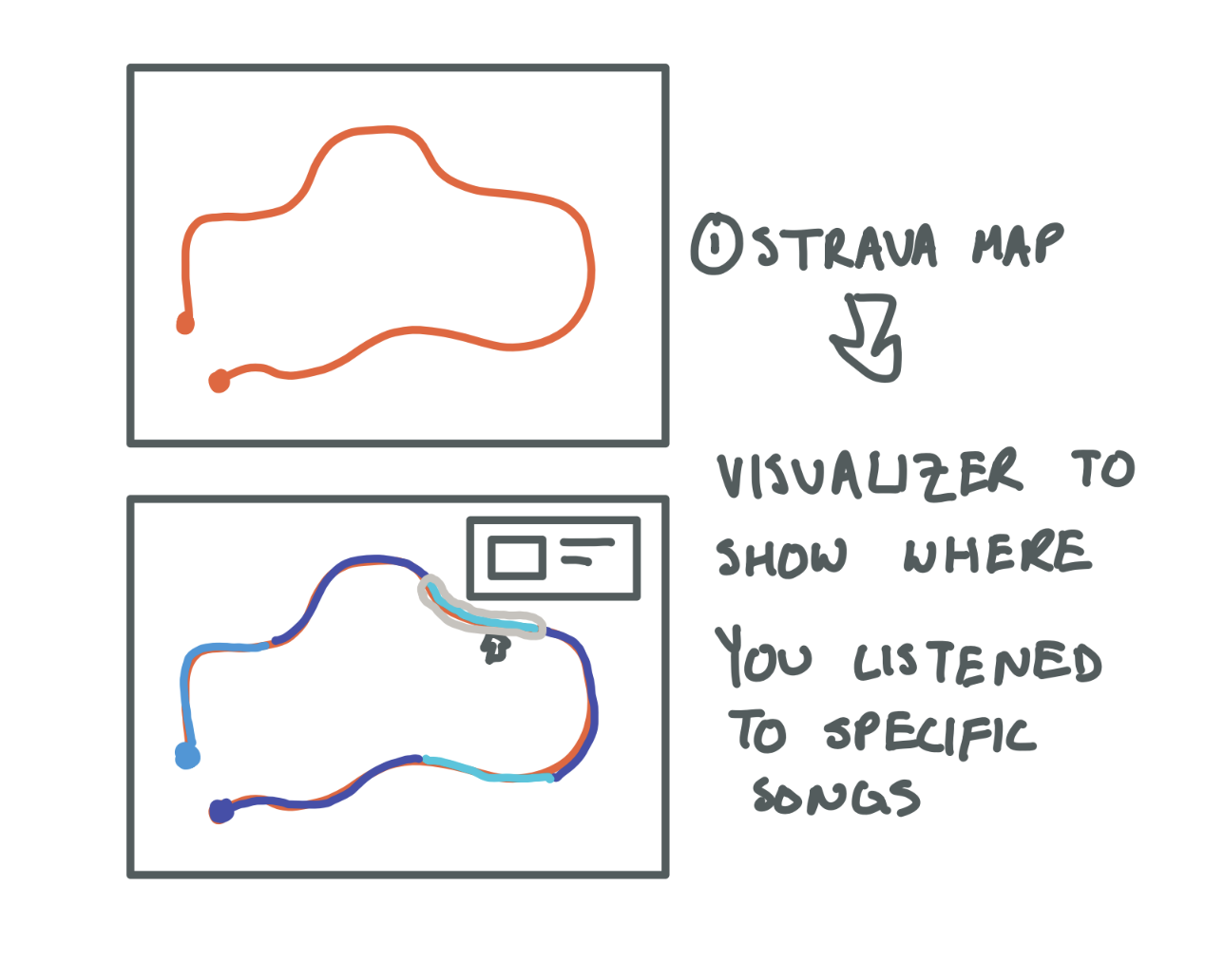
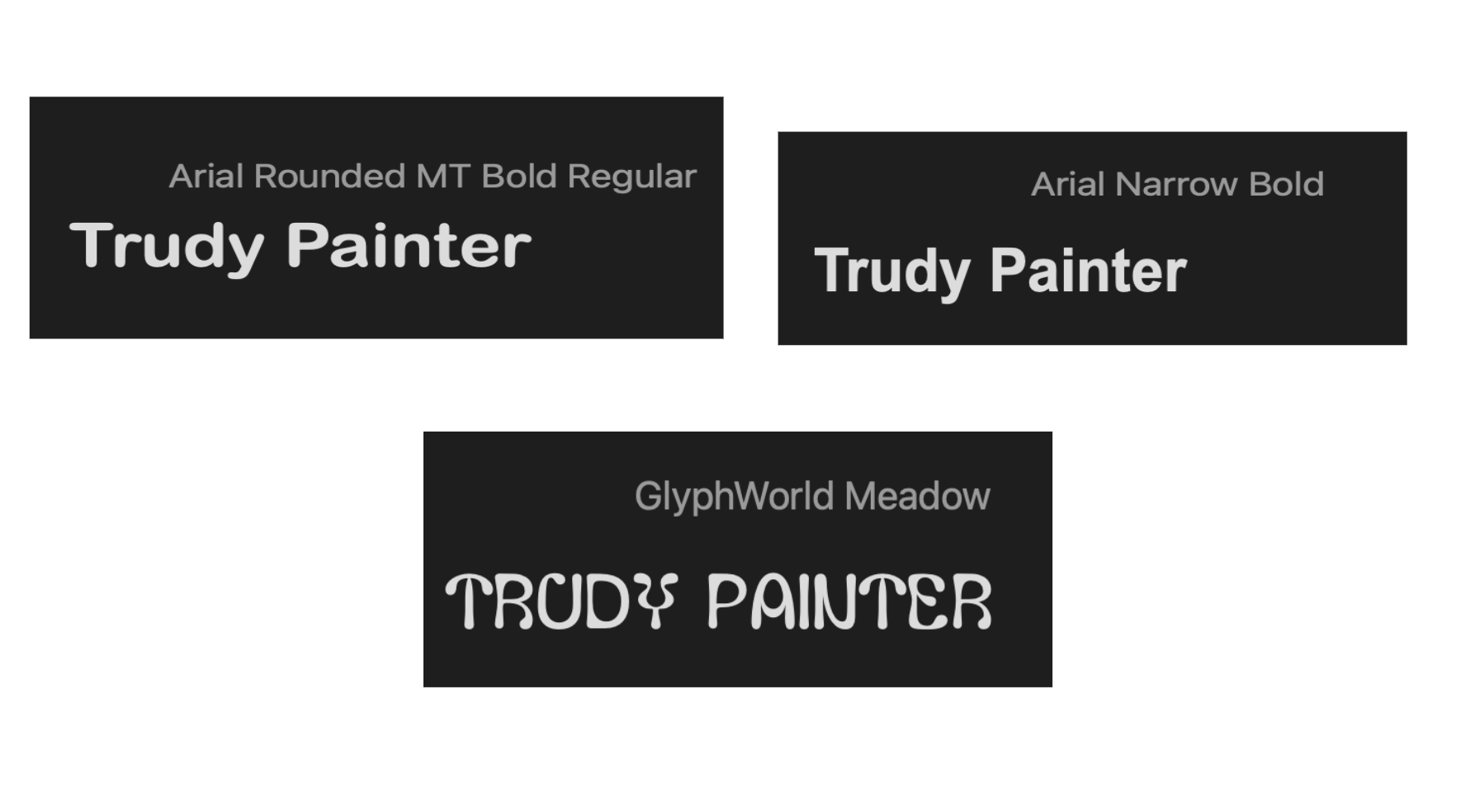
Mapping Ideas - Trudy Painter
I want to make a data visualization of the songs you listen to and where after you go for a run. Often I remember parts of my run by where I was listening to a specific song.
What kind of experience or imagination are you trying to map?
- Geolocation memory in relation to personal data
What are the dimensions of your experience/imagination that you are trying to visualize?
- Memory relationship to physical place and songs
What is the data source for your mapping idea?
- Strava API, Spotify API, Google Maps API
What are possible inspirations for your mapping idea?
- http://www.trudy.tube/
- https://www.queeringthemap.com/
- https://www.oldnyc.org/
- https://www.strava.com/heatmap#7.77/-120.51313/37.76625/hot/all
-
Design Project 4 Brainstorming
**Potential Ideas **
- Bathrooms on campus: how they’ve changed over time (when were men’s restrooms converted to women’s restroooms? all-gender restrooms?); possible inspiration: Course 4 thesis on All-Gender Restrooms at MIT
- MIT students and food: where do students eat? how do students feel about the places they eat? where do they eat alone? where do they eat with others? where does our food come from?
- Mapping restaurants that have closed in NYC (specific to Chinatown/LES?); why they’ve closed, public response; possible inspiration: map of NYC restaurants that closed due to Covid
- Mapping movement: Strava data; aggregation of people’s running/exercising routes? GPS art?; possible inspiration: GPS art
- Mapping trash: where does our trash go?
- Maps in politics: possible inspiration: gerrymandering
-
Design Project 4 Brainstorm - Audrey Gatta
**Potential Ideas **
- Bathrooms on campus: how they’ve changed over time (when were men’s restrooms converted to women’s restroooms? all-gender restrooms?); possible inspiration: Course 4 thesis on All-Gender Restrooms at MIT
- MIT students and food: where do students eat? how do students feel about the places they eat? where do they eat alone? where do they eat with others? where does our food come from?
- Mapping restaurants that have closed in NYC (specific to Chinatown/LES?); why they’ve closed, public response; possible inspiration: map of NYC restaurants that closed due to Covid
- Mapping movement: Strava data; aggregation of people’s running/exercising routes? GPS art?; possible inspiration: GPS art
- Mapping trash: where does our trash go?
- Maps in politics: possible inspiration: gerrymandering
-
Design Assignment 4: Ideas (Isabel Báez)
What kind of experience or imagination are you trying to map?
- My main idea is to map the experience of one’s dreams (while sleeping). I wanted to be able to convey the stages people go through as they dream, and the imagery that is created.
What are the dimensions of your experience/imagination that you are trying to visualize?
- I want to be able to grasp the ins and outs of dreaming. How situations and people merge together into senseless scenes. I also wanted to explore the dimension of nightmares, and what exactly converts a dream into a nightmare.
What is the data source for your mapping idea?
- Retelling of people’s dreams.
- Online texts of people discussing their own dreams and how they made them feel
What are possible inspirations for your mapping idea?
- I wanted be inspired by psychedelic designs, and abstract representations of everyday things
- Music based on the idea of Dreaming (ex. Dreamland by Glass Animals)
-
Map prelim thoughts - KCG
Experiences/imaginings -green spaces, mapping the condition of green spaces across Boston (like who upkeeps them, what kind of amenities are offered there, like enough space of soccer game, etc?) —public restrooms in the Boston area -hot dog carts/food truck maps -flowering plants (versus just green spaces) in the Boston area -restaurant closures/movement -restaurants by cuisine
Data sources -walking around Boston myself -going on restaurant websites, going onto Facebook for various pop-ups -public database of green spaces in Boston, or land under management of city’s gardening management department
Inspirations
 Es Devlin, Memory Palace –> mapping out historical human moments based on where they happened
 Dorothy, History of UK club culture –> links between different people, ideas, types of musics, locations but all done through text
Click for video Human app –> draws out and visualizes human movement in New York City and other large cities
 Albert Schrurs, France –> maps out France via plates that show the location of Michelin starred restaurants
 -
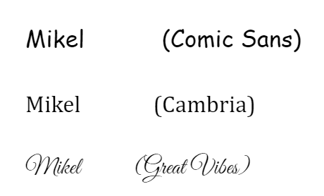
Experience Map First Idea - Mikel
What kind of experience or imagination are you trying to map?
- Watching a tv show, specifically people’s enjoyment or relationships to episodes/seasons/characters/elements
What are the dimensions of your experience/imagination that you are trying to visualize?
- Public reception, over time
- Maybe something to track how different parts of the show were seen at different times in its run? Overall perception of a show changes as more content comes out, like Game of Thrones being hated at the end while (older) shows like Buffy took a bit to get into their normal groove
- Critics vs ratings vs predominant online opinions
What is the data source for your mapping idea?
- Ranking articles (that rank seasons/characters/episodes from best to worst)
- Online discussion forums
- Rating data on how many people watch, and how that number changes over the course of the show (most shows decline in ratings over time but do they at all link up with critic or public opinion of those seasons?)
What are possible inspirations for your mapping idea?
- Not sure
-
Design Project 4 prelim brainstorm (Rachel Chae)
- What kind of experience or imagination are you trying to map? Mapping real-life cities to movies/fantasy that takes place in an alternate version of the city or is inspired by the city. (ex. queens <= marvel spiderman, chicago <= divergent, etc.)
- What are the dimensions of your experience/imagination that you are trying to visualize? The two dimensions would be the real-life geography and the fictional one. I’m not quite sure what form they would take yet, but I was thinking that elements of the fictional geography would be overlayed over the real one.
- What is the data source for your mapping idea? The real-life geography would be drawn from sources like google maps, while the fictional one would require curating a collection of movies scenes/stills and other media.
- What are possible inspirations for your mapping idea? I found some interactive maps such as marseille 2021 (https://marseille.laphase5.com/en) and the Netflix map for witcher (https://www.witchernetflix.com/en) very interesting, but I’m not quite sure how these inspirations would merge with my idea yet.
-
Visual Poem Animation - Mikel
-
Design Exercise 3 (Isabel Báez)
-
Design Assignment 3, Hanu Park
-
[chxchen] Project Ideas
Some concepts I would be interested in exploring are fantasy maps and maps with ties to my heritage or upbringing. I really like studying how fantasy maps are constructed and particularly their ties and inspiration from real geographic locations, so it might be cool to take a map from either a game or novel I like and interactively explore where the inspiration for these fantasy locations comes from. The data would be sourced from whatever information the publishers have made readily available and maybe also fan theories.
I would also be open to exploring maps with ties to my own heritage or upbringing, either related to my upbringing as a Chinese-American or the places I’ve grown up with. I think another interesting idea I’ve thought about is the growth of cities, particularly ones that have experienced recent bursts of growth (i.e. Atlanta, Toronto, Seattle, etc.), and seeing what new developments have arrived at these cities to help them grow recently.
-
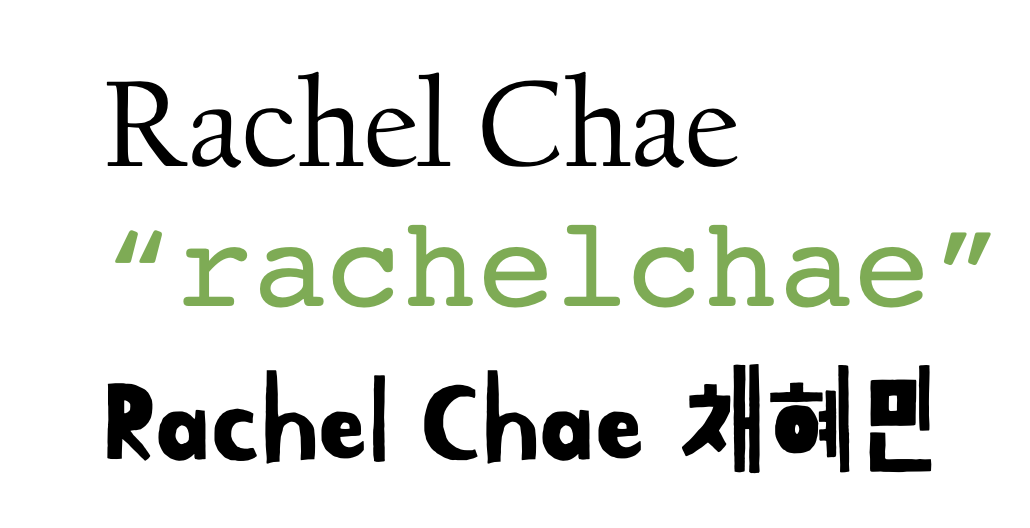
Design Project 3 (Rachel Chae)
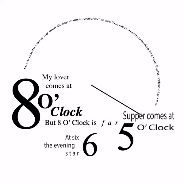
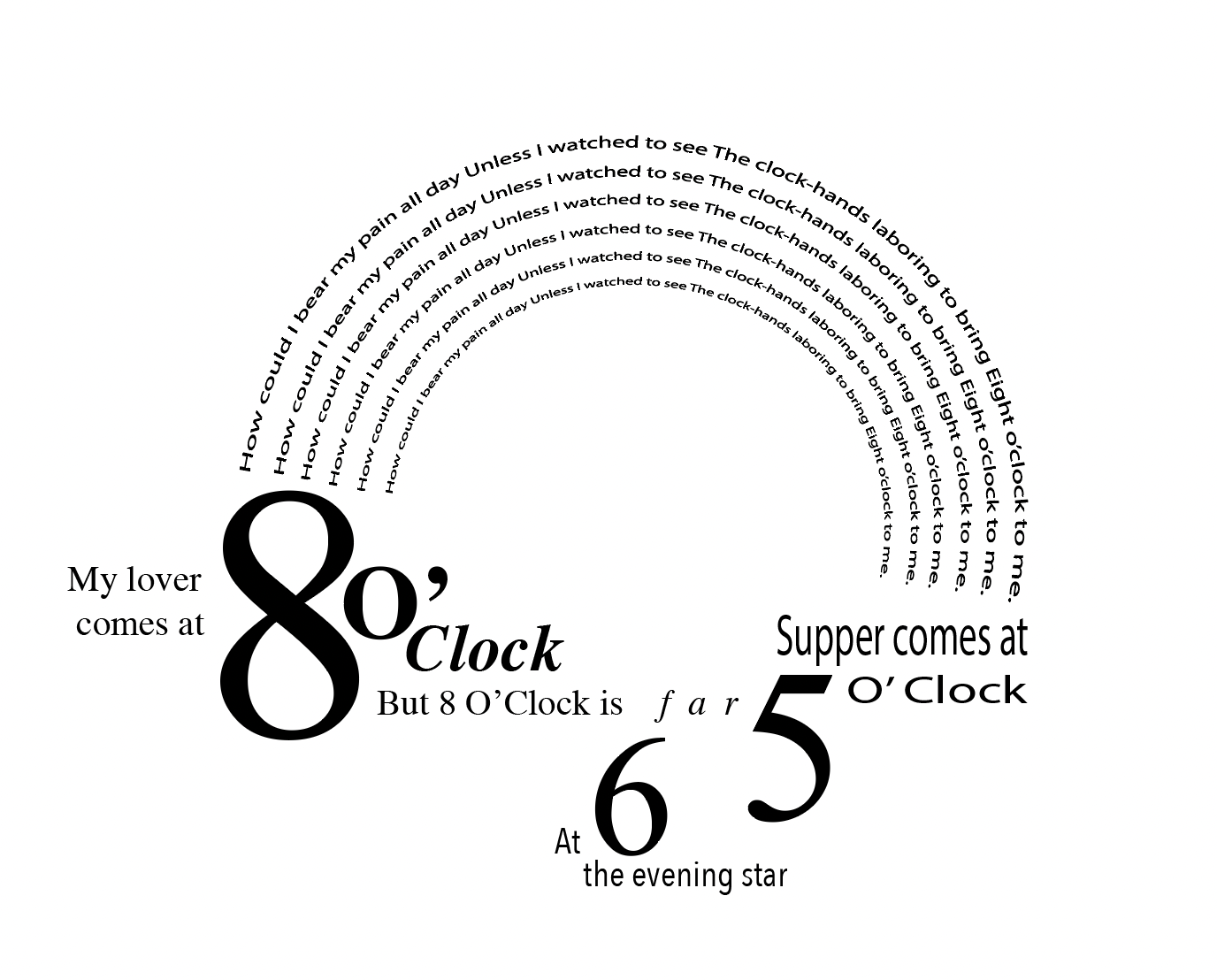
Original Poem:
Eight O’Clock BY SARA TEASDALE Supper comes at five o’clock, At six, the evening star, My lover comes at eight o’clock— But eight o’clock is far.
How could I bear my pain all day Unless I watched to see The clock-hands laboring to bring Eight o’clock to me.
-
Concrete Poem Animation - Audrey Gatta
-
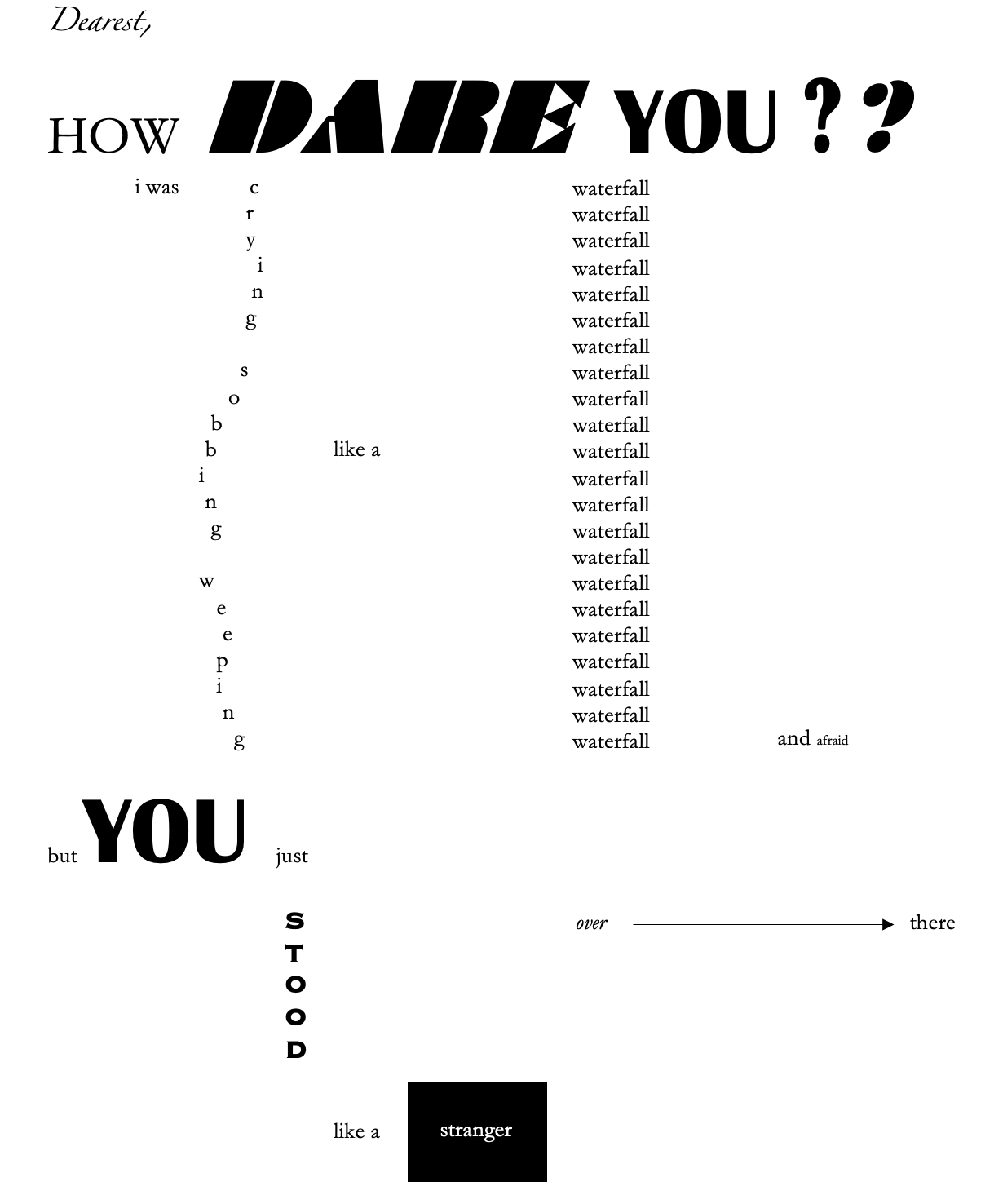
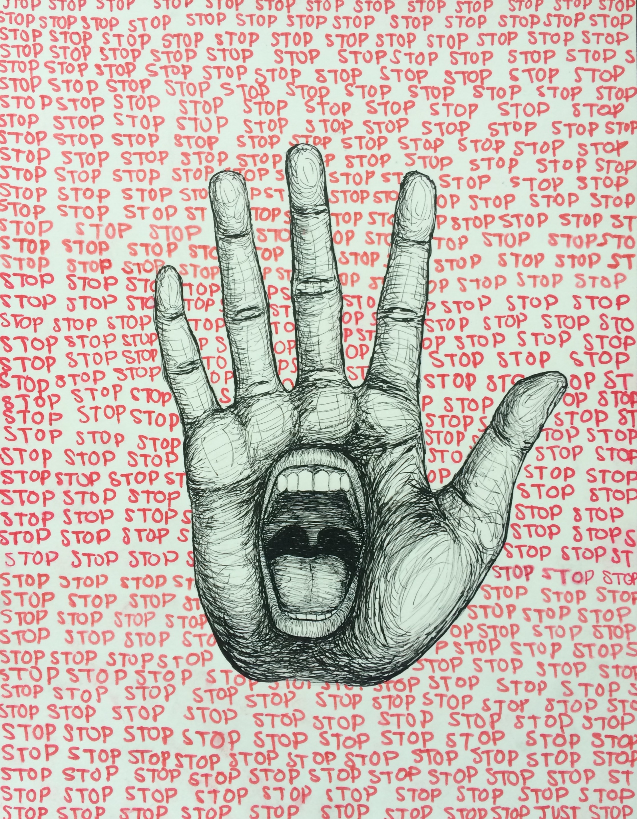
How dare you? - Final
-
[chxchen] Concrete Poetry Animation
-
Concrete Poetry Update 2 - Trudy Painter
I wanted the text to feel overwhelming all at once. I wanted to maintain the cascading effect of the lines bleeding into each other.
https://editor.p5js.org/trudypainter/sketches/yJyoUzORs
-
Movie Title Sequence (Isabel Báez)
Sinister Title Sequence: https://www.youtube.com/watch?v=dk6ZyqNfI7E
-
How dare you?? - KCG
-
Movie Title Sequence (Rachel Chae)
Title sequence for movie “Catch Me If You Can”
https://www.youtube.com/watch?v=cwvIzFqrd7U&t=138s
-
Moving Film Titles - Audrey Gatta
¿Quién mató a Sara? opening sequence
-
Moving Film Title - Mikel
https://www.youtube.com/watch?v=Kq3XtZNTo_I&ab_channel=AgentSpider
Spider-Man: Into The Spider-Verse opening
-
Movie Title Sequence - Meenu Singh
https://www.youtube.com/watch?v=Jpmrd_GdddI
Pink Panther (1963)
-
Loki opening sequence
https://www.youtube.com/watch?v=183tEhupiSQ
I really like the Loki opening sequence, because the sequence itself gives context to how Loki is viewed by the Time Variance Agency once they captured him, and all of the work that went into that. However, the actual text of “Loki” at the end of the film is particularly nice, because one, it changes in time to the score, but also the changing fonts refer to the “tricky” nature of Loki and his changing faces.
-
[chxchen] Moving Film Titles - Monsters Inc.
-
Interactive Poem Link
https://editor.p5js.org/trudypainter/sketches/yJyoUzORs
-
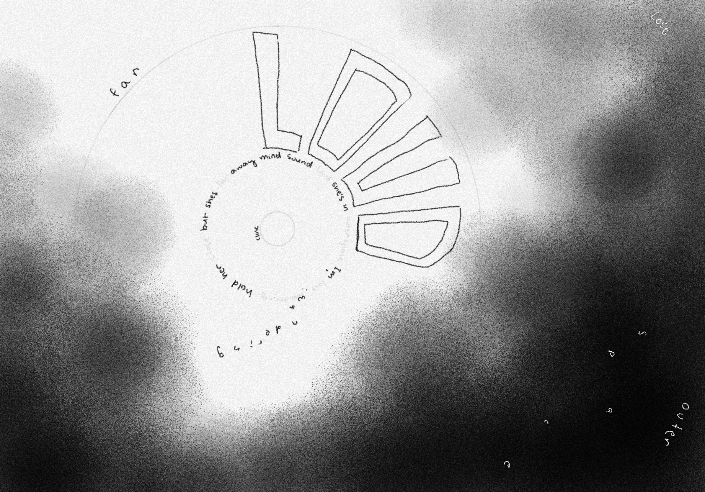
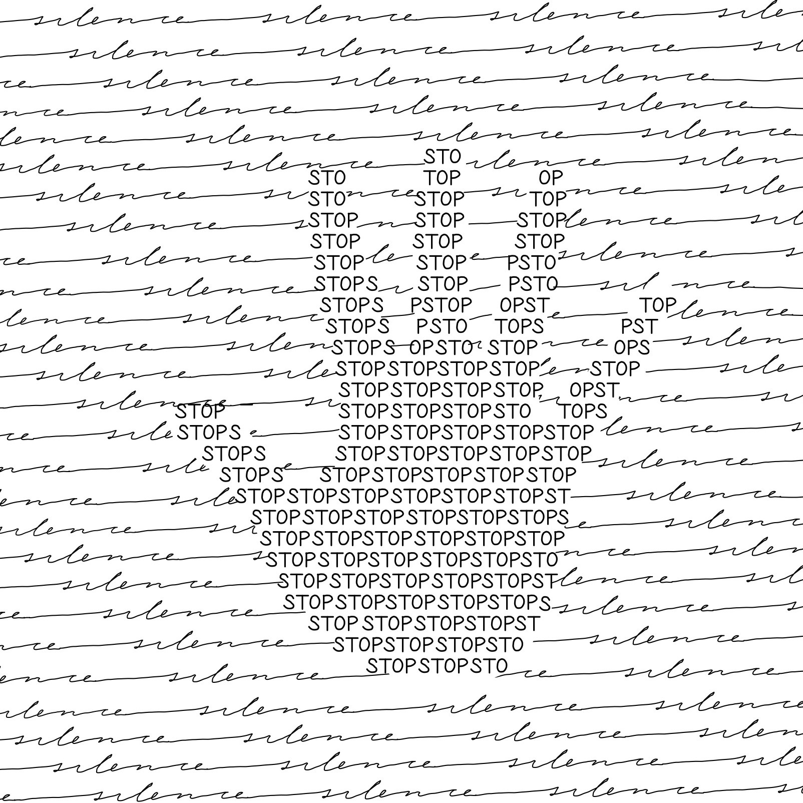
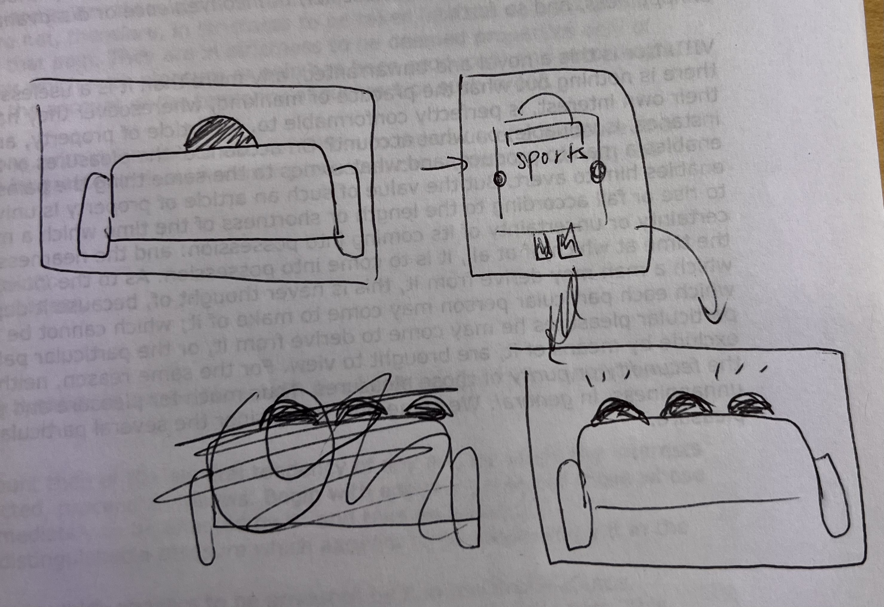
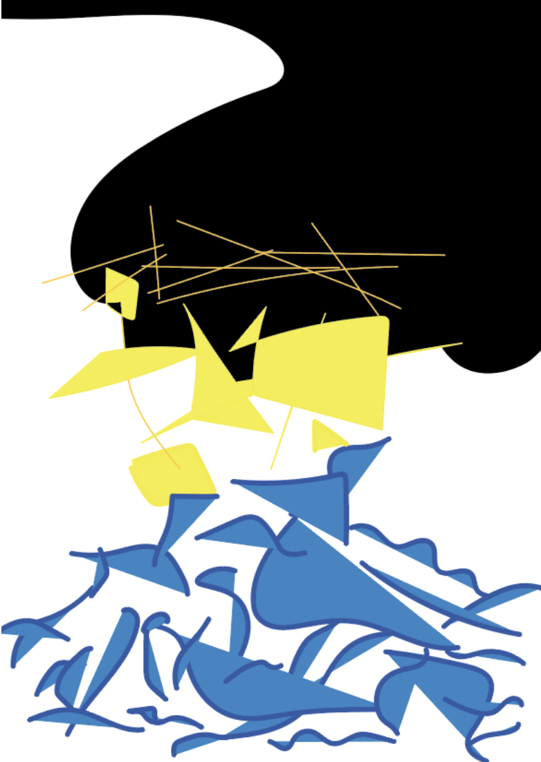
design project 3 v1 - meenu singh
This is one of the first drafts of my concrete poem. The idea was supposed to be that the poem would be in the shape of a stringed marionette but I’m not entirely pleased with how it turned out visually, so I might revise it/try other ideas.
-
Design Assignment 3 (Rachel Chae)
-
Visual Poem Draft - Mikel
-
How Dare You? - KCG
-
Design Exercise 3 (Isabel Báez)
-
Design Assignment 3.1, Hanu Park
You Can’t Find Her
This is a draft that is based on disassociation and vulnerability.
-
Concrete Poetry Draft - Audrey Gatta
Based on a drawing I did a few years back on body language and consent.
-
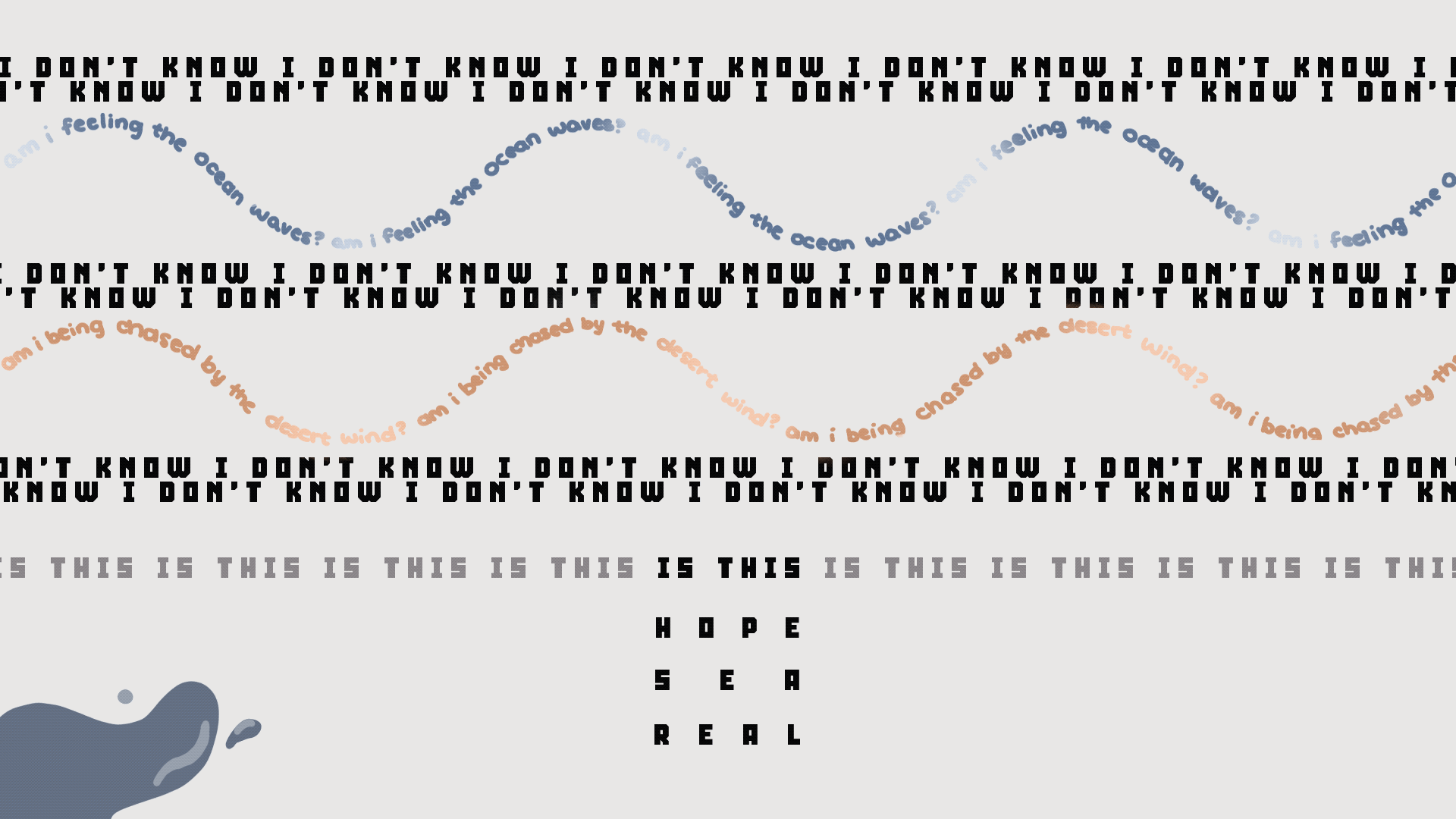
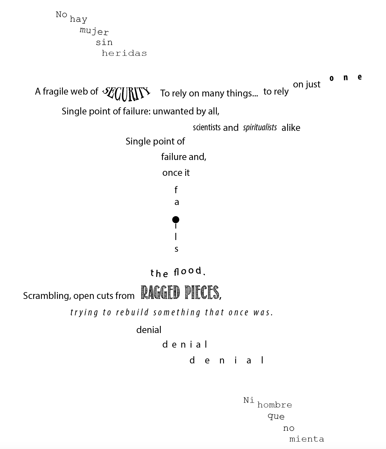
[chxchen] Concrete Poetry Draft
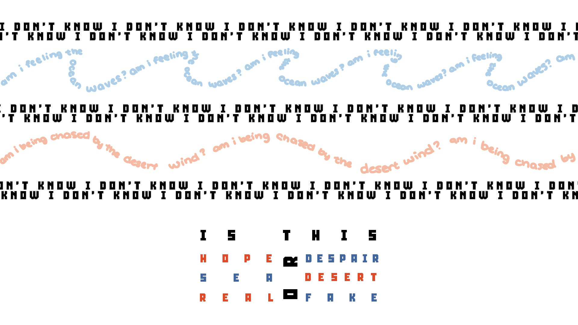
These are lyrics from Sea by BTS, translated to English and modified slightly: “I don’t know, I don’t know, Am I feeling the ocean waves? I don’t know, I don’t know, Am I being chased by the desert wind? I don’t know, I don’t know, Is this the sea or the desert? Is this hope or despair? Is this real or fake?”
The song uses the concept of reaching the sea to represent achieving a final success, whereas the desert represents a difficult journey towards that sea. This verse is about how we can’t always tell when we’ve reached our goals or whether we’re in the ocean or the desert. I tried to capture this feeling with the long reels of “I DON’T KNOW” across the design, and a very similar design for “Am I feeling the ocean waves” and “Am I being chased by the desert wind”. For the final section, I contrasted the concepts of the hope of reaching success at the sea versus the despair of trekking through the desert, and finally whether we know our success is real or fake.
With my animation, I hope to capture this even further by adding movement to the text and adding a glitching effect to the “I DON’T KNOW” text to make it more discordant and confused. I also might adjust the spacing and design of the last three lines to make the piece more cohesive.
-
Design Assignment 3 - Concrete Poetry - Trudy Painter
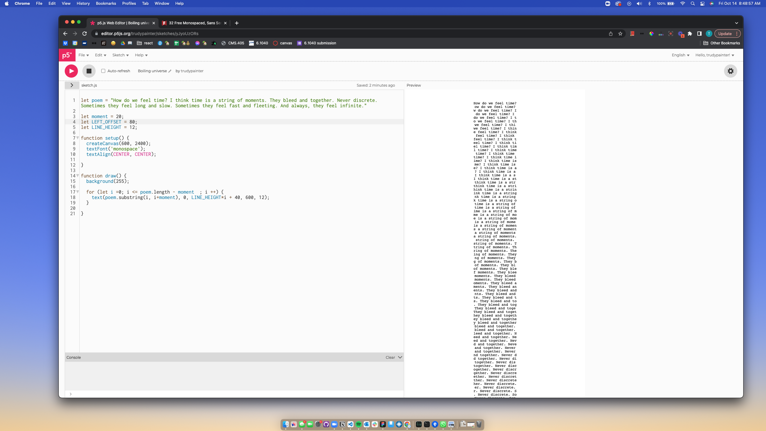
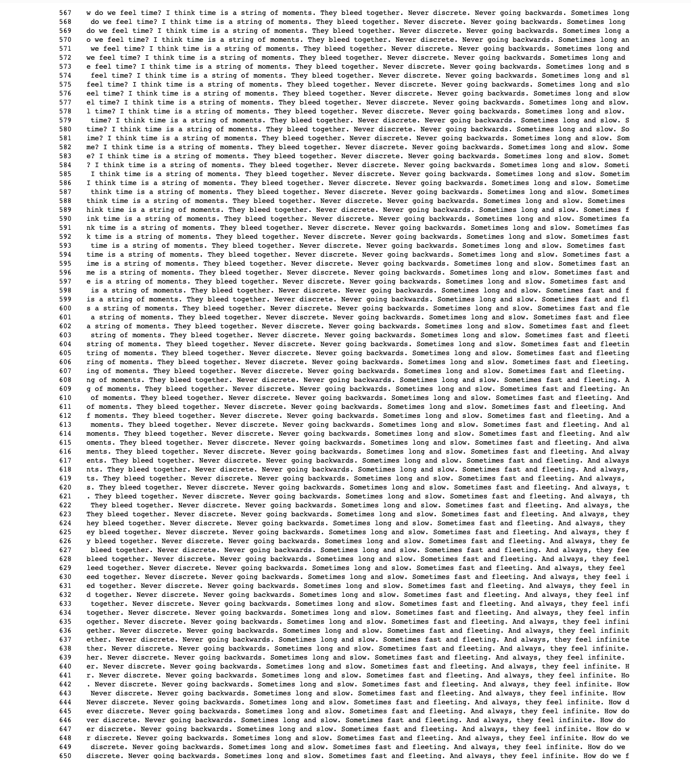
My poem is the following:
How do we feel time? I think time is a string of moments. They bleed and together. Never discrete. Sometimes they feel long and slow. Sometimes they feel fast and fleeting. And always, they feel infinite.
I weave all of moments of this poem together in the way I think I feel time. The cascading substrings communicate how moments overlap to create a feeling of time.
For my animation, I want to add an infinite scroll that only moves forward and a counter that only increments upwards.
-
Final Ad - Trudy Painter
For my final advertisement, I wanted to make sure I had a tag line for BeReal. I chose “As real as it gets.” This addresses the mission of the social media platform to create a more authentic and “real” environment. However, in the actual ad, there is clear distortment.
-
Design Assignment 2.3, Hanu Park
Final
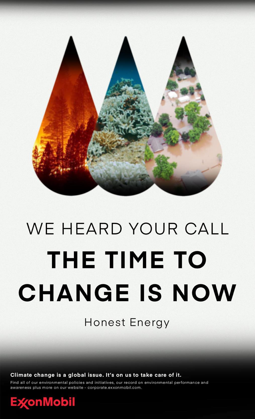
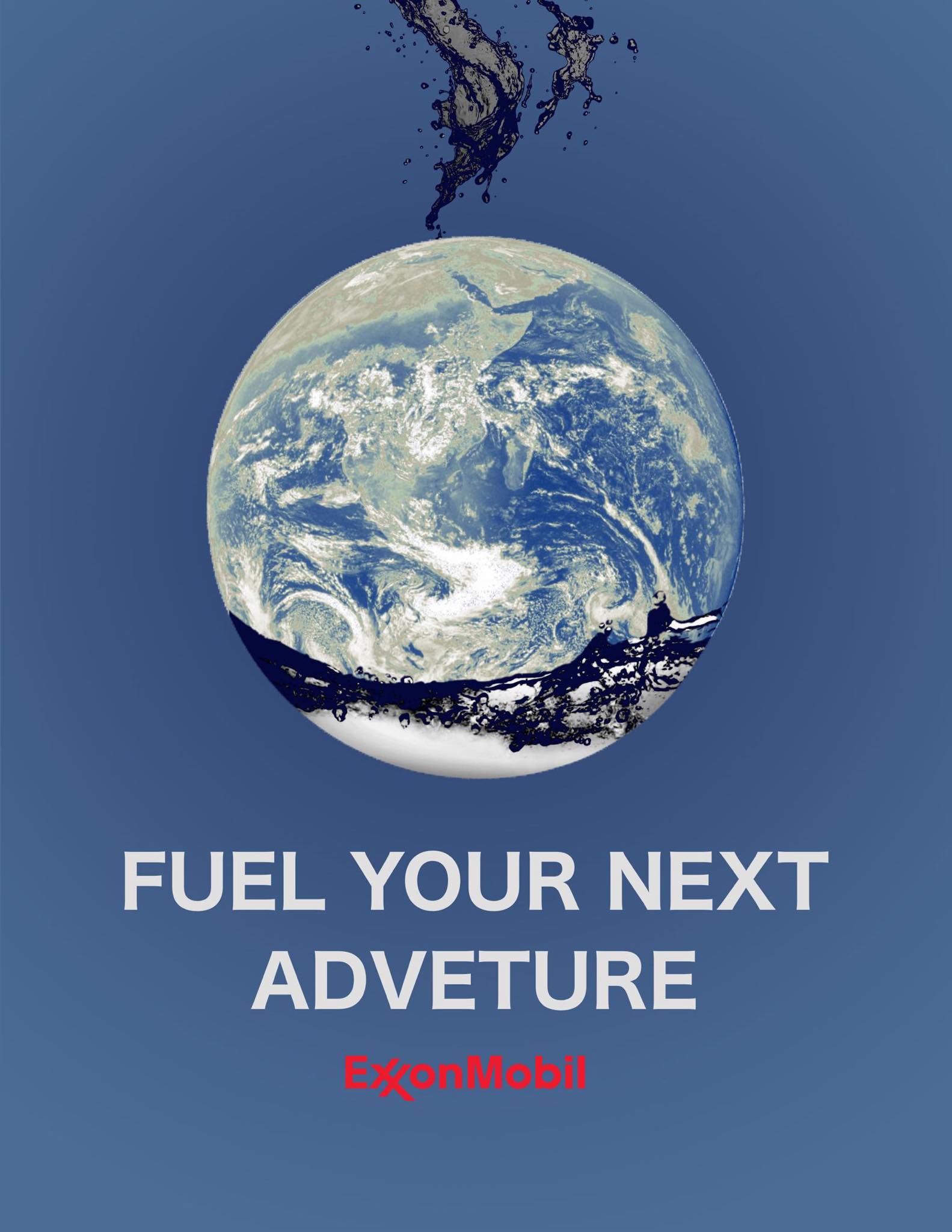
In my revision, I wanted to clarify the reason why I was targeting ExxonMobil. In my original ad, the point was too broad and could be interpreted many ways. This is not always a bad thing, but seemed out of place for the project at hand. Instead, I decided to pivot away from choosing an issue with such wide symbolism and narrowed down to a more specific criticism. I also severely updated the graphics from the last draft. I said I was going to lean towards more graphic illustrations for my revisions, but I changed my mind in order to challenge myself to handle photo-realistic graphic design better. Overall, I find that the finished product looks much more like an ad than my draft, and the mood of the ad matches the company overall.
-
Subversive Ad Revision (Rachel Chae)
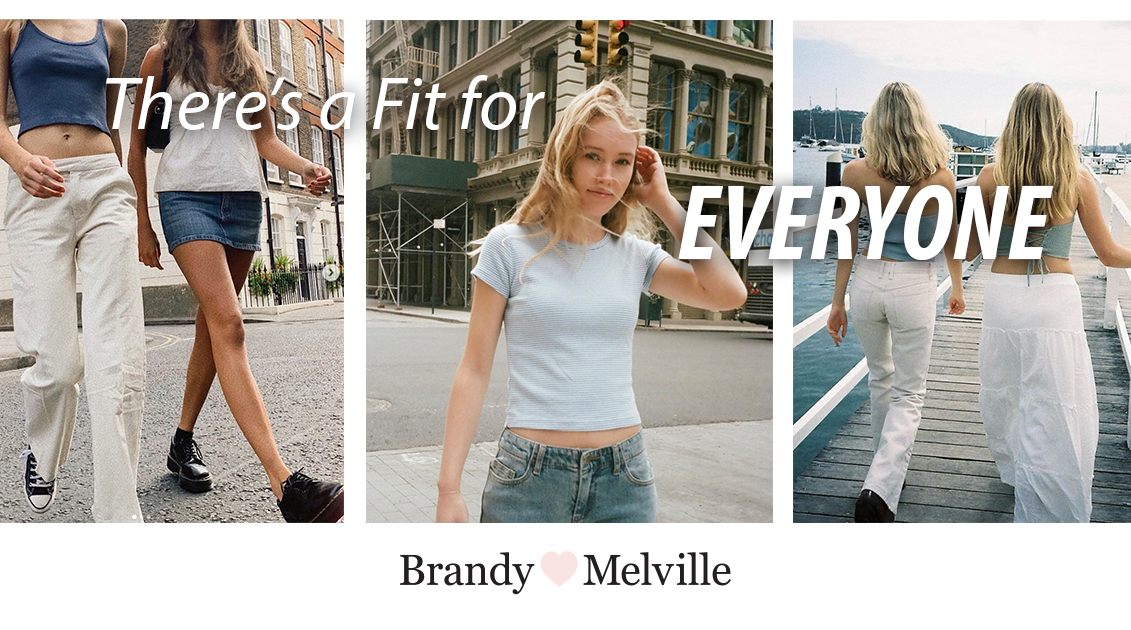
For my revision, I wanted to strengthen the original message of the advertisement—that many fashion brands claim to be inclusive but fail to represent such diversity in their marketing—using suggestions I received during class. For instance, I brought more attention to the central message “There’s a fit for everyone” by choosing a bolder typeface and larger font size. I also put an extra emphasis on “everyone” and framed the letters around the girl in the center. This serves to highlight the fact that the brand’s clothes aren’t actually meant for everyone but instead catered towards a very specific societal beauty standard, one that is exemplified by the girl in the center picture. Furthermore, I made the brand logo smaller and placed it on the bottom of the advertisement. This was to allow the viewers to focus on the central message and to make the advertisement more generalizable to other fashion brands.
The pictures used in the advertisement are taken from Brandy Melville’s Instagram page (@brandymelvilleus). I specifically tried to find references on Instagram since brands like Brandy Melville find their target audience on social media platforms. Moreover, I took inspiration from facebook ads and webpages of fast fashion brands like ZARA (https://www.zara.com/us/) and tried to emulate their modern layout and typefaces. By adopting their minimalistic design, I hoped to make the advertisement appear on trend with current fashion campaigns.
-
Subversive Ad Revision - Meenu Singh
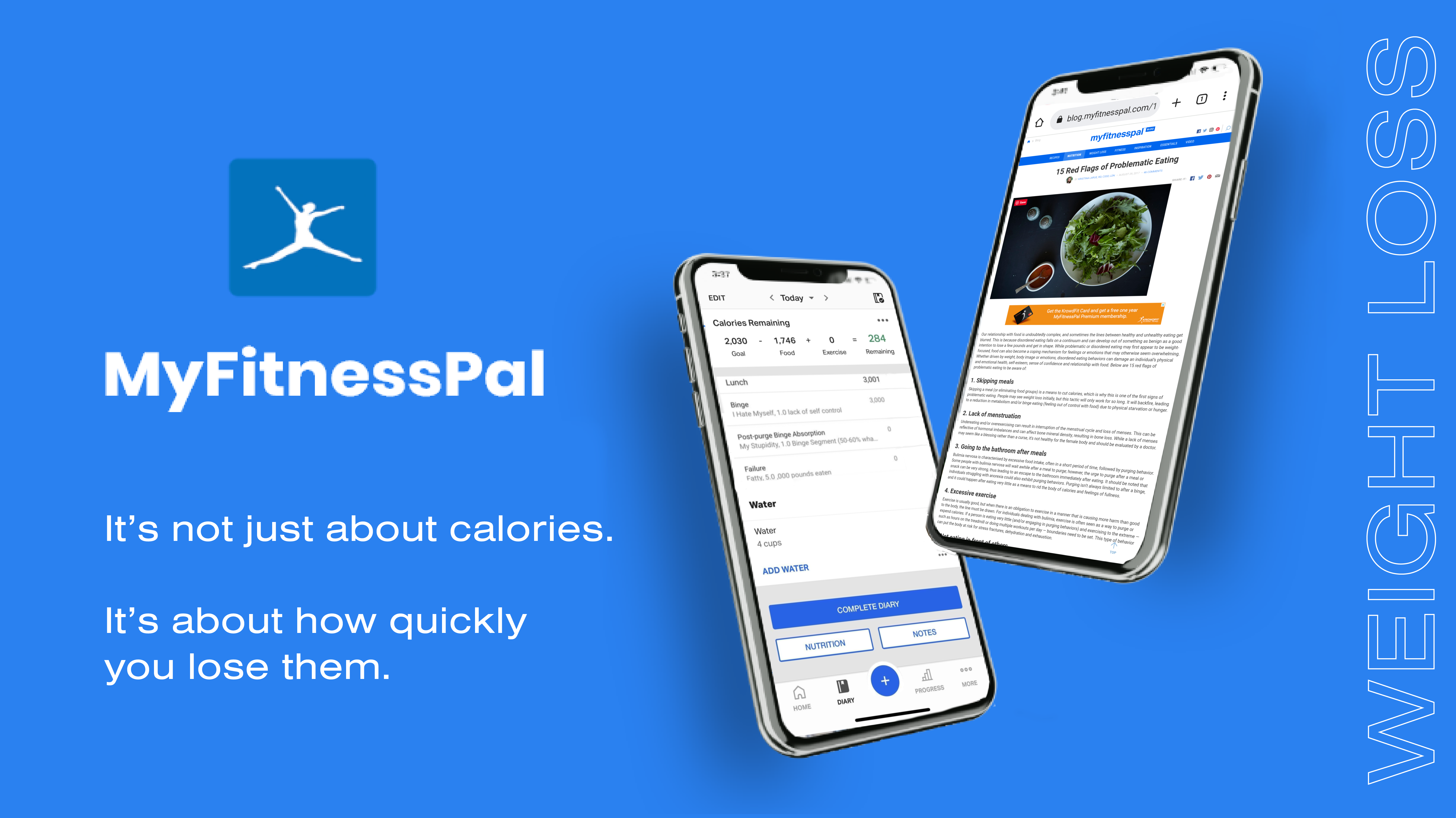
In my ad revision, I implemented some of the suggestions mentioned during class last time, such as bringing the logo further towards the top and increasing the spacing between the logo and text for greater emphasis, removing the white line.
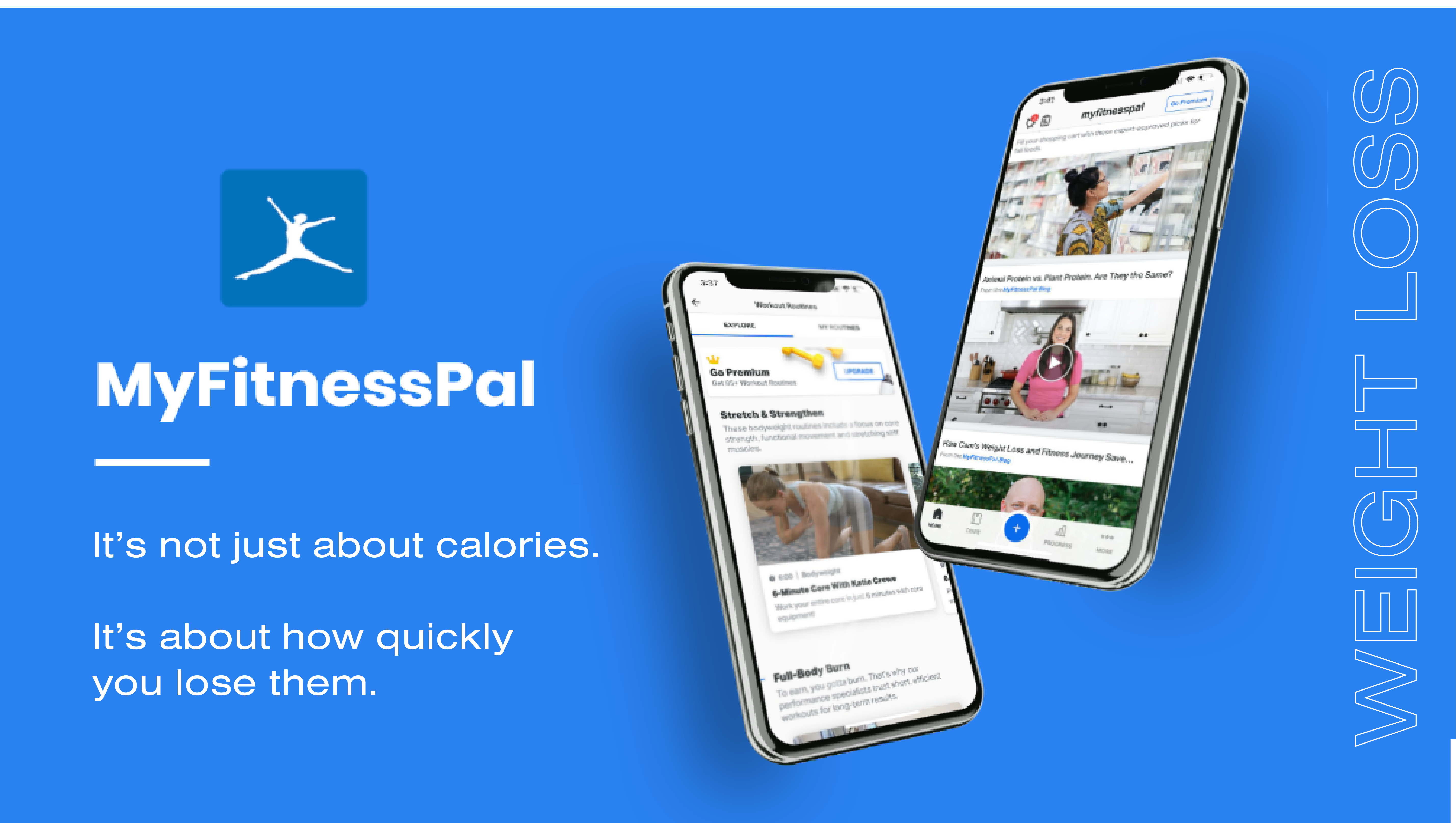
I wanted to make the connection to eating disorders more clear, so I changed the images on the phone screens to be more subtly pointing towards problematic eating patterns encouraged by MyFitnessPal. On the first phone, it shows MyFitnessPal’s eating diary, but I combined a regular diary entry with a more problematic entry where the user is criticizing themselves and speaking negatively about not meeting their weight goals. On the second phone, I have a picture of a user looking up eating disorders on myfitnesspal’s blog website.
Another aspect I played around with was the weight loss line on the right. I increased the spacing between letters so it would fill up the entire height of the image to look more dramatic. I played with a couple different option for the borders, but decided I liked the thin white border and the double meaning of the unhealthy weight loss nature of the app being something that you might initially miss, but it becomes more recongizable after you see it.
-
Subversive Ad Final - Mikel
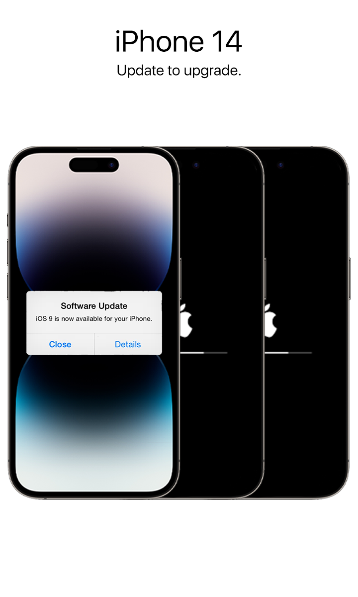
I went with the phrase “update to upgrade” to have a more subtle idea pushed through the words. I hope that with the images of the phones stuck updating, and the frontmost one getting an update notification, that the phrase can be read as “updating your phone will force you to have to upgrade to a new one,” although I’m not sure if I achieved that.
I went with the idea of having each phone model be the same, to keep Apple’s clean/modern design and also poke at the fact that new models of iphones do little to improve on the old ones. I prioritized the polish, even though it might detract from the idea that the further-right phones are technically supposed to represent older models.
-
Design Exercise 2 - Subversive Advertisement (Isabel Báez)
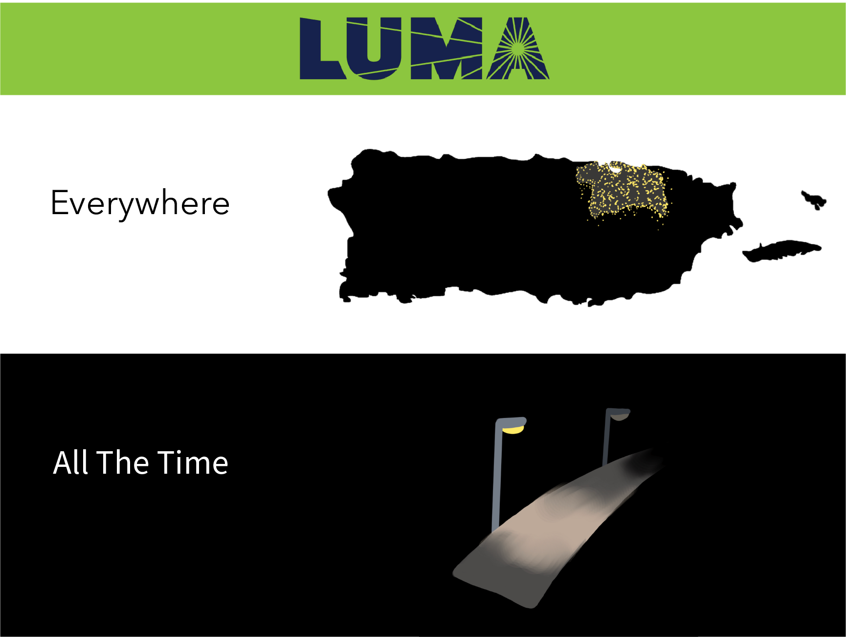
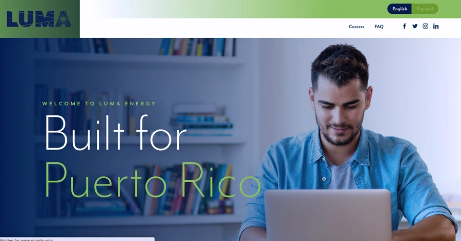
 (1).png)
As previously discussed, LUMA Energy is a new, privatized energy system that currently powers all Puerto Rican homes. For the final version of my subversive advertisement, I focused on accentuating the idea that LUMA Energy only provided reliable power to a certain subsection of the island, which goes against their mission of being “Built for Puerto Rico”. I accomplished this by utilizing a satellite image of the island post-hurricane and accentuating the darkness of the non-metro areas. This use of real images is classic of the advertisement for LUMA Energy.
In terms of visual design, I focused on using a font very similar to the one used in the company’s print advertisements. This consisted of the “Built for Puerto Rico” tagline that is often displayed in these. I modified this taglin so the phrasing accentuated the imagery used. Another component I extracted from these advertisments were the white lines that portrude from the LUMA logo. These tradditionally represent light beams that relate with power. I repurposed these lines to also represent the cables in power lines. I used this recognizable iconography (the power lines) to highlight what the company’s purpose is: an energy company.
-
Subversive ad v2 - KCG
I wanted to create more unity between the image of the cheese cavern and the background of the text caption so I introduced the gradient. I think the gradient also introduces a menacing / threatening feel to the imagery which adds to the the idea of how vast and wasteful these cheese caverns are in addition to the government subsidies that cause them in the first place.
-
Subversive Ad Final - Audrey Gatta
In my revisions, I changed the text in order to make it more of a subversive ad, as opposed to an explicit critique. I also played around with the placement and opacity of the bubbles, as well as the symbol of the black hole.
-
[chxchen] Subversive Ad - Citizen [Final]
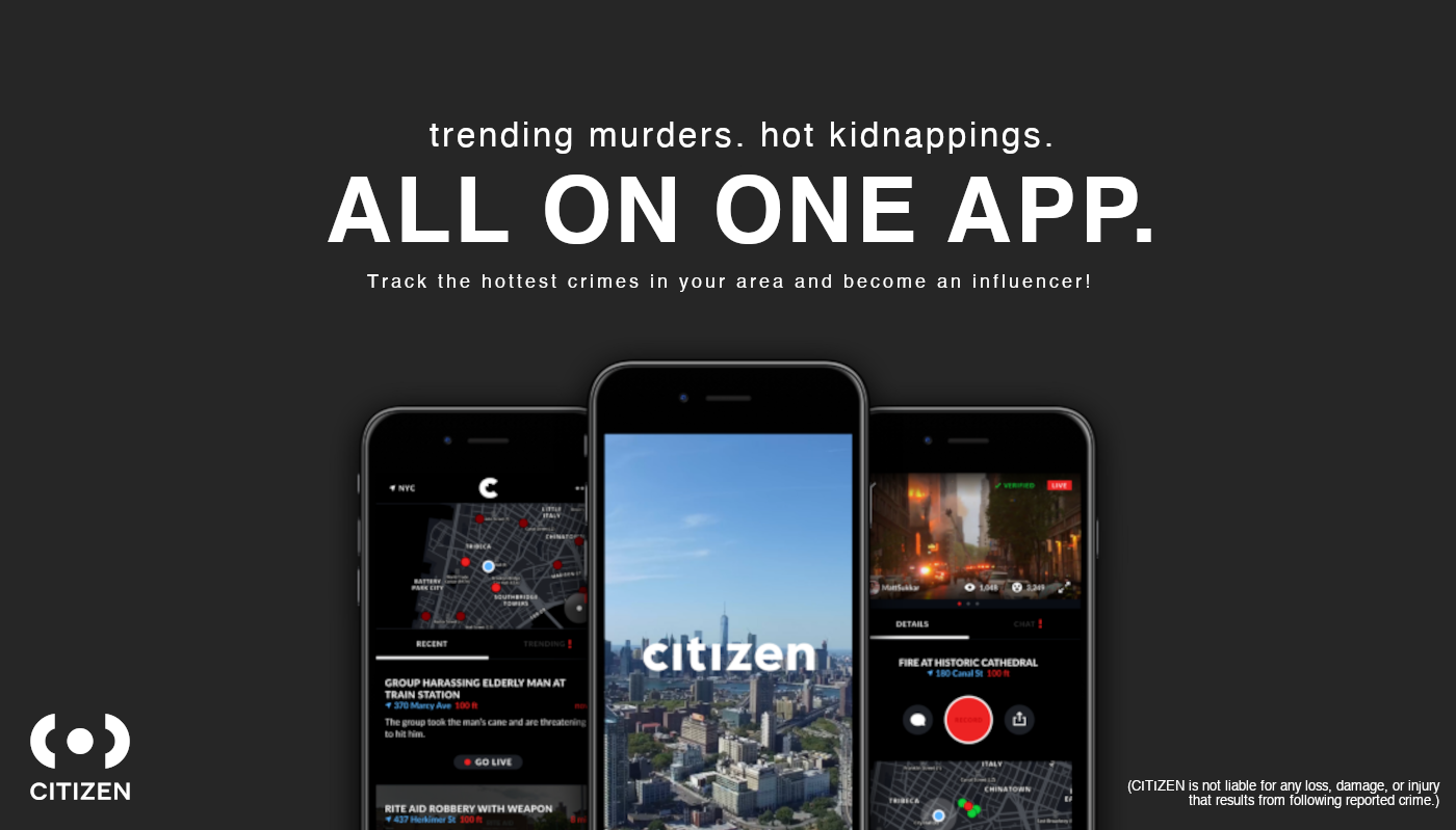
For my final draft, I wanted to include more context on what the app was so it would be apparent at first glance even to people unfamiliar with Citizen. I also wanted to include some more insight into Citizen’s method of paying for people to livestream incidents and how they compensate almost similarly to how TikTok and Instagram will pay creators to make Reels/TikToks and other media.
I wanted to add more attention to the “All on One App” part because it is ironically the vaguest part of the advertisement and something that will immediately set the mood of a perky all-in-one helpful gadget, before people’s eyes wander up to the “trending murders, hot kidnappings” line.
Finally, I included a disclaimer footnote on the bottom right to visually balance against the Citizen logo about how Citizen won’t claim liability for any damage that results from usage of the app even while it encourages people to get into dangerous situations.
I didn’t change anything about the images used but enlarged the phones slightly so it was more obvious – I really liked the juxtaposition of the utopic city against the arson and crime-tracking displayed on the side screens, and thought it was reflective of the “ALL ON ONE APP” headline screaming at the user while flanked by disturbing taglines.
-
subversive ad draft - meenu singh
In my ad, I wanted to call out how many calorie counting apps are gateways into eating disorders. While the app content seems to target exercise habits, it makes calorie tracking too easy and allows you to set calorie limits based on goals that can be extreme. It was inspired by their marketing and feature which heavily emphasizes tracking macros but portrays this in a nonchalent light.
-
Design Assignment 2.2, Hanu Park
Base Draft
Updated Draft
-
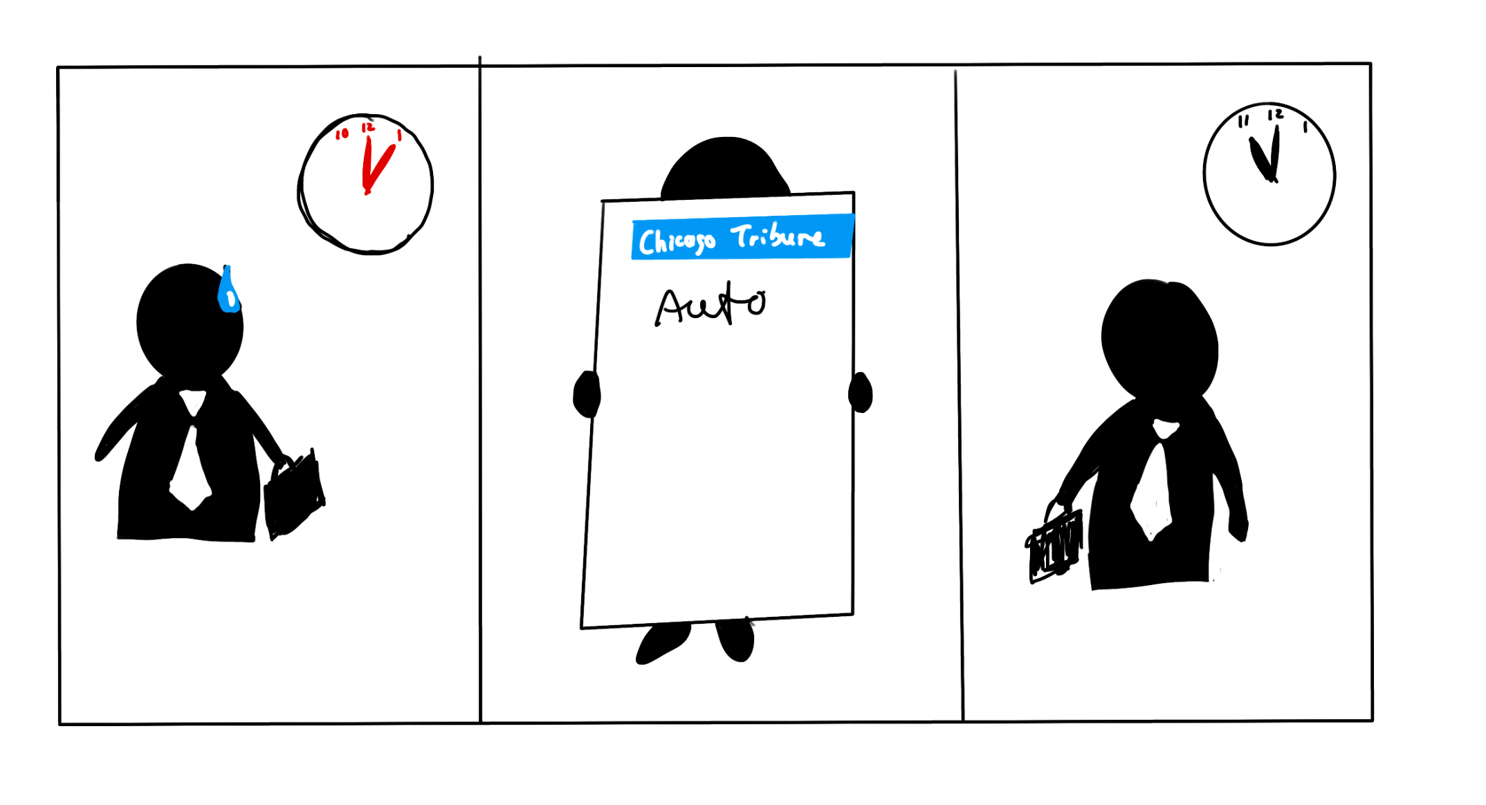
Quick Assignment for Neil Cohen Reading
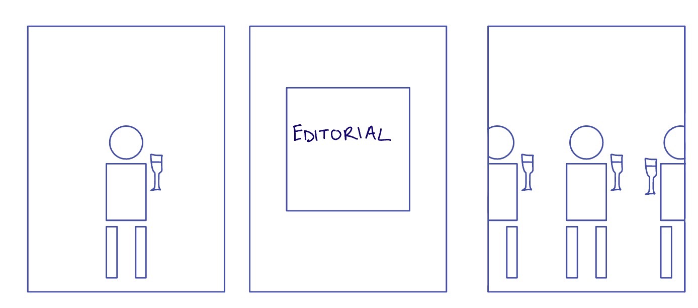
This shows the idea that if you read the Editorial section, there are high class things for you to talk about at a cocktail party.
-
Metaphor example - KCG
-
In-class exercise (Rachel Chae)
-
Design Exercise 2: Subversive Advertisement (Isabel Báez)
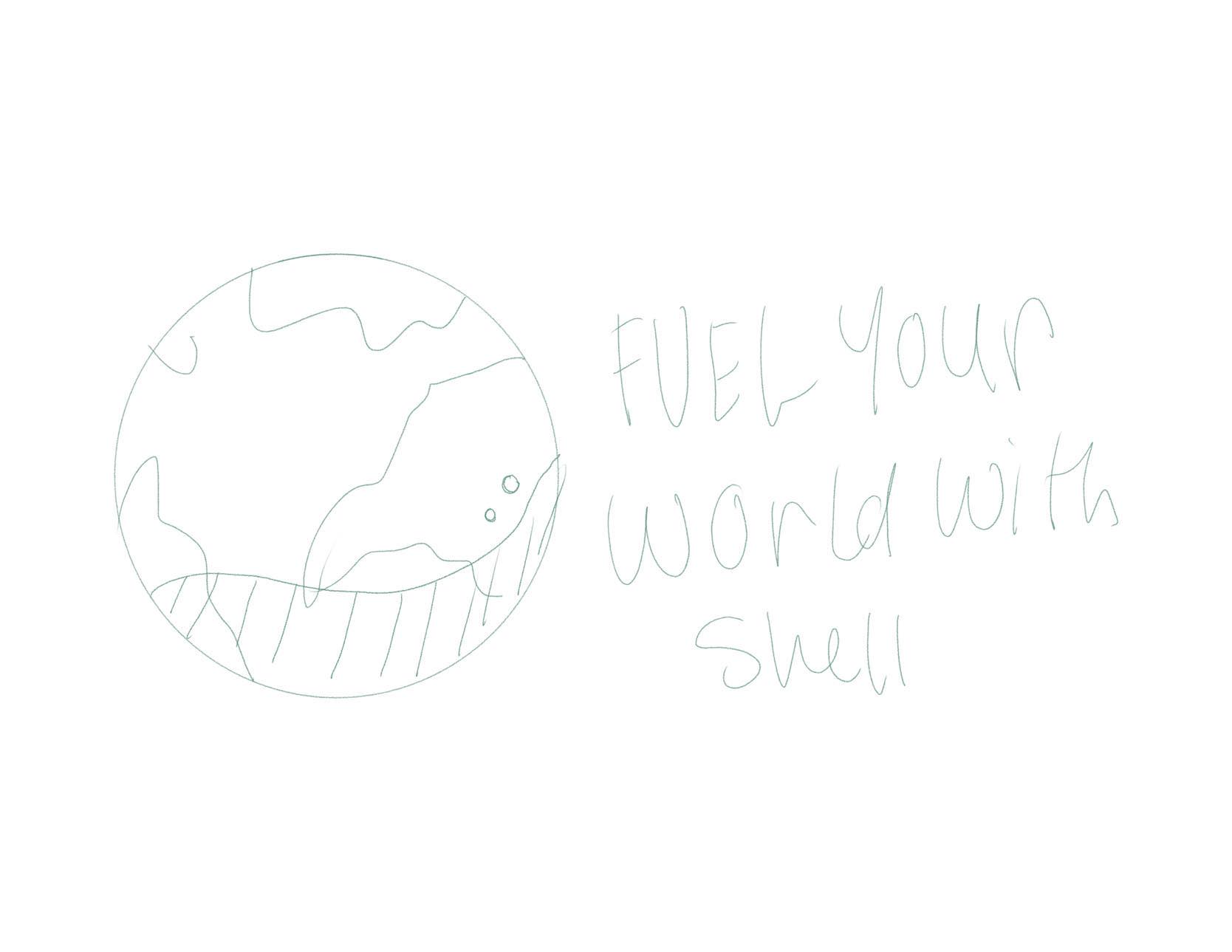
Luma Energy is a subsidary company from Atco Energy, a big Canadian-American coorporation. Luma’s purpose is to tackle Puerto Rico’s energy infrastrcuture by privatizing the island;s power grid (which was public until 2021).
Although promising to be made “for Puerto Rico” (as shown in the advertisement below), the change has resulted in higher prices for energy, and less reliable service. All of this while also contributng to the forces americanization of the island.
In my design, I want to accentuate the hypocrisy by the statement “Made for Puerto Rico” written in English, as well as the lack of accuracy of its promise versus its delivery. Moreover, I also want to highlight how the richer areas of the island get disproportionately better service than those with less resources.
-
Design Assignment 2.1, Hanu Park
Again, I started with a simple sketch. In this draft I wanted to flesh out the ideas of why a consumer might actually believe this could be a real ad, and why upon closer inspection it’s not. I did not want to have a busy screen, since it’s supposed to feel corporate and polished, so I left out detail and texture that did not need to be there. This is especially true because I am writing for a fuel company.
-
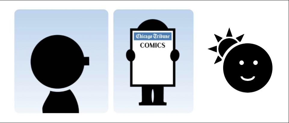
Class Exercise - Cohn Comics
-
Blending Example - Audrey Gatta
-
[chxchen] In-Class Assignment 2
-
Subversive advertisement - KCG
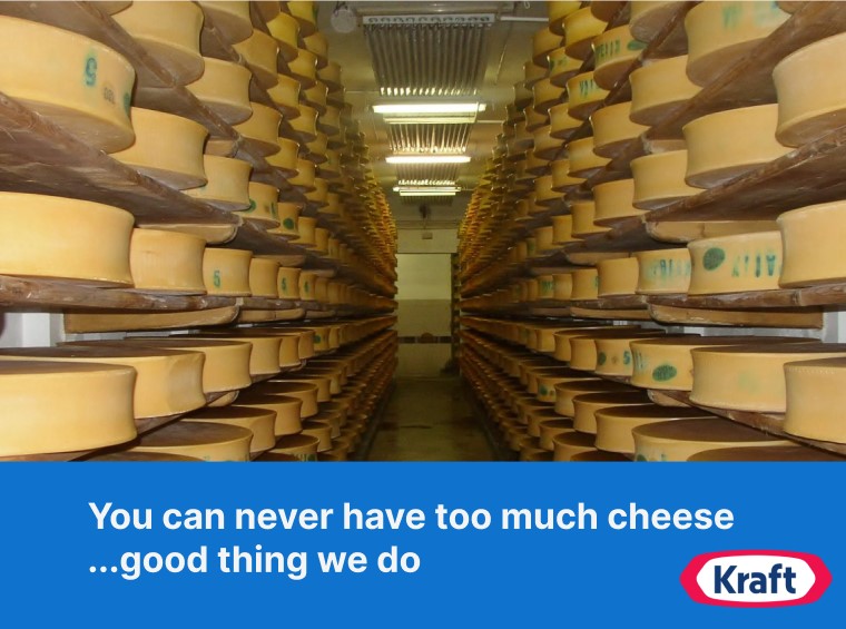
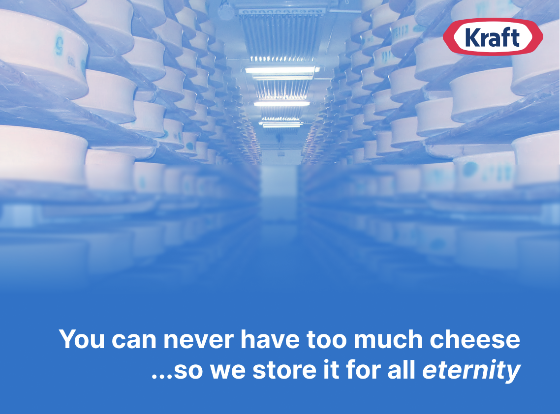
In the USA, cheesemakers (such as Kraft) are subsidized to produce cheese, and because of those subsidies, they produce so much cheese that the excess is stored in a cheese cave in Missouri. There is so much of it that we will never be able to finish it all - we will never run out of cheese. This government subsidy of foodstuff is so absurd to me, especially when you consider the food insecurity that is so prevalent in our country - in the form of food deserts and food prices being unaffordable. I wanted this advertisement to highlight this inconsistency in the way our current system of food distribution works (or rather the way it doesn’t).
This advertisement itself is inspired by traditional Kraft advertisements I saw in my childhood which always utilized the Kraft navy blue. I wanted the photo to be realistic and aesthetically pleasing since those advertisements always featured an idealized family sharing bowls of Mac and Cheese - thus I choose a very symmetrical photo of the cheese cavern.
-
Subversive advertisement - Katherine Caol Guo
In the USA, cheesemakers (such as Kraft) are subsidized to produce cheese, and because of those subsidies, they produce so much cheese that the excess is stored in a cheese cave in Missouri. There is so much of it that we will never be able to finish it all - we will never run out of cheese. This government subsidy of foodstuff is so absurd to me, especially when you consider the food insecurity that is so prevalent in our country - in the form of food deserts and food prices being unaffordable. I wanted this advertisement to highlight this inconsistency in the way our current system of food distribution works (or rather the way it doesn’t).
This advertisement itself is inspired by traditional Kraft advertisements I saw in my childhood which always utilized the Kraft navy blue. I wanted the photo to be realistic and aesthetically pleasing since those advertisements always featured an idealized family sharing bowls of Mac and Cheese - thus I choose a very symmetrical photo of the cheese cavern.
-
Subversive Ad - Mikel
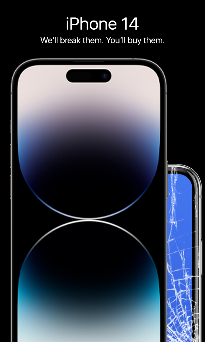
Apple is known for sending out software updates that slow down older iphones for the sake of getting people to buy new ones. Their ads tend to focus on new features that people argue are only marginally better than on previous phones. They usually layer multiple iphones on top of each other for a clean look, but I used that depth in my ad to overshadow the broken phone. Their taglines(?) tend to be clean and direct which I tried to use to have the ad communicate their strategy.
-
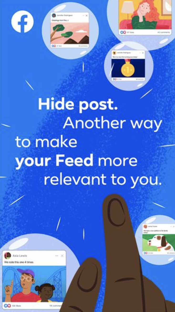
Subversive Ad - Audrey Gatta
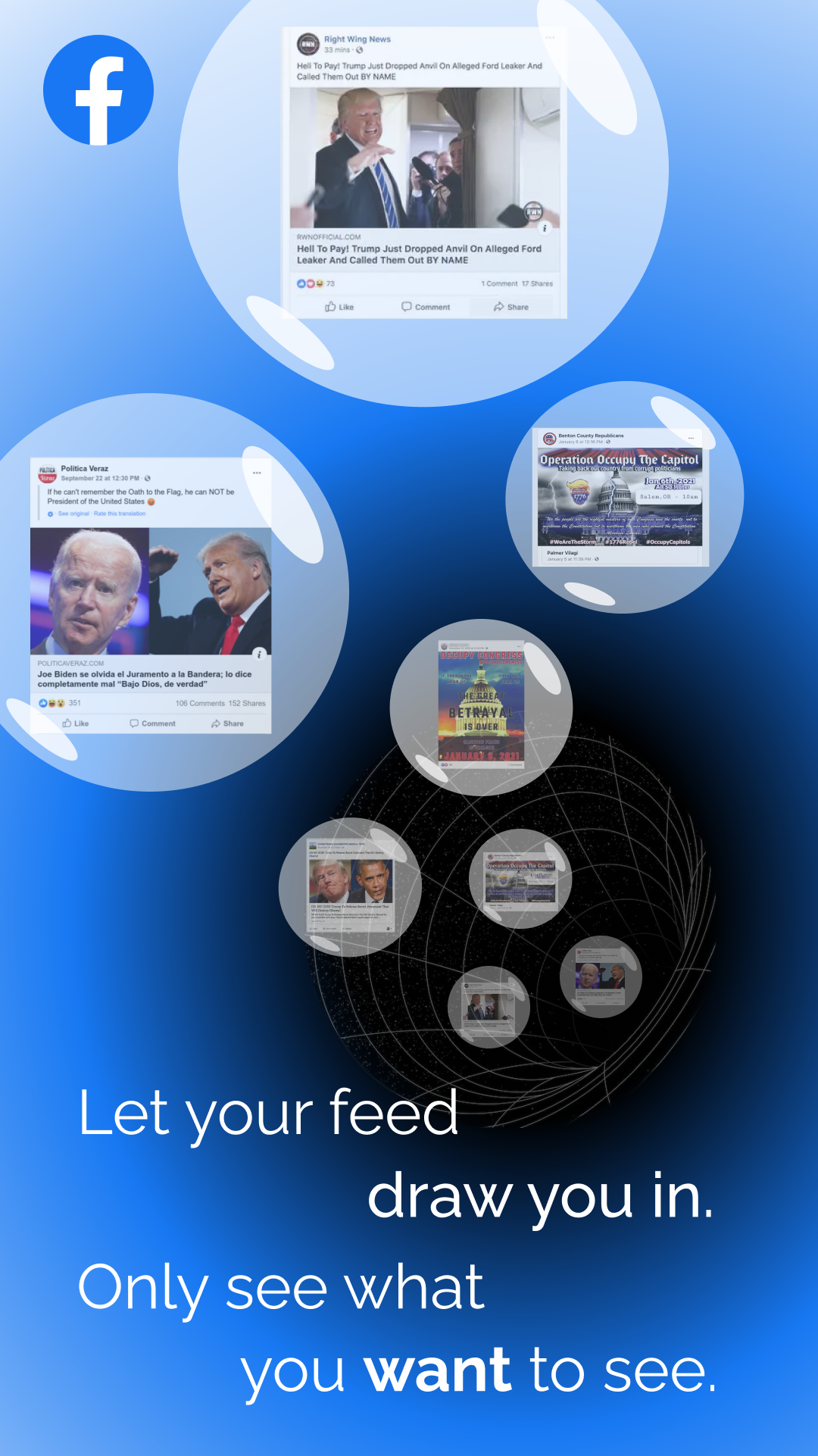
My inspiration for this subversive ad was from seeing a Facebook ad about the ‘hide post’ feature, which encouraged users to do so in order to have more control over their feed. This make me think directly back to the role of Facebook in spreading election misinformation and the use of the platform to plan the January 6th Capitol attack. I found it pretty ironic considering that Facebook already fuels political polarization through fostering echo chambers, yet it is encouraging users to hide posts to curate their feed, which directly allows them to hide viewpoints that go against their own and fall even deeper into their own black hole.
For the design of the ad, I mimicked some aspects of the Facebook ad I took inspiration from, such as the text format and the posts in bubbles. I chose to represent the posts being pulled into (or emerging out of) a black hole, to show that users can live in a vacuum through Facebook, surrounded only by posts that reinforce their own opinions, biases, and (mis)information.
-
Design Project 2 Draft (Rachel Chae)
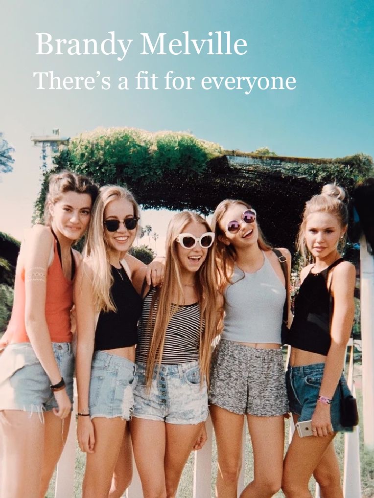
Many fashion brands claim to be inclusive but fails to represent such diversity in their advertisements. Brandy Melville is an extreme example of this: the brand claims to make clothing for the “everyday girl” but are notorious for only including skinny, white models in their campaign. They’ve particularly received criticism for their “one size fits all” sizing, which is actually a size small or extra small. While being a petite clothing brand itself not unethical, marketing their clothing as inclusive while catering to a very small subset of the population creates a problematic message.
In my advertisement, I wanted to portray the contrast between what fashion brands like Brandy Melville claims vs. what they show in their campaigns. While the text in the advertisement claims that the brand’s clothing is meant for everyone, the picture below fails to reflect any diversity in their models. As for the style of the advertisement, I used Instagram advertisements as reference, since social media platforms are where many fashion brands like Brandy Melville find their audience.
-
[chxchen] Subversive Advertisement
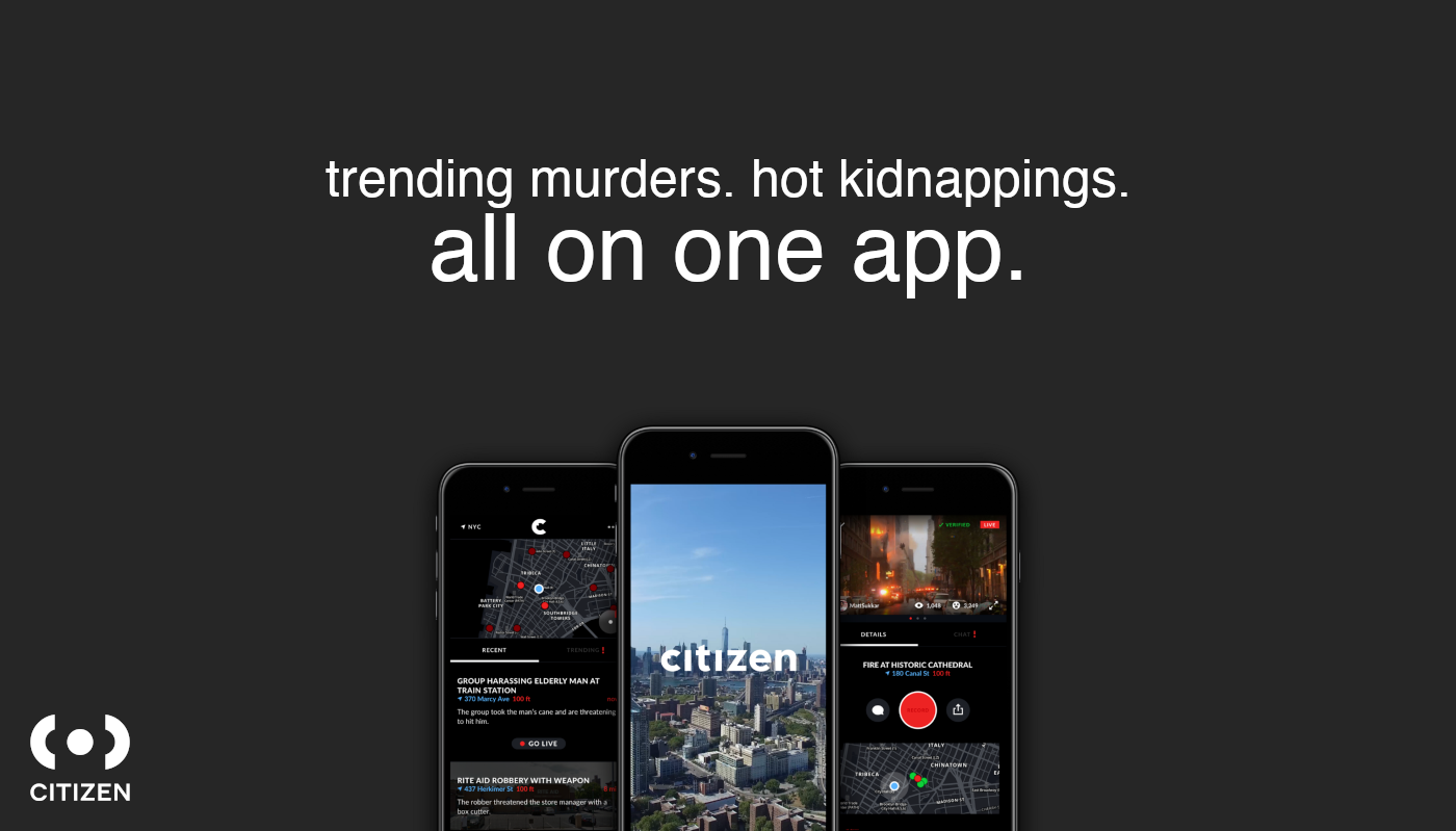
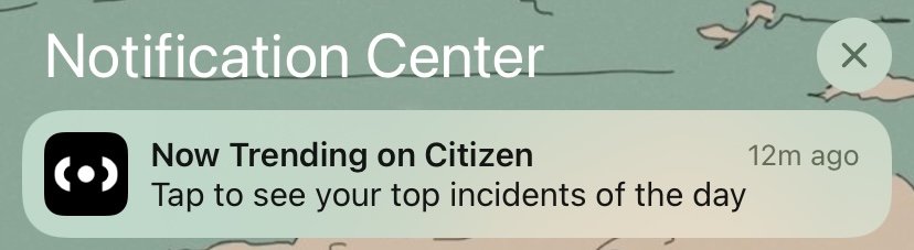
For my subversive ad, I chose an app called Citizen which tracks and monitors crimes and police activity in your area in real time. This ad was inspired by a notification I got from the app a few weeks ago:
The app can be very helpful in keeping people in an area alerted about any potential dangers to their safety. However, the almost social-media-esque approach to the app is concerning in its potential to glorify crime. The app uses language like “trending” and “top incidents”, wording you’re a lot more likely to see in relation to, say, a trending post on Instagram. In addition, Citizen pays users to go to crime scenes and livestream what happens there. This incentive can be very dangerous.
In my advertisement, I used an advertisement style similar to Apple, trying to embody Citizen’s dark, sleek appearance. The language I used is ironic given the topic of the app and is a lot more similar to what you would find for a Twitter or Instagram advertisement.
The images used on the app are meant to be subtly disturbing and draws from current Citizen advertisements – the usage of a picturesque, “utopian” city is dead center (the “pretty” picture associated with most social media ads), but if you look closer at the surrounding information and details, you see a video of arson and text about harassment and robbery, juxtaposing against the clean, pretty main picture.
-
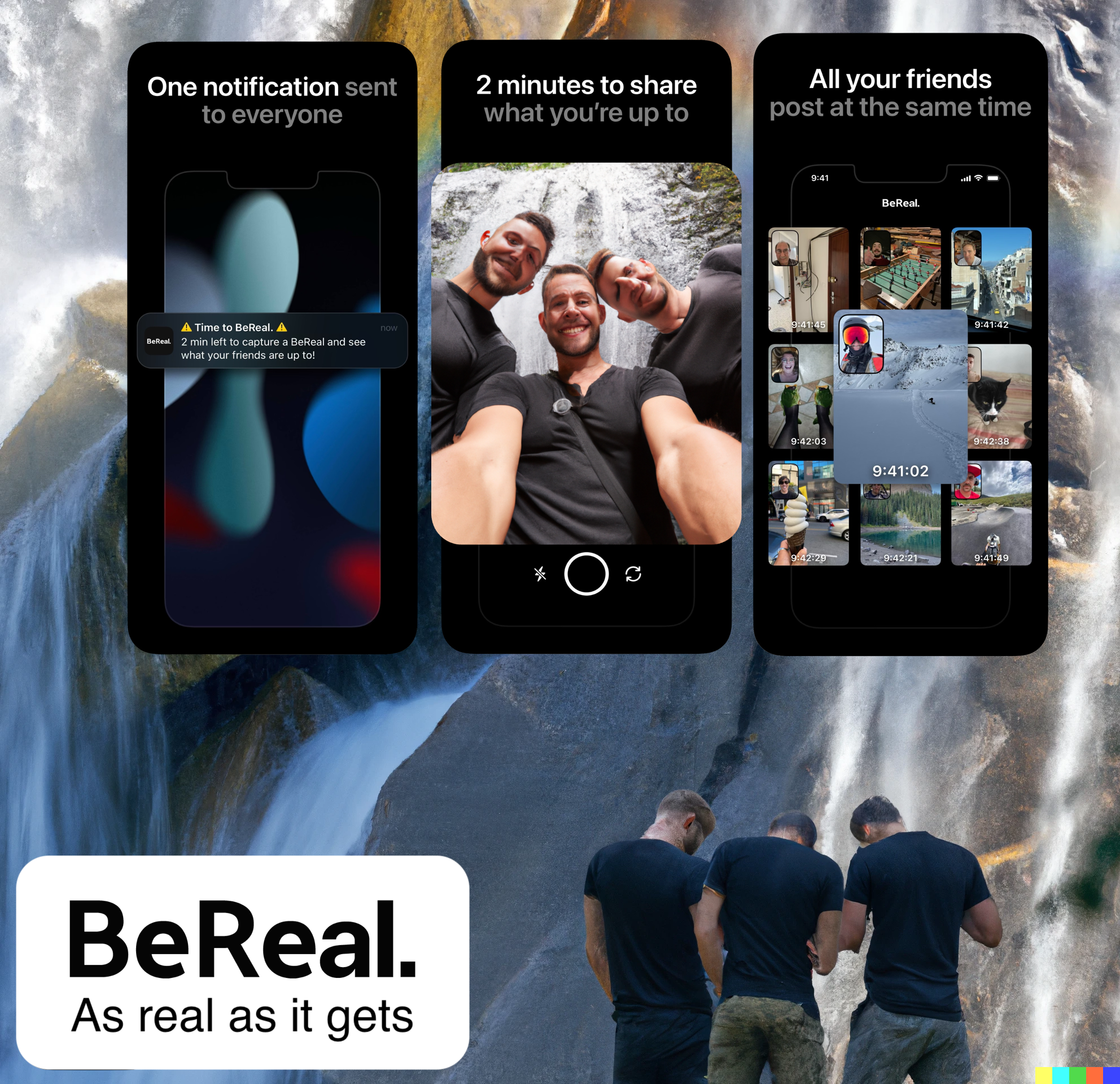
Subversive Ad
BeReal is a new social media that claims to be more authentic than exisiting platforms (Facebook, Instagram, etc). At a synchronized time everyday, every user on the app gets a notification telling them it’s “Time to BeReal.” Users have 2 minutes to post what they’re doing at the same time the rest of their friends are.
It’s a novel idea. You don’t get to pick when you post. However, the app will ruin real life moments. I’ve had the exact scenario happen too many times:
- I am enjoying a meal/walk/hang out with a group of friends
- Everyone gets a BeReal notification
- People exclaim “thank GOD i got this notification now.” People pose and try to get in each other’s photo
- Everyone waits on their phone to check what other people are doing
A group of friends hanging out will get sucked out of real life and into this app to compare to what other people are doing. It’s an insidious nuance that I’m sure the original developers didn’t intend for.
In my advertisement, I tried to capture this type of moment. Three friends are on a hike at a beautiful waterfall. They get their BeReal notification and are sucked into the app (and out of the beautiful nature). The friends are AI generated to show the distortion of the app. No matter how “real” the platform may claim to be, users will still show a polished, distorted version of themselves.
The advertisement reads left to right, with the friends hunched over their phone at the end, concluding that BeReal will actually ruin real life moments at the expense of trying to look “authentic” to pseudo-friends online.
-
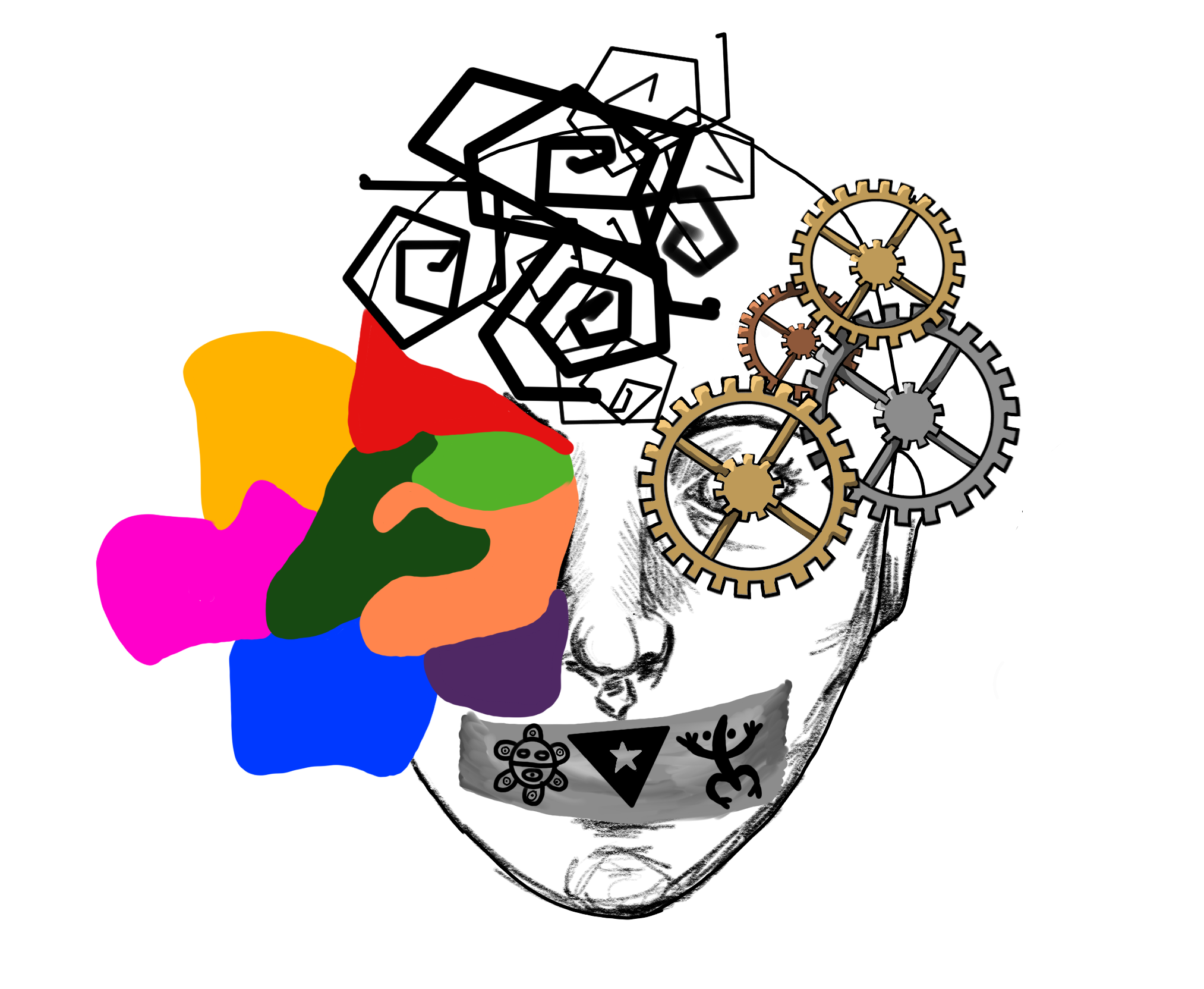
Self-Portrait Final (Isabel Báez)
A big part in the creating of my self-portrait was balance and symmetry. Although not exactly equal, both sides of the face have the same composition: same flow of horns, same shape of additional elements, etc. This balance helped accentuate and highlight other intentional components, such as the slight bend of the top horn. I also focused a lot on color, particularly the contrast between vivid, colorful hues, and dull, more subdued tones.
-
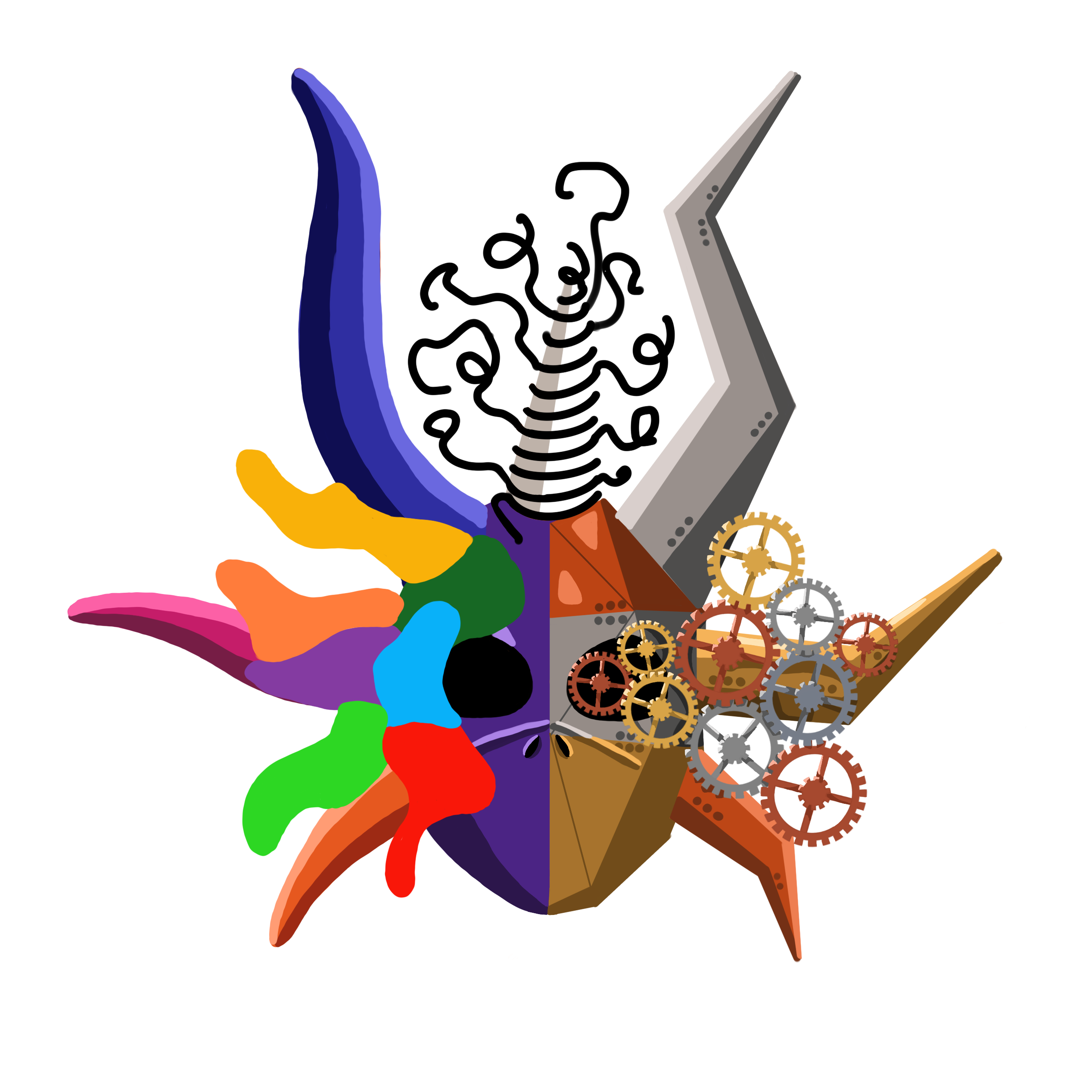
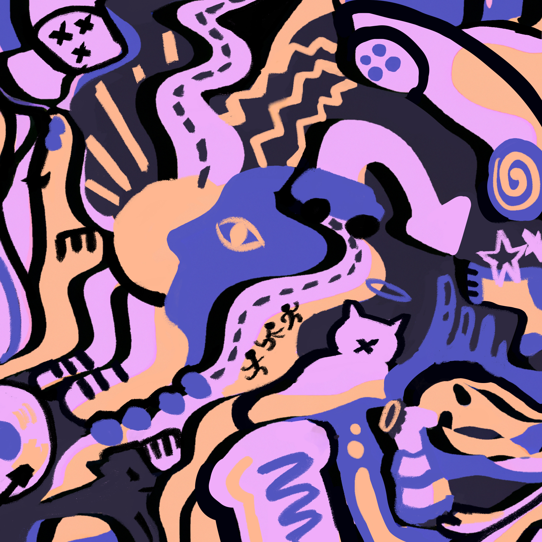
Self portrait updates - Katherine Caol Guo
I focused on fragmentation. There are 3 distinct sections, based off of color, but also based off of line / shape. Separately, they represent the flip sides of different emotions.
-
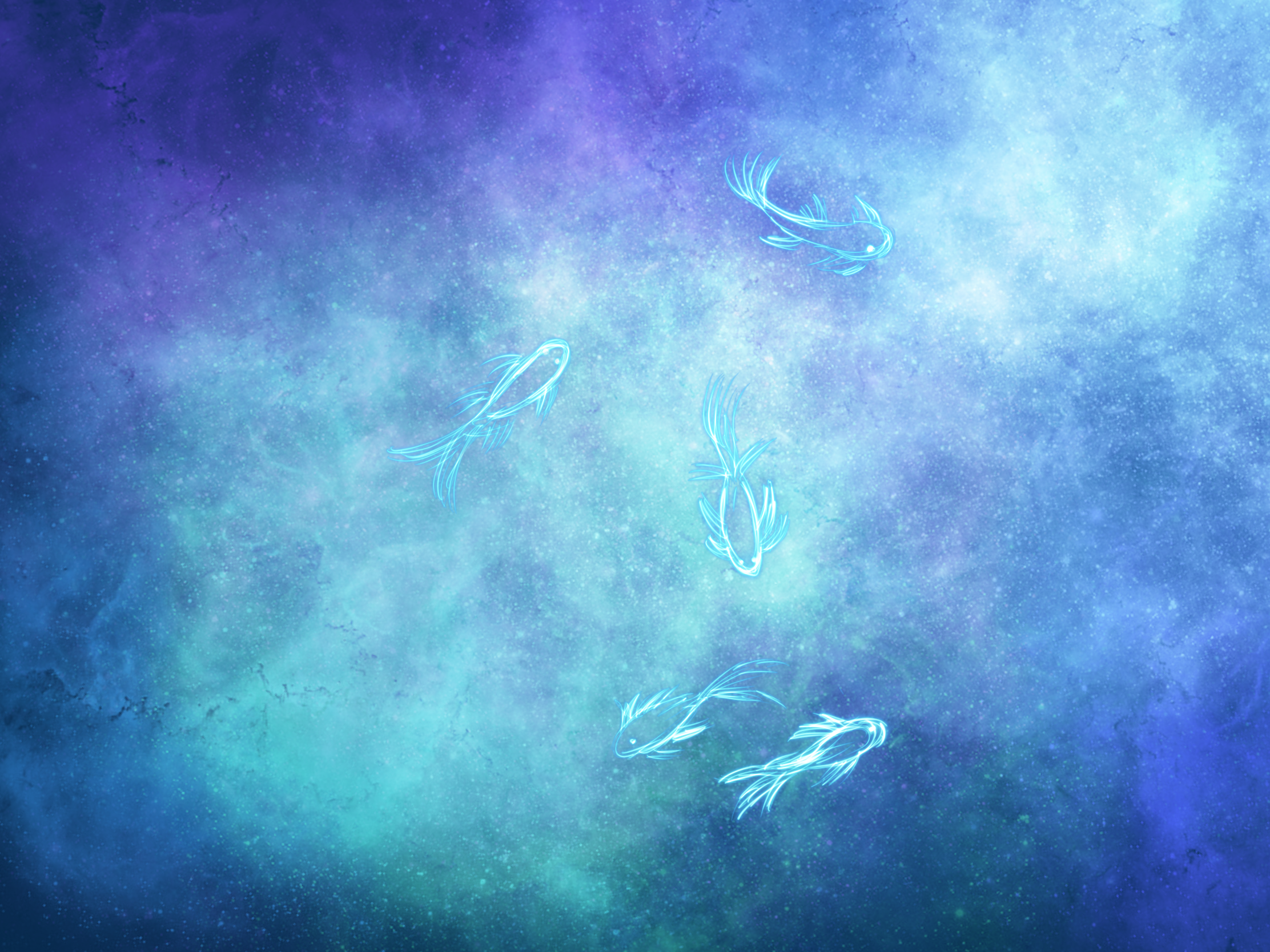
self portait revision -meenu singh
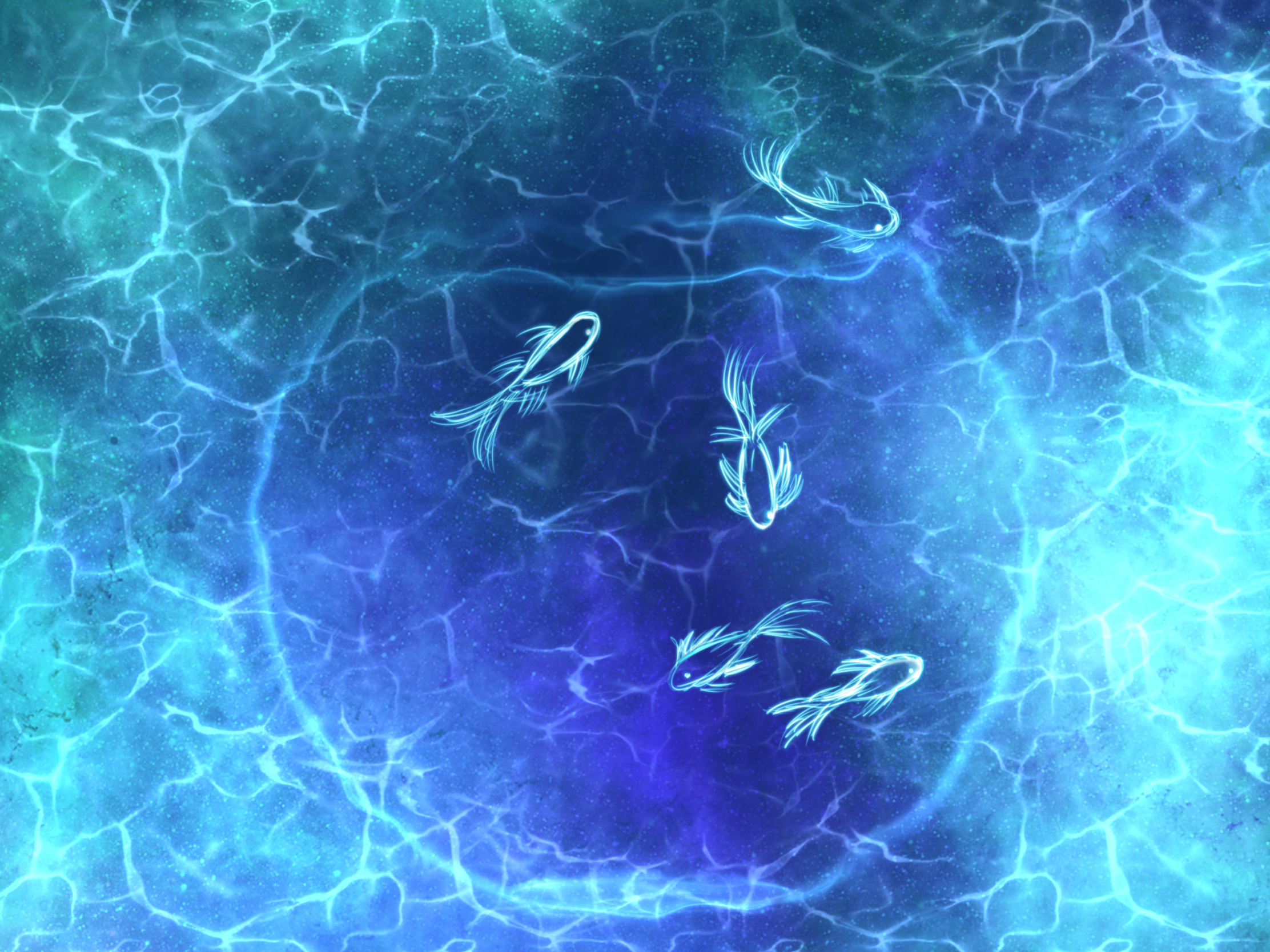
I thougt about assymmetry in my placement of the fish. It felt more interesting and meaningful then to make them the fish offset to capture the element of freedom/not being bound by rules. Another technique I focused on was diffusion, I wanted the fish bowl to appear soft and diffusing/rippling into the background. I also used fragmentation in the sense that each fish has its own individual character, the units of the design were broken up into pieces.
-
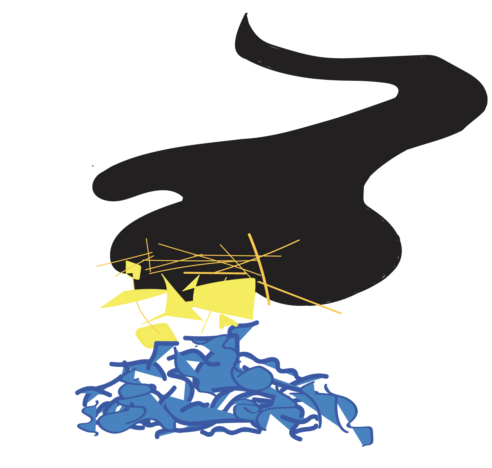
Self-Portait Revision - Audrey Gatta
My goal was to create a sense of randomness yet also unity by including random symbols and representational objects in various spots, while creating thinner lines that connect and tie them together. I attempted to portray how I find that many aspects of my life and personality are very distinct from one another and don’t necessarily make sense (even to me) at first, but they all intertwine to form who I am. Additionally, I employed distortion in the background, where I chose to depict flags of my heritage and have them melt into one another.
-
Revised Self Portrait (Rachel Chae)
While most of the elements in my portrait appear flat, I strategically varied the black outlines around some shapes to give an illusion of depth. Furthermore, I tried to create a spontaneous composition as opposed to a predictable one to highlight the feeling of chaos and disorder in the portrait.
-
Final Self Portrait - Mikel
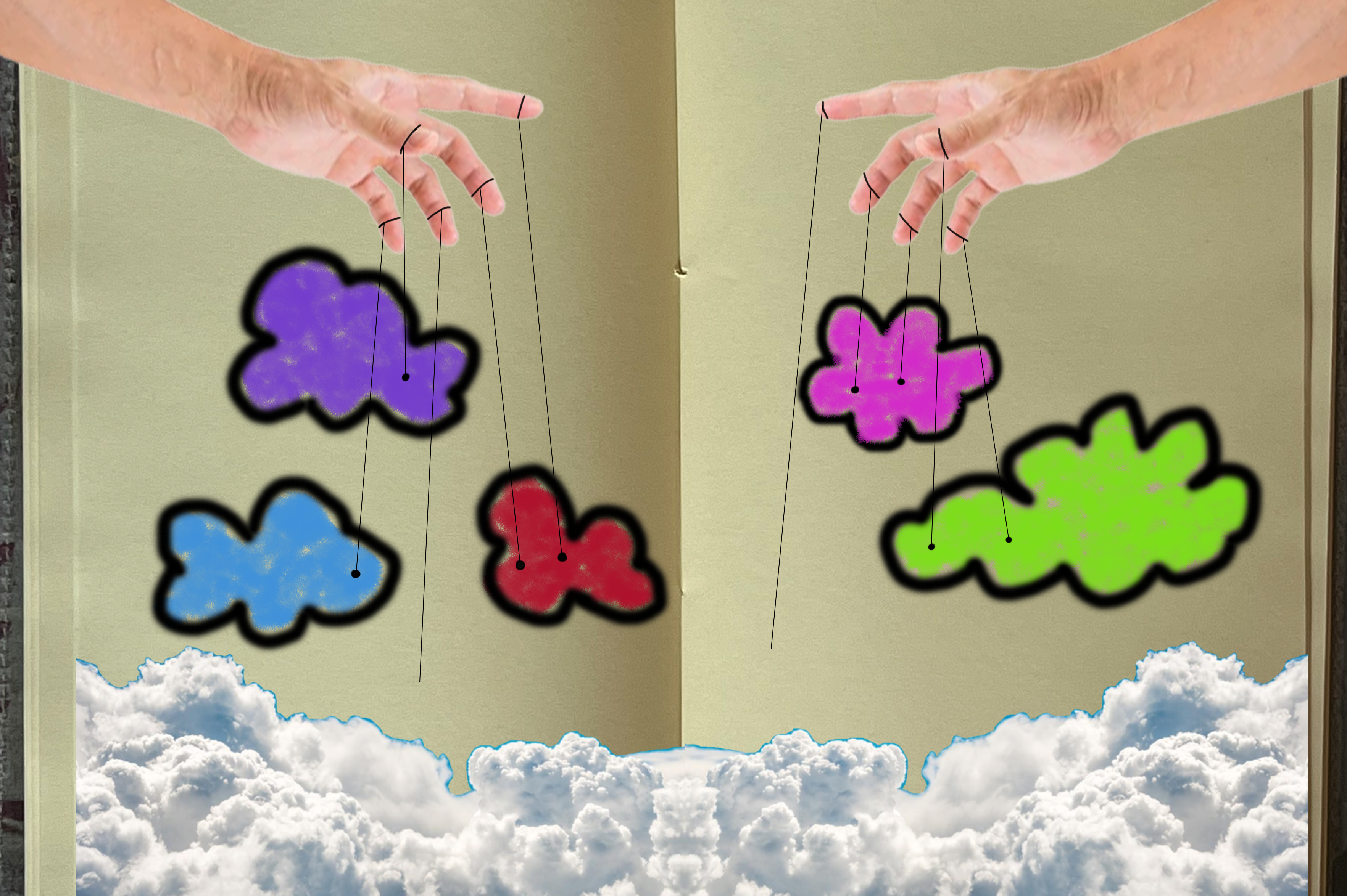
Originally I think juxtaposition was a main part of how I tried to differentiate between the real clouds and the fake clouds. I also had the hands be photorealistic to match this, and form a strong contrast with the imaginary parts.
With the symmetry I wanted add some level of “fakeness” to the real parts that would then have this push pull affect with the question of which part feels more real.
-
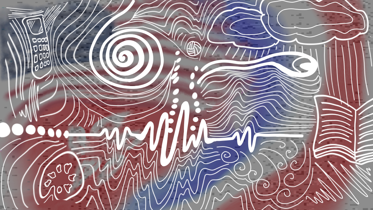
[chxchen] Self-Portrait Revised
I thought about the concepts of instability and fragmentation. I wanted to bring the theme of juxtaposition even more prominently to my final draft by filling in my background.
-
Trudy Painter Self Portrait Revised
I focused on Dondis’s notion of balance. All of my circles are perfectly round, and the center box is a perfect square. The orbs inside the white screen are also spaced with regularity.
⭐️ Visit the site! (and click on orbs)
-
Design Assignment 1.2, Hanu Park
Tentative Final
edit: Sorry, I forgot to upload my analysis in regards to the Dondis chapter 6 reading.
Balance
I talked about this a little in my 1.1, but I used the idea of balance in my self portrait to convey different aspects of myself. Having distinct sides, but necessarily symetry, serves to create domains of ideas on the page that compartmentalize different ideas.
Fragmentation and Unity
Within the right side, I fragmented the shape of the hair into different items that relate to me. I liked the idea of fragmentation within the hair form to create a unified shape. I liked the idea of Fragmentation because it would introduce a level of detail that contrasts the simplified left half.
Sharpness and Diffusion
Similarly to Fragmentation and Unity, I wanted to implement both ideas into the piece. The texture I added to many of the shapes looks like diffusion, but only within the borders of its own item. I like the way this looks because it adds texture to the piece. Examples of it can be seen on the suitcase and the upper left corner.
Flatness and Depth
As discussed before, I wanted to go for a 2D-3D look, similar to Kroger’s current branding. With the use of shading I feel like this effect has been achieved, but not in a way that takes away from the magazine cover flatness I was aiming for. For example, it can be seen on the car, the hand, and the teeth.
-
Self Portrait Design - Trudy Painter
-
Self-Portrait - Audrey Gatta
-
Design Assignment 1.1, Hanu Park
Base Sketch
Base Layers
-
Self Portrait (Rachel Chae)
-
Self Portrait - Mikel
-
self-portrait -meenu singh
-
Self portrait - Katherine Caol Guo
-
Design Exercise 2 - Self-Portrait (Isabel Báez)
-
[chxchen] Self-Portrait
-
Week 1 - Design Exercise 1, Hanu Park
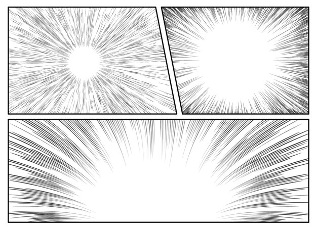
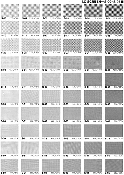
These images are examples of screen tones. They are often comprised of dots or lines and are often used in asian comics to convey tone or expression. I find them an effective use of design because they do their job well and have been widely used for generations.
Looking at the radial lines examples, one can easily recognize that it is used to bring emphasis to a point in the clear.
-
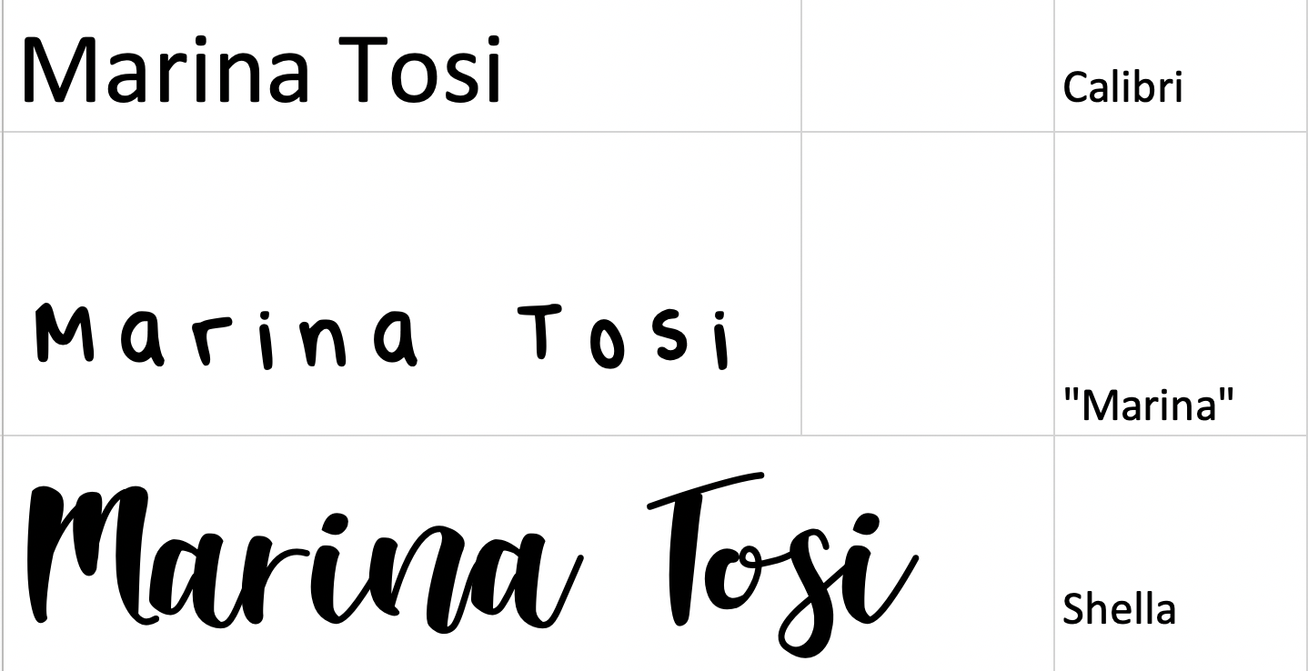
Marina - Name in 3 Fonts
-
Design Exercise One - Marina
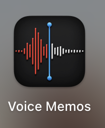
The logo for the voice memos apple app consists of just lines and two dots. The logo is essentially a snippet of a voice recording (upon further research the recording it’s modeled after is someone saying the word “apple” which makes a lot of sense). This is effective as one knows what to expect when they open the app - they are greeted by the same visual inside the app as they are outside. The red and white colors in the waveform show the progression of the wave which creates a sense of movement and vitality. The vivid blue line showcases a sort of “pop” indicating its lively/present sense as well. The app logo and the display inside the app are simple, intuitive, and familiar. To the point of the readings - multiple dots make a line (has a sense of direction and purpose) - here multiple lines still maintain a direction and purpose - they showcase a past, present, and future.
Reference: https://apps.apple.com/us/app/voice-memos/id1069512134
-
Week 1 - Expressing Your Name, Hanu Park
Font 1 - Karla

Font 2 - Planet Kosmos

Font 3 - Comic Sans

-
Week 1 In-Class Activity - Mikel
-
Name in Fonts - Trudy Painter
-
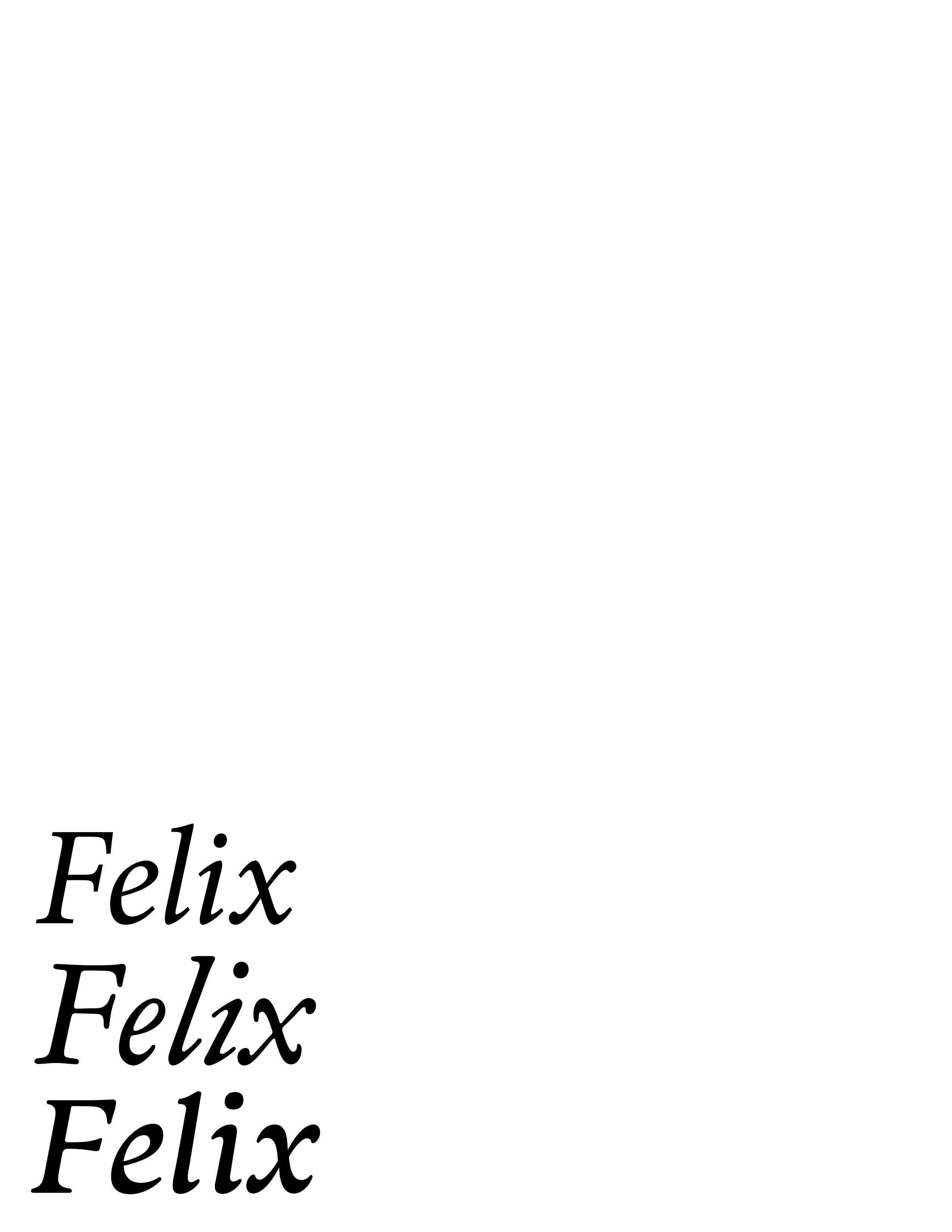
In-Class Activity Week 1.1 - Felix Li
-
Design Exercise 1 - Felix Li
 (Didactic Video - Woody Valsuka)
http://www.vasulka.org/archive/4-30c/AfterImageOct75(5024).pdf
(Didactic Video - Woody Valsuka)
http://www.vasulka.org/archive/4-30c/AfterImageOct75(5024).pdf -
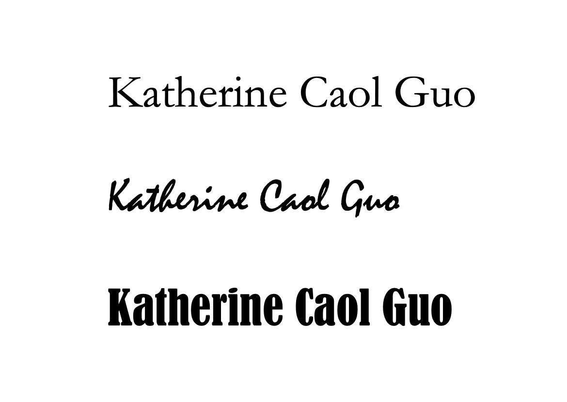
Name in 3 fonts - Katherine Caol Guo
-
In-Class Activity 1- Meenu Singh
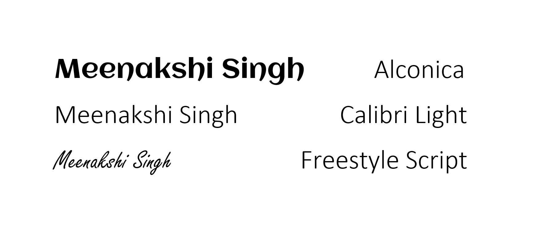
Alconica: I picked this font because I was drawn to the curves in the ‘n’ and ‘h’. They both appear very similar to the way some letters look in hindi and so I thought this was a very cool representation of my background identity.
Calibri Light: My full name is fairly long in terms of the number of characters. Because of this, I am often drawn to fonts that have lighter + thinner strokes, because it feels like it makes the length of my name look more balanced.
Freestyle Script: This font is an ode to my personality. I think I am very chaotic and I felt that a script that has a more handwriting, scrawl look to it would represent that aspect of my life.
-
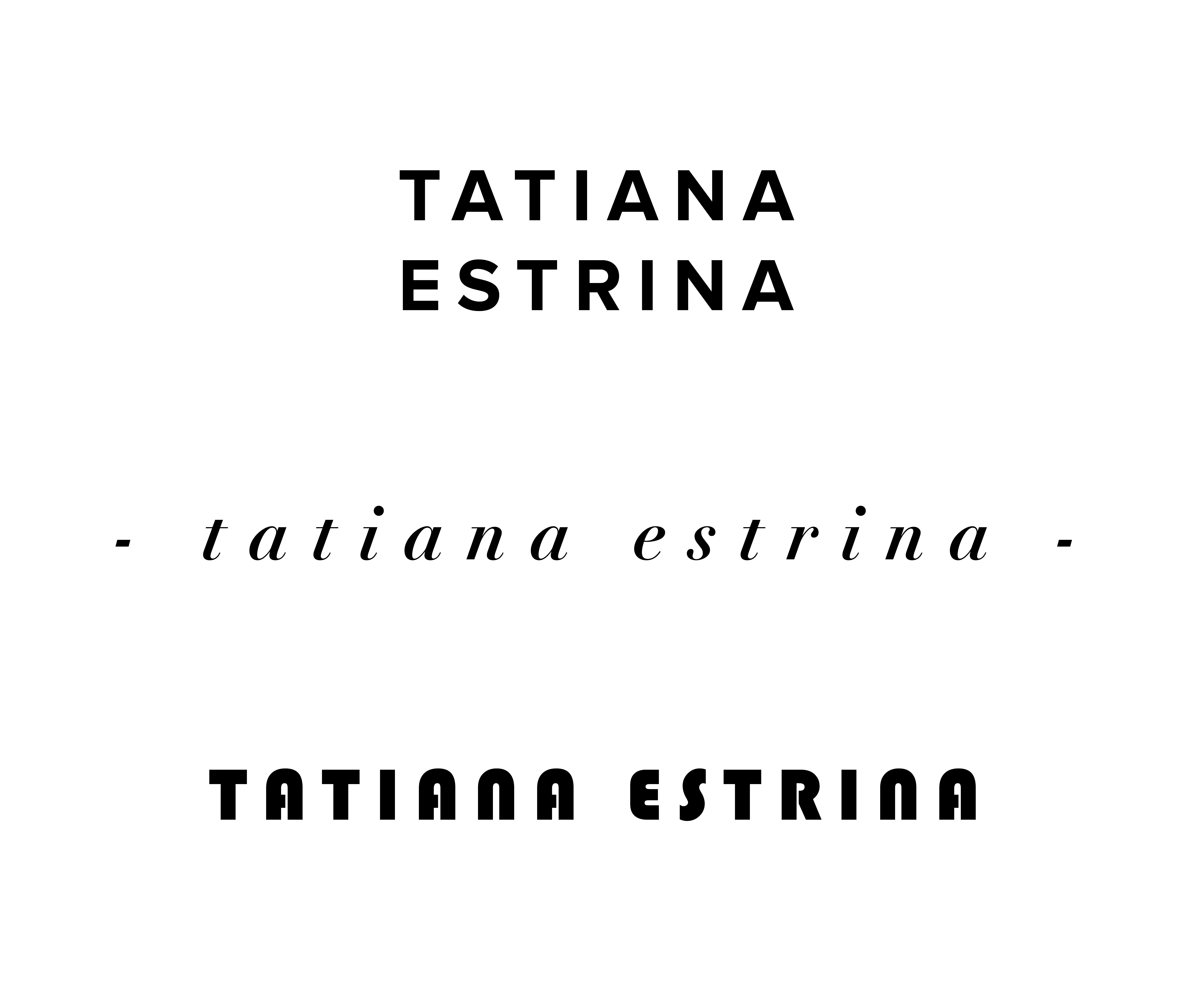
In -class activity, Day 1 - Tatiana
-
In-Class Activity 1- Isabel Báez
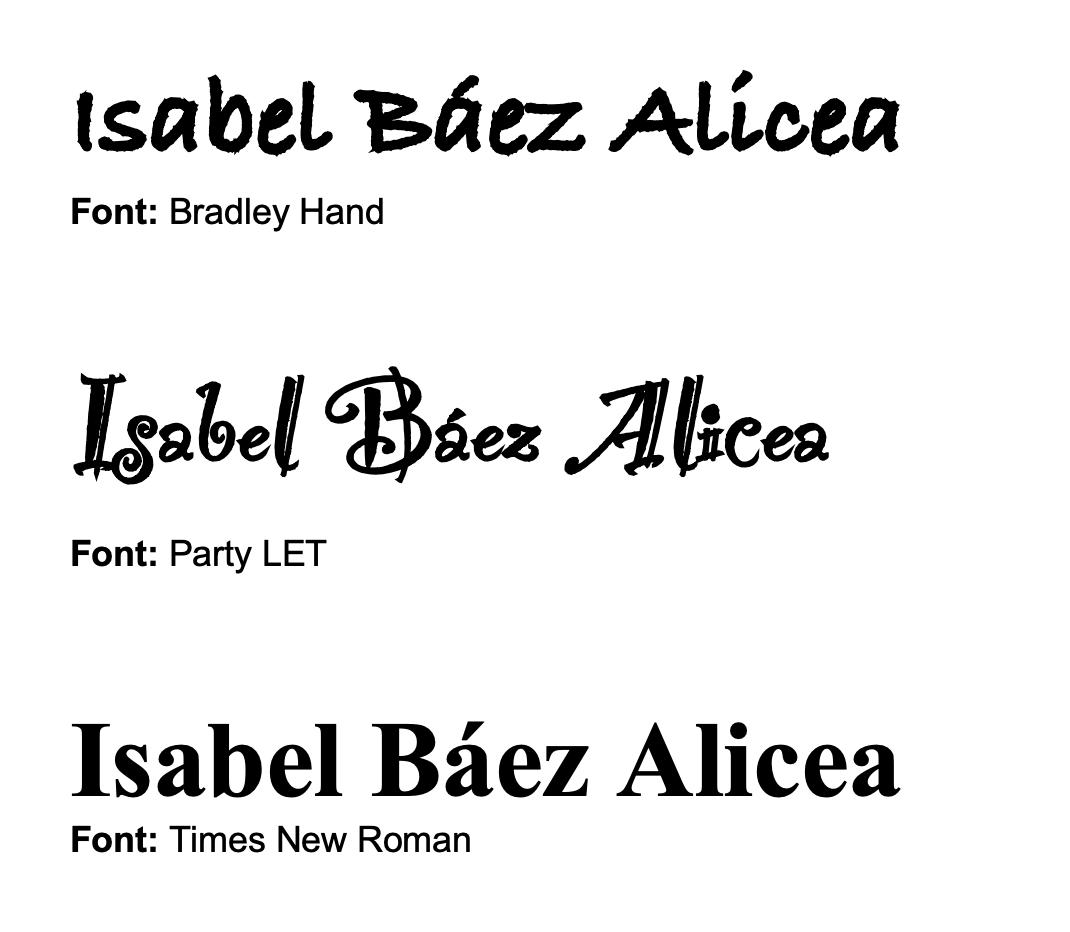
Overall, I chose fonts where the accentuared “a” (á) was a valid character, as this is a representation of my first language, Spanish, which forms a big part of who I am.
Bradley Hand: I chose this font because of its roughness, which matches well with my personality and behaviors. I’m a bit disorganized overall, which then translates into inconsistency when it comes to my actions. Moreover, my handwriting is a little illegible as well.
Party LET: I chose this font because of its clutter and elaborate designs. Sometimes, I tend be loud and expressive, and somewhat complicated. Due to this, I also wanted to select a font that was charged and complex. Additionally, I love making art, so I wanted to somehow symbolize my creativity, and the uniqueness of this font was representative of that.
Times New Roman: This font is one of the default fonts that we often use in our day to day. Although a little boring, I wanted to choose this font because it is dependable. I also aspire to be dependable and trustworthy in my day-to-day life, and I take pride in being a loyal friend.
-
In-class Activity 1 - Audrey Gatta
-
Design Exercise 1
The MIT Press logo was designed in 1965 by Muriel Cooper. Cooper used seven lines to represent “mitp” as books on a bookshelf.
Cooper was also a pioneer of design at the MIT Media Lab. She designed the visual identity for the MIT Media Lab which also only uses lines and a tight grid system.
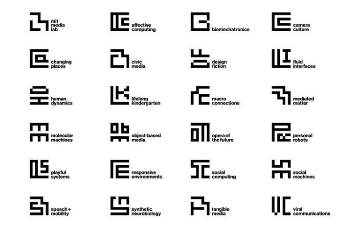
Only using lines, her designs feel contemporary and communicate the innovative yet interdisciplinary research of MIT + the MIT Media Lab.
-
Design Exercise 1: Video Game Skill Trees
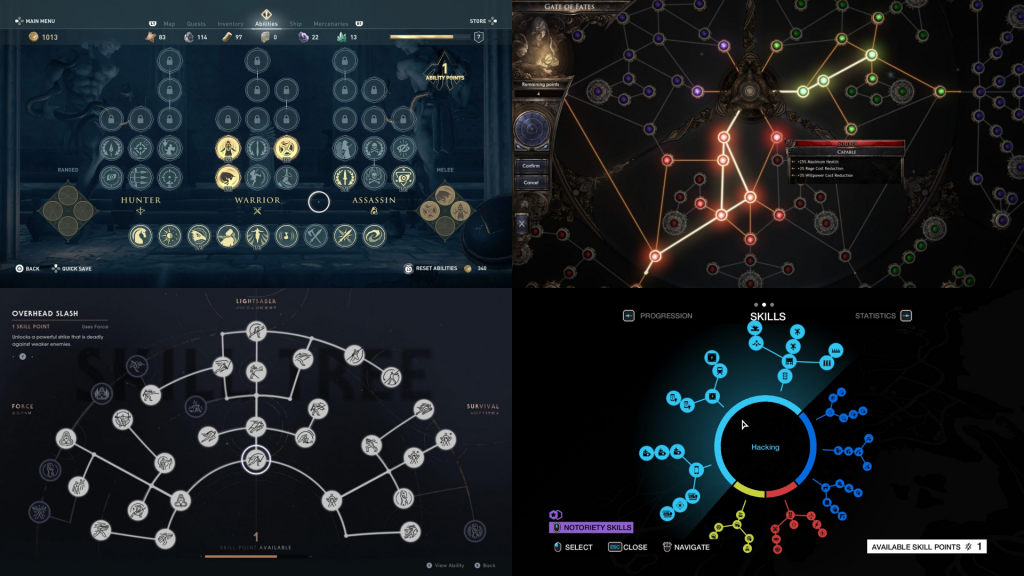
“Skill Trees” in video games are the upgrade systems used to progress the player character. Although all look different, most use the common structure of edges(lines) and nodes(dots) to represent themselves. The nodes are the actual features of importantance, representing the upgrades, while the edges show the potential paths that can be taken through the tree (i.e., you can only acquire an upgrade if you have unlocked the preceeding node, preceeding shown by the lines that connect them).
Lots of information about these upgrades can be communicated through the dots and lines, depending on the speciifc game. For example, many of the dots may be clustered together to represent a commanlity between those upgrades. The number and length of the lines that connect dots can also be used for information (many lines leaving a node could demonstrate its importance, since choosing that node will open many more possibilities).
-
Design Exercise 1 (Rachel Chae)
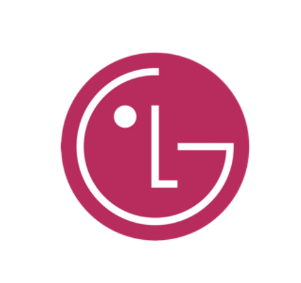
Source: https://www.lg.com/global/about-lg-brand-identity
LG is an electronics company in South Korea. Their current logo was designed in 1995 and is meant to represent their consumer-based, humanity-oriented goals. I liked how simplistic the logo is and how the designers were able to represent the company’s philosophy and spell out its name using only two lines and a dot.
-
Design Exercise 1 - Meenu Singh
Two Dots
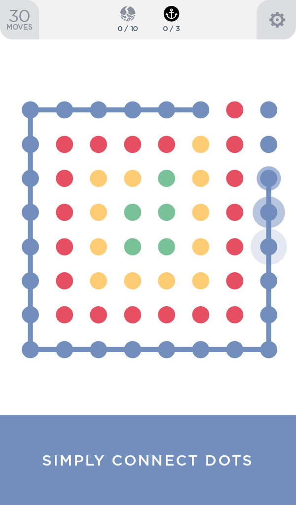 Source: https://images-na.ssl-images-amazon.com/images/I/51AbCN3UgJL.png
One of the first examples of effective use of dots + lines is the mobile game Two Dots. The entire premise of the game is to connect dots of the same color using lines. Many of the levels reflect and emphasize this premise through their design. There are no other obvious design features within each of the levels and so all of the user’s attention is drawn to the dots on their screen which are evenly spaced in a grid like pattern. When the user begins to make connections between the two dots, the other primary visual feature is revealed: lines of the same color as the dots you are connecting. The evenly spaced grid of dots conveys a straightforward message without any instructions necessary: connect the dots. The spacing between the dots invites the users to draw connections between them using lines. Overall, I think the visual design of this game is effective because it uses the basic graphical elements of lines and dots by relying on their simplicity to convey meaning and purpose.
-
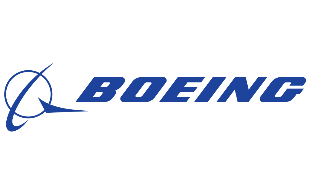
Design Exercise 1 - Katherine Caol Guo
The current Boeing (an aerospace company) design was created by Rick Eiber in 1997 after the company merged with McDonnell Douglas. It maintains most elements from McDonnel Douglas’ original logo design, such as the circle (representing the world), and the two swooshes which add dynamism and direction to the image because of their shape as well as their varied thickness. Overall, the design is recognizable and is in line with what the company actually does.
-
Design Exercise 1 - Isabel Báez
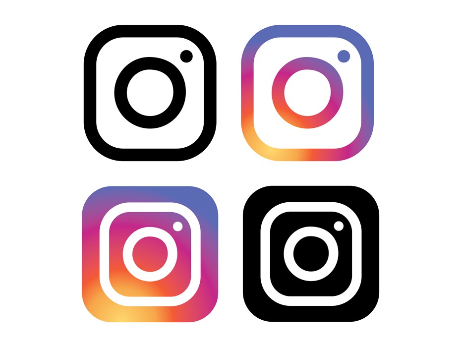
Instagram’s newest logo design is the most simple: composed of a series of colored dots and lines. This new simplicity gives it much more versatility and allows it to become more iconic and marketable. Regardless of its few components and their simplicity, it effectively showcases the image of a camera, which is a core representation of what the application does: photo and video sharing amongst millions of people. Instagram’s camera logo is direct, to the point, and effective in showcasing the company’s purpose.
There is the main circle in the center, which represent’s the camera’s lense, the dot in the corner, which represents the flash, and the enveloping rounded square, which represents the overall camera structure. We can also highlight the difference between the inverses of the design. When the lines are white and we have the black background, the design seems more compact. This illusion is similar to the one discussed by Dondis when it came to tones, how different uses of color can alternate the image of two identical structures.
The original design for Instagram was created in 2010, as a depiction of an old polaroid camera. It was meant to signify nostalgia and memories, and was therefore a nod to the past. Although the new design is still inspired by these values, its simplicity has allowed it to become more universal. Not all users used polaroid cameras in their life, or even remember them. Therefore, with the new logo, more individuals recognize the icon for what it is: a camera. This is an example of how the fundamental combination of lines and dots can elevate a design’s effectiveness.
Source: https://blog.logomyway.com/instagram-logo/
-
Design Exercise 1 - Audrey Gatta

I chose the design of the danger sign because it is quite simple (it consists of simply a dot, a line, and a shape), yet it is universally understood.
-
Assignment 1: Different Fonts
Californian: I chose this font purely based on its name. I went to middle and high school in Southern California and it is a big part of my identity.
Courier: I’m a 6-2 major so I code very frequently, so Courier is the font I see most often in my day-to-day life. I colored it green because that’s how my name would appear on python as a string.
Kirang Haerang: This is a font I used to love back in elementary school in Korea. I like how irregular and spontaneous the font is. Since the font was designed for use in Korean script, I wrote my Korean name on the side as well.
-
[chxchen] Design Exercise 1: MTA Map
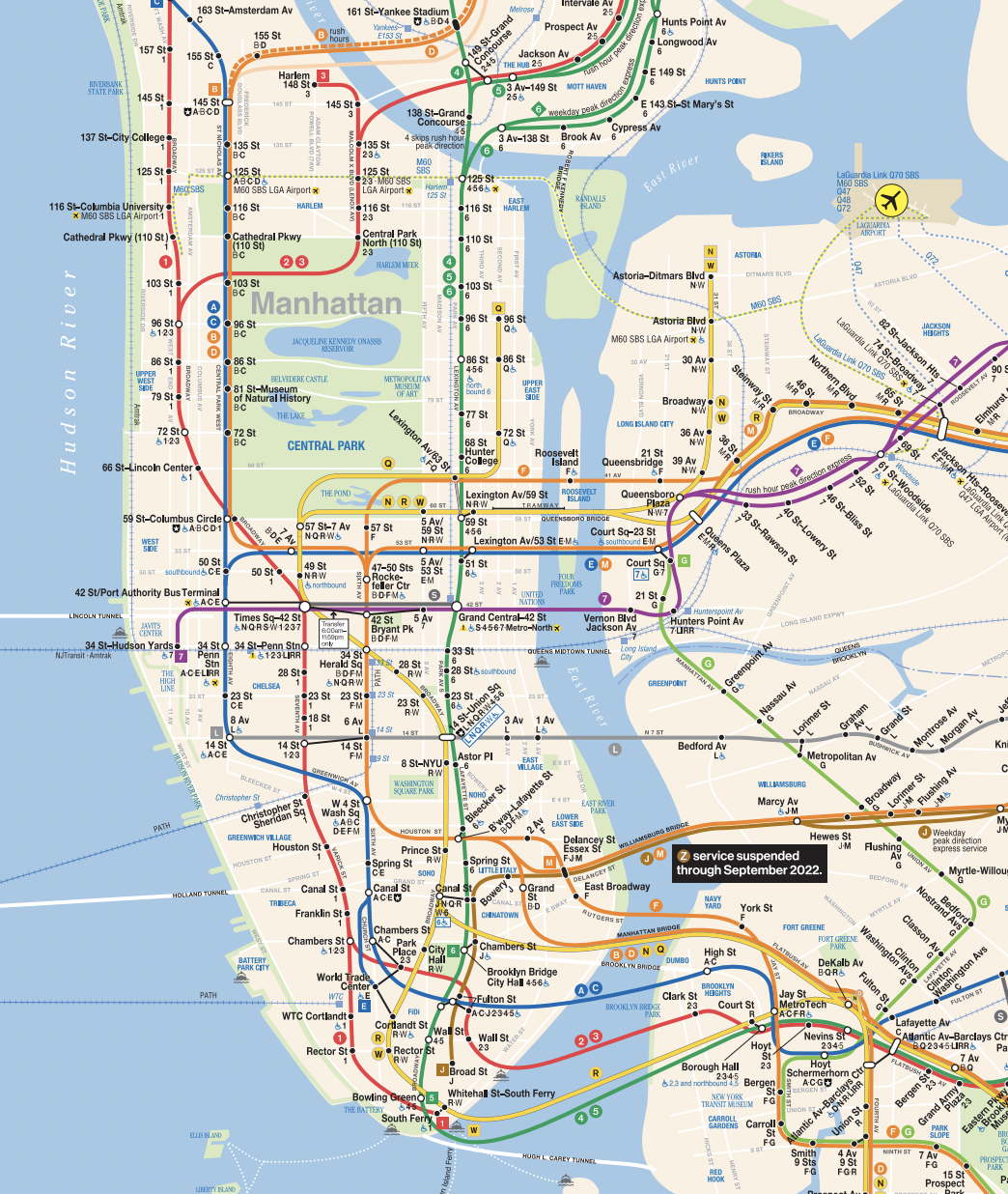
An example of an effective design that uses lines and dots is the New York City subway map (MTA map). On the MTA map, dots are used to represent stations, and their proportionality helps readers estimate the distance between them, similar to what Dondis states, as “Two dots serve as handy tools for measuring space in the environment or in the development of any kind of visual plan”. This is particularly important for a map as the distance proportionality is very important to readers in carrying out its function effectively. In addition, the representation of the dots as filled in or not also convey important information to the reader – express versus local stops. The contrast in color of the not filled in dots is more disruptive to the reader, representing the more disruptive stops that all trains stop at.
The other important component to the MTA map are the colored lines connecting the dots that represent the paths of the subways. These lines add form and direction to the map and intuitively draw the users’ eyes to some path. A line is a “dot in motion” according to Dondis, and these lines represent the motion of the subways while the dots represent the stopping. The texture of the lines is also of note – they are bold and smooth, suggesting the reliability and never ending motion of the subway system (whether this is accurate is another point). Finally, as Dondis states, the lines represent “the juxtaposition of two tones” – the lines stand out against the background of the map, juxtaposing the underground nature of subways versus the aboveground map.
-
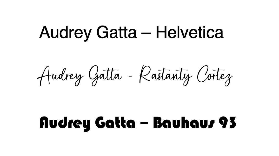
[chxchen] Assignment 1: Expressing Your Name
1. Helvetica: The first font I chose was Helvetica – when I first started gaining interest in visual design, I religiously used Helvetica (specifically with low font spacing). It’s a very simple font, but I think when used well it’s very clean and serves its function well, which I hope reflects myself.
2. Squarely: My second font is called Squarely and it’s a font I downloaded for a video game creating class last year. I love how the vibes of this font reflect a sort of indie/creative game, which I really enjoy.
3. Moonrise: My third font is called Moonrise and it’s the last font I downloaded to use in a thumbnail. I like this font because it looks pretty simple at first, but there’s slight variations in the height that make it interesting.