Subversive Ad Revision (Rachel Chae)
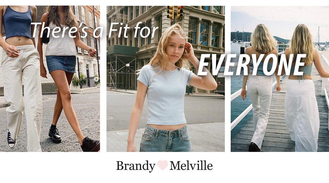
For my revision, I wanted to strengthen the original message of the advertisement—that many fashion brands claim to be inclusive but fail to represent such diversity in their marketing—using suggestions I received during class. For instance, I brought more attention to the central message “There’s a fit for everyone” by choosing a bolder typeface and larger font size. I also put an extra emphasis on “everyone” and framed the letters around the girl in the center. This serves to highlight the fact that the brand’s clothes aren’t actually meant for everyone but instead catered towards a very specific societal beauty standard, one that is exemplified by the girl in the center picture. Furthermore, I made the brand logo smaller and placed it on the bottom of the advertisement. This was to allow the viewers to focus on the central message and to make the advertisement more generalizable to other fashion brands.
The pictures used in the advertisement are taken from Brandy Melville’s Instagram page (@brandymelvilleus). I specifically tried to find references on Instagram since brands like Brandy Melville find their target audience on social media platforms. Moreover, I took inspiration from facebook ads and webpages of fast fashion brands like ZARA (https://www.zara.com/us/) and tried to emulate their modern layout and typefaces. By adopting their minimalistic design, I hoped to make the advertisement appear on trend with current fashion campaigns.