Commentary
-
Week 11 Commentary - Meenu Singh
Tufte, Chapter 6: Narratives of Space and Time
I thought this chapter of Tufte was very interesting, especially because many of the examples felt like they tied back to some of the prior chapters. One section that interested me was the part about timetable and schedule design. Tufte writes that “Schedules are among the most widely used information displays” and says that there have been efforts to organize schedule information for 150 years. This stuck out because the widespread nature of schedules/timetables made me take for granted the design choices that go into making them. I also feel like there is a new wave of trying to redesgn/display schedule information because of the shift towards digitizing schedules and displaying them effectively in the mobile/web space.
This chapter also made me realize how challenging of a task it is to represent spatial and temporal information on a flat plane. With technology we are able to filter out information and move between different representations at the click of the button. However, on paper there are several limitations in terms of dimensions that can be represented before the information becomes too dense and cluttered for paper. One effective example I found was the Czechoslovakia air transport map. The balance between space and time information really felt effective and overall the map felt really clean (not too information dense + there was plenty of white space). On the contrary side, I was quite confused by the serpentined data representations like the Tokyo water supply bar chart. As much as I tried to look at the charts, I genuinely could not understand why someone would ever choose this representation because it felt both confusing in terms of conveying information as in addition to being aesthetically displeasing.
The bus schedule as an example of a graphical schedule was another point of interest for me. Initially I thought the jumbled lines during peak rush hours were a point of design failure, but after reading the description I realized that the relevant information is simply being conveyed through a different property of the schedule: its line density, as opposed to the familiar numerical representation that may be used for the rest of the times. I feel like this really shows how one can play with information representation in unique ways without compromising its functionality.
-
week 13-1 commentary - meenu singh
Chapter 4: Small Multiples
I thought this chapter on small multiples reinforced how powerful it is to be able to present information within the “eyespan”. The juxtaposition of those images allows us to draw comparisons and single out key differences at a glance. I really liked the train example and how Tufte described it as “a scope of alternatives” or “a range of options”. The example kind of reminded me of shopping catalogs or online stores where the products are placed next to each other so that you can decide on a design quickly.
I was expecting very data driven examples in this section (like the smog/air polution chart we had previously seen in chapter 1) so I was surprised by the example of Mural with a Blue Brushstroke which displayed the different inspiration images to parts of main painting. It feels different than the other examples of small multiples that are placed together to draw out comparisons between each other. In this example, it felt like the inspiration images were being connected only really to the main image which I thought was interesting.
-
Week 12.2 Commentary (Isabel Báez)
Tufte highlights the relevance of how multiple small designs lead to comparisons that enrich the data being presented. By drafting out multiple, sequential details, the audience is giving context in the form of change.
His train example, which accentuate’s the meaning behind different light signals for railroad employees I found personally very effective. The thin lines of the train, in contrasts with the dots of color created a clear image. It also made the differences between frames clear. However, there were some different elements (white lights in the middle) that also showcased examples between frames and were not very clear at all. Their lack of color make them get lost within the complex shape of the train. Adding color to these or more accentuation would’ve grouped them with the other differences and made them more evident. Although I do like the train’s detail, another alternative would be to simplify it as well.
I liked his example of Linchestein’s New York mural painting. Antupit disects Linchestein’s work and showcases the contrast between the inspirations behind the work and the actual mural. I would’ve enjoyed to see a little more marked connection between both components. The dotted lines they use to trace the inspirations to the mural are not very noticeable and sometimes get lost. I would’ve liked to be very clear on what part of the mural the inspiration was referring to, so I would’ve liked closer tracing.
-
[chxchen] Commentary 19
Tufte starts this chapter with a quote I really like: “Confusion and clutter are failures of design, not attributes of information.” I really like this quote because of the ownership and responsibility it gives the designer to decode data into visualizations. Layering and separation help segment aspects of data. It’s tricky because various elements will always interact just because they are present in the same space, regardless of if the designer intends for these elements to be perceived together — a concept known as “1+1=3”, because the combined information becomes something else.
The first example with the parts manual was quite simple and easily understandable. I think a more complex example would’ve actually been more beneficial, especially with more layering, maybe for different parts of the item. However, it was a very good example of colors helping differentiate using annotation. In contrast, I disliked the later city map where it was honestly a lot more difficult to differentiate between the color differences the author was talking about.
The concept of “data imprisonment” is very interesting to me because the common perception of data is usually using tables with a grid system. However, I definitely see Tufte’s point — I really like spreadsheets where different cells are merged and add more dimension and understanding to the data given, for example. I think looser divisions are also more aesthetically pleasing to me — for example, not just heavy border lines for each cell, and use of color blocks to separate. I really like the example with the music staff because I’ve noticed this particularly with handwriting in music staff books that more bolded staffs make it more difficult to write things down and everything looks less cohesive even if it’s played the same, and I also really like the concept of layering using negative space.
-
Week 13.1 Commentary (Rachel Chae)
One thing that stood out to me was Tufte’s dislike of strong grid systems. For instance, he demonstrates through the New Jersey Transit timetable redesign that removing harsh lines with subtle shading can help calm the display and remove visual barricades. He even goes as far as to state that grids “should be used only when they are absolutely necessary.” However, I’m not sure if I agree with his statement. Most figures and tables in research papers still use defined grid systems even though they are visually less appealing because they clearly define rows/columns and minimize mistakes when reading the table. It made me wonder how designers should balance visual appeal and practicality.
I also found the use of color to create a separate layer interesting. I liked how Tufte brought back principles from earlier chapters, especially when discussing the Berlin map and the way they used strong colors sparingly to create an effective display. I particularly enjoyed the Rome river map example, where a very subtle change in hue of the river was still able to reduce the feeling of clutter in the map.
-
Tufte Chapter 3 Response - Mikel
Most of all I think this chapter helped me think about the ways that the organization of data can sometimes make it harder to navigate. Especially with gridlines that are meant to delineate different categories, I see how only implying them or being very subtle with them is effective if using the ways humans naturally group things together.
The only time it didn’t feel as impactful was with the marshaling signals example. I agree the bottom one looks better, but I really don’t think the first design had any hindrances to understanding it. I think the bottom design did make it more visually attractive, but didn’t make any of the information any more clear. In comparison I think the statistical graph example right after is a good example of this consideration because there actually needs to be comparison between the data boxes. You wouldn’t need to compare between different signals, so I think the thick lines are unnecessary but also not harmful in the orignal.
-
Ch 4 Small Multiples - Trudy Painter
I really liked this chapter. It reminded me rich prospect browsing interfaces, those that “combine a meaningful representation of every item in a collection with a number of emergent tools for manipulating the display.” By using small multiples, I feel the scale of a collection of information. And each of the multiples provides context for the slight variation (ie the train light signals).
Many of the diagrams feel imaginative. Like exercises in world building (the different bugs and pictograph characters). I thought this chapter had the most personality of the readings.
-
Week 13.1 Commentary - Audrey Gatta
Envisioning Information, Chapter 3 - Edward Tufte
In the chapter, Layering and Separation, I found that the most effective methods of identifying interacting information was the use of color as well as the use of negative space. The example of the IBM Series III Adjustment Parts Manual demonstrated how the use of color creates a differentiation between the parts themselves and the annotations — even though there is so much information on the manual, it is still possible to find which part corresponds to each number. Paul Klee’s sketch had a lot of parallels with the manual, because there is a clear separation between the black line and the red commentary (he also played around with thickness too). The Tokyo map shows different elements in different colors on a more muted background, with only a few colors being brighter (red and yellow), which connects back to the “first rule of color composition”. The other aspect I found interesting and effective was the use of negative space. In the same example of the Tokyo map, the white lines, or negative space, between the buildings highlight the roads and paths themselves. Also, in Gaetano Kanizsa’s drawings, the intentional spaces create the appearance of shares in the negative space.
-
Week 13.1 Commentary - KCG
I found the maps of the birthplace of Chinese poets to be very interesting, and immediately it made me think about maybe the places of the highest concentration were linked to the most populous, the most educated, and the most powerful areas of China during the corresponding time periods. Of course, this connection between the birthplace of famous poets and where power in China was located at the time is not explicitly explained by Tufte, I just assumed this, but then later in the reading when he mentions making comparisons among geographic distributions of sea-goddess temples and birthplaces of Tang, Sung, Ming, and China poets” I immediately took notice and thought that any connections would be a correlation, not causation. Generally, I’m confused why he is trying to compare the two, but I see his point on how because that map was on a separate page, you cannot easily compare the map with the other four (which would be on the same two pages, even though in digital format, we cannot discern this difference). This discrepancy between comparing in a digital vs a physical format is interesting to me because, in the digital world, it is much easier to compare things if you want (assuming the format of what you are comparing is the same) since you can more easily manipulate the data visualizations by shrinking them so they fit on the same screen, by duplicating the book and then flipping each copy to different pages, etc. If this were a physical copy of the book, I couldn’t easily do the same thing - I would have to purchase or procure another physical copy of the book to compare, or I could rip out the pages (but even then, the maps would be on the same sheet, so I couldn’t view them at the same time).
I found the river and mountain comparison chart to be interesting, too. Like Tufte said, the lakes add a depth of meaning to the river chart. I’d also argue that it seems like there is more meaning in terms of knowing where the rivers start and end (what direction the river flows) as well as how wide the rivers are relatively, even if not to scale. The mountain comparisons are less successful to me, too because they are spaced too closely together, and it is difficult to read the corresponding labels. The mountains are also drawn the same way, even though in reality I know these mountains have unique shapes. This is truly an instance of an embellished bar graph - one that is difficult to read, too.
-
Week 12.1 Commentary (Rachel Chae)
I thought Tufte’s philosophy of clarifying with the addition of detail as opposed to simplifying graphs was really interesting. I think the different types of information that can be conveyed at the Macro/Micro level was best examplified through the Vietnam Veterans Memorial. While zooming into each names in the memorial give insight into individual stories of the veterans, looking at the memorial from further away conveys the magnitude of the loss. I also thought it was interesting that they decided to arrange the names by chronological order as opposed to alphabetical order.
One example I didn’t understand was the graph displaying temperature and conductivity of different elements. Tufte seemed to find the display very effective–“Note how easily these displays organize the material, recording observations from several hundred studies and also enforcing comparisons among quite divergent results …”. However, I personally found the individual plots way to cluttered and distracting from the overall trend. It made me wonder where is the line between informative/excessive and what is the “ideal” level of detail that designers should strive to achieve.
-
week 12-1 commentary - meenu singh
Tufte: Chapter 2
This chapter on micro/macro readings was very interesting because it connected informational design/map making to design principles we have seen in earlier reading where we learned about the importance of juxtaposition and contrast that arises from a wholistic view of information. I really liked the example of the conductivity/temperature curve because I find that it is effective at providing a lot of dense information within a small area. At first I didn’t understand what the point of graph was, but after reading the description I think it provides an overaching look at the same experiment conducted over time. I also liked the improvement described about numbering the curves chronologically as opposed to alphabetically because it adds another dimension and creates a story for the graph. think the stem and leaf plot examples are also very interesting because I would have never thought to use them for the purpose of train schedules. However, they were able to effectively use it as a way of preserving characters, improving readability, and saving space. Aestheticaly, I didn’t really like the back to back stem and leaf plot as much.
The chapter overall reinforces the idea that “To clarify, add detail”. The author seems to have a fairly extreme take on this, because they state that simplicity is an aesthetic choice not an information design on. I’m not sure I agree with their statement that “clutter and confusion are failures of design, not attributes of information” because I feel like there are places where the purpose is to convey information quickly. In places where speed of processing information is crucial, having a detailed wholistic view is anineffective information design choice, not just one of aesthetics.
-
Week 12.1 Commentary - Isabel Báez
In his second chapter, Edward Tufte dives into the combination of micro and macro readings in visual design and physical structures.
He speaks of the Vietnam War Memorial in Washington, D.C., and explains the complexities behind the contrast of the actual structure’s macro design, and the micro readings of each soldier’s names. Similar to Tufte, I agree that stemming away from an alphabetical, telephone book asjacent micro design was the right decision. Grouping fallen soldiers by name strips them away of some sort of individuality, as each individual name gets lost in a see of similar one. Moreover, the value in the chronological ordering is much more significant in the context of a war.
The aspect of the Manhattan Midtown diagram was less comprehensible to me in the context of the macro/micro design. Tufte mentions that the details supplements the drawing of routes accross different shops, specific locations, etc. However, I think more detail is needed (such as perhaps adding inviduals performing daily activities) to give this additional dimension to the diagram.
-
[chxchen] Commentary 18
Tufte discusses the concept of micro / marco in this chapter: building something large using small units.
Some of Tufte’s examples really resonated with me, but others didn’t make a lot of sense. For example, the poster with the hand composed of smaller hands did not seem like an effective example in my opinion. The poster seemed very different from the other uses Tufte talked about, which dealt with more data visualization and practical uses of micro / macro.
Others of Tufte’s examples felt a little like they were trying too hard, such as the graph on electrical resistivity. The graph was still quite cluttered, and Tufte’s praises would apply to any graph – all graphs are made of smaller data points. I think it made more sense when he talked about this in application to a larger map, because the smaller data points are different from just shading in areas of the map. The idea of stem and leaf plots as effective use of micro / macro was also very convincing to me.
I like this line towards the end of the reading: Clutter and confusion are failures of design, not attributes of information. I think it really encapsulates the usage of micro / macro as a skill in design – effectively making lots of information fit concisely.
-
Week 12.1 Commentary - KCG
For certain data, detail and the whole set are both equally as important (either within the same context or for differing but both relevant contexts) and in those cases, data visualization and presentation should include details and the whole picture; by the whole picture, I mean a way in which the viewer can get an understanding of the data (in number sets, this can be the number of data points, the average, the median, the range, etc) without getting bogged down by the details. An example of this that Tufte examines is the design of Lin’s Vietnam War Memorial in Washington DC. As the viewer, you can access the “details” (the individual names of American casualties of the war, the chronological order in which they died) as well as the “greater picture” of the relative amount of casualties of the war during its span. However, I would argue that the memorial still does not do that great of a job of conveying detail - if you were to want to find a specific name engraved within the granite, you must use a separate index entity in order to find the name.
A more effective design is the stem and leaf plot, especially the one of the 218 volcanoes, since you can see the individual volcano heights, and you can also see the distribution of the heights. However, in terms of a data usage perspective, the plot is more difficult to deal with than a list of the data points arranged from low to high or vice versa. However, this might be just because the former is the form in which we are most used to receiving data in.
-
Tufte Chapter 2 - Mikel
Overall I think I best understood the motivating principle behind “to clarify, add detail.” I related it to the idea of “trusting the reader,” especially with Tufte’s paragraph at the end of the section detailing all the ways people parse out an informationally dense image. Sometimes in writing people want to clarify by being super overt, but that shows a lack of faith in the reader. Instead, efficient but subtle methods should be taken to relay information using the known ways that people tend to extract information from a busy scene.
Two examples that I found confusing were the graph about copper conductivity, and the Tokyo population maps. I thought the labeling on the copper graph cluttered the information too much, it was an important part of the graph of course but the lines for the actual graph and the lines to label those made it very hard to follow. I liked the Tokyo population maps, but Tufte said residents are still able to pick out their own square. I don’t see how someone could do this without more information on the map helping them pick out where they live. I still think it’s a good map, but for an individual I don’t think this is the best example of micro/macro design.
While I was glad to have some takeaways from this chapter, I think I struggle with Tufte readings because of his insistence on only using existing examples. I would have liked to see something from the ground up: with a given data set/audience/goal how he would use the tools of the chapter to create a display. I think there are so many intricacies to the examples he puts forth, that he doesn’t really talk about, that make them not feel like a great way for me to learn.
-
Tufte Chapter 2 Commentary - Trudy Painter
I thought this chapter was too general. It could have benefited from dividing up the types of information you are displaying.
For example, Tufte starts out by claiming, “to clarify add detail.” He is referencing Constantine Anderson’s map of NYC. This map builds upon an existing, clean grid system. Anderson is able to add detail to the portrayal of buildings, which have already been neatly compartmentalized to their geographic constraints.
Then Tufte shows examples of more organic, unorganized data (the temperature/conductivity graphs and Tokyo population density). Of course theses are harder graphs to read. The data is less regular, and its harder to fit a consistent grid system approach to them.
If I were Tufte, I would have adjusted the final statement to switch simpleness for regularity → “the regularity of data and design equals clarity.” This is less of a contradiction as you could add detail in a regular grid system to clarify instead of clutter.
Also as an aside, the Tokyo train schedule system reminds me of Maison Margiela’s garment tag system.
)
)
-
[chxchen] Commentary 17
This was an interesting read that I felt had very strong ties to our previous Tufte reading on escaping the flatland. For example, the section on schedules tied back very well to the train/rail schedules we discussed in the previous reading. Tufte makes a great point about how schedules are designed for the needs of a variety of audiences and are very rarely multipurposeful – this was something that I definitely thought about in the last reading regarding the complex railway map that would’ve been useful for an operator but less so for a passenger. I liked that Tufte dove deeper into a criticism of the original New England train table, and I agree with his criticisms. The variety of ways to arrange train schedules is really interesting – I didn’t like the ones with the diagonal lines because it ended up being too cluttered and not exact enough for me to read, but I think the idea is very solid and depending on the complexities it could look really good.
I thought the astrological mapping was an interesting case study, particularly looking at the development from a day-to-day mapping of Jupiter and its satellites to the continuous motion of its waves. From an educational standpoint, we can also see that mapping occurrences in different ways can change a lot about how they are perceived.
-
Week 11.1 Commentary (Isabel Báez)
For me, the first graphical visualizations depicted by Tufte were a little hard to follow. The overlaid map of the New York bus system was unclear. The aerial view was very dark, and made the routes hard to follow. Morever, it was complicated to draw the connection to the graphical representatiom. I do, however, find value in the density created by closer lines for buses that were scheduled close to each other. This charged component is easily connected with the idea of “being busy”, which makes sense for a busy schedule of buses.
I did enjoy the representations of dance. The first, very symbolic ones, were hard to follow, and made me question their universaility. I wondered if the symbols used were something familiar to proffessional dancers, or just a design choice at their moment of creating. The more figurative representations were easier to follow and more comprehensible. This reminded me of the McCloud reading, in which he states that humans map their face, or in this case body, everywhere. Perhaps that is why I perceived these diagrams to be more understandable. Moreover, the last diagram with the adorned text reminded me of a static version of dynamic text, as the movement of the text makes reference to the flow of the dance being represented.
-
Week 11.1 Commentary (Rachel Chae)
I found the serpentined data representations interesting. For both the river comparison chart and tokyo’s water supply chart, the data curves and bends around to work with the graph’s grid. While I found both examples really visually interesting, it made me wonder why the designers chose a sepentined data representation as opposed to just rescaling the graph. The serpentined graphs made it harder to visualize the differences between different rivers/water supplies, and since the designers can choose any scale, I was puzzled as to why they would chose to work around the space limitations this way.
The most difficult-to-understand graphs in the reading for me were the dance notations. While I really liked all the “art of dancing” diagrams and the way they played with perspective to give information about different dance steps, the way that music notes were marked made it difficult to follow. The birds-eye view where they abstracted different steps into symbols were also very confusing to me without a clear key to reference.
-
Week 11.1 commentary - KCG
I found the train time table example to be interesting because in my own experience, I sometimes get confused by how to navigate them - like when looking at the commuter rail schedule, or when I’m at the train station, and trying to figure out which direction is a train is going with high stakes, since they often are going in opposite directions. The redesigned example, even though in my opinion, is no more aesthetically pleasing than the “bad” example, at the very least does a better job of differentiating if the train is going to New York or New Haven by having it in two different places (as a title, and then as a column header), and the arrow between the two locations is a nice visual, non-verbal indicator of directionality, too.
I found it interesting that Tufte brought up another dance visualization as an example. I don’t personally dance but I have a lot of friends who dance, and also have family friends who are professional dancers and they do not use any dance notation (dance notation is primarily just for documentation) and still rely on learning and teaching dance from live choreo and doing by example. This brings up the question, what are the limits of the use of visual documentation?
-
Week 11.1 Commentary - Audrey Gatta
Envisioning Information, Chapter 6 - Edward Tufte
Tufte really highlighted the omnipresence of the dimension of time within information design through the many examples of timetable designs that he provided. I was especially interested in the New York to New Haven train timetable example: immediately when I saw it, I thought about how it could be redesigned into two columns for weekdays and weekends/holidays, so that the times within one day could all be aligned and the viewer’s eye would not have to awkwardly transition from one column to the next to find the right time. It was cool to see this idea within the redesign on the next page. (I also appreciated his comment that the biggest issue is that the duration of this train journey is still the same as it was 70 years ago.)
It was really cool to see the examples side by side of the collegiate rowing contests “bump charts” and of the timetable of Wagner’s operas from writing of text and music to first performance — the visual similarity was striking, despite being timetables with completely different contents.
-
Week 11 - ChartJunk, Hanu Park
Tufte:
I agreed with most of his design points for maps, although I did face points of confusion. Particularly, in his points with computer windows, he described yellow as the only suitable color. However, computers today have no border color, and in the past I believe Windows systems used blue (?). I wonder what influenced companies to reduce color from their UI, and if that trend will continue.
Second, I had a bit of confusion with his fourth design point. I did not understand what he meant, and the examples he chose did not display the point completely, in my opinion. To get this idea better, I wish I saw an example of non-intertwined maps.
Other than that, his points made sense to me and pointed out aspects of good maps that I had not formalized beforehand.
ChartJunk:
This study condensed into words my sentiments from the previous class. The author had a moderate viewpoint and objectively weighed the pros and cons of graphics in data representation. I agree with his three points about the merits of graphics, but also with his definition of chartjunk. He doesn’t define in strict terms what constitutes as chartjunk, but describes a general characteristic, where readers can define their own thresholds for what constitutes as unacceptable.
-
week 10-1 commentary - meenu singh
Tufte - Chapter 5:
I really enjoyed the continution of Tufte’s writing and focus on usage of color in information design. Tufte outlines four categories of functions of color: to label, measure, represent or imitate reality, and to enliven or decorate. I found the distinction between the different uses of color is a little vague. The categories themselves make sense to me, but in the example case given of the Swiss mountain map, the colors distinguishing water from stone was considered an example of labeling, but I feel like it is also an imitation/representation of reality because the colors used correspond to the color of the natural elements.
The rules provided on how to effectively use color reinforced a lot of intuitive understandings that I had, such as not using too many bright colors, or the increase in effectiveness when contrasting bright focal points with dull backgrounds. However, one example of the color usage stuck out to me because I didn’t find it very effective. I can’t tell if I’m used to standard mathematical notation but I honestly found the colorful proof of euclidean geometry to be difficult to parse. However, this made me wonder if my understanding of the more complicated proof is a function of me not knowing the language of the symbols yet.
Few - Chartjunk Debate
I think this paper points out a lot of important flaws in the study described in the paper. Designing an experiment that has controlled assumptions is vital to producing results that can be reproduced and also more widely accepted. Even before reading this paper, I had reached the conlcusion that Tufte has a little too much faith in the power of data. Not all data is processable in its simplest form and requires the use of embellishments to make points. I appreciate Few’s acknowledgement that “no one graph can display the full story that lives in a set of data”. However, I didn’t quite understand the jump to the characteristics Few describes must be in graphs in the typical manner and wanted to know more about the evidence for these characteristics/how they reached this conclusion. It felt like the paper dispelled the credibility of the study effectively, but didn’t provide reasoning for the conclusions suddenly presented at the end.
-
Week 10.1 Commentary (Isabel Báez)
Edward Tufte
Tufte discusses the way that color used to display data, along with its benefits and shortcomings. Digitally, color can provide significant advantages: it reduces video glare and, moreover, its edge definition strives away from grid-like representations. Sticking to nature-based color is also better on the eye, as they are more familiar and prevent the garnishing that stronger, non-significant colors would bring.
Tufte evaluates the differences between differentiating scales by values versus by hue. Although recognize the faults in the ocean mapping example he presents, where similar values may be hard to tell apart, I do think its benefits overpass those of the rainbow alternative. The ability to relate the blue to the ocean, and the darker values to more depth, is much more valuable. As Tufte mentions, rainbow colors have no meaning towards the mapping, would be harsh to the eye, and would need some kind of legend to give them meaning.
Steven Few
The findings of Few’s study, comparing information digestion from embelished versus plain graphs surprised me. I hypothesized that overtly embelished graphs would distract from the information displayed, in contrast to their plain counterparts. However, Few expresses that participants were able to recall the information of embelished graphs much better. I suppose his justification makes sense: when information is accompanied and supported by multiple visual elements, it is easier to remember. Moreover, an embelished graph with interesting elements might be more memorable overall.
Nevertheless, although I think some embelishmment is beneficial, the Holmes graphs studied by Few’s certainly over do it. The amount of detail in the graph make them very hard to understand first glance. If the amount of time that participants were allowed to study the graph was reduced, I’m sure teh results would differ. Moreover, maybe there exists some middle ground between the embelished and plain graphs presented by Few that superpass them both in initial value interpretation and in recall.
-
Week 10.2 Readings
Reading: Edward Tufte - Color and Information (Chapter 5)
I agreed with most of the points in this reading. I thought that color should be used more sparingly. I especially liked the point that viewers of a graph wont remember the order of color gradients. For example, i don’t actually remember the order of ROYGBIV as I look at color coded stock prices. These color gradients can be dangerous to use because a viewer will need to continually cross reference the color key for context.
Reading: Steven Few - The Chartjunk Debate. A Close Examination of Recent Findings
I am anti no chart junk. I know that is a mouthful. But I do not agree with Edward Tufte’s stance that charts need to be devoid of character and as minimal and stripped down as possible. Steven Few’s survey showed that embellishment is useful for a chart that can be explained in a single sentence. This feels intuitive. However, I think there will be more interactive elements to information in the future. For example, how will schoolchildren explore virtual reality information landscapes. I do not think that Tufte’s minimal landscape would be the best approach for meaningful sense making in immersive data. And I also don’t think that Few’s embellishment of simple data would help to tell meaningful stories about complex multidimensinal data. I would be interested in exploring more research on immersive information landscapes.
-
Week 10.1 Commentary (Rachel Chae)
Tufte Chapter 5
I agree with Tufte’s arguments that strong, bright colors are the most effective when used sparingly. The example of a 1970 map he showed seem to demonstrate this point, where too much bright colors resulted in a jarring effect. I particularly liked the section where he talked about color theory and how it can be used to extend the perceived visual palette of a design. When I saw the example he gave (a road map), I initially thought the darker red was a different color. However, after reading his explanation I realized it was the same red color outlined with blue. I thought it was interesting how color theory could work to create “new” colors within the limitations of print.
Few
After reading Few’s article, I still maintain my position from last week that adding embellishments to a graph can be an effective means of communicating information. For instance, the study that Few cites demonstrates that people are still able to interpret charts accurately with embellishments, and that decorations actually help with recall of this information. While some embellishments may go too far (e.g. the 2010 sales chart), I think it’s very harsh to assume that any effort to decorate graphs are unnecessary and patronizing to the viewer.
-
Tufte and Few Readings - Mikel
Tufte
I like how clearly Tufte was able to explain how color can be used effectively and how it can harm a design. I especially thought the math proof using color coding was great, because when used in combination with the alphabet-labeling notation I thought it was a greatly improved diagram over the only-color/only-letters. It reminds me of the McCloud reading for combining image with text, when both explain the same situation for clarity, and not to add meaning to each other necessarily.
I also appreciated two of Tufte’s points, that colors from nature are usefully familiar in design and that contour information can be given with thin/subtle lines, because of how they related to the Science of Art reading / Gestalt theory. Lots of the arguments in the Science of Art paper came back to our eyes perceiving certain things as pleasing because our visual processing is based on images of nature, which felt similar to Tufte’s color argument. The insistence by Tufte to only give the “presence of a line” I felt was supported by the Law of Good Continuation since people already do a lot of work to distinguish between feels by following vague contours.
Few
I didn’t really know what to pull from the Few reading. His breakdown of the study was good, but it seemed so obviously faulty that I found myself frustrated with how general the final takeaway was: to base the design on the content and audience. One of his final points, that embellishment can only enhance effectiveness as long as it doesn’t distract/misrepresent, was too general for me to agree with completely but also felt too simple as a final point that I’m not sure if I missed something.
-
[chxchen] Commentary 16
Tufte’s chapter on Color and Information was an interesting read. I liked that Tufte talked about diminishing and even negative returns when it comes to usage of color – he specified 20-30 colors, but I think it could be even less than this. Particularly in websites today, we see a range of 2-5 main colors, perhaps with varying shades that can increase the “number” of colors. I didn’t like Tufte’s example on the uses of color in information design to label, measure, represent, and decorate. Tufte seemed to just describe any scene in nature, which isn’t really information design – in his example, all the colors simply represented reality. I thought Imhof’s rules were interesting, but I didn’t agree with all of them. Rule 2 in particular I didn’t understand what Imhof defined as “light, bright colors mixed with white” – I didn’t think the example used was a good one.
I also disliked both the US map example and Burnham’s map. The US map tries to combine too many bright, bold colors, when more complementary colors or varying shades of the same color (depending on how many types are being mapped) would have been more coherent. However, I disagree that Burnham’s example is coherent just because muted colors were used with gray. The green and red definitely stand out, but do not create a pleasing effect together and are rather jarring against the background.
Steven Few’s article on the chartjunk debate was a good read and mainly focused on one study in accordance with Tufte’s definition of chartjunk. Bateman et al’s “Useful Junk?” tests the influence of chartjunk vs. minimalistic graphs on comprehension and recall. Though the study seems to demonstrate that embellished graphs are better than minimalist graphs, Few disagrees, contending with the argument that the embellished graphs were more often than not just graphics. I agree with this, but not with the examples Few goes on to use. I particularly didn’t like his example of an embellished graph – it definitely used a lot of features inappropriately, and while I would describe the graph as chartjunk, I think with proper usage of the visual elements (gradients, images, etc.) it could have been a nicely embellished graph that was more interesting. I also don’t agree with the author that the minimalist graphs from the study were poorly designed. Looking at just the first example, I think the lack of color was purposeful, I don’t understand why the axes were flipped in Few’s version, and the box doesn’t harm the graph at all.
-
Week 10.1 Commentary - Audrey Gatta
Envisioning Information, Chapter 5 - Edward Tufte
I enjoyed this reading, because it provided plenty of effective and ineffective examples of the fundamental uses of color in information design: “to label (color as noun), to measure (color as quantity), to represent or imitate reality (color as representation), and to enliven or decorate (color as beauty).” This breakdown is one that I had never heard of before, but it makes a lot of sense and is quite straight forward to follow in the examples.
I liked the examples of the use color in the mathematical proofs — usually we see this represented with a lot of symbols and letters, so it can be harder to follow because you have to look a lot more closely to understand it, whereas here, you can know what piece of the diagram they are talking about with just a quick glance. It is specifically effective since the diagram just uses four colors — the primary colors and black — to represent the concept. I loved how this example was followed by the abstract pieces of Piet Mondrian and Theo van Doesburg, who used very similar colors in their work, yet employing a very different fundamental use.
I agreed with Tufte claim that ROYGBIV is an ineffective scale in comparison to the clear visual sequence of tone. I think using a few colors, that have a corresponding scale of tone, is effective to create a wider range in certain cases, but a ROYGBIV scale is generally less intuitive to the viewer because each color has its own average tone, which generally does not make sense within that exact order.
Steven Few - The Chartjunk Debate
I thought the experiment that found that people recalled embellished charts better a few weeks later was interesting, but doesn’t really make the case for embellished charts, because in general people remember extremes better, whether they are good or bad. It was relevant that the readers understood the message of the embellished charts just as well as minimalist designs.
To me, the “2010 Sales” example really showed how much better minimalist chart design is compared to unnecessary chart junk — the minimalist design is far more readable and easy to comprehend. However, when the embellishments add to the meaning, then I think there is definitely a strong case for it. The next example, “Employment Costs for a Steelworker per Hour”, illustrates that clearly. The visual adds to the meaning, and the fact that the US has the highest costs is clearly emphasized. In this case, it really comes down to weather the goal is to be able to analytically compare information (such as having the lengths of the bars be to scale to visually compare one country to another), or to get a certain point across (like the fact that costs in the US are much higher).
-
Week 10.1 Commentary - KCG
I felt most of the rules were already intuitive to me. For instance, the fact that you don’t want to use too many “pure” or “strong” colors (rule), especially not wanting to put those kinds of colors together - these colors are only supposed to be used sparingly and to accentuate certain things. Tufte used the example of how in real life, extreme events are rare (such as in geography), and thus, these extreme colors should also only be used rarely, in conjunction with whatever extreme or rare events of whatever context the colors are being used in. However, I did find some issues with this reasoning, because of the definition of extreme - by the definition of extreme, it must be rare, since if there were many instances, it would not be extreme. At the same time, there shouldn’t be a parallel drawn with colors since we can actively choose color palettes whereas we cannot form mountains or crevasses as easily.
I found Tufte’s point about making color scales to be interesting. He gave the example of values to show scale, or ROYGBIV to show scale, and implied that it is more natural for humans to intuitively understand value scales compared to ROYGBIV scales, perhaps because we have to learn the order of ROYGBIV (although this order occurs in nature, such as in rainbows). I don’t think this is true in my own experience. While value scales look better in my opinion, I don’t find ROYGBIV scales more difficult to interpret - weather maps often are ROYGBIV-scale-like, and the recent COVID tracking maps from the NY Times were also not value-based.
I found Few’s article to not be that interesting. I liked how he broke down his grievances with the Batesman paper, specifically how the examples they choose he felt, were leading toward a certain result. This is something that is super important in research - how to frame your experiments to not just confirm your hypothesis or your preexisting beliefs. However, the actual conclusions - that sometimes plain charts are better than embellished charts, and vice versa is self explainatory in itself in my opinion. It really depends on the content that is to be displayed, it depends on the audience, too. Of course, if the data is simple, then an embellishment can drive home that simple point, but if the data is complicated and hard to comprehend in itself, embellishments are just noise.
-
Week 9 - Tufte Ch.1, Hanu Park
At first I had some trouble understanding the definition of “flatland”, but after reading the examples I have come to define it as the representation of ideas or data across a 2D space. I was confused because I had a hard time distinguishing between the ideas of the physical flatland, such as the screen or the paper, and the abstract values that were attached to them.
In the reading, there were several points that stood out to me. First, I agree with the idea of small multiples, which is to standardize the representation of data across multiple needed distinctions. It makes sense to keep a representation that changes specifically the points that the data calls to. One downside I do see to small multiples is the difficulty of choosing boundaries or differences that will effectively separate the sections of data into meaningful distinctions. For example, if all of the carbon emissions were vaguely similar, then all the mini graphs would look similar, and there would be less of a point to display all of the mini graphs.
Next, I will comment about tables. I agree with Tufte that tables are a standard and powerful way of communicating data. I find that they are this way because there are often times where two ideas want to be intersected, and tables do that well. However, I find that tables have a weakness when it comes to trying to display a data story with more than a few points. Yes, this could be solved with innovative headers, but at certain point the information becomes too muddled to understand.
His point at the end of the reading regarding chartjunk was interesting on many levels. I didn’t agree when he said that if your numbers are boring, then you’ve got the wrong numbers. Sometimes, numbers can be “boring” and still right. For example, I will read the weather charts even if the numbers are all in the 60’s for the next month, and those numbers are still right. I do agree that there is an established quota for conveying information professionally though, and that the concepts of striking visual design and attention-grabbing formats are not necessary and may even take away from the data.
-
Week 9.2 Commentary (Isabel Báez)
Tuffe discusses the initial movements towards three-dimensional data representation. He first references paper-model designed, which first achieved three-dimensionality, specifically in Euclid’s Elements (1570). Then, he makes references to the solar systems developed in order to demonstrate accurate planetary positioning.
An interesting example he gave were stereo illustrations, were two images were given to viewers (one for each eye), in order for them to mentally fuse them together. In accordance with Tuffe, I had trouble actually managing to merge the images in my head and create the desired three-dimensional product.
He examines Galileo’s studies of Sunspots in the 1600s. Although this process consisted of multiple studies, I fail to see its three-dimensionality. As Tuffe states, the sunspot locations were unclear to astronomers, given the lost of data of the spehre-to-circle translation. Given this, its two-dimensionality makes Galileo’s Sunspots an incomplete data representation. Nevertheless, it did achieve merits significant to its time. Previous to it, the Sun was seen as “flawless”, as, according to Aristotle, it was a “celestial being”. Galileo’s diagram disproved that.
-
Week 9.2 Commentary - Audrey Gatta
Envisioning Information, Chapter 1 - Edward Tufte
I really enjoyed this reading because to the wide variety of examples of information design, although I did find that some were far more successful than others (and Tufte didn’t really talk much about the limitations or shortcomings of some of the designs). I found some of the examples to be very confusing, such as the graphic timetable for a Java railroad line (way too much information at once), the sunspots diagram, and the Japanese travel guide (I didn’t understand the transition/connection to the right hand side). For a lot of these examples, especially the ones I found less successful, I wondered who the intended audience of the design is. For example, for the train timetable, is this for train operators who need all this information and look at this diagram all the time? Or is it for passengers, who need specific information quickly, who would be overwhelmed by such a diagram? (In this case, it served as an internal planning document for the Java Railroad, which makes a lot more sense).
Some of the examples I found more successful are the periodic table (the clear organization of elements into group, including several pieces of information on each element), the art of dancing page (combining four dimensions: the flatland of floor, coded gestures in dance notation of body motion, and time sequence), and the weather map of Japan (the symbols and drawings make this design very effective, but there is a clear limitation here in terms of dimension of the country/geography).
-
week 9-2 commentary - meenu singh
Escaping Flatland - Tufte
I really enjoyed this reading and the diversity in the different examples of information design. Two of the examples that stuck out to me were the 3D scatter plots and periodic table. I have previously never considered the periodic table as an example of design. It is so rooted in our curriculum and upbringing but presents a dense amount of information effectively. I found it fascinating because a lot of the design choices that led to this table (organizing different elements into groups based on properties, etc.) were made by scientists and probably not someone who was looking to optimize the visual appearance of the periodic table. Upon looking at the 3D Scatterplots for data and the oft-plotted data where the data was mapped onto six of the twelve surfaces of a pentagonal dodacahedron, I started to wonder how much of information design is rooted in past constructs + how willing are people to learn how to read something less intuitive but that could be potentially more structured. It also made me wonder about what the right balance between mimicking 3D/reality and our perception vs playing upon what we are used to that is based in that is rooted in some culturally taught phenonmenon (i.e. do I only think that periodic table is easy to read because I have been taught in science classes how to use it/its accepted culturally?).
Another piece that I really liked was The Art of Dancing which had a perspective map that coded gestures in dance notation of body motion. Visually, I thought the piece was very apealing even though I don’t know how to read it/what kind of dance is being conveyed. From this section, I was also really intrigued by the sentence “The redundancy of bilateral symmetry construmes space better devoted to fresh information”, because I never realized how inefficient symmetry can be when trying to display large quantities of data, especially because it can be attractive and pleasing to the eye. Even though the design is assymetric, it still felt very balanced and was designed in a way that I didn’t relaize it wasn’t symmetric upon a first glance. One last closing thought is I was really struck by the fact that humans have been using similar strategies of compressing information and displaying it on flat surfaces for centuries (i.e. mapping sunspots). We may develop technologies but the core principle hasn’t changed in the sense that we’re still here trying to better understand the world around us and communicate that to other people.
-
week 9-1 commentary- meenu singh
Chapter 4: Layering, Juxtaposition, and Scale
I thought this chapter was really interesting because it explained the process behind many of the design decisions that were made for the Talmud project. It made me more conscious of the way I process differnet streams of information. Traditionally, there isn’t an obvious spatial representation of how we mentally switch between multiple sources of information/different texts. The goal of the project comes down to displaying information from three different texts in a structure that is more intuitive and reflective of parallel thinking that occurs as we build connections between similar texts. To represent multiple texts on the same screen, Small utilized layering and added controls to shift the focal point of the display by varying different font features. I think this also connected well to a lot of the ideas we found in the master thesis, as the changin g of text blur with varying scales/sizes is rooted in interesting technical ideas. I found it very cool how blurry characters were computed in a manner that would require less storage by weighting two images and interpolating between them. It reminded me that the work necessary to have a dynmaic text that has smooth transitions is costly comptuationally and requires lots of work to optimize.
-
Tufte Flatland Response Mikel
Sunspot and train schedules were super confusing to me.
Even though I know nothing about music, the little sheet to teach dancing looked cool. I’m not sure how useful it would actually be, although the bit that dancer’s prefer symbolic notation over stick-figure poses was interesting. It makes me think about games like Just Dance where future movement is represented by figures on a timeline.
The weather map of Japan was interesting because of how it was designed specifically for the location, as Tufte said that this representation won’t be as useful for countries that aren’t thin. I wondered then if data in the California pollutant map works with the perspective it has. Not saying that it doesn’t, but I wonder if there are interesting areas of the map that are hidden by the angle.
I really liked the usefulness of small multiples, even though it felt like Tufte didn’t want to explain them, especially when talked about in regards to the colorful t-shirts. How easy it is to compare them is great, but the “active eye” idea engages a person more in the same way that investigating an image for more information can.
-
9.2 - Tufte Commentary - Trudy Painter
I liked Tufte’s intro to information design. I thought he synthesized the most important aspects data presentation (bountiful details with the capability for broad overview). Even though this book was published in 1990, the points were still relevant to today. Most of the examples of “good” information design I could have expected to see in the New York Times or some other big publication.
I liked that he brought up exploring multi dimensional data on computer screens. This is a point that feels especially relevant to the field of machine learning and model explainability. I had never seen a pentagonal graph and thought it was super cool. I honestly still don’t really know what it was plotting but had never seen a graph like this.
. The stereo illustrations felt novel, but I couldn’t even understand the example given. I wasn’t sure how stereo illustrations could be applied to tabular data.
Tufte’s continuation of flattening complex information felt weak addressing the more complex problem of visualizing interconnected high dimensional data. I hope future chapters present more approaches for dealing with abstract multivariate data.
-
Week 9.2 Commentary (Rachel Chae)
I found the stereoscopic pair of images very interesting, because even after staring at it for multiple minutes I couldn’t seem to see what I was supposed to see. It made me wonder what kind of viewers are more likely to be able to see the intended effect (maybe it has something to do with vision/eyesight?) and how it was used at all given that even experienced viewers often had trouble finding the right images.
The next section on representing data was much more confusing to me, and I found the sunspot example and the railroad example difficult to follow. However, I liked the air pollutant chart because it reminded me of the automatic 3D plots created in excel, and the fact that multiple graphs of similar structuere were placed side-by-side (“a small multiple”) made it easy to notice the changes across time.
I had conflicting thoughts on the “diamonds were a girl’s best friend” poster. Like the author, I didn’t particularly like the poster and thought the message that the poster was trying to send was unclear. However, I disagree with the author’s criticism that decorating a graph/source of information automatically makes it less trustworthy and is patronizing towards the viewer. I feel like there are graphs that add flourishes to numbers/information while still retaining the validity of their information, so it felt harsh to judge these creative displays as a group based on one bad example.
-
Week 9.2 Commentary - KCG
I found the stereo illustrations to be very interesting. At first, I wasn’t seeing the 3D scene, but then I went cross-eyed and eventually say it. However, I’m unconvinced that that image gave me any more information about the depth of the scene than each image viewed separately. It honestly felt more like I was looking through a magnifying glass or lenticular printing.
I found the sunspot and Java railroad line examples to be impossible to follow because they were too complex. The Japanese weather diagram was easy to follow because the symbols are pretty much stand-ins for their meanings (a sun means sunny, etc). Even though I am not familiar with the topography of Japan, I could still make out where the weather corresponded to what location just based on geography and relativity to the north and south ends of the islands (and of course aided by the text, too).
However, it is not just sheer amounts of data/the presence of numbers that led me to draw that conclusion, because I really liked the stem and leaf plot that depicted the heights of 218 volcanoes. Objectively, 218 data points is on the same magnitude as the data portrayed in the sunspot and railroad line example (albeit the data is more one-dimensional), but I found the stem and leaf plot to be easy to navigate, and it also gave me a good sense of the height distribution.
I thought the chart from United States v. Gotti to be very interesting, because as Tufte wrote, in terms of space, only 37% of the boxes are marked, and yet because of the long steaks (such as under Polisi) and because of the accumulation of marks under more severe crimes which are listed at the top, the mind draws the conclusion that there is a lot of criminal activity going on.
-
Week 9.1 Commentary - Audrey Gatta
David Small - Expressive Typography - PhD Thesis - Chapter 4
In this chapter, David Small discuses layering, juxtaposition and scale within digital media, describing the computer as intelligent paper, as it “can be programmed to intelligently react to changing inputs and models of both information and the user.” I liked the way he described this, with paper not being able to know what is printed on it, whereas a computer can. Several of the concepts that Small talked about show how computers have evolved significantly since 1999. For example, he says that the resolution is much worse on screens when compared to paper, but that is definitely not the case anymore. Small also emphasizes the limitation that “only the information in the topmost window is visible” on a computer screen, but now we can have split-screen views and multiple windows visible at once (also with smoother transitions from one to another).
I thought that Small’s continuous comparison to the design of a Talmud study tool to highlight the concepts of layering, juxtaposition and scale was very effective. I was specifically drawn to emphasis he places on the “dynamic context” of the computer and how “the elements are in a continuous state of change.” This brings the biggest difference to traditional graphic design, in which objects, as well as their relationships, are fixed. In terms of scale, Small shows how it opens up a new realm of possibilities, with scale no longer having to tie back directly to the relationship to the human form. Now, with the dynamic model that allows us to zoom and move elements around, “we are free to explore a vast range of scales.”
-
Week 8 - David Small, Hanu Park
In chapter 4, I find that through the process of anti aliasing, which is to make appearances more fuzzy, we as readers get the impression of clarity. It makes sense for larger font scales, since as the size increases, the jaggedness of the font becomes more obvious and less readable. To try and udnerstand what is happening, I think of it as scaling the slope of the diagonals into readable levels.

I went and found this image that demonstrated this idea since there were none in the chapter. The concept of anti aliasing was familiar because it often pops up in many video game settings! It is used in the same way, and has great impact on the graphics of the game.
-
[chxchen] Commentary 14: Tufte, Envisioning Information Ch. 1
This reading was pretty interesting and included a lot of cool historic examples of visual information. The introduction on the dimensionality of visual information made a lot of sense to me, and the Japanese travel guide aligned with what Tufte mentioned. I thought that the use of dimensionality in the travel guide was really interesting. The transition from 3D to more 2D flatland already gave an interesting mix of dynamic perspective along with typical map information, and the addition of the completely flat train map on the side added another dimension to how the map could be interpreted.
I also liked the examples of mapping over time – for example, the sunspots map, dots on a disc over time, and the train timetable. The mapping of information over time is a very interesting concept to me, and I liked how these examples could be aggregated to extract more information. The complexity and dimensionality of the train timetable was also pretty intriguing, though I didn’t look too deeply into the specific details. I think it works really well for organizing complicated logistical information where all operators need to be intimately familiar with these intricacies, but works less well to an outside viewer that needs quick access to pertinent information.
-
Week 9.1 Commentary (Rachel Chae)
Chapter 3 (form)
Throughout the chapter, I found the author’s description of the Shakespeare project very interesting. On one hand, it was cool to see how the virtual format allowed the text to be displayed in creative, unconventional ways, with each act of the Midsummer Night’s Dream floating in 3D space and each character’s dialogue being displayed in a different color. It reminded me of the video we watched in class last week, where he argued that since the virtual text is not limited to the constraints of paper text, we’re missing out on a huge opportunity by continuing to display text in a conventional, paper-like way. It made me think of reading apps like Kindle which try to mimic the paper reading experience as much as possible rather than be creative with their displays as a comparison to his virtual text displays. While I think these types of 3D text displays are very fun to navigate, it did may me question the legibility of the text and if it may end up hindering the reading experience rather than enhancing it. In this chapter, he does address the concern of different angles, orientations, and speeds of the display making it difficult to read, and suggests varying type sizes and limited movement as solutions. Still, Shakespeare’s texts are already so dense that zooming out and having multiple acts overlap seemed a bit disorienting, and I wondered if our eyes would get tired after reading the 3D text for a while. I think it would be really interesting to see his ideas on shorter texts like poetry or short stories.
-
Week 9.1 Commentary - Isabel Báez
Chapter 5: Expressive Movement
In his Expressive Movement chapter, David Small elaborates on how the movement of dynamic text is perceived by an audience. He dives into a description of the Minsky Melodies, in which music and text were combined to create an audio-visual experience. His description of fitting the text to the tone of the song, reminds me of Synesthesia, a condition in which certain music causes an individual to see shapes and colors. Moreover, his description of accurately timing the text so they were perceived as in par with the music reminds me of lyric videos; specifically, the idea of performing karaoke: where the timing of the text in conjunction with the music is crucial.
Small also gives into how sequential dynamicism of text enhances reading speed inviduals, and how this may mean that by enhancing the effictivity of a text’s movement, you are also enchancing its readibility. But he doesn’t just stop at tempo: he analyzes the influence of tone as well.
All in all, he creates a very intersting dynamic with sound an text. So far, our discussion has focused more on the visual movement representations of text and letters. Adding sound, music, and dictation to it adds an additional dimension that affects its perception. However, what is the line between this sound-driven text, and, say, a set of subtitles in a film? Or between it and the use of a kareoke machine as previously mentioned?
In the last section of this chapter, he discusses the Stream of Conciousness project. I found this work to be very intersting, as they use the flow of the water to have the audience interact with the text itself. The idea of word association, however, is a little lost on me. I would think that visitors of the space are more likely to play around with the letters, and arbitrarily see what other words are formed that directly meditate and associate with the words they first perceived. Regardless, the idea of the garden gives an erthereal feeling that, together with the interactiveness, clearly separates it from the idea of lyrics and/or subtitles. In this scenario, the sound at hand are the flows of the water, which are not directly connected with the words themselves, as is the case for the songs.
-
Rethinking the Book Chapter 3 - Mikel
I think I liked the analogy Small made between information landscapes and gardens, and also that the design of a space must be fitted to the content it will display. I think that we mostly try to conform all the information we want to the basic layout of a page, and although there are probably modern attempts to display information in a 3d environment I can’t think of any. I liked this reading because I believe I had a better idea of what Small was trying to achieve. His in depth explanations of the different constraints and considerations they had while making the Shakespeare Project were very clear to me, and I think the 90degree footnote idea was a cool solution that felt more realistically usable than others. I think by looking at the specific constraints Small had to tweak and design around I understood better how a 3d information landscape could be innovative as well as functional.
-
[chxchen] Commentary 13: David Small, Ph.D. Thesis Ch. 4
I read Chapter 4 of Small’s Ph.D. Thesis on Layering, Juxtaposition, and Scale. I really liked this chapter and thought it tied in well with the previous Small reading we did, and I can definitely see similar ideas as well as some progression.
Small starts out by discussing the difference between print and digital visual design, and I particularly find it interesting how Small claims that the latter has worse resolution – I can definitely see how this was the case previously, but I think digital work has gotten much higher in resolution.
Small discusses the Talmud project, addressing the issue of working with multiple texts simultaneously. The criteria for the project was creating a digital space where relevant texts could coexist, with material easily accessible (like flipping through a book). Small discusses the difference between physical and digital visuals in length in this section. Again, I found it interesting that he claims the main advantage of physical materials is the high resolution and how easy it is to compact many pages into one source of information like a book. Technology has definitely advanced to the point where we’re a lot better at data storage now, and websites can store a lot more than books can. The advantage of being dynamic and responsive remains the same. This also made me wonder about how Small views the existence of digital reading material that resembles physical ones, namely items like the Kindle.
Small also discusses layering as a method of controlling focus – by taking advantage of layering, we can shift user attention to different information centers. I found the discussion of the technical limitations to something like blurring quite interesting, because this process is definitely a lot faster now and more feasible to do.
Finally, Small discusses dynamic juxtaposition and scale. I didn’t really buy into his dynamic juxtaposition examples, particularly due to the emphasis on translated texts. Since most translations can’t happen word to word or even line to line, this kind of juxtaposition wouldn’t benefit the reader anyways. I think it’s worth also delving into non-Western-centric examples – for example, how can we digitally visualize both English and Chinese texts, with their different methods of reading (left-right vs. right-left). I liked the section on scale because one of the areas Small discusses is pretty relevant to modern design – the idea of persistence and allowing users to see multiple things on a screen at once. Many web browsers now support split screen and responsive sizing is an important element of UI design now.
-
Week 9.1 Commentary - KCG
I really don’t like these readings because I think they are quite dense and honestly a little contradictory. For instance, I thought the definition of “good text” that Small uses for this thesis to run contrary to my understanding of expressive text so far based on our readings on text/fonts and expressive and kinetic text. His definition, adapted from Jan Tschichold, only maintains that “good print” should be pleasing to the eye, and “should not attract particular attention” implying that if it does, then the print will “fight against the words it must convey.” However, based off of our other readings in this class thus far, the argument has been the opposite, in that fonts and kinetic text can aid the meaning of the content of the text - that the form of the print can be an additive to the meaning, rather than it being passive and deferential to the meaning.
-
9.1 - David Small Thesis - Trudy Painter
Chapter 2
Small outlined the history of reading machines. He started at the scroll, moved onto the printing press, then into book bindings, into the memex and hypertext, then finally webpage and screen-based mediums. I liked his point that the physical basis of the page has been replaced with the notion of a window. He also argues that dynamic typography is useful to place emphasis or save space in pages. I thought the linkage between dynamic typography and screen document was argued more effectively than in his master’s thesis.
Then, he moves into Muriel Cooper’s work with information landscapes and her project that used 3D flight to explore 3D dynamic typography. He also points out some issues with text in 3D (vanishing perspectives, inconsistent sizing, etc).
Here’s my thing: I don’t think text is meant to be the cornerstone of a three dimensional environment. Maybe some word art for a logo could be novel and fun. But, I think text works best in two dimensions. In recent virtual reality demonstrations, I’ve been unimpressed by the incorporation of text based content (and even pictures). For example, during quarantine, lots of museums tried to make virtual reality mediums. However, they were at best just 2D signs of text / paintings floating in 3D space. And whenever the type was dynamic, it was difficult to read.
This is an example of hypertext reimagined in 3 dimensions. It does a better job of communicating the scope and size of the content in its collections. How would it feel to be in a physical space with this content? However, navigation is difficult, and I always have an itching feeling of disorientation.
-
Week 8.2 Commentary (Isabel Báez)
Small discusses the importance of maintaining the idea of types and their dynamics in a digital context. Around the time this was written, computer graphics were not very developed, and the portrayal of text was very simple and plain. The urgency behind Small’s paper makes sense in this context. He discusses the importance of advancing these technical components to ensure that types become rich in a digital medium. He hypothesizes, and rightly so, that the digital medium will become prominent in design. Therefore, not developing these procedures to exploit types in this context puts them at a risk of losing their characteristics and richness. It is quite impressive to see Small predict the future for digital design so accurately. He mentions the need for speed in programs meant for design, which is certainly a high priority in any program that is created digitally today.
Moreover, he discusses the procedure behind dynamic simulation. These processes and calculations are what enable animations in today’s day and age. The diagrams shown for these movement of bodies are very similar to the logic used in programs such as Adobe Animate.
-
Week 8.2 Commentary (Rachel Chae)
I never quite realized how much physics and systems engineering goes into simulating motions—not only do computer systems have to calculate each pixel at a time but it also needs to make sure that there is a memory to hold those calculated values and that the computations are fast enough to display in real-time. Especially in the “wet fonts” section, I saw how much calculations go into simulating watercolor brush strokes, and it made me grateful for apps like photoshop and procreate that let me bypass the whole process and skip to the result. Reading the paper written with 90s technology in mind also made me recognize the advancement of visual design tools since then. Hearing about how multiple servers and sound systems had to work together to create something that can now be done by one person in adobe made me realize how many tools we take for granted.
It was also exciting to see that many of the works mentioned in his conclusions/future works section have come to fruition, such as a robust text editor or the simulation of bristly brushes. One area that I think may still be in the process of being realized is the dynamic comment linking and annotations. The way he described it made me think of google doc and word document comments, but I’m not sure if either of them exactly matches the approach he was proposing in the paper.
-
week 8.2 commentary - meenu singh
This thesis brought a lot of attention to things I have always taken for granted in art programs and graphics related software. One of these examples I never thought about is the accuracy and reproducibility/consistency of high quality text/ type faces. Screen resolutions have improved so much over the course of the past 30 years, allowing for the intricacies of different fonts to really come across. Rescaling/resizing different fonts and texts was always second nature and embedded in word processing tools, but reading the section on how rectangular convolution needed to be applied in order for this seemingly “basic” concept made me appreciative of how much mathematical work was put into designing the tools I use today.
Many of the animation principles were based in physics mechanics equations to simulate the dynamics of the text. Similarly, the distortion matrices to map a text to it’s representation in a distorted space showed the underlying technical detail required for many graphics techniques. I also found this cool because a lot of the same principles apply to what I am doing in another one of my classes, Computational & Digital Photograhpy. For one of the assignments we also wrote code to distort and morph an image into a new image space based on a transformation matrix like in the text and used bilenear interpolation to reconstruct it. It probably sounds silly, but I had this mental distinction between text and image, but this thesis and the recent readings on typefaces/kinetic typography are making me realize that text in the context of fonts and digital media relies upon many of the same graphics techology and tools as images/image processing.
-
Week 8.2 Commentary - KCG
To be honest, this reading was very dense and technical to me - which makes sense considering it was a thesis. I’m not sure what Small’s technical background was, but I surmise it was not rooted in art/design, but rather in computer science, which made his conversation around filtering especially confusing because even though I have some knowledge of filtering in the CS sense, I couldn’t really understand the differences in the technique behind how the different filters were generated, what it meant to “save disk space” (like disk space in terms of generating type even a concern nowadays), etc.
This reading also confused me, because in the beginning, the background and the introduction, Small focused a lot on how typography is to be used to express ideas and emotion, and that by using computers to create type, the main benefit is having that type no longer be static, but dynamic and able to react to its environment, whatever its creator wants it to do. It makes type not permanent, but everchanging. however, none of the techniques Small talks about are focused on achieving this (except perhaps in “sound” and in “keyboard type control”). “Sound” to me however is widely ineffective still today, because people rarely have sound on when they are in most settings other than leisure. Apple, which is an example Small uses, has very specific sounds, such as to iMessages sending, or the fake keyboard typing, but most people turn those sounds off on their devices, 99% of the time they are using them.
-
Expressive Typography Response - Mikel
I didn’t fully understand what Small was trying to achieve in his thesis, or at least on a very specific level. I understood that he wanted some simulation to help make text move, some capability to capture voice and display it as text (but with intensity correlating to text size), simulate wet brushes as well as others, and I wasn’t sure what the discussion of quality meant. I think, generally, that nowadays there are tons of programs that do all that he wanted and probably more, but since I didn’t understand the full scope of his system I’m not sure if any features he wanted are still not accessible to us.
One thing I found interesting was his desire to make the simulation realistic in the wet brushes part, even wanting the individual paper fibers to have randomized color and absorbancy. I imagine this is possible already, but that most programs just assume a creator wants a clean-digital canvas without the real imperfections of paper.
-
8.2 Commentary - Trudy Painter
David Small’s thesis was super cool. I’d never thought about the crazy linear algebra and matrix multiplications required to distort font pixels at such a granular level. It was fascinating to see his extremely technical and math intensive process of bringing responsive text environments to life. Clearly, this was something he was passionate about, and I can’t even begin to imagine all of the road blocks he faced (math equations for distortion, debugging on the parallel connection machine, designing a modular interface, etc). I don’t even like using the watercolor brush on Notability, but after reading this paper, I have a newfound appreciation for the math that went into developing the tool. It was crazy to think that translucency and layers hadn’t been considered also at the time of Small’s thesis; this was definitely cutting edge work. His head was also in the right place in terms of where creative tools needed to go. He predicted that real time text addition and layers would be needed in the future. However, I was left fuzzy on what he meant by dyanmic linking. I wasn’t sure how it related to the pixel-by-pixel manipulations of type (quoted description below).
“Dynamic linking of comments and annotations to the text is an important way to expand the generality of the system. Although footnotes currently perform some of the functions associated with hypertext, a more robust and general system needs to be developed. It should be able to handle an arbitrary number of layers and types of links.”
-
Week 8.2 Commentary - Audrey Gatta
David Small - Expressive Typography - Master Thesis
I really enjoyed reading David Small’s 1990 Masters Thesis on Expressive Typography. The depth that he went into for many of the techniques through which to use typography in the electronic environment really highlighted the way in which we take many of these computational aspects for granted today, because they are so easily accessible. Many of these ideas were well ahead of their time. For example, Small goes into the details of the physics of the movement of individual points across a page, as well as the matrix setup to transform points to a new distorted space. Additionally, the section on “Wet Fonts” highlighted the work of the Connection Machine with the goal of simulating the actions of water and pigments on paper. Small discussed the parallel computing architecture of this process, where each fiber is a pixel that contains information on the “pigment it contains, how wet it is, how absorbent it is, its x and y location, and the color it computes to send to the display.” He also describes how this method can be implemented with a pressure sensitive stylus. This is a method that is incredibly common now in digital art (I personally really enjoy using a “watercolor brush” on Adobe Fresco using a pressure sensitive stylus).
-
Week 8-1 Commentary- Meenu Singh
This was a very interesting look into how kinetic typography developed over time and gained relevance as a form of semiotics. Kinetic typography feels so tied to computer software to me that it was good to be reminded that it was rooted in manual labor from film title designers in the mid 20th century. I really appreciated the systematic approach of describing the cultural trends which influenced and drove the innovation in kinetic typography: pictorialization, informalization, emotivaization, and dynamicization. Out of these four trends, I was most fascinated by emotivization. I found it very interesting that the authors cite corporate culture + advertizing as so tied to evoking emotions through text and imbueing the text with emotion. Maybe this is a personal thing, but I often picture corporate culture to be at odds with creativity and individuality. The fact that kinetic typography is trying to bring back the personality and inviduality that was found in handwriting almost seems contradictory to advertizing which wants to mass market and tries to apply to many people.
Another part of the text I found interesting was the section on constraint and creativity. I still haven’t reconciled my own thoughts on the role of technology in animated movement. On one hand, software with presets makes art forms more accessible which allows for more people to innovate and use it as a tool. However, I also wonder if this kind of software that allows users to use “animation schemes” will create a monotony of effects that are overused/standard causing the animation to lose its special meaning/wow factor. From a CS angle, I also wonder if the responsibility to innovate and add more animation schemes and find new ways to animate text should fall on software developers or artists/animators. I imagine that going forward, in order to make sure that new additions to the language of kinetic typography are not solely created by software devleopers but with joint input.
-
Week 8.1 Commentary (Isabel Báez)
The concept of pictorialization reminds me of the points made in McCloud’s Chapter 6 reading: how writing started off as pictures depicting scenes in real-life. The McLean examples mentioned do seem to be calligraphy to me, especially the image of a words spelt out with a rope. It feels more adjacent to embellished fonts than it does to pictures. However, with the element of movement, I do see how this transforms into the kinetic typography described. However, is this movement restricted to the meaning of the word? Would a word that is animated in a way that’s irrelevant to its definition still fall underneath this umbrella?
The informalization is an interesting angle that I had not considered. Fonts, as discussed in previous readings, aid in conveying the emotions of some word, but it is true that movement better portrays the act of speaking. It is often the case, that we will be texting with someone, or writing something online, and some reader misinterprets our intention or tone, given the lack of voice variation. In a way, in formalization reminds me of the tone indicators that are often used to counter this problem.
The emotivization seems very correlated to informalization. The idea of emotion behind font seems more applicable here, although I suppose it is separate from voice tempo and/or variation. However, I think informalization is caused by emotivization. The rhythm and tempo of one’s speech most often depends on their mood and/or emotions. Therefore, the line between these two characteristics seems a bit blurry. Nevertheless, it is true that the informalization is more direct. We often perceive a person’s tone before analyzing the emotions behind it.
Once again, the idea of dynamicization correlates closely with that of pictorialization. Pictorialization is not only visual representations of words, but it includes movement. Dynamicization is the evolution from the static to the moving. Although I see the appeal in the advancement of staticness, I believe it is a bit drastic to state that “whatever is still static must become dynamic”. In a way, it rises this sense of urgency that, as the world moves, we move, and time moves, then everything else must also move. However, I think there is some appeal to the stillness of certain elements, even calligraphy at times. In a world where everything moves, we can find some peace in something sedimentary.
-
8.1 Commentary - Trudy Painter
I liked this text as a supplement to the font reading we had earlier in the semester. This reading felt more modern and incorporated how code affects the process of screen based kinetic typography. I liked the authors’ consideration of how the software and tools artists use will affect their creative expression.
Especially, I liked the invocation of Brian Eno’s essay of smells. I knew he was a prolific songwriter and ambient music producer, so it opened up my opinion of him to hear his thought on smells. He argued that smells can only be a unique individual experience tied to specific memories. And therefore, there can be no “grammar” for smells, which “defeats the semiotician’s quest for codification.” Smells are acutely similar to growth of kinetic type. Since kinetic type is a new field, there is less of a standard for consumers’ expected attitude towards different kinetic type. Consumers have different levels of Internet literacy and digital device familiarity, impacting their proficiency in understanding nuances in the screen based medium. And I don’t see the grammar for kinetic typography being easier to define in the future considering that the consumers are becoming the producers following the advent of fluent creative software tools.
-
[chxchen] Commentary 11: David Small, Expressive Typography
I really enjoyed this reading and Small’s analysis of how to create expressive typography. I thought his section on sound was definitely enlightening and not something we’ve seen that much of, and I also really liked the thought put into the technical components of typography on screens even if a lot of the actual math went over my head.
Small’s section on dynamics was a great read because it really helped me understand how animation is done digitally – how we can model different actions, and what underlying processes are going on to give the text the appearance of moving. The distorting matrices and springy fonts sections were especially helpful for that, and looking at how we distort perspective using matrix math.
I also really liked the detail Small added about using sound to better understand what happens with the forces, such as the clicking sound to notate a mass has been tacked down. I liked how much thought was put into how sound could be incorporated into typography (and vice versa), because I feel like this is a subject we haven’t really seen as notably in previous readings. I do think that it’s fairly difficult to incorporate sound and typography, however, especially now that it is a social norm to have pretty distinct visuals and audios (outside of select media like films and videos). I also think this is an area that needs a lot more research and experimentation – Small’s example associating volume and size was definitely understandable, but I thought it was a pretty obvious example and true incorporation of typography and sound should go deeper.
Finally, I really enjoyed the section on Wet Fonts from the perspective of digital art alongside just typography. Digital brushes also simulate some of the real aspects of paper and different types of paintbrushes – the method Small talks about to simulate wet fonts is likely very similar to how watercolor paper/paint would be simulated.
-
Week 8.1 Commentary (Rachel Chae)
Many of the principles discussed in the article paralleled other concepts discussed in class. For instance, the section on pictorialization made me recall how McCloud described writing as symbolized pictures and made me wonder where concrete poetry and kinetic typography would lie on McCloud’s pyramid. Furthermore, I found the concept of emotivization/informalization interesting because it reminded me of the “Stop Stealing Sheep” reading we did and the exercise where we matched different typefaces to emotions. The authors argued that most of the affective qualities of text are lost in translation to computer screens or prints. They stated that the process of emotivization and informalization helps reimbue emotional qualities of a speech to a writing script. I don’t know if I agree with this argument, since even static fonts can portray emotions like doubt, anger, joy, etc. However, I agree that animations can amplify the effect of typefaces and convey emotions more effectively. For dynamicization, however, I had trouble thinking of a direct connection to one of the other concepts we explored earlier in class since this is our first exposure to animations/dynamic images.
I also really enjoyed the way authors described the grammar of kinetic design and how they paralleled it to the practice of mixing scents—how both were initially considered “lexese” language with no grammar but developed structure. Like the basic principles of visual design in the Dondis reading, I think the grammar of kinetic design gives structure to the principles we understand intuitively. I think it opens up new venues for creativity because it makes it easier to analyze pieces of kinetic design, understand why some designs work, and how to replicate the effect in other works.
-
Week 8.1 Commentary - Audrey Gatta
I found this reading to be a bit dense, and I wish it had included more visual examples, but it did touch on many interesting points of the history of kinetic typography, its grammar, and its current use. The writers describe how kinetic typography was developed in the context of film titles and animated electric screen. With kinetic typography being everywhere nowadays, I didn’t really realize its origins. Also, the text went into the early examples of kinetic design: “Serifs could suggest shoes, as in Warde’s example, because, in common with shoes, they are elongated horizontals on which something stands. Vibration could suggest fear because when we Social Semiotics 247 are afraid we tremble. The splitting of words could suggest the splitting of the mind in schizophrenia.” It is interesting to think about how kinetic text has evolved from these more simple meanings to complex and multidimensional pieces. Now, kinetic text is everywhere: the authors dived into this by describing their use in contemporary software, like PowerPoint. When I think of an example of kinetic text, I usually think of moving news headlines that portray a sense of urgency.
-
Semiotics of Kinetic Typography Response - Mikel
The article brings up pictoralization, informalization, emotivization, and dynamicization as cultural trends that have led to kinetic typography and I think McCloud has pointed to these trends in his discussion of comics. The comic medium has often tried to experiment with text in more visual ways, and maybe their place in society as a less esteemed artform is why these trends didn’t produce kinetic typography earlier. Also I think it’s interesting that we now see the standardization of company logos like we talked about in class, because this trend seems to push back against the four listed by the article.
I think an interesting quote about the grammar of kinetic typography said, “Kinetic typography is not just an emotional overlay on words, but a means of expression in its own right.” It reminded me of the intuition vs skill idea that Dondis and McCloud talked about, since I understood “emotional overlay” to be akin to intuition and the grammar to be similar to skill. I think this paper argues that a grammar will allow people to find standards in kinetic processes that will help them make better design decisions if they don’t have the proper intuition. I also think a grammar for kinetic typography opens up creative possibilities since having a structure in a medium allows creators to push against it, which is often a practice people enjoy.
-
Week 8.1 Commentary - KCG
One main question I had from the reading is what exactly defines kinetic typography. For instance, does the text fading in and fading out count as enough movement? Or the scrolling up of text, would that count? The reason why I’m curious about this is that generally when I’m thinking of moving text that I’ve encountered in daily life, the movement is pretty subdued, and not very dramatic. For instance, in the Psycho example from the reading, I don’t think the movement of the text was generated from the text itself, but rather the background effects affecting the text.
I thought it was interesting how the authors of the readings first mentioned kinetic text as a method for relating to a younger audience. From what I could gather, the reasoning for this is that the movement from kinetic text is connected to excitement, which is connected to younger people (since there is a general connotation of young people being more mobile than older people physically but also in terms of their plans, or ways of thinking).
In regard to pictorialization, informalization, emotionalization, and dynamization, I found many very obvious parallels to our previous readings. For instance, pictorialization, connects to the idea of words and images being brought together which McCloud discussed in depth. But beyond that, text itself is able to convey meaning beyond its combination of latter, but rather also having meaning just from its shape, and visualization (for instance, even if you didn’t speak the language, you could get a general sense of what the text meant). Informalization reminded me of Modernist artists wanting their art to be of emotion/expression rather than content - with the text not just conveying meaning, but also a sense of familiarity or at least individualism, ideally someone that you could relate with. Emotionization was very obviously similar to the discussion of fonts in the Stop Stealing Sheep reading. For instance, the example of loudness being able to be conveyed through an increase in size was very similar to the idea of angry fonts being very bold and heavy. Lastly, I’m not quite sure what dynamization means exactly. In the reading, there were many examples of human want/fascination and then human technology catching up to it, but my best guess of what dynamization itself refers to is something static literally having movement. This goes one step beyond Dondis’ example of line weight, or line directionality implying movement - in the case of kinetic type, it literally is moving.
-
[chxchen] Commentary 11: Notes towards a semiotics of kinetic typography
This was a very interesting read into how kinetic typography developed as a language and became a new type of semiotics. Kinetic typography began with filmmaker experiments before being formalized and made widely available, and includes moving logos, digital communications, motion graphics, etc. It allows for text to become closer to voice and speech, matching tone and expressiveness that can usually only be conveyed through spoken voice.
Kinetic typography is driven by broader cultural trends, not necessity, and involves the concepts of pictorialization, informalization, emotivization, and dynamicization. Pictorialization was the concept that seemed most similar to what we’ve discussed in class recently, though all of them share similar elements. Pictorialization is the mingling of pictures with writing, and the authors’ description reminded me of the McCloud Understanding Comics readings. Some examples include emoticons and letters/icons in logos. Informalization seemed to relate to how we can give text the same modes of expression as speech, such as inflection, tone, and speed. Emotivation matches the shift from formal/impersonal text to writing that will appeal to our emotions – this reminded me of how we’ve seen art shift to realism before going back to more abstract work, which I think was discussed in an earlier reading.
I found the description of what a lexese is pretty interesting, as well as the example with odors of how base components can be composed into a language, but I didn’t fully understand the section on what exactly composes the language of kinetic typography.
-
Week 8 - McCloud 6, Hanu Park
Before commenting on the actual content of the novel, I wanted to state that I enjoy reading this comic from McCloud because he is so effective at stimulating my mental using both images and text.
I was a bit skeptical about McCloud’s argument that GREAT works of art/literature had text and images separate. It seemed like a incorrect view to me since there are counterexamples across time and cultures. Combined art and text has been a part of Japanese culture for a while. I could not tell what McCloud was referencing in his art half on the page of 140, but on the written half, I could see “Peace and War” which was published mid 1800s. During the early 1800s, Japanese artist Hokusai had released famous works of art with text that would later develop into manga. In Southern Asia, old temples have visuals on the walls and ceilings with text grouped together, and they are regarded as works of high art and displayed in museums. Even Durer’s famous self portrait from a long time ago had text accompanying the side.
However, I can see that most of the time, famous works of art and literature stay within their own visual / text domain. I find that this makes sense as well, since famous art and literature are often created by geniuses or intellectuals, which means that it will be harder to be comfortable with both on a level that is on par with works that are purely in one facet.
I liked his explanation of pictures and words on a scale, but I think that structure of their relationship suits comic writing better than works with a visual art focus. For example, looking at examples of art within the Dada movement blurs that rigid relationship between image and text. Instead of a scale, it felt as if the text and visuals were two independent factors that came together and worked instead of restricting the other or reacting to it. However, I don’t mean to say that the text and images are unrelated. In constructivism there is a clear dynamic between image and text, and it plays into some of the relationships that McCloud listed in the chapter.
-
Week 7.1 Commentary (Isabel Báez)
McCloud dives into an analysis of how the relationship between text and pictures has changed over the years. He notes how the two have become more and more disjoint as time goes on. He highlights a fact I found interesting: that, as we grow older, we are expected to enjoy both elements separately. And that media with a close combination of text and images is perceived as child-like. This reminds me of games such as Skribblio, were users have to guess the word for what another usr is drawing. In this game, including words in your drawing is perceived as not valid or “cheating”. However, as McCloud highlights, in the early forms of writing, words were represented through abstract figures that symbolized their physical shapes.
McCloud also discusses how the relationship between images and text varies in comic books. Sometimes, the text serves as sound implications for the scene. Other times, the imagery is just a compliment, or add-on to the text. Most of times, the text and imagery are co-dependent: neither makes sense without the other. The actual ratio for this is not always 50/50, but each has its own weighted influence on the overall scene. I think this relationship is crucial for comics, as they are one of the last types of media that fully depends on the combination between text and images. Nevertheless, it is still true that comics are perceived to be less proffessinal, or mature, that say a novel or a painting. This goes back to McCloud’s initial point: that mediums which such text/picture combination are seen as more childlike.
-
Week 7.1 Commentary - Audrey Gatta
Scott McCloud - Understanding Comics Ch. 6
I really enjoyed reading this chapter of Scott McCloud’s Understanding Comics on the relationship between text and image. I appreciate how McCloud illustrates this concept; there is truly no better way to explain it than through a comic. It was fascinating to think about the pictorial aspect of logograms in many early languages, and how they completely merged together pictures and words at the center of our iconic abstraction chart, whereas the adoption of phonograms separated them. I also enjoyed learning about the different ways in which words and pictures can be combined in comics (word specific, picture specific, duo specific, additive, parallel, montage, interdependent, etc). This made me me wonder, when should each one be used? What makes one more effective over another for certain situations? What is their impact on the reader?
-
Week 7.1 Commentary (Rachel Chae)
I found it interesting how McCloud described that the combination of text and images is viewed as less “great” than either of them alone. I definitely agree with his observations, and it made me wonder if it is because using both text and images makes the art/writing too easy to comprehend. I feel like the idea of “great art” has always been very exclusionary and works of writing or art praised as masterpieces are often the most difficult to understand. If the inaccessibility of art is what makes it prestigious, maybe comics are considered less so because combining text and images allows for easy communication.
I also really liked how McCloud described the different ways that text and images can work together in a comic panel. Even though I’ve never been an avid comic reader, I was able to recognize almost all of the examples he used. I particularly enjoyed the example comic panel scenario at the end—-it was cool to see how altering either the images or the text could drastically reframe the tone and mood of the story, and I personally really enjoyed when text and images amplified or paralleled each other rather than deliver the same message.
-
week 7-1 commentary - meenu singh
In this reading McCloud analyzes the relationship between words and pictures over the course of human history. I really liked how they described the development of both writing and art and how they grew further apart from each other. McCloud describes the earliest words are stylized pictures and how gradually they became so stylized. I found it interesting how in the beginning language/written word was tied to the “visible world” in the sense that it was representing things pictorally; however, now it only represents sound/most written languages do not correspond to the image of the word.
Another connection to history I never considered was the was the idea that “each new medium begins its life by imitating its predecessors”. McCloud says that the beginning of each new media form is a replicated version of the early ones (e.g. early television is radio with pictures). This brings up the point that comics are trying to match other modern medium forms, but are often not taken as seriously as other art forms because they combine words and pictures. Its hard to reconcile these differences and prove that the way in which words and pictures are being brought together in a deliberate and unqiue way is an art form of itself, but McCloud’s method of categorizing the different ways that words and pictures can be combined helps to show this.
-
Week 7.1 Commentary - KCG
This reading was most interesting to me in terms of thinking about what constitutes “high art” and how accessible media is to the masses. High art since its very beginnings was provided for the elites by the elites (think of Chinese scroll paintings only being painted by royal scholars, think of the Medici’s sponsoring various artists such as Michelangelo, etc). Thus, I think it was interesting how McCloud brought up the time span of high art, going from being very representational (where theoretically it can be easily understood by everyone including the masses) to being more abstract as well as more focused on ideas and yet then, they were less comprehensible by the general public without a broader understanding of the context of that art. Similarly, in terms of text, way back in the day, text wasn’t even accessible to the general public because they couldn’t read, and also because books were in so short supply. Thus, in a way, high art and high literature were literally gate-kept and separated from the public in a way that comics aren’t and never really have been. I found it interesting that McCloud brought up the fact that comic artists however aspire to be “high art” because to me, the two are very different, and that is OK. For instance, journalism is considered to be a form of writing, but it is not literature, and yet journalism is a very respected field, with very prestigious awards and fellowships. So why can’t comic artists do the same with their field?
-
McCloud Chapter 6 Response - Mikel
I think McCloud made a very clear argument for how pictures and words together can open up the space of communication, and I think his story example with the woman buying groceries was very helpful in illustrating this point. I see this refusal to blend elements of a medium together in video games as well, since many think that good gameplay and good narrative can exist independently of each other in the same way McCloud says about comics creators.
I also thought it was interesting that McCloud gave us good examples of how pictures and words can work together, but still stresses that the actual blend should be left to a creator’s instinct (unlike what Dondis said about the pre-visualization of a composition).
-
[chxchen] Commentary 10: McCloud, Understanding Comics
McCloud’s comics are always very refreshing and an interesting read. I really enjoyed this chapter on the intersection of words and images. I especially liked his first point about how we grow up communicating in a combination of words and images. Though he didn’t specifically say it, I got an undertone of this thought that perhaps we assume the combination of text and picture is childish because it’s how we begin as children. I thought the concept was also similar to how multilingual children will grow up communicating in a combination of different languages – visual language is a language of its own (i.e. ASL).
I also enjoyed the brief history into the combination of picture and text. The earliest written languages were pictorial symbols, and while some have retained that (i.e. Chinese), most languages symbolically represent sound instead of the visual representation. Text and image became more and more distant, and even in early comics, they remained pretty separate and weren’t as incorporated, but text and pictures have started to be more similar and combined again. I thought it was interesting how McCloud talked about this concept of returning to its origins, because I feel like there is still a significant difference between using images as text versus incorporating a combination of them.
-
6.2 Reading Commentary - Trudy Painter
Humans seem morph creatively to whatever the current medium is. Their appetite for content has proved to be insatiable. For example, when the camera was invented, painting as an art form wasn’t forgotten. Rather, paintings and photographs existed together and gave more people a means of expression. And as philosophical as it sounds, humans never slowed down consuming and creating content. I think the same applies for exploring the relationship between images, videos, and text.
McCloud proves that the combination of words + images can strengthen each others’ meanings. And to take it a step further, a strong combination better captures our attention. Tik Tok has seen trends of absurdity and sensationalism to catch viewers’ attention. And the most viral Tik Toks use both text and video. I think there is unexplored territory in shortform video + text to move viewers using unexpected combinations of image and text.
-
6.1 Reading - Trudy Painter
Barthes felt fluffy. Most of the readings earlier in the semester were structured by examples and classification using an analysis framework. However, I thought Barthes was harder to follow because he led with vague generalizations about photographs (example “what the photograph reproduces to infinity has happened only once”). I often had so-what questions about his points. Was he the first person to separate out Operator, Spectator, and Spectrum? These concepts seemed underdeveloped, and I was missing the real point in his proposed framework. I thought only the final chapters covered real examples and gave me a concrete idea of whatever point Barthes was trying to make. For example, I liked how Barthes related a good photograph to an “adventure.” And I agreed that photographs with essence often have the co-presnce of 2 elements (but I wasn’t sure if they were always limited to just 2).
I liked Gerz’s work. I think for the 1980s, Story Art is a novel medium. It reminds me of some of the postmodern nonlinear narrative structures that were popular around that time also (hypertext stories, Infinite Jest, Kurt Vonnegut, etc). However, I couldn’t stop thinking about Instagram poetry. It’s sparse and cliche and targeted to optimize likes. And I think it was the sparseness of the Story Art pages. But overall, Gerz’s work was helpful to review before Assignment 3.
Note: this was late (apologies)
-
Week 7 - Roland Barthe Reading, Hanu Park
Overall, the read was not bad. I found the homey style of writing interesting to read, but annoyiong to decipher, especially when he would try to explain new ideas and concepts. On the plus side, I think I understand better what type of person he is through his writing, and how that affects his relationship with photography. Besides the reading style, the content of the 10 chapters were okay. I feel like I could have read half of each chapter and all of chapter 11 and gotten the same gist with a lesser experience. His idea of two themes within photography (the set and the point), I personally feel are too broad to cover anything specifically meaningful, but then also too narrow to include all points of photgraphy.
From chapter 2, I found it interesting that he comments how the science and study behind photography took away from his experience as an enjoyer of photography. This is interesting to me because in many aspects, art connoisseurs are respected for their degree of refinement and discerning when regarding art. I imagine he would also dislike the labels put onto art as well, and it reminded me of the videos of regular people trying to choose which art piece was insanely expensive between two extremely similar pieces. If he was still alive to view them, I think he would find them funny.
To comment on the French Wall, I viewed the photos and the writing as well as read the accompanying review, but still did not feel anything in particular towards the art form or exhibition. I recognize that it is a delicate art form, but confusing for me to interpret as an audience. For some of the pieces, the link between text, photo, and presentation was interesting, and I found that they all worked well together in order to create a mood.
On story art in general, I wanted to find more related information in hopes I could better understand the French Wall, but struggled to find resources.
-
Week 6.1 Reading Commentary (Isabel Báez)
In Camera Lucida, Barthes discusses the philosophy behind photographs. He contemplates how photographs are an infinite stream of copies of a unique event that can not be replicated. He uses this idea as a justification as to why photographs can not be categorized. Although there exists the categorization of the subjects: still life, landscapes, etc., these are not categorizations of the the photographs themselves.
There are many different kinds of relationships that we, as people, can have with photography. Personally, I would section then into three main ones: one as the photographer, one as the audience, or one as the subject. This goes hand-in-hand with Barthe’s divisions: the Operator, the Spectator, and the Spectrum.
Barthes speaks in depth of being the subject of an image, the Spectrum itself. He contemplates the version of himself that is created when he is aware that a lens is “watching him”. In an intersting manner, he compares the taking of a photograph with death, as the finger clicking is also the one pulling the trigger. This is an intersting concept: a photograph itself does, technically, mark the death of a moment; as soon as the picture is taken, that moment has passed and is gone forever. In this aspect, Barthes could be speaking of the death of the version of himself that is created at the time of that pose: gone with the flash of the camera.
The relationship most common between people and photographs is that of the audience, or the Spectators. As Barthes states, we see photographs everywhere, and some trigger certain emotions deep within us. These can vary from positive, such as inspiration and joy, to negative, such as aversion. Regardless, many images have the potential to make them strong. Many of these emotions and/or reactions, however, exist in the subconcious. And it is through the vieweing of images, that they are brought back into the light.
Lastly, the relationship I can speak the less on is that of the photographer, or the Operator. I too, like Barthes, am not a professional. Nevertheless, whenever I take a picture, it feels less about myself and more about the moment I am capturing. Barthes talks about how the image that the Operator sees is not that that is then observed by the Spectator. Operators are restrained to the small key-hole, where the moment of the image is framed. Nowadays, I believe this separations has changed. We take many images with our phones, which are seen then almost identically by ourselves and others in the camera roll. Does this lack of difference merge the Operator’s and the Spectator’s views? Are we loosing something with this assimilation?
Gerz’s combination of photographs, graphics, and text was very intersting. Apart from the text he included, there was also some text in the pieces themselves. This makes sense in the context of story art, as the photograph itself tells some story. However, I feel these creations don’t compare with Barthes’s statements. He speaks of the unique moment captured by a photograph, by Gerz’s story arts are more of a fabricated nature.
-
week 6-1 commentary - meenu singh
Barthes
This reading was interesting because I was expecting a structural analysis of photography. It felt more like a philosophical reading where the author went through his own personal view and experience with photography. It was interesting to see his thought process as he tried to understand what parts of photography he liked/disliked and why, but I also felt that this was a very egotistical approach (which was done purposefully). As a result, I don’t know if I really resonated with many of the statements made in the reading.
There were serveral points of contention I had with statements the author made. One of the thoughts I had was about the author’s claim that photograpy is unclassifiable. One of the reasons they give is that some of the apparent classification approaches (pro/amateur, landscape/object/portrait/nudes, etc) could be applied to other forms of art representation. However, I feel like many of the classification systems that are used for other art forms do still apply to photography. I don’t really understand why sharing a classification system was problematic/invalid in a sense.
I did like the point the author made about how many of the photographs we see are filtered through society/culture. They were very discontent with this, but societal filters also are a measure of some kind or relevance and it can be used as a mark of a good photograph if it is able to convey meaning to such a large span of people. I also think its very rare that we like all forms of art from any given artist, this is not something unique to photography or the author. Another interesting point the author made was about posing and how we change our bodies when we are aware that we are being photographed. The conept that posing is likened to “making another body of oneself”. It reveals that posing is of itself another art form/skill that we learn as we seek some form of aesthetic representation of ourselves.
Gerz
I thought the Gerz piece was interesting as it played with combinations of text and photographs in ways I haven’t considered before. I think I was fairly confused on a lot of what the artist was trying to convey after looking at the photographs and found myself turning to the text as a form of explanation. However, even then, there were several points where I wasn’t sure what the connection between the images and text were. I’m still not quite sure whether the purpose of this was to play on the missing spaces/imagery (like the frame becoming the picture). Even though I don’t think I extracted the full meaning I enjoyed the intertwining of text and image and think the format is very cool.
-
Barthes and Gerz Response - Mikel
Barthes
I had a very hard time understanding anything of what Barthes was trying to say so I feel like I picked up very little from this reading. In the foreword I think I most latched onto his idea that “a photograph is a witness, but a witness of something that is no more.” The idea, to me, gives this weight to each photo that would constantly evoke sadness(?) for the lost moment. This is also why his insistence that the photos in chapter 9 were “banal” was weird, since his own philosophy tells me that no photo can be unoriginal.
Gerz
There are few examples where I can make any sort of connection between the images and the text. For the first, the Silent Majority tree, I think it’s easy to see that the words “The Silent Majority” act as the bark of the tree that holds up the vocal hatred. I understood the second one, with the list of objects, to be an interesting map where you are tasked with forming the image yourself. The paper-clip one was interesting because of the multiple frames, and how the words weren’t fixed to the “outermost” frame.
Ultimately, I felt as if each of these was a message meant for someone else that we are being allowed to look at. It was hard to find the connections I did, but they all give me the feeling that there is a more complete meaning in them, but only for someone else.
-
Week 6 Commentary - Rachel Chae
Camera Lucinda
For our first reading on photography, I was expecting something like the Dondis readings we had earlier in class where we analyzed different components of photographic design and composition. So, I was somewhat surprised to find that this author’s accounts on photography is much more personal and subjective than I expected. I found the author’s take on being the subject of a photograph particularly interesting. From how he explained it, he sounds like a person who really dislikes taking his photo taken, as he recounts how unsettling it is to look at his own photographs, going as far as to describe it as “becoming Death”. I do agree with him that when we take photos, we find it hard to resist posing and we try to present a different version of ourselves. However, he seemed to make an argument that it is impossible to truly capture oneself through photography, which I disagree with. I think photos–even if posed artificially–has a way of bringing out different aspects of ourselves and doesn’t necessarily conflict with our sense of identity.
Gerz
I was pretty confused by the images and texts shown in the exhibition, since I couldn’t find a clear correlation between what’s shown and what’s written. The only common thread I could find between the pieces were their use of color—words “black” and “brown” are mentioned multiple times as well as shown in the displays. Collectively, the both the artwork and the text seem almost aggressive towards the viewers, as if questioning if we really understand the message of the artist’s work or not. Personally, I felt like the juxtaposition between the text and the image added to the feeling of failed communication, as I constantly felt like I was missing the point while viewing/reading the images and text.
-
Commentary 6.1 - Audrey Gatta
Roland Barthes: Camera Lucida
I was pretty confused when reading Roland Barthes’s “Camera Lucida,” it read very much like a stream of consciousness to me, where Barthes discusses his views on photography: how he discovered photography, how he feels when he photograph is taken, how he evaluates or analyzes a photograph, and his commentary on several photographs. It was interesting how he described getting his photograph taken as death — I don’t particularly like getting my picture taken either, but I certainly would not go as far in that comparison. I was very drawn to part 4, where he describes that a photograph can be the object of three practices: to do, to undergo, and to look (where the three roles are the Operator, the Spectator, and the Spectrum. This section was interesting because I’m sure we have all taken on each of the three roles at some point, likely frequently. This made me think about the distinction between these three roles, specifically in the sense of how we interact with the photograph based on each role. For example, if you’re the photographer, you’re probably thinking about the best way to capture the moment and the composition scene; if you’re the subject, you are thinking about how to pose; and if you’re the observer, you are probably analyzing and judging the piece.
Jochen Gerz
The relationship between image and text is something we see and experience everywhere, all the time, such as in advertisements, books, instruction manuals, social media posts, and so much more. In this case, I had trouble making sense of a lot of Jochen Gerz’s text and image pairings. In general, the eye is drawn to the image first, then reads the text often for clarification or additional detail. Here, I found myself reading the text first, maybe because it was on the left side or because it was not very clear what the images were of. My favorites, and the ones that made the most sense to me, were “The Silent Majority” and the one with the tree (the text felt like a caption or the back of a postcard in this case).
-
[chxchen] Commentary 9: Barthes, Camera Lucida & Gerz, The French Wall
Barthes
While this reading felt like a good introduction to photography as an art form, I disliked the author’s writing on photography. I first started questioning the author’s writing when he mentioned how he liked Photography in opposition to Cinema but also failed to distinguish between them. I think his urge to fully define photography in classification and style worked against rather than for him.
The author mentions this concept of how the photograph is a single, unique, and honest depiction of some moment in time (“What the Photograph reproduces to infinity has occurred only once”, “the Photograph is never anything but an antiphon of “Look,” “See,” “Here it is””, photographs exactly represent what they depict”). While I see what he’s saying, I don’t think I fully agree with him. For example, photographers often try again and again to capture what they release. I think it’s very rare to really capture the essence of a unique phenomenon, even if the actual moment itself is “unique”. He also mentions how when sharing a photograph, the first thing people react with is sharing a photograph in a similar topic of themselves. I think there’s a difference between sharing photography as an art, rather than sharing photography as a casual picture of a moment. In one there is a focus on the artistry, whereas in the other there is a focus on the moment.
I did enjoy the emphasis that the author put on modeling for photography, including the model as a core aspect of photographs (the “target”). I think this line of thinking is a good one, as well as the description of the human urge to “pose”. The last topic I strongly disagreed with the author about was about how he didn’t think there was style in photography because there was no photographer that he universally enjoyed the works of. I don’t think this can be the case in any work of art, regardless of photographs, painting, music, etc.
Gerz
For Gerz’s art, I enjoyed the concept but had difficulty actually analyzing the pieces. I don’t think I understand the context around what his artwork is showing well enough. However, from just an artistic lens, I really enjoyed the framing of the text in his poetry. I liked the variation the author used between shorter texts (“look & lose”) to the longer poems. I think the shorter texts were not as artistically interesting to me (the writing looked sloppy and off center in comparison to the longer works), but I did enjoy the use of black and white against the natural texture and color of the paper, and the use of photographs in the later works.
-
Week 6.1 Commentary - KCG
Camera Lucida
I found the Camera Lucida reading to be quite confusing. I also didn’t like how he focused primarily on humans as being the subject of photographs because they are not always the subject - often times there are nonliving things as the subject, such as buildings, and mountains, and there is an entire genre of landscape photography.
I did think his discussion on himself as a person changing when he knows that he is being photographed, as well as the photograph itself turning the subject into an object, and equating this transformation with death. I don’t think this comparison is quite right though, to me, the transformation is more similar to lifelessness, not quite like death. After all, photographs have to do with time, once the photo is taken, that moment has passed forever.
I found chapter 10 to be peculiar, where Barthes is explaining his rule of photographs that he found to be interesting. In essence, his “field” and the second object “disturbing” field, is what I interpreted to be a background and a subject. However, in my opinion, a successful photograph doesn’t necessarily have to have both. There are plenty of photographs that just consist of a subject, or just of a background that are interesting to look at. I did do some further research into this book and found that studium isn’t referring to a physical background, but rather to external interpretations (such as cultural, political, and social) whereas punctum is not just a subject, but the specific component of the photograph that makes you, the viewer to relate to the photograph on a personal level. However, even then, this explanation is unsatisfactory to me, because I argue that this definition is too specific and too dependent on the individual viewer. One example of this is that I didn’t really find any of Barthes’ examples of “interesting: photographs to be any good at all, and thus to me, they didn’t have any punctum.
Story Art - Gerz
I also found Gerz’s work to be quite confusing because when looking at the French Wall and Text-Foto Geschichten, there seems to be something missing, where I cannot pinpoint what he is trying to convey through the photos and the text. Sometimes it is the content itself that is confusing, sometimes it is that I cannot find a link between the text on the left and the images on the right. I have to bring in my own interpretations and personal and cultural background to attempt to fill in those blanks to make meaning. Words and text often work together in our daily lives, such as in advertisements, and on social media, and it is something that we are familiar with even as children since picture books often have images and text - in fact, we first rely on images to help us understand text, and then we are finally graduated and move onto novels without any pictures. In Gerz’s case, there is not an obvious tie between the text and the images. The text do not obviously caption the images. The images do not elaborate on the text. My favorite pairing is the look and lose. I love how the text is very coy, but then there is the juxtaposition of the heavy-handed “x” that gives the exact opposite mood of the text. It’s almost as if it is saying, “look, I’m super serious, don’t look or else you will lose, and you will pay in some manner.”
-
Week 5.2 Commentary (Isabel Báez)
In this article, Spiekermann discusses the different type faces that designers use and the different ways these can be categorized. He explains how the characteristics of many of these typefaces are often based on emotions. In the example of the shoes, however, I attempted to match the different faces with the overall “vibes” of the shoes. I got 3 right and 3 wrong. Although I think some connections are obvious, such as the feathered heels and the cursive font, I think that trying to gauge and vibe of each typeface is very dependent on each person and therefore sometimes yields inaccurate results. This is the same mentality Spiekermann discusses on how categorizations were made: not solely based on emotions.
However, I had trouble understanding how these different typefaces were divided. To me, it seems that the first seven faces shown are very similar to each other. This is especially true when comparing the Garalde and Transitional categories, as their two example fonts (Sabon and Janson Text, respectively) are nearly identical. It is not until the last 4 categories, Script, Display, Blackletter, and Symbols, that I can actually see distinctive differences that define each face.
-
Week 5 - Spiekermann Reading, Hanu Park
Comment
This reading gave great insight into typefaces, and it was much more intuitive than some of the previous readings. I found the shoe and font especially intersting because I could properly map the fonts to the pictures. I also asked a friend to try it, and she matched them correctly as well. I found his point about learning all of the graphic expectations before trying to break them logical. This makes sense because if someone who isn’t experienced tries to break an expectation, they may accidentally make it seem like a less experienced graphic designer made a mistake.
Tying back to Dondis’ ideas, typeface rely strongly on shape and form, as well as dynamics for movement. These ideas can be cross referenced and make sense relatively to each other.
Fonts that I enjoy looking at are often from video games because they have unique and recognizable designs similar to logos.
Examples include Stray, Risk of Rain, and Stardew Valley.
-
Week 5.2 Commentary (Rachel Chae)
Echoing other people’s commentary, I really enjoyed this reading and the examples it provided. I found the shoe-typeface matching exercise interesting, how the shape of each typeface complemented the style of each shoe so well. It made me realize that just like visual symbols, fonts also have cultural/symbolic associations–for instance, the accents in the middle of the typeface in Mesoquite immediately gave it away as a Southern style shoe.
As for the emotion-typeface matching examples, I felt like I agreed with their choices a bit less, making me think that abstract ideas/emotions are harder to visualize than physical objects/styles. For the anger example specifically, I really wished they chose the “Angst Heavy” font, I feel like it conveys the boldness/messiness of anger better and fit the person’s facial expression well.
I found the pixel-font examples interesting because it demonstrated how much you can take away from a letter and still recognize it. Just like other visual symbols, I think we’ve grown so used to reading letters that even a couple of pixels are enough to convey a letter. It made me think back to arcade video games like galaga and packman that kept their pixelized font over the years without upgrading and wonder whether they did it out of practicality or to envoke nostalgia.
-
week 5-2 commentary - meenu singh
I thought this reading on type faces was very interesting. I really enjoyed the sytematic explanation of how typefaces were developed and are designed to adapt to their purpose. I didn’t know about the different families/categorizations of typefaces before this reading so I appreciated that explanation. For me, typefaces are an interesting intersection of art and language, because it shows the intricaties and infintie number of design choices that are made in order to communicate text to an audience. The layout and typeface of a text is first percieved as a whole before we even begin to read the word.
I found it interesting that a lot of the typefaces used in books/papers used today have not changed much. The author says that “We read best what we read most”, which means that even if a certain typeface is ineffective at communicating text, many have been so standardized that we have grown accustomed to reading them. This makes me wonder if an innovative typeface would be able to break customs, even if it meets its design goals more effectively.
I also liked the way the author attributed typefaces to different emotions, objects, and purposes. In the example where we had to match the typefaces to the shoes, I was fascinated by how so many of the typefaces had a distinct character where we could almost arbitrarily connect it to one of the shoes. Although I swapped some of the type face examples, I was able to get the majority correct which surprised me at how my brain was able to make the connection that was seemingly nonsensical.
-
Week 5.2 Commentary - Audrey Gatta
I really enjoyed this reading; it communicated the concepts and choices in typography very clearly, and I appreciated the various examples throughout. Also, the layout of the page was very effective, with the main text in bigger type, yet also including details on the history of the example typefaces in red on the right, as well as additional comments in smaller type on the left. I loved the example comparing typefaces to various shoes for different purposes, and I did match 4 or the 6 fonts to the the intended shoes.
I definitely agreed with the observation that “type in books hasn’t changed much over the last five hundred years.” I actually noticed this recently, because I started reading a book that is written in a typewriter monospace font, and I immediately saw the difference, which made me wonder why the author made that choice (I realized that it is to lean into the screenplay theme of the book). Another comment I found interesting (and agreed with) is that “Newspaper typography has created some of the very worst typefaces, typesetting, and page layouts known to mankind.” For the most part, I honestly do agree with this — reading a printed newspaper feels a lot like a puzzle with the page layouts and page jumps. However, this made me think of how nowadays, we mainly read newspapers digitally — how has that evolved the typefaces, typesetting, and page layouts used by newspapers?
For the emotion examples, I liked most of them but disagreed with surprise — I would personally have chosen a more bold type in all caps to express that emotion. I really liked the comment on the way some letter forms can be seen as illustrative, such as the Y in joy representing a person with their arms in the air.
-
Stop Stealing Sheep - Mikel
“We read best what we read most,” was a funny line because it also served to incorporate the “audience” part of art into the understanding of how people interact with typefaces. I know I fall into this with Comic Sans, since I spent all of elementary school loving it.
I didn’t really agree with the fonts chosen for the emotions except for Anger, and I think it’s very hard for me to understand why a certain font might evoke an emotion. They made an argument for bold/dark typefaces pairing well with Doubt and Anger, but since the Doubt didn’t land for me I feel like they missed on explaining something more specific about the typeface that would have helped me understand the link better. I think the hardest part for me was to look at the singular word and see if the typeface could express that emotion. I more felt that “I didn’t know if the typeface worked here” but slightly leaned to it not although it could if more words were around it.
-
5.2 Commentary
While I thought this reading was a great way to tie in earlier concepts from the Dondis reading (regularity, balance, etc), I thought this chapter was wildly outdated. I struggled to agree with the author’s claims that certain fonts looked better paired with the emotional photos because honestly I didn’t think any of them paired well. The fonts felt stale to me. They looked like the default fonts from 2004 Microsoft Word. But, maybe I’m too jaded by the Gen Z clean Sans Serif and isometric angle photograph of modern product marketing to have an open mind.
But the icing on the cake was the final page talking about designing for screens and bitmap fonts. I couldn’t take that seriously. Very few modern type designers dream of designing an 8-bit font. I understand the point about designing within constraints. However, when I consider modern font design, I think about open source, or variable fonts, or responsive fonts. All of these font design domains have to do with the exploring the untapped potential of fonts on screens, not how screens limit fonts.
This reading left me yearning for more.
-
[chxchen] Commentary 8: Spiekermann, Stop Stealing Sheep
I really liked this chapter as an introduction to typefaces and how we can use them for different purposes. Spiekermann starts off by discussing general typefaces used for reading and how the process of reading hasn’t changed much. I thought his point about how more recent books have adopted trying to cram more text into a smaller amount of space by using smaller margins and line spacing was very interesting – I actually haven’t read a physical book in a long time, so I’m not sure if I agree or disagree with him on that point. I wonder if the digitization of books will change reading typefaces in the future.
I liked Spiekermann’s comparison between typefaces and shoes later in the reading, particularly the line “Not all of us want to be seen wearing the same shoes as everybody else” – I think this explains a lot more about why visual designers try new things. I think the typography puzzle fit in really well with the section after this on how different typefaces have different personalities. I think some of the typefaces really matched up well/instantaneously for me, but some others are less obvious to me.
Near the end, he discusses pixels. I like the idea of how limitations of display have actually led to human association and new design practices. For example, on older gaming screens, typefaces consisted of bitmaps. This has actually led to new indie games adopting this trend and designers purposefully using this design even without the original restraint in order the emulate the “vibe” of the previous work.
-
Week 5, Neil Cohn Reading, Hanu Park
Commentary
I understand the different sections and what they are trying to achieve, but I am having a harder time understanding the difference in the what of each section, especially between metaphor and blending. Besides this, I agree that the use of each method is great, and that each does effectively get across the ideas that a group like the Chicago Tribune is looking for.
I can’t cite specific examples right now, but advertisements for makeup, skincare, and bodycare brands do menotymy often. I believe it is because of the nature in these industries that focus around making someone better than they were before.
I believe there is also an ad going around currently that showcases a woman getting into simple jumproping and then kickboxing by the end.
-
Week 5.2 Commentary - KCG
I found it interesting how certain emotions lent themselves more easily to having a physical manifestation via typeface. For instance, I really agreed with the fonts Spiekermann choose to be “joy.” All of those fonts seemed very open and reminded me of blue skies which remind me of joy. I loved his comment about how the “Y” also resembled a person with both of their arms outstretched in joy. However, one thought that occurred to me is that I usually associate all uppercase types with anger and emphasis, so why did Spiekermann choose fonts that only have an uppercase type? The three fonts don’t look angry to me in this instance because they lack the characteristics he later associates with anger (dark and heavy typeface), in fact, they are the opposite and are very light and thin-lined and thus overrule the anger usually associated with all-caps.
Despite Spiekermann’s careful analysis and examples of fonts that tie to various human emotions, in my personal life, there isn’t that wide of a variety of fonts being used. Most things that contain content and information have very basic, informational fonts - the only time there are unique fonts is in branding or in more casual settings. In fact, when fonts similar to the examples he chose are used in daily life, they often look tacky to me. For instance, in the example below, the font is very similar to Spiekermann’s “joy” fonts, and while they do convey a sense of airiness and nature, it looks so bad to me. In imagery, in many of the readings we’ve done so far group simplicity with accentuation of certain features, in the land of fonts, I think subtlety is more effective as a design choice.


-
Week 5.1 Commentary (Isabel Báez)
In this article, Cohn discusses many interesting aspects of the composition of more modern comics. He starts by defining the usual structure of the three panels: an initial state, a causative state, and a resultant state. He describes this composition and its elements as formulas.
He dives into a discussion of Metonymy: having one element dictate an important concept in the comic storyline. There are also different types to showcase this element: addition, alteration, or reduction. I found his example of element reduction to be the most helpful, as it was the hardest to comprehend from the start.
His discussion of Metaphor is also very interesting. This reminds me the most to the recognizable semantics discussed previously. As an example, we have the visualization of anger, with steam coming out of the character’s head. This reminds of the classic iconographic representations of emotions described by McCloud.
Blending was a little harder to grasp as a concept. Although it is stated that it is some sort of intersection between metaphors and metonymy, where the line is drawn between either and blending is a little unclear. The best way I understood this blend is as having one metaphorical element in the comic that dictates some important concept to the storyline. We can see this with the example of Einstein’s hair. Like before with the clown nose, and element that showcases the storyline is added. However, now this element has the additional layer of metaphor: as Einstein’s hair represents intelligence.
-
Week 5.1 Commentary (Rachel Chae)
In this article, Neil Cohn identified and analyzed several semantics used in Chicago tribune advertisements. Since principles like metonymy and metaphors were concepts I encountered often in English classes, I found it interesting to see them applied in a visual context.
Metonymy
Cohn defines metonymy as using one thing as a substitute for another concept, and he gives several examples where different elements are added or removed to represent a change/narrative. I particularly found the example of the bus stop panel interesting, how you could add meaning and imply causation simply by taking away elements of the original image.
Metaphor
For me, the definition of visual metaphor seemed the most consistent with what I’d learned in English classes. I particularly liked the example he used with a graphic of steam coming out of a character’s ears. Here, he explains that metaphor comes into play because we’re comparing anger to a hot fluid. This example made me think back to the McCloud readings, where a similar image would have been used as a usage of symbols. It helped me recognize the intersectionality of these concepts.
Blending
I was a bit confused on the exact boundary between metaphor and blending. Cohn distinguishes blending from other principles by stating that blending directly combines two concepts as opposed to merely mapping two concepts. However, the examples he showed made me wonder if this blending is purely physical (e.g. gauge inside the head instead of steam outside ears) or if there is another element of conceptual blending I am missing.
-
week 5-1 commentary - meenu singh
In the beginning of the reading, I think I had a good understanding of the approach the author was trying to take. I appreciated the structured approach to extending an already well studied concept (metonymy, metaphor, and blending) from visual media to this comic strip pattern. However, as the reading progressed, I found myself more confused about how to differentiate between the categories at points.
Metonymy: The definition of metonymy provided was “using one thing to stand for another related concept”. This definition feels too broad for me to understand the difference between it and the two other semantic concepts. I really liked the example with the lipstick marks because it invoked a more emotional and nuanced response. Despite there not being a direct connection with the gift ideas, the symbollism of the lipstick conveyed a story very effectively.
Metaphor: Metaphor was explained by the author in terms of domains and mapping, which appealed to me from an analytical perpsective. However, I was confused on the difference between this and metonymy. Do metaphors not use words or images to stand in for other related concepts? Why is the steam symbol in the comic panel not an example of standing in for the concept of anger and instead considered metaphor.
Blending: The idea of blending was very interesting because I think there are many examples of blending I’ve seen and have innately understood as “metaphor”. The definition of blending given was that it is a mapping is into a new “mental space” that contains the blend of the two domains. Its supposedly not a full blwon metaphor, but still uses characterisitics of metaphor, such as metaphoric iconicity. I find that this makes it hard to fully distinguish this from a metaphor.
Aside from the three concepts, I wanted to raise another confusion I had. In the conclusion, the author says “Sequences can transcend narrative norms to convey purely conceptual expressions”. I don’t know if I agreed with this because I thought the sequential panel structure was being used to convey a narrative. How did it then transcend narrative norms. How was the expression was purely conceptual if there was a story being told through the concepts?
-
Week 5.1 Commentary - Audrey Gatta
Metonymy I have this figure of speech specifically being used in the written context, such as in poetry, so it was interesting to learn more about it in the visual context. I think this tool is really effective when used in parallel with different contexts in the same set up, so I really liked the various examples for each section of the Chicago tribune, especially the one formed through backformation.
Metaphor Although I mainly think of metaphor in the literary context as well, this was one that I was more familiar with in the visual sense too. However, after having just read the metonymy section, I was left a little confused between the exact distinction between the two (I looked this up, and the distinction is that metaphor is more used for the substitution of two things whereas metonymy is used for the association of the two things). The example I thought of off the top of my head it the “Smoking Kills” one, where the shadow is a gun.

Blending Conceptual blending was the most intriguing to me, as I have not previously encountered this concept before. It was interesting how the writer described blending as creating a new “mental space” in a way that allows for mapping that is not necessarily the sum of its parts.
-
Force of Change - Mikel
Metonymy
I think all the ad examples given made sense to me, but I think the use of metonymy to describe certain examples confused me. The “Auto” and “Sales” examples confused me most since I couldn’t pin down a definition of metonymy that wasn’t just “something that references another thing,” which feels too broad to be useful. Also, even though Cohn says that there is no narrative relationship between the panels, I feel like that is an arbitrary definition of narrative that confused me more since they made such an effort to say that it wasn’t.
Metaphor
These examples felt pretty simple and effective to me. The main difference I understood between a metonym and a metaphor is that metaphors are used to relate the traits between two things, whereas a metonym won’t use two distinct items, and instead will use two already related things.
Blending
The way Cohn juxtaposed blending and metaphors didn’t really make any sense to me. The main argument seemed to be that blending evokes a metaphorical relationship, but in the times where the metaphor does not fully relate two concepts. I don’t understand this because no metaphor ever equates two things exactly, but Cohn seemed to poke holes in the “metaphors” of the blending section but not in the metaphor section.
-
[chxchen] Commentary 7: Cohn, A Force of Change
I really liked this reading on how the Chicago Tribune used these various properties to create an effective advertising technique. The general gist of the panels was a flow from an initial state, some causative effect (usually reading a certain part of the Chicago Tribune), and finally reaching the resultant state.
The first concept talked about was metonymy, which is the use of something to represent a related concept. I think the clown nose and lipstick marks were really good examples for me because of the very clear connection between the object and what it was supposed to represent. However, the rest of the examples were a lot less clear to me. I had to look at them for a while to understand or read the description, which makes me think they would’ve been less effective, especially if they were meant to be quickly consumed (which I would expect if they were displayed on buses, etc.).
The author then talked about metaphors. I’ve actually always had trouble distinguishing metonymy and metaphors, and I think this is still something that trips me up. My understanding is that metaphors are more abstract and have less of a clear connection. I was a bit confused by some of the examples used for metaphors. For example, the first example uses steam to represent anger. However, is this not just symbolism? Are all symbols metaphors in a visual sense then? The second example with travel also didn’t seem like there were any metaphors going on.
Finally, the author talks about how blending is used to map domains onto each other so that they almost occupy a new space of understanding to the reader.
-
Week 5.1 Commentary - Katherine Caol Guo
Overall, I found these examples to be very interesting, even though the distinction between these three categories was not very distinctive to me personally and I would have difficulty categorizing them.
Metonymy I found the lipstick example the most compelling because of the extra complexity - because the person read the tribune’s gift section, they bought a gift that their SO really enjoyed as signified by the abundant lipstick kisses. The other examples mostly only had one additional layer - read the tribune, bought a lamp and it became bright. However, some of these examples were also difficult to understand. For instance, the water cooler one, I originally interpreted it as before people weren’t drinking water, then after reading about sports, they also decided to become more active and thus drank more water and became more healthy - rather than the water cooler being a stand-in for social interaction, in this case, I didn’t understand the metonymy and thus misinterpreted the panel.
Metaphor The metaphor panels were much more streamlined and easy to understand. I think it is because the metaphors they used are more accessible and more generally known, such as the weighted chain being an unpleasant burden on your life, moving up the escalator as a metaphor for advancing your career, etc.
Blending Conceptually, this category was the most interesting because as the reading mentioned, when we blend two concepts, the whole might be different from the meaning of the separate parts (the surgeon was a butcher). I would be interested in finding an example where the symptom of blending I mentioned above happens.
 This advertisement and the spoof of it made by a coke fan are examples of metaphors because, in the original Pepsi advertisement, it is implied that Coca-Cola is scary (during Halloween, Pepsi is scary like Coca-Cola because of the cape), and in the spoof, it is implied that Pepsi wants to be heroic like CocaCola.
 -
5.1 Commentary - Trudy Painter
I hesitate to call the ad campaign from the Chicago Tribune effective. It was without a doubt regular and predictable. I always understood where I was supposed to look to find the takeaway. And I liked how the three images in the comic strip followed a formulaic narrative structure.
However, I struggled to understand the differences between metonymy and conceptual metaphors and blending. A lot of times, I thought a comic strip could fit into multiple categories. For example, the metonymy where the person turns into a clown felt similar to the conceptual metaphor with the hot air conceptual which felt similar to the blend with the mind feeling stimulated.


I don’t think this is the fault of the Chicago Tribune, rather I was confused by the author’s categorization strategy. I wasn’t sure where metonymy would end and conceptual metaphor would begin.
-
Week 4, Ramachandran Reading - Hanu Park
Brief Comment
I enjoyed this reading a lot! The concepts made sense (at least I think they did), and the paper was well organized. I like that there were many works and artists cited that I could easily look up and view, with exception to the plates and one Dali reference I could not find. This reading helped point out less obvious aspects of design, which I found more interesting than Dondis’ reading of basics. Not to spite Dondis though, because his reading was also enriched with great content!
From the reading, this comment “What is odd about this criticism though, is that it misses the whole point of art. The purpose of art, surely, is not merely to depict or represent reality — for that can be accomplished very easily with a camera — but to enhance, transcend, or indeed even to distort reality.” stood out. I find that many artists who are not guided often have a hard time finding their own style and distinction from other media. It’s like walking in the dark with no lantern. You can feel the different styles and forms around you, but finding the path you want to walk is difficult. This summer, I played with the idea of realism through digital painting because I thought that it was what I wanted while feeling around online. However, after I kept creating realistic portraits, I wondered what I was doing and why. This led me into a crisis, which this line from the reading pointed out clearly. I was plunged back into the depths of finding a stylized form that played to my aesthetic and how I wanted to portray my reality. That’s why this line and the questioning in the beginning resonated with me so strongly.
Peak Shift Principle
This law interested me becasue of it’s open endedness. For the bird and rat example, the stimuli were concrete and controlled. For open pieces of art floating on the web, how does one recreate the same experience? For example, in what ways can an artist reward a viewer and how will they know which preconceived notions will be attracting in the first place? Since many cultures and even individuals create their own unique semiotic space, it would be a struggle to cater to everyone. I like the concept, I’m just interested in how it would play out in a more concrete human complexity example.
Also, they clumped in the subtracting and amplifying idea here, which I thought was a great observation of how details are abstracted in order to enter a symbol like phase. The comic book reading touched on this idea, but not from this perspective.
Problem Solving
The fifth law discussed, about problem solving, is something I would like to incorporate more into my own work. When scrolling through Google’s online art gallery, the descriptions almost always offer a deeper insight - something that wouldn’t be noticed alone without study. When I read this section of the paper, this memory came back to me. I have the issue of my work being too digestable, easily read and left. From reading this law, I’ve seen some ways to reinforce ideas, such as creating tension through contrast somewhere to keep the attention of the audience and draw them towards a smaller idea or detail.
Metaphor
Again, I want to use metaphor more in my own work. Metaphors in a way can be taken as a symbol when represented visually, and it has great potential to keep an audience guessing or to reward them tremendously when interpreting a metaphor in a reasonable way. Usually, art with metaphor are the ones often seen in museums, and it shows how important it is when evaluating (RIP) art. I also liked the perspective that the reading gave on metaphor removing detail. When I’m usually taught about metaphor, say in English classes, it is about adding more detail - to enrich the writing. In this case - it is about a shift in focus. I liked this distinction, and it was a good way to describe visual metaphor.
-
Week 4.2 Reading Commentary (Isabel Báez)
Symmetry
Ramachandran and Hirstein address the science behind symmetry very directly. They comment on how most of the things that required our attention in primordial times- predators, prey, and mates- we’re, in fact, symmetrical. They suggest that this means our brains are wired to prefer symmetry over asymmetry, whether that be in romantic partners, or in artistic representations. However, I think asymmetry can be appealing as well, as it makes things seem a little more imperfect and relatable.
Contrast
The authors of the article also five deeply into the idea of contrast and how it feels rewarding to the human eye. They state that the optical components in our body are attracted to edges, and therefore consider these more interesting than homogeneous surfaces. This interest translates into pleasure when viewing these works, such as line drawings. I agree with this analysis, as I think designs with drastic contrast are a lot stronger in their depictions, and grasp my attention a lot better. They note the seemingly opposite meaning between contrast and grouping, but highlight how they complement each other: grouping focuses on a set of objects similar to each other, that are not adjacent, while contrast marks the division of two adjacent objects.
Perception
Another topic that Ramachandran and Hirstein discuss is that of perception. They analyze how viewers often recognize a certain perspective as the more generic version of the object, rather than one object that would require that exact point of view to exist. This idea that we stray away from coincidence, and find it hard to believe is very interesting. Individuals with a very mathematical way of thinking will often analyze the probabilities to decide what they are seeing, which will lead to the more generic figure. I find this very intriguing, as I also strive away from believing in coincidences. Therefore, it should be the same when looking at artwork. However, I did not fully grasp the example of the pyramids. Although the first drawing looks less realistic, I’m not sure if it qualifies as less generic, albeit the absence of the floor.
-
Week 4.2 Commentary (Rachel Chae)
Peak shift principle
I found it interesting how the authors brought up the example of a chick and a red beak as a comparison to how humans interact to art. Even if there isn’t a physical resemblance to the original object, the same neurological circuits are activated by art that captures and represent an exaggerated version of the object. The mention of caricatures made me think back to the McCloud readings, where he described how we have no trouble recognizing very abstract or exaggerated version of faces. I found it interesting how the authors went one step further and argued that caricatures have even more “faceness” to our brains because of their heightened characteristics.
Perceptual Grouping
This principle made me think back to the examples of Gestalt principles. I liked how the authors expanded the principle to other dimensions of visual design such as “color space” and “motion space” and described how Gestalt principles work in more than one dimensions. For instance, two colors that are close in color space will be grouped together in the same way that two similar shapes will be grouped together. It made me think of visual design elements as lying in a multidimensional space with overlapping connections.
Symmetry
This principle was also discussed in the Dondis readings, so I was interested to see how the authors interpreted it similarly or differently. They linked the visual appeal of symmetry to biological roots, arguing that reaction to symmetry is an innate response. I found it interesting how the authors stated we are biologically attracted to symmetry as a sign of good health. It made me think of psychology experiments where people were unnerved by perfectly symmetrical faces and preferred faces with slight asymmetry instead. Since almost every human face bears some asymmetry, it made me wonder if there is an “ideal” level of symmetry that is most pleasing to the human eye.
-
week 4-2 commentary - meenu singh
In this paper, Ramachandran and Hirstein outline an approach for understanding the laws of artistic experience. They describe eight such laws and analyze them in three components: the logic of art (the laws themselves), its evolutionary rationale (why and how the laws developed), and the neurophysiology (what happens in our brain from a scientific perspective). I thought the structure of the paper was very easy to follow and I really appreciated their attempt to understand the scientific reason why we view art in certain ways.
Peak Shift Principle : I really liked the explanation of the peak shift principle being applied in different dimensions. The concept that there are different “spaces” other than form space such as color space or even “beak space” that can be exaggerated or caricaturized was fascinating. They were able to compare this to how rats are more stimulated when recognizing longer/more exaggerated rectangles as opposed to the original rectangle presented to them showed that this response is measurable.
Generic Viewpoint: This concept reminded me of a previous topic we covered in class, the Gestalt Psychology’s Law of Prägnanz (Good Form). The Gestalt Law suggests that we tend to organize what we’re looking at into the simplest forms possible. However, I feel like the concept of Generic Viewpoint took the Law of Pragnanz and devloped it further in a manner which explains more clearly why we tend to do this through Bayesian Logic. The authors suggest that our visual system dislikes interpretations of art which rely on “strange coincidences” that are deemed improbable. For the most part, I feel like the examples given also further illustrated this with the overlapping signs and cube examples. I will note that for the picture with the palm tree, I had honestly preffered the first picture over the second (as did some of my friends), so I wasn’t able to quite understand why the second picture is generally considered preferable to the first one.
Contrast Extraction: I feel like this connects to the concept of juxtaposition that we had learned earlier and explains some of the scientific explanation for why juxtaposition is so effective. The authors state that cells in our retina respond to edges (changes in luminance) and don’t respond to homogenous surface colors in the same way. I thought the connection to camouflage was also really interesting, because I typically associate camouflage as “blending in” or “sameness” in a sense, but in this example the contrast being so easily extracted helped to hide some of the less noticable features. I also thought the distinction between contrast extraction and grouping was interesitng, as their effectiveness almost feels like opposites (dissimilar features that are physically close together vs the reward from grouping similar features together).
-
Week 4.2 Commentary - Katherine Caol Guo
The essence of art and the peak shift principle The wording Ramachandran used, of the meaning of art to convey the “essence” of something in order to “evoke a specific mood in the observer” was interesting to me. It reminded me of McCloud’s arguments when describing and detailing how comics work. Usage of the Peak Shift principle, whether intentional or not, is found in comics, as well as in “primitive” art as Ramachandran brought up. In the cave paintings of Lascaux, even today we know they were painting horses 20,000 years ago - the horses then, if we somehow had a photograph would likely be less recognizable than the paintings. However, it raises the question of what defines art - a question that is constantly brought up and pondered, and in all honestly will likely never be answered. Are very realistic paintings considered art (such as Dutch still lives), especially if the artist was most fixated on making the representation look as real as possible, rather than having it convey a certain emotion? I also wonder about this focus on distinctive, differing features and their accentuation and this abstraction as 1) being a very deliberative process but also 2) just being easier to draw. Looking at art history, in the Western canon at least, there was an obsession with making things look as realistic as possible - it was only once that was achieved, did artists go back to the “primitive” in order to focus more on expression and meaning. Why did other areas of the world hold steadfast to this tradition of using the Peak Shift Principle?
Isolating a single module and allocating attention / Contrast extraction is reinforcing Outlines being very effective in visual art is something I learned about in my neuroscience class - just the ways our neurons are set up in a visual system make us more sensitive to edges, just because of how we detect things. Part of it is for depth perception, and part of it is because of our rods and cones, where rods produce sharper images but are in our peripheral vision, whereas cones are more blurry (but focus on color) and are in our central vision. To me, in the context of neuroscience, outlines and edges are the same thing (the same part of the brain lights up when we see outlines and edges - after all, outlines are a kind of edge), so it is interesting that Ramachandran made these two distinct principles and portrays outlines and edges are distinct pieces.
The generic viewpoint and the Bayesian logic of persuasion To me, this ties into the Gestalt principle, the law of Pragnanz. They both are conveying that human psychology lends itself to the simplest explanation, whether it be in the context of shape, or in the context of viewpoint. For the second example, where a flat hexagon with radiating spokes can also be viewed as a cube, there is some sense of the Law of figure / ground, because I can see the cube if I shift my viewpoint a little - but the image itself is just an outline, so I don’t think it quite counts as an example of the Law of figure / ground. However, the “simplest” is not very obvious and there is no real definition for it, except for whatever is the most likely in the real world. With the mountain and the palm tree image, A is less pleasing because it is too much of a coincidence that the palm tree is in the middle between the feet of two mountains even though it is symmetric, which is supposed to be pleasing (it is another principle from above). Thus, when multiple principles are in play, which one is weighed more heavily in our brains?
-
Week 4.2 Commentary - Audrey Gatta
V.S. Ramachandran and William Hirstein’s “The Science of Art: A Neurological Theory of Aesthetic Experience”
In the introduction of V.S. Ramachandran and William Hirstein’s “The Science of Art: A Neurological Theory of Aesthetic Experience”, I was specifically intrigued by their description of the purpose of art, which they claim “is not merely to depict or represent reality — for that can be accomplished very easily with a camera — but to enhance, transcend, or indeed even to distort reality.” However, I was not quite sold on this, because art has been around long before cameras were invented. Did the purpose of art then change with the invention of the camera? How has the purpose of art evolved over time, and how will it continue to change in the future?
Symmetry I enjoyed reading their description of the law of Symmetry. I had never really thought about the root of our visual interest in symmetry, so it was cool to understand the connection to symmetrical biologically important objects that may have served as an early-warning system. However, although we may have a built-in attraction to symmetry, I find that symmetry in art is only effective with certain intentions. In many cases, artists can effectively utilize asymmetry to create a visual tension and reject the appeal of symmetry.
The Generic Viewpoint The generic viewpoint principle reminded me of the Gestalt principles we talked about, specifically the Law of Closure and the Law of Prägnanz. In the example where we see one square occluding the other, even though the form in the back is not explicitly shown as being a closed square, that is how we complete the missing piece. In the next example where both views could be cubes, we only see one of them as a cube and we see the other as a hexagon with scopes, which is similar to the concept of the Law of Prägnanz.
Contrast The description of the principle of contrast was very thorough, but it did seem to be a bit antithetical at first to read how contrast extraction is reinforcing right after reading how perceptual grouping is reinforcing. The following examples of the two patterns clarified this complementary complexity, though, because we see both the groupings and contrasts by texture and color. Also, I was intrigued by the description of their differing spatial constraints, with contrast tending to occur between dissimilar features that are close together. I never really though about the spatial implications of creating a contrast between two objects.
-
Science of Art Response - Mikel
Peak Shift Effect I think the focus on caricature helped me understand this effect the most. The idea of chasing an essence, by extracting and amplifying certain features, also seems applicable in other forms of art that try to capture an experience. The animal examples of the rats and birds were also interesting, since they seemed to hold an exaggerated ideal as more stimulating than the original thing they were interested in.
Contrast Extraction I think the example given in the article about the orientation/color borders was interesting because I wonder if there is a hierarchy for what features we choose to distinguish between. Do we find the bottom image to be divided by color because color is more identifiable than orientation, or is it just in this specific example? Using their ideas of biological perception, could there maybe be a reason for why certain features are privileged in this law, or does it completely depend on the situation.
Abhorrence of Unique Viewpoints This was happening before this section, but one thing I had issue with was how firmly they asserted that certain things were “pleasing” as compared to others. I found that in the third example in this section, with the palm tree, I thought the first image was more pleasing even though it was more “coincidental.” Other examples compared sketches to photographs in terms of how “pleasing” they were, and I never felt convinced when this was used as evidence. Maybe another law can explain why I find the first image more pleasing though, since I do think the repetition was exactly what made me like the image.
-
Reading 4.2 Commentary - Audrey Gatta
V.S. Ramachandran and William Hirstein’s “The Science of Art: A Neurological Theory of Aesthetic Experience”
In the introduction of V.S. Ramachandran and William Hirstein’s “The Science of Art: A Neurological Theory of Aesthetic Experience”, I was specifically intrigued by their description of the purpose of art, which they claim “is not merely to depict or represent reality — for that can be accomplished very easily with a camera — but to enhance, transcend, or indeed even to distort reality.” However, I was not quite sold on this, because art has been around long before cameras were invented. Did the purpose of art then change with the invention of the camera? How has the purpose of art evolved over time, and how will it continue to change in the future?
Symmetry I enjoyed reading their description of the law of Symmetry. I had never really thought about the root of our visual interest in symmetry, so it was cool to understand the connection to symmetrical biologically important objects that may have served as an early-warning system. However, although we may have a built-in attraction to symmetry, I find that symmetry in art is only effective with certain intentions. In many cases, artists can effectively utilize asymmetry to create a visual tension and reject the appeal of symmetry.
The Generic Viewpoint The generic viewpoint principle reminded me of the Gestalt principles we talked about, specifically the Law of Closure and the Law of Prägnanz. In the example where we see one square occluding the other, even though the form in the back is not explicitly shown as being a closed square, that is how we complete the missing piece. In the next example where both views could be cubes, we only see one of them as a cube and we see the other as a hexagon with scopes, which is similar to the concept of the Law of Prägnanz.
Contrast The description of the principle of contrast was very thorough, but it did seem to be a bit antithetical at first to read how contrast extraction is reinforcing right after reading how perceptual grouping is reinforcing. The following examples of the two patterns clarified this complementary complexity, though, because we see both the groupings and contrasts by texture and color. Also, I was intrigued by the description of their differing spatial constraints, with contrast tending to occur between dissimilar features that are close together. I never really though about the spatial implications of creating a contrast between two objects.
-
4.2 Commentary - Trudy Painter
The the Science of Art reading.
Peak shift principle
This principle felt like the trump card of all other modules. At the end of the day, THIS is the evolutionary principle that I buy the most. As we read about symbols, I am increasingly convinced that any visual object has embedded social context for the viewer. And that contextual meaning has been baked into their brain over and over again. I had never thought to call all art caricature. I wondered if anyone had any examples of art without caricature though.
Binding
I don’t know if the binding principle is a perfect framework. But, I liked the thought exercise of imagining an image as a top-down recursive function of what the brain processes first and groups together. It makes sense to me that humans evolutionarily had limited neural bandwidth, so their optical perception is drawn to the most “important” part of the image first. However, I thought it was a bit of a stretch when the authors claimed artists intentionally “tease” the system of putting these groups together. I don’t think artists are that intentional with teasing our limbic system groupings.
The generic viewpoint and the bayesian logic of perception
I was drawn to this law because it tied back the the Pragnanz Law from the Gestalt readings. I thought it was true that people are abhorred by coincidences in natural landscapes. And I also think it’s funny that we engineer randomness into art to make it feel more real. I think about Minecraft and how they generate worlds with randomness to make it more believable.
-
[chxchen] Commentary 6: Ramachandran and Hirstein, The Science of Art
Ramachandran and Hirstein discuss some more tools we can use to examine art and how we study and react to it. They open by discussing that any theory of art needs three components: (1) the logic or universal principles and laws, (2) the evolutionary rationale or why this rule has developed, and (3) the actual neurophysiology that happens when encountering this law. I found this concept extremely fascinating because it’s really interesting how the study of senses and perception can be applied to something as seemingly nonscientific as art.
The Essence of Art and the Peak Shift Principle: The peak shift effect is a behavior studied in animal discrimination learning. If a rat is rewarded for distinguishing a rectangle from a square, it will respond to a “more” rectangular shape with even more vigor. I actually wasn’t able to think of any human equivalents for this principle however. Especially in recent trends, it feels a lot like humans are leaning more towards moderation, such as minimalism. The world we live in also has a lot of sensory input from different types of media nowadays, so I wonder if this behavior is dulled for us. I also found it interesting how the authors talked about the concept of how all art is caricature. I agreed with the authors’ analysis here, but I did wonder what the difference is between simplifying things to their essence and doing caricature – prehistoric cave art seems much more similar to the former than the latter.
Perceptual Grouping and Binding is Directly Reinforcing: The process of discovering visual correlations is positively reinforced for us. This makes a lot of sense to me as someone who likes playing those games on the App Store where you just sort things by colors and shapes, etc. – our bodies reward ourselves by discovering these connections. I really liked the tie into music, with the concept of “good” chords being sounds that seem more like they come from “one object” and dissonant chords sounding like they originate from separate entities. I think our natural grouping can definitely be overridden by learned laws – for example, the mental closure of () being more intuitive than )( despite spacing in the authors’ example.
Contrast Extraction is Reinforcing: I think the ideas of grouping and extraction are very related to me. Reinforcing as described by the authors is the process of extracting features prior to grouping and then discarding redundant information while extracting contrast. I think it makes a lot of sense how contrast and similarities are both rewarding to us, even though the authors mentioned it seemed antithetical – it seems natural that we try to bring order to the chaos of the world around us, spotting similarities and differences and letting those guide our behavior.
-
Week 4.1 Commentary (Isabel Báez)
Harrell
Phantasmal Media: Chapter 4
Harrell discusses the impacts of visual representatons of graphical components in computers. He speaks on how users’ different epistemic domains influence their perceptions of these designs, and how different represenration might satisfy them differently. This reminds me of the change in Twitter’s like/favoriting feature. Originally, the action was represented by a star icon, and it was later change to a heart icon. This was in partly due to the merging of the population’s epistemic domains. As more social media applications came to existence, they all collectively tarted using heart icons. This meant users were familiarized with this representation and shunned away from Twitter’s orginal star design, which prompted the change.
Basic Semiotics Concepts
On a separate piece, Harrell dwelves into the concept of semiotics. He discusses the division between the sign, a distinguishable icon, and the signifier, the concept or idea it represents. He also elaborates how some signs use other signs (at a more removed level) to convey their ideas. As Harrel showed with his example of the “Youth Against Racism in Europe” sign, I think this is the case for a lot of anti movements. These are most often based around existing issues which already have recognizable iconography, therefore by including those elements into their own signs, their movement becomes recognizable, and their iconography, easily interpretable.
Ron Allman
Gesalt Psycology
Allman dicusses the main laws behind Gesalt psycology. As a perceived the examples provided, I concurred with of these ideas discussed. However, the example for the Law of Similarity was not especially effective. Before the text noted it was a triangle inside the square, I simply perceived a set of mismatched elements. Nevertheless, I do not think this disproved the law, but rather demonstrated that it is exhibited at different degrees. Moreover, I would’ve appreciated if the visual example for the Law of Good Continuation did not have the arrows drawn out. I feel these arrows take away from determining if us, as viewers, truly follow the direction of the elements.
In all, I find it very intersting how all people’s perceptions have some pre-determined set of rules. This remind’s me of McCloud’s comment on how we see faces in everything. The same way we are wired to follow patterns, or group elements, we are also taught to recognize prominent symbols subconciously.
-
Harrell Reading Responses
Harrell Response
The Harrell reading was fairly confusing to me, and I got bogged down in the use of the different terms that were similar enough that they often got mixed up in my head. I think the Brawn example was useful in understanding how we code our own biases into a computing system, especially when it comes to individual “epistemic domains.” I look at the eBay representation and instinctively see it as containing a useful set of information, but I realize how this might just be because it was what was offered to me. I think the section on basic semiotics was interesting and provided many ideas that were easy to follow, but I got confused at the difference between icons and indexes. I think more examples of indexes would let me understand what makes them different from icons, because right now they seem too similar to me to have unique terms.
Gestalt Theory Response
I think the examples given for the Gestalt Theory laws were fun, especially because some of them took some understanding but mostly made complete sense. The law of figure/ground confused me since I wasn’t sure how the definition linked to the images? I saw many of the images to contain at least two different common ways of viewing them, and seeing a different image, but I wasn’t sure if that was what I was supposed to understand.
-
Week 4.1 Reading Commentary
Phantasmal Media
Harrell describes how different representations can be used to convey meaning in a computing systems. I found it interesting how he defined iconic, indexical, and symbolic signs. Iconic signs bear direct resemblance to the actual scenario/object it is representing while indexical signs represent causal or physical relationships, and symbolic signs do not bear resemblance to the original object at all, instead using text and symbols to represent the same meaning. His examples of various traffic signs made me think of how interchangeable iconic/indexical/symbolic signs are—I see all three types of signs in my everyday life but never stopped to distinguish between the three since they all communicate their meaning effectively. Since there are also signs that use combinations of these methods (iconic sign with text underneath, etc.), it made me wonder what combination is most effective for fast communication and if there have been any psychology studies done to measure this.
Gestalt Psychology
I’ve learned about Gestalt principles in my psychology class before, so it was fun to revisit them in the context of visual design. I particularly liked the examples the website showed for Law of Figure/Ground. The description about figure/ground reversals creating a visual surprise made me think of the FedEx logo, and it made me wonder how many other designs also use this principle.

-
Week 4.1 Commentary - Trudy Painter
Phantasmal Media
The whole time I was reading Harrell’s piece, I couldn’t stop comparing it to a talk from Are.na founder Charles Broskoski. In Broskoski’s talk, he asks the audience to imagine what their favorite social media platforms would be like as a physical space. Harrell’s framework for analysis using morphic semiotics to analyze interface design choices applies directly to Broskoski’s talk. You can use morphic semiotics to reflect on how the signs are situated within a system. How emphasized should you make a follower count? Should you call them followers or friends? Should you display friends at all? How would these decisions play into how the platform’s cultural nroms develop?
Gestalt Principles
I had mentioned it earlier in class, but my first exposure to Gestalt principles was in machine learning. Explainability of models has been trending recently because there are lots of black box deep learning models. And humans don’t know if computer vision models interpret images in the same order that humans do: aka do computer use Gestalt principles to understand objects? Been Kim is a researcher who has explored this if you are interested.
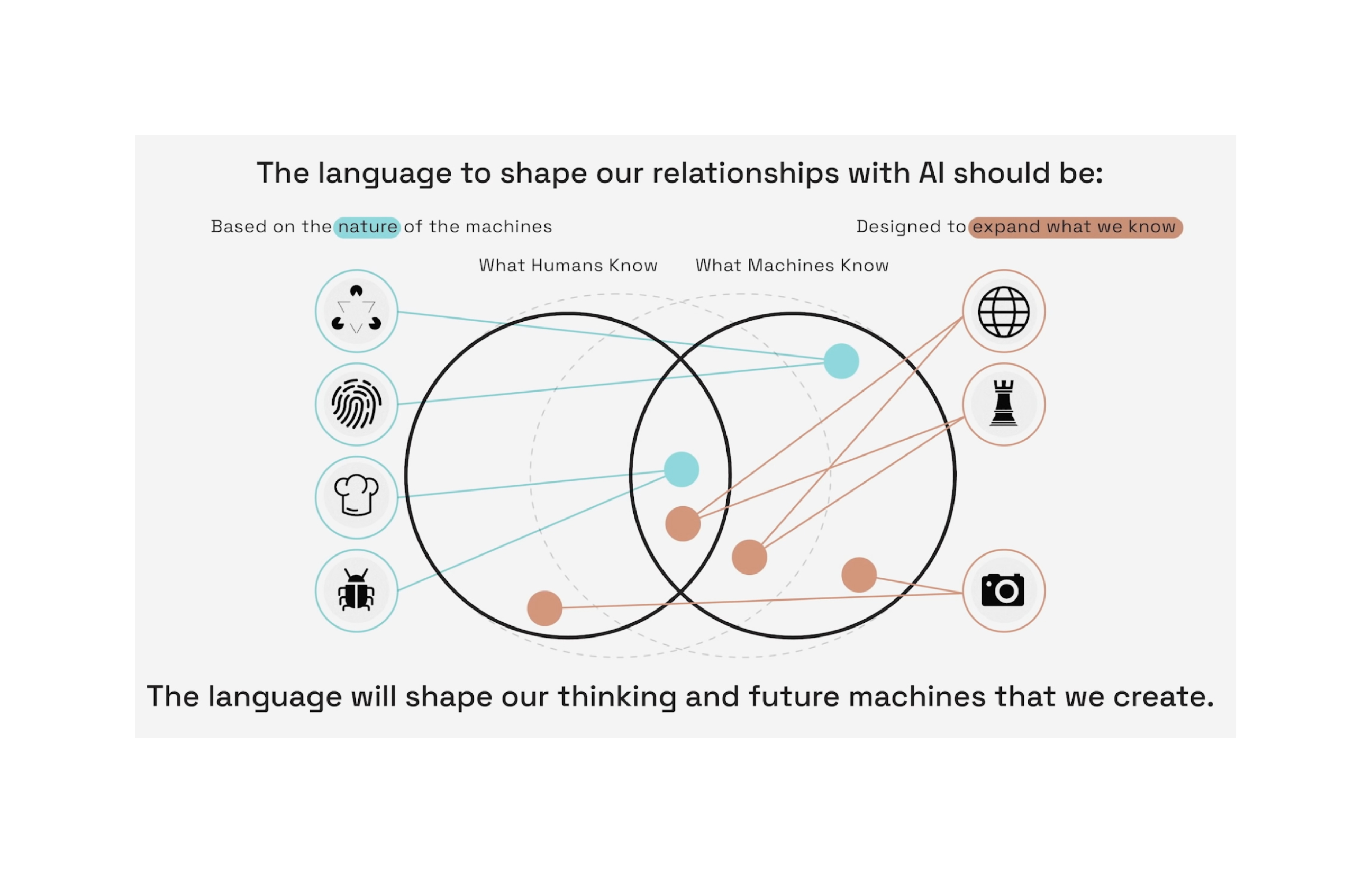
-
week 4-1 commentary - meenu singh
Harrell Reading (Morphic Semiotics)
Today’s reading on Morphic Semiotics felt very abstract at some points. There was a lot of terminology that I wasn’t able to understand the definitions of till later (and even know my understanding of what semiotics is is vague). I really liked the example of Brawn at the Bazaar and how their experience translates to a design online as it helped me understand the concept of semiotic spaces and semiotic morphisms a little better. Another part of the reading I thought was informative was the categorization of the three different categories of signs: icons, indexes, and symbols. Indexes were a very fascinating category of signs because they thing being represented is connected to the object physically/casually. Even though this type of sign is described as “directly connected to the object” it feels less effective than the third category of symbol, where the connection between the sign and object is described as arbitrary social conventions such as speech and language. I think this shows that signs are incredibly dependent on context for their meanings, because I find what is described to be “arbitray social convention” as a simpler and more clear way to represent the meaning than certain representations from the icon and index category
Allman Reading (Gestalt Psychology)
The website about Gestalt Psychology was very helpful in defining the principles that explain how we percieve the world around us. I really like how direct they were in explaining the different principles and the use of an example for each of them (very easy to parse). I think the concept that was most interesting to me was the Law of Closure because it reminds me of how we also parse words and how often times we fill in gaps for missing words because we are so used to certain words in a context (i.e. filling missing articles or prepositions).
-
Week 4.1 Commentary - Audrey Gatta
Fox Harrell: Phantasmal Media
In Chapter 4 of Fox Harrell’s text, “Phantasmal Media”, I found the section on “Brawn at the Bazaar” to be a really interesting example of the role of semiotic spaces and their use and interpretation. It made me realize how there are many unconscious biases that come into play in our day-to-day decision making, which don’t necessarily translate to computational models, such as the eBay Simple Seller Representation that does not capture Brawn’s criteria. It is intriguing how semiotic morphisms from reality to computation can lead to a loss of meaning, but in some cases, like in the contrast between Brawn’s Seller Representation and the eBay Simple Seller Representation, that has a potentially positive impact of reducing unconscious bias and discrimination. This section of the text helped me better understand the more technical descriptions of semiotics that Harrell presented in subsequent sections.
Gestalt Psychology
I really appreciated the examples provided for these laws, as they were very clear in explaining the concepts. I really like the ones that create a sort of optical illusion, such as the Law of Closure (which creates the appearance of a triangle due to the incompleteness of the other shapes) and the Law of Figure/Ground (in which the forms appear to change depending on whether you are looking at the positive or negative space).
-
[chxchen] Commentary 5: Harrell, Phantasmal Media
Harrell’s piece on Phantasmal Media and semiotics was honestly a pretty confusing read to me. It was a bit dense and difficult to parse through, so it took me a while to get through. I was mostly confused about a lot of the terms, particularly at the beginning, where these words were used with little context.
Near the end of the section, Harrell talks more about basic semiotic concepts, morphic semiotics, and semiotic spaces, which gave me a little more insight into these areas. Semiotics is the study of signs. Harrell also talks about Peirce’s classification and incorporation of interpretants to invoke unlimited semiosis, which I really agree with – the concept of having infinite interpretations of symbols depending on who is viewing them is something we’ve already seen with our self-portraits, for example.
The section on Brawn at the Bazaar was definitely very interesting to me. One question I had was whether epistemic domains contained cultural/ethical/moral beliefs, or if there was any distinction between them, as it seemed the definition just seemed to include those. I found the comparison between Brawn and the Simple Seller Representation really interesting, especially the qualities we use between an in-person and computational seller model. I think there’s a lot of questions to be answered here about how much we allow computational seller models to mimic those in real-life, balancing giving buyers a more realistic experience versus opening the gates for possible discrimination.
-
Week 4 - Gestalt and Harrell Reading, Hanu Park
Harrell
I enjoyed learning more about semiotics. I have not heard of this field of study before, but it was a great read. The narrative of Brawn and eBay related to UI/UX in a surprisingly pleasant way. There is a saying that a first impression takes less than a second, and I find that this applies to websites as well. Using semiotics and other graphical ideas to make a website the best it can be for the audience is important. I agree with the idea of semiotic domains, and I feel that it ties in heavily with understanding one’s audience. Accessibilty is key when trying to get someone to use your product, and this pointed that out perfectly. Besides this, the small bit about semiotics and their affect on human percpetion and mindspace was interesting because it brings up the fact that there subtle visual cues can influence people. It’s hard to draw the line between what comes first, the art’s influence or society’s influence on art.
Gestalt
Most of laws made good sense to me, and I could think of some examples for each. However, I am a little confused about the Law of Pragnaz. The definition implies that there is a ‘good’ figure and that the ‘good’ changes. I wish they elaborated more on the different forms and what is ‘good’ and ‘bad’, since they decided to use that distinction.
-
Week 4.1 Commentary - Katherine Caol Guo
I’m not familiar with semiotic theory at all, so I learned a lot from the Harrell reading but am still confused. Even though most of what they said was common sense, I have never thought about some of the points they raised explicitly. For instance, in the Harrell reading, I found the example when they compared the fictional Brawn’s criteria when making a purchase with the eBay seller information, I had never really thought about all the conscious and unconscious things I consider when making a purchase. I really love jewelry, and usually buy off of Etsy, which is an online platform and on Etsy, the things that are most highlighted in its interphase are the seller’s name, the ratings, and the number of reviews they have. Because those are the three criteria that are most readily available, I realize that they are all the three criteria that I look for to inform a purchase.
Later in the Harrell reading, they brought up the example of the swastika being representative of Tirthankara Suparshvanath within the context of Jainism or more broadly India whereas, for a Western audience, the same sign (except for a slight rotation) is interpreted very differently to represent the Nazis or fascism. We’ve already been introduced to this concept earlier with the comics readings, but it leads me to wonder, are there any signs that have a universal meaning? If not, is such a sign even possible?
To be honest, even though I read through Harrell’s definition of semiotic spaces, I still don’t quite understand what they are. For instance, if a Gregorian calendar is an example of a semiotic space, what would be examples of its sorts (months, dates, holidays, pictures), constructors, functions, and axioms (the actual size of the calendar)? Do a semiotic space have to have all four components?
-
Dondis Chapter 6 Commentary - Isabel Báez
All the elements that Dondi’s describes in this sixth chapter rely on a set of oppositions that correlate to each other. Many assimilate to each other, and even help describe their relevance in visual works. As an example, we have the similarities between sequential and randomness, predictability and spontaneity, and consistency and variation. Although not exactly the same, we know their is randomness and variation in spoteanity. It is these type of relationships that make the categorizations not be mutually exclusive.
Accuracy & Distortion
Dondis compares accuracy with the realisticness of a piece: the work of a camera. This idea of accuracy and distortion relates to the conversations we’ve been having with our self-portraits. We distort its elements to create abstract meaning that represents us better than accuracy could, as it reaches beyond our physicality.
Singularity & Juxtaposition
Dondis discusses the difference between works the focus on a solemn subject, versus those that focus on the relationship of multiple components. The name “juxtaposition” suggests the impact of the position of these multiple elements to achieve an effective and fruitful interaction in the work. This is a key components when it comes to the development of our self-portraits as well. As we implement multiple abstract elements, we want to ensure their relationships is legible and successful.
Neutrality & Accent
The idea of neutrality and accent is similar to that of singularity and juxtaposition. Most notably, the accent refers to highlighting a particular element in the piece, which goes along the singularity idea of focusing on a particular element. Neutrality, on the other hand, is more about losing the boundaries for the elements within a piece, rather than establishing relationships between them, like is the case for juxtaposition.
Understatement & Exaggeration
I hadn’t really considered how understatement could be expressed within a design until Dondis provided the visual examples in this reading. The idea of creating simple, under defined elements that still carry across a message seems very challenging. It seems more effective, as Dondis states, to carry out exaggerated statements in these visual works. However, I believe this idea of minimalism has become more and more popular in the recent years. The simplification, which is another of the elements that Dondis discusses, of companies logos portrays how a designer seeks the “maximum response” from an audience, while showing “great restraint” in the design.
-
Week 3 - Dondis Reading, Hanu Park
Brief Comment
Dondis, just like the first reading we covered of his writing, encapsulates design elements in a way that is comfortable to read. The topics in chapter 6 are interesting to me because now we are using the base elements of design he described, such as lines and shape, and putting them together in interesting ways to demonstrate composition ideas. When reading this chapter, there were many great design keypoints that I didn’t even realize I thought about when analyzing art. I often chalked up my improvements as ‘it just feels better on the eye’ without actually considering why. This chapter helped to point out some of those ideas. However, some of the points did seem repetitive to me, such as simplicity/intricacy and understatement/exaggeration. On top of that, I did not agree with some of his examples, such as 6.21 a as well as 6.32 b and c.
Balance and Instability
Balance and instability have always appealed to me when creating my own art. I enjoy cosidering where the art is the ‘heaviest’ or if balanced, how to evenly distribute the weight of my ideas across the canvas. Another way I like to think about balance and instability is as gravity: do I want a focal point to gravitate all attention towards itself? or do I want a collection of smaller bodies each with their own gravities in orbit? I enjoy playing around with this concept and trying to find balance with elements that seem hard to control, which is why balance and instability appeals to me.
Sharpness and Diffusion
Another concept that Dondis covered that appeals to me is sharpness and diffusion because both can be greatly impactful to the piece that one is working on and often has to be considered. For example, companies typically go for a sharp design = it’s easy to print, overlay on publications, and edit in design. On the other hand, diffusion is often used in illustrative pieces using realism. Most commonly, sharpness and diffusion are used together and can convey shape, tone, and more. It has a wide range of uses together and is interesting to look at. For example, Rachel’s self portrait used both watercolor (diffusion) and marker (sharp) brushes to create an interesting affect that other’s picked up on in class. An artist that I follow online, Baot Pham has a wonderful use of sharpness and diffusion.
-
Week 3.2 Commentary (Rachel Chae)
I found it interesting how Dondis described visual design as an immediate, spontaneous medium. He makes the case that visual images are interpreted “without conscious decoding, translating, or delay,” but I’m not sure I agree. It made me think of those “Where’s Waldo?” drawings where viewers take time to digest each detail and hidden messages in the painting, as well as examples like the picture below where messages are delivered in a sequential manner, even if all the components are presented at once.

Symmetry and Asymmetry Out of all the principles that Dondis described, I think these were the easiest to grasp for me. I liked how Dondis described symmetry as an “axial balance,” and his examples demonstrated this effectively. The asymmetrical examples appear off-balance and tilted to the side, while symmetrical examples appear balanced and static.
Repetition and Episodicity I found this principle interesting because I don’t think I would have considered repetition and episodicity as opposing principles, I would have considered episodicity as a variation of repetition. However, looking at the examples I see why he categorized them this way: repetitive examples felt uniform and steady while episodic examples felt irregular and unbalanced. This principle made me think of those Andy Warhol paintings of Campbell soup cans and Marilyn Monroe, which would fall under repetition.
-
week 3-2 commentary - meenu singh
In this chapter, Dondis describes how content and form are are connected with artist and audience in visual communication. One of the lines that struck out most to me is the line “Meaning lies as much in the eye of the beholder as in the talents of the creator.” Thus far, I haven’t reconciled the connection between the artist and audience, and I feel like this line really helps express why artists are so important to society. Their skill lies in the ability to communicate to us a message they put together in a medium that is almost infinitely interpretable. Dondis presents different techniques for visual communication that are used to present information in “opposite pairs”.
Economy/Intricacy: I thought this pair of techniques was very interesting because they are two I have never heard of in the context of art. I also would never have paired these two as polar opposites, but after reading the description it makes sense. Dondis describes economy as “the presence of minimum units of visual means” and associated with the poor. It is design that is purely for function, with the purpose of getting a job done in the most simple and efficient means possible. There is nothing to detract from the goal of the design. For example, a blank line at the end of a text is quickly understood by the audience to be for a signature. On the other hand, intricacy being described as associated with power and wealth is interesting because I would not have intiially connected a design to something like wealth. However, the presence of details that serve little purpose other than to be ornamental or aesthetic is something that is often characterisitic of things like luxury or leisure time, which is a commodity that is often only available to those with power or wealth.
Singularity/Juxtaposition: This technique appealed to me because I am personally fond of juxtaposition in pieces of writing and art. When there are two things presented together, our brains are able to draw connections and find differences between them. It is a powerful tool that is often used to draw out hidden qualities that are missed at a first glance, adding depth to a piece. However, what was interesting to me is that while I’ve seen juxtaposition used in pieces of writing, the technqiue of singularity is not apparent in verbal pieces. Words are not alone in novels, so I can’t think of any examples at first. Meanwhile, singularity within visual communciation is powerful for similar reasons to economy and simplicity. Singularity allows the audience to focus on the main theme. Our attention is drawn to only one component of the piece and not competing with other components for focus.
-
Week 3.2 Commentary - Katherine Caol Guo
The first thing that struck me while going through the contrasting pairs was that the examples Dondis provided were not immediately evident to me at first glance. Of course, after I reread the description again and more closely examined the images, I recognized the connections but truly, for some of the visual examples, my first thought was that the image would have been a better example for a different principle. This demonstrated to me how interconnected these principles are in visual design. For instance, boldness, sharpness, and exaggeration are linked both in my mind, but also when looking at Dondis’ examples you see elements of all three principles. However, not all bold designs are necessarily sharp, for instance, the middle example under boldness is more diffuse than sharp, and the first example under subtlety is sharp (not diffuse as one would more readily assume). This led me to further ponder, how many of these principles will a “good” design incorporate. What are the most common principles we see today? (However, are these questions in themselves pointless, since it seems that the definitions of these principles are rather vague and to some extent, up to the interpretation of the individual?)
Accuracy and distortion This principle made the least amount of sense to me. Is accuracy just realism, or does it have to be also true to the natural world (for instance, a photoshopped image of a 3 headed goat can be rendered to be realistic, but it is not natural - is that accuracy or distortion?). Based on Dondis’ explanation of distortion “[tampering] with realism…through deviation from regular shape, and possible true form” it seems the 3 headed goat would be distortion, but then are the principles of accuracy and distortion then mainly constrained to photographic-based visual media? At what point would a drawing be a distortion rather than an abstraction?
Sharpness and diffusivity I was really drawn to this pair and the examples Dondis provided in their primer. Sharpness is linked to clarity; if the image is sharp, it is easier for us, the viewer, to make out what is being represented. This kind of ties into what Dondis was talking about earlier in this chapter, her addendum on “form follows function” in addition to “form following content.” If an image is sharper, we can identify the content. However, it is let’s not forget that not all things being conveyed have a physical form - in fact, most ideas, emotions, and thoughts do not readily have a physical manifestation and in those cases, introducing some diffusivity could aid in bringing those points across. To me, any blurriness immediately introduces an additional level of emotions, because it is less precise, and precision connotates thinking whereas the lack of precision is more about feeling. At the same time, diffusivity does not equate just to warm, fuzzy emotions - blurriness sometimes is confusion and headache, and pain. Sharpness is not just analytical and emotionless - in fact, it can be an extremely pleasant feeling, like the crisp cool air on your face while the sun is bright overhead.
-
Week 3.2 Commentary - Audrey Gatta
Dondis’s text explained and presented examples of techniques for visual communication that are ever-present in designs all around us, such as posters, UI, signs, book covers, and more. They are a toolkit that allows designers to employ the elements of design in meaningful ways. Although I always absorb their meaning and intentions, I rarely think about how these techniques work to make a design successful, so it was really helpful to read Dondis’s breakdown of these. I found it interesting how she highlighted the need for visual pre-planning in design, stating that “Sudden inspiration, mindlessness, is not an acceptable force in design.” To me, there can be a balance of both, because I feel like random strikes of inspirations can lead to great ideas that can later be thought through and refined visually.
Symmetry and Asymmetry I was specifically draw to Dondis’s comparison of symmetry and asymmetry because I previously had a very traditional mindset when it came to this polarity: I associated symmetry with balance, and asymmetry with instability. However, here Dondis highlights how asymmetry is not necessarily ill-balanced: “balance can be achieved by variation in elements and placement, which is a counterpoise of weights.” I do think that the middle example that she presents for asymmetry exemplifies this quite well, because the design feels balanced without being symmetrical due to the distribution of weight, with the figure (which feels heavier) being toward the bottom of the page, while the text (which feels lighter) being at the top.
Understatement and Exaggeration I found “Understatement” and “Exaggeration” to be interesting polar techniques because even though they are opposite approaches, they are often used for the same goal. When used effectively, both of these can result in a bold and clear message. Understatement says more with less, while exaggeration really emphasizes a point, loud and clear. To me, the difference that marks when each one should be used is really dependent on the content itself. This goes back to the point that Dondis made earlier that “form follows content.”
-
Dondis Chapter 6 - Mikel
I read a lot of the ideas being presented here by Dondis again through the lens of other mediums. Their point that only in visual communication is content undetachable from form felt odd since I don’t know a medium of communication where this is not true. What did strike me as unique to the visual is the same idea that McCloud presented, that it holds a lot of immediate power, “visual thinking is not a delayed system.” Since there is a lot to be discovered in the meaning of a work as it is investigated, I wonder how the difference between the immediate reaction and the developed one can be used to evoke certain realizations. This obviously isn’t that applicable if you need the audience to understand the message on first glance, but for art I see how this can be a technique that is more unique to the visual medium than others.
Sequentiality and Randomness These principles are similar to predictability and spontaneity, and I think are most interesting to me when used together. When a pattern is formed in one part of the composition, but broken later it brings a certain weight that comes from breaking an expectation.
Understatement and Exaggeration Understatement is interesting to me because of the contradiction it brings, the element is given less visual weight for the purpose of giving it more meaning, which I think can speak to ideas of invisibility, feeling undervalued, or being at the margins.
-
[chxchen] Commentary 4: Dondis, Visual Techniques
Chapter 6 of Dondis’s A Primer of Visual Literacy digs deeper into how artists visually communicate. The focus is on the four factors in visual communication: artist and audience, content and form. Particularly, Dondis talks about how content (what is being expressed) and its intrinsic tie to form (how it is being expressed). I found it curious how Dondis specified that in visual media, content is never detached from form – I find that this same trend exists in all the arts, including the ones he mentioned, such as music, prose, dance, and so on. A message conveyed through limerick is certainly not the same as one conveyed through sonnet.
Dondis talks about how the designer can only determine three out of the four aforementioned factors: artist, content, and form. Designers will target certain audiences, however, to try to determine all four. To me this raises two questions: do we have a duty to create art that will be understood by all audiences, and do we have a right to limit our art only to those who we think will understand it?
Dondis also challenges the notion that artists are simply struck by fits of inspiration or intuition, instead emphasizing visual intelligence and the ability of an artist to make quick decisions when sketching or concepting. True visual communication comes when all individual effects of an image come together to convey the same message, idea, or feeling. To me, the presence of some of these effects almost suggest the rest – i.e. Figure 6.3 has no color, but I can almost see the bright, bold colors that would be associated with it.
Dondis dedicates the rest of the chapter to discussion of techniques for visual communication. I found many of these interesting, but also redundant in a way. For example, symmetry and asymmetry seem like a subset of balance and instability, and predictability and spontaneity seem to include consistency/variation, sequentiality/randomness, and repetition/episodicity.
-
Week 3 Reading - Isabel Báez
Upon first glance, I perceived Dürer’s self-portrait as very polished and royal, simulating the portraits of Jesus Christ, as stated by article author Farago. However, it did not strike me as uncharacteristic of a self-portrait. I believe this is in connection to the abundance of “self-portraits” in today’s day and age. With the popularization of selfies and social media, vanity is prominent in today’s culture. Therefore, the arrogance presented in Dürer’s self-portrait seems normal to this type of work. However, as Farago commented, flattenned mirrors were not even in existence by then, so this type of presentation was very unusual. This is especially comparable with the idea of presenting the best version of one self in a selfie and/or self-portrait. Even if he did not release this painting to the public eye, it is a show of arrogance, as he wants to witness himself in expensive clothing, and in a god-like context.
-
Week 3 - Farago Reading, Hanu Park
Brief Comment
I found that the article provided great insight to the self portrait, especially since I have not been introduced to it before. I enjoyed reading about the possible parallels being made between the portrait and other factors, such as religion. The speculations made from these parallels were also sensible.
The part I found the most interesting was the part about the personalization of art and how Durer authoritarian stance to his work affected the art community today. I wish the article wrote more about that aspect.
Selfie
On the topic of self portraits developing into selfies, I find the connection strong. Historically, people would have portraits made, typically for special occassion or at a steep price. Even a few decades ago, portraits were still a special event or usually done by professionals. Now, humanity’s interest in capturing one’s self is not new, but how they do is. With the introduction of smaller and accurate cameras, people have access to self portraits more than ever. Generally speaking, the idea is the same - capturing one’s self in their work. However, I find that the reason for self portraits have broadened. Taking a selfie today is inexpensive and fast, which means that there is no particular reason to limit self portraits only for special events. In other words, the threshold for taking self portraits have been substantially lowered, and they happen all the time. The total relationship selfies have with the modern world is hard to keep track of. For example, how have selfies impacted popular media today? People are typically embarrassed to take selfies in public - why is that? Is there an innate narcissism associated with liking to take selfies?
Ultimately, I view selfies as a form of self expression and capturing of memory, since I usually take selfies during events I want to remember in the future. Others could take selfies to keep track of their body, record a great day, or even to simply look at themselves and feel good. As long as it’s not harming those around them, I find selfies to be a good thing.
-
Self Portrait - Trudy Painter
I rarely take a selfie straight on. The two-handed hold, staring straight into the camera feels clinical to me. There’s no room for angles or concealing. I pretty much only use the straight on selfie when I need to check if my hair is lopsided or if glasses I’m trying on would look good. For me, the straight on self portrait is about utility and striving for perfection.
Durer’s self portrait feels the same. The fact that Durer had only convex mirrors blew my mind. He went through all the calculations to perfectly align his features in a symmetrical, sacred fashion. At first, I wanted to give Durer the benefit of the doubt: he just wanted to document himself in the most anatomically accurate portrayal. However, the similarity to holy image of saints and Christ is undeniable. After looking at the portrait for a while, Durer’s representation of himself ended up looking unrealistic. I was thrown off by how biblical this man chose to paint himself and subsequently stopped looking at it as a utilitarian documentation of self. However, if that portrait had been done in current day on a camera, I would perceive it to be a utilitarian, anatomically accurate portrayal of self.
note: i don’t have an nyt account so i had to read it on archive.ph
-
3.2 Reading - Trudy Painter
My preferred mode of creative expression is through websites. For these techniques, I couldn’t help but apply them to web design + development.
Balance - Instability
This feels like one of the most applicable to web design. HTML and CSS have balance baked into their structure. HTML automatically formats content into a linear list view. To create instability in web design, the developer would have to manually code the instability. So unlike the organic world, balance feels natural in online spaces.
LACA Index - simplest way to throw information up on the internet (balanced list view)
Regularity - Irregularity
Again, similar to the balance/instability comment above, regularity is a backbone of any online system. All modern frontend Javascript frameworks are centered around reusable components which connect to uniformly structured data types. Personally, I’m drawn to regularity. Since most websites are just skeuomorphic abstractions of real world objects, it helps to build familiarity + predictability through regularity.
my literal personal website - uses consistent representation of projects (regularity)
Economy - Intricacy
We discussed elements of minimal design earlier this semester. Web design is overflowing with economic designs. Online interfaces are often celebrated for their lack ornamentation or ornamentation. While these economic designs are often more palatable (and suited for consumerism), they don’t leave much room for personality or character.
cargo is a website builder used in design spheres. it defaults to minimalism (economic)
Flatness - Depth
This isn’t necessarily web design. But interface design has also recently moved towards a default flatness. Buttons used to have depth and shadows, but now they are flat to a fault. The most striking switch to this was the iOS 6 → iOS 7 update. Before humans were so tech literate, having 3D buttons was a helpful hint to get a user to click on a button. However now, all Internet users are trained to click on a button when their cursors change. I dont think depth has the same effect that it did 10 years ago for interface design.
-
week 3-1 commentary- meenu singh
In this reading we were taken through an analysis of Durer’s self portrait. I’m quite unfimiliar with art history so this was my first time learning about the background of a self-portrait.
On first glance, the painting of Durer looks quite normal. It is impressively detailed, but it didn’t strike me as unusual in any manner. However, as Farago takes us through the different parts of the painting, I learned why the painting is set apart from others during the reneissance period. During this period of time, it was unusual to have paintings of people who were craftsmen - and not rich, important figures. Durer also depicted himself in a seemingly arrogant way, portraying himself with a fur-lined coat characteristic of noblemen. His skin is also clear and unblemished and his hair is perfect and detailed. Another interesitng note is the choice of orientation. Durer’s previous self-portraits feature him in a three-quarter profile, but even then his confidence and strong sense of self shows in the medium and subject matter (nude portrait and the use of silver point). The frontal orientation and posing is almost sacriligeous, as it is often used for Christ and saints. For Durer, a craftsman, to portray himself as rich and visually perfect is telling of how Durer viewed himself and his work as of equal importance to the holy.
Because of cameras, cell phones, and mirrors, the mental image that we have of ourselves is arguably closer to reality than in the past. When Durer was painting himself in intricate detail, he didn’t even have an exact mirror, so he had to work out many of the proportions by hand. Its interesting that Durer also wanted to paint an image of himself that was more perfect than his actual image because we also do the same with filters and photo editing nowadays. Even in the past, the image of self we want to put is more idealized and embellished than we actually are.
-
Week 3.1 Reading Commentary (Rachel Chae)
When I saw Durer’s portrait I was immediately reminded of religious paintings and mosaics, which the article confirmed as inspiration for his painting. My first thought was to wonder how egotistical does Durer have to be to liken himself to a religious figure in his portrait. However, as I read through the article and saw all the impressive details in his portrait—features that must have been incredible difficult to execute with tools available in the 1500s—I began to think that maybe his confidence was not unfounded. I also found it interesting how he created his own copyright using his emblem and admired how he creatively incorporated it into each piece he designed.
I found it interesting how the article referenced other famous self-portraits, particularly Frida Kahlo’s. The comparison between Durer’s and Khalo’s portrait demonstrated how the self-portrait has less to do with how someone looks and is more about how the artist views themselves. Khalo painted herself as very masculine and severe in her portraits, even though photographs of her show otherwise. Although there are no photographs of Durer available, the other symbols of luxury he used (e.g. the extravagant fur coat, glowing hair) makes me think that he painted himself in a more flattering light. Looking at various examples of self-portraits spread out over centuries also made me wonder how the development of photography changed artists’ approach to portraits, if the existence of photos steered artists away from realistic portraits to impressionistic ones.
-
Week 3.1 Commentary - Audrey Gatta
I do like the way that Jason Forago described this self-portrait as “supremely arrogant.” In a way, all self-portraits are so, but I would agree that this one is in particular in the way that Dürer depicted himself in a front-facing pose with perfect symmetry, creating the sense of a holy icon, and especially with his clothing, dressed in a rich fur-lined coat. I also appreciated learning more about the details that were pointed out, specifically that of the hand pointing inward, invoking his gift of art. His monogram is also a key detail that is a reflection of his individuality and authorship. Also, it is important to highlight the purpose of the work: Dürer painted this self-portrait for posterity. This makes me think, what was the purpose of other artists throughout history when they painted their self-portraits?
-
Farago Reading - Mikel
Since we looked at more abstract self-portraits in class, the biggest question I have is when that type of self depiction first appeared. Durer’s painting is an attempt to capture himself in a realistic way, shown by the impressive effort he put into the details that make the portrait look closer to reality. I think by trying to draw himself accurately, it adds more arrogance to the symbols that relate him to perfection or Christ. Instead of interpreting himself through art, the painting reads much more as a statement of fact to me.
The reason I asked my first question is because I wonder if painters before Durer aimed to capture themselves in their work, but did not try to do it through realistic means, closer to some of the examples we saw in class that might not be read as self-portraits had we not been told. Are there prior examples of people trying to capture themselves in art?
-
[chxchen] Commentary 3: Farago, Seeing Our Own Reflection in the Birth of the Self-Portrait
In the reading for today, we perform an in-depth study of the self-portrait using Albrecht Durer’s self-portrait as an example. Durer’s self-portrait departs from the abstract, semi-realistic self-representations we explored during class, but contains details that distinguish it from just a realistic portrait.
Durer represents himself as someone who is more than just the craftsman he would’ve been. One interesting point I think is relevant here is the importance of examining symbols and icons through a historical lens. The author points out in the article that Durer’s fur-lined garb would’ve been standard for a nobleman or scholar – this detail is not apparent to anyone viewing this portraiture without this historical knowledge. For example, fur has come to no longer represent royalty in today’s culture – in fact, many people look down on the fur industry.
Durer’s representation of himself, realistic though it may seem, is actually still full of symbols and iconography including this fur lining and even just the composition of the portrait – likening himself to Christ. He seems committed to making a permanent mark on history by living through his paintings – his self-portrait makes note that he painted himself “with indelible colors…”, and he used silverpoint, which is an “unfixable” medium for an earlier self-portraiture. Durer’s self-portraits are larger-than-life and speak a lot about his personality and how he sees himself.
-
Week 3.1 Commentary - Katherine Caol Guo
Prior to reading this article, I’ve already been introduced to Durer as an artist and his role in the Western canon as well as his self-portraits specifically. The 1500 self-portrait is especially familiar to me because I’ve studied it in depth in a previous art history class, so the symbolism of the furs (elevating Durer’s profession of the artist as noble), the frontal positioning (drawing comparisons to depictions of Christ), the fact that Durer’s image is the only content of the canvas (accentuated by the black, void lack of background) that Farago describes is similar to what I previously took away.
I’ve always thought the frontal position and similarities to how Christ was portrayed back then were extremely arrogant and bordering on slightly blasphemous. I’ve heard the argument of “the pious…[striving]…to live in imitation of Christ” before but was not very convinced because this portrait was never circulated so we do not really have a good understanding of how contemporaries would have interpreted it. However, Farago pointing out the positioning of Durer’s hand, and how it points inward rather than outward (as Christ usually does in blessing the viewer / masses / the pious) is interesting. Farago argues that the inward placement signifies some sort of pride in his artistic gift. To a modern artist though, this translation is personally slightly lost, because at least to me, with the way his hand is buried in the furs, Durer looks kind of nervous and fiddling around.
On a separate note, I wonder how Durer achieved his likeness because as Farago mentioned, mirrors back then slightly distorted the reflection. I know more than a century later, Dutch Baroque artists such as Vermeer may have also used mirrors to aid them in creating extremely life-like images in their own paintings, but I imagine mirrors by then were already closer to the ones we know of today.
-
Week 2 - McCloud Reading, Hanu Park
Chapter 2
Chapter 2 was long and heavy, filled with great ideas! However, one concept that struck out to me is McCloud’s views on abstraction. He states that the abstraction of realism into cartoony style allows for the communication of more information with less information on the page. I agree with this concept, as counterintuitive as it seems. Abstraction, even in the world outside of comics, is often needed to clarify details that matter and improve readability. In McCloud’s line of reasoning, he argues that cartoons allow people to better self-insert, which is why cartoons are often so popular. After considering this notion, I don’t believe it applies to me. Whenever I watch cartoons, I enjoy the abstraction because it creates a more familiar character, one with obvious details. I also enjoy that it is not in a realistic setting and that the rules of the world can be played around with. In this sense, I am out of alignment with McCloud, although I agree on his points about abstraction.
Chapter 5
From chapter 5, I enjoyed his explanation of lines and how they impact an audience’s perception. Particularly in the last panels, as he zooms in, differennt qualities of the lines can be more easily seen, such as its shape and direction, which explain why the zoomed out version communicates different emotions. Artists can use this to connect their work or separate it, an important staple in recognizing who an artist is from their pieces. I struggle with keeping clear and consistent lines, so this chapter helped in explaining some of the qualitites I should keep in mind when lining.
-
Week 2.1 Commentary - Marina
The Line: The first element discussed in this paper is the dot but when several dots are positioned close together they form a line. The line is a dot in motion (it is not static), it has energy, direction, and purpose. The line can be loose and free but also measured and technical and take on different vibes whether that’s spontaneous or delicate. The text says lines rarely exist in nature but can often be seen in the environment due to its artificial nature. Lines are used to show contrast and describe juxtaposition. Examples of lines are dividers that section off/group ideas on a page, sketching lines/outlines used for drafting. There are vertical, horizontal, diagonal lines, etc. and the intersections of these lines create shape.
The Shape: Dots describe lines, lines describe shapes. There are three basic shapes: circle, square, and triangle that each have their own meaning and connotation. Squares are said to be bland whereas triangles indicate action and circles capture the essence of endlessness, warmth, and protection. These shapes lend themselves to even more variations - more sides/angles or curved edges for example. Shapes draw in the eye and interest the person looking at the subject. Shapes are used to represent buildings, people, life, and everything with substance. Shapes are needed everywhere - thinking about clothing, for example, something that is “shapeless” is oftentimes bland or uninteresting. Shapes are also used to enclose/section things and provide a border (they help organize space). Shapes are symbols; likely the most obvious example is the stop sign - a red octagon - is nearly universally recognized as a symbol for stopping. Similarly a triangle with an exclamation point is taken to be a warning sign.
-
Week 1 - Dondis Reading, Hanu Park
Tone
I find myself always wanting to learn more about tone and reading Dondis’ short summary of it reminded me of why I enjoy it so much. I agree with Dondis that tone is often an overlooked but vital component of our perception of depth. His simple example of turning a circle into a sphere with just a few lines communicating tone was a great way to demonstrate some of the applications tone has in the world today. For example, compare the two movies “Moana” and “Monsters, Inc.” side-by-side and it is clear that one has a much better lighting engine, which makes the movie much more realistic. Just how tone has applications like this in 2D, I am interested in seeing where tone will take off virtually, and how close we can get to a virtual reality.
Color
Similary to tone, I always enjoy reading or listening about color theory. Color associations play a vital part in most cultures, and extensive studies have been taken to research its impact in different communities. For example, communities with colorful mural artworks experience less crime than communities who don’t. Similarly, communities that installed colorful murals in the community experienced decreases in crime. In short, the researchers found a theory agreeing with the Broken Window Effect on the opposite spectrum. Overall, color plays a much more meaningful role to communicate ideas in more ways than people realize, and Dondis did a nice job touching on both the social and concrete aspects of color.
-
Week 2 Readings - Isabel Báez
Chapter 2: In the second chapter of McCloud’s “Understanding Comics”, what most caught my attention was how McCloud expressed that our brains were programmed to see human faces in everything. He used the examples of doodles, cars, and electric plugs. I found it extremely interesting because it is true, I often think about how “mean” or “friendly” a car looks based on its headlights and bumper. I have sometimes even used this information to gauge the character of the person driving it, even if I can’t see them. It seems ridiculous, but it is a common occurrence amongst people. When McCloud expressed that we couldn’t convince our brains to not see a face when presented with a traditional smiley face, I tried to stare at it long enough to see if I could identify some other figure, to no avail. However, I do not necessarily agree that these attributes make us self-centered beings. Faces do not belong exclusively to humans. Most animals and insects also have faces consisting of two eyes and a mouth. When I look at these objects, such as the car, I do not necessarily see myself in them. In fact, I think I relate them more closely to other creatures than I do to humans. I do, however, understand the concept of having some objects as an extension to our bodies, as the car example. However, I think this is more directly connected to the fact that, in our subconscious, we are aware that if something touches/hits the object we are on or holding, we will feel it. If someone hits our car, we feel the impact. If someone knocks down a cup that we’re holding, we feel its absence. This awareness is what I think causes that mental extension of our bodies.
Chapter 5: In the fifth chapter of this reading, McCloud expresses how lines are used to represent emotions, and both visible and invisible phenomena. The concept of iconic symbols used to depict a variety of these phenomena grasped my attention. It is true that many of the symbols used in comics are picked up by many artists, as McCloud expressed with the example of the flies in rancid smells. However, I had never noted the difference between the phenomena that existed, and those that were exagerations. With the example of the smoke from the pipe and the smell from the trashcan, in my head both of their visual depictions were accurate. It wasn’t until McCloud pointed out that smoke is, in fact, a visisble phenomenon in real life, while smell is meant to be invisible, that I realized the difference. I believe this is due to the literacy of the language of comics that McCloud discusses. As more artists use the same symbols again and again, they become normalized in our minds, making their differentiation from real-life phenomena harder. He uses the examples of the sweat beads in the forehead, exes for eyes to signify death, and such elements, which are all familiar to us.
-
Week 2.2 Commentary (Rachel Chae)
A New Post
Iconic expression: The part of chapter 2 that stood out to me the most was when McCloud described the iconic expression of faces, particularly when he added googly eyes to a bunch of random shapes and they suddenly turned into faces. It reminded me of a psychology study where they showed babies various images. The study found that, even at a young age, we tend to favor images that have face-like configurations and forgive abstractions more readily when it comes to facial features. It made me think about Pixar animations, how the characters’ facial features would be grossly disproportional if translated to real life but we still perceive them as natural-looking.
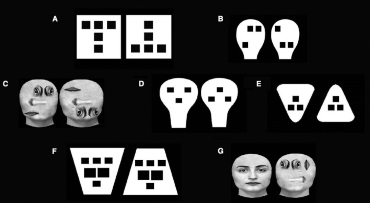
Lines, patterns, and shapes: In chapter 5, McCloud describes modern comics as a language of its own, how lines and shapes accumulate meanings over time. Just like any language, the language of comics evolves differently in each culture, which explains the different set of symbols used in Japanese comics vs. western comics. At the same time, I found it interesting how comics language is still relatively universal. While I didn’t read Japanese comics growing up, I could probably still guess what the comic symbols mean even if I won’t understand the Japanese text at all.
-
week 2-2 commentary - meenu singh
I grew up around cartoons and comics, from Indian chitrakatha and Japanese manga to classic American comic strips like Calvin & Hobbes, so this reading was a very fun read and presented many intriguing ideas on communication through comics.
Chapter Two: This chapter focuses on how comics use various levels of abstraction to their benefit, simplfying reality in order to amplify qualities and focus on the important attributes. The idea that we can abstract a face to just two eyes and a mouth is of particular interest to me. McCloud furthers this idea by pointing out we often see faces in many inanimate objects around us. McCloud describes this as humans being a self-centered race, and thus we see ourselves in anything. I disagree with this framing of seeing faces in animiate objects ecause of our self centeredness and rather think its because we are creatures of emotion, constantly searching for meaning in the world around us. It seems like the same reason behind why humans “pack-bond” with certain inanimate objects such as roombas, treating them like pets in many ocassions. From my perspective, it’s not that humans want to see themselves in the world around them, but that we want to see life in the world around us.
Chapter Five: In this chapter, I was most fascinated by the development of lines and shapes to represent something invisible. I never realized how some representations are so instinctively understood by me due to their commonplace usage within comics: such as wavy lines for smell and smoke. “These lines are more than a visual metaphor– a symbol. And symbols are the basic of language.” The word language is the key here for me; comics essentially use their own language that has commonplace symbols that are understood amongst readers without any effort. Just like standard languages such as English are constantly evolving with new slang and words, comics also have an evolving language as artists come up with new ways to represent ideas.
-
McCloud Readings (Chapters 2&5) - Mikel
Chapter 2
I thought McCloud’s idea that the cartoon face is easier to identify with because of all the features that have been stripped away is interesting. I always compared animated movies with their live action counterparts under the lens that cartoon faces can be more expressive, and thus amplify the emotion that is trying to be conveyed. I thought this amplification was the biggest drive for stories being told in animation vs live-action. At first I had trouble with his idea that we attach to cartoons because we see ourselves more easily in them, but then I thought about the trend of “what would I look like in this cartoon.” I’ve seen some artists do multiple renditions of themselves in different animation styles, and never realized that this self-identification might come from the less than accurate self image we have of ourselves.
Chapter 5
I liked the comparison McCloud made between the power of describing the invisible that images have vs words. His idea that words have a “cumulative” effect makes sense to me since it takes time to read and process a piece of text, whereas an image has an immediate effect because of our ability to see the whole thing at once. I have a much better understanding of how the build-up and pace of words can lead to a desired effect, but much about why I want to take this class is learning how the different elements of the visual can create a similar experience.
-
2.2 Commentary - Trudy Painter
Chapter 2
Once as an icebreaker I was asked, “What would you wear as the cartoon character version of yourself?” It made me question what clothes I would choose to extend my identity. My fixed expression of self. McCloud’s discussion of our investment in inanimate objects resonated with me. He talked about how inanimate objects (clothes for example) can trigger transformations of ourselves. I’m sure many of us would feel different in pajamas vs an evening ball gown. And, in the same vein, there are times I wouldn’t feel myself if I didnt have some of my staple objects. Call me materialistic - but I identify with the objects that have essence and communicate my values.
Chapter 5
I liked McCloud’s point that while there are lots of symbols + icons that garner universal linguistic understanding. For example, a fly symbolizes a nasty smell. However, I found it even more interesting that certain cultures develop separate idiosyncratic meanings for their symbols - example Japanese facial expressions. I’d never seen the Japanese facial expressions before. And it made me wonder - are there American symbols that are intensely American that I don’t realize are?
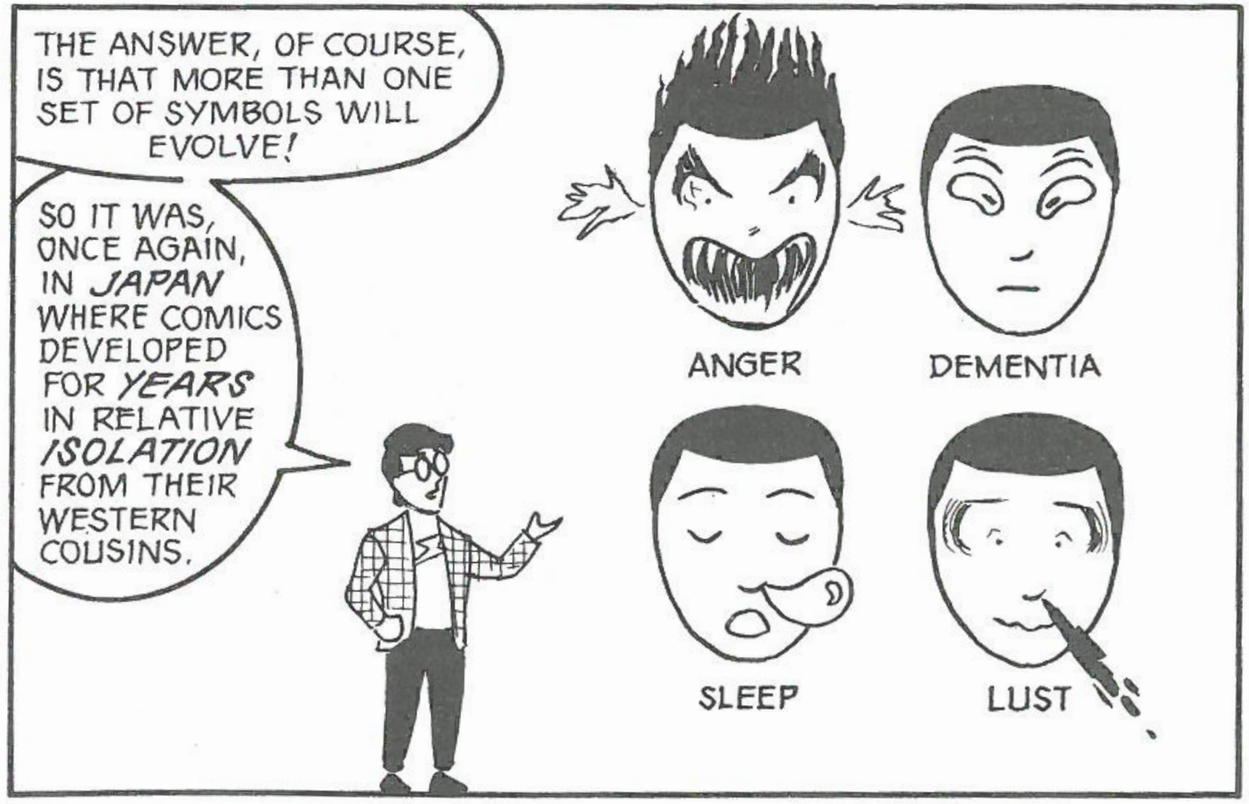
-
[chxchen] Commentary 2: McCloud, Understanding Comics
In the reading for today’s class, McCloud covers several concepts towards understanding comics as an art form and how we can better interpret them.
In chapter 2, McCloud covers several concepts towards the representation of icons in comics. One concept that really stood out to me was how McCloud pointed out how we see ourselves in everything. I found this a really fascinating concept because I do think humans tend to design in a way that reflects ourselves; however, I didn’t agree with all of McCloud’s ideas. Though the examples drawn for the car lights, plugs, etc. definitely reflected the human face, I think McCloud exaggerates to some degree how much we really self-insert ourselves. The exercise McCloud mentions with drawing the faces onto blobs I did not identify this, or I at least saw it as a reach. I do agree with the concept of us seeing inanimate objects as part of ourselves when we think about vehicles/machinery we control or the clothes we wear, but McCloud seems to suggest that even inanimate objects like cups start possessing separate identities in comics and I don’t think I’ve seen this except in the case of the author actually animating that object (think the furniture in Beauty and the Beast). Overall, however, I do like this conception of how we see ourselves reflected and identified in the world around us and how a comic rendering helps us visualize that.
In chapter 5, McCloud talks about the role of lines, shapes, and patterns and the role they play in comics. I really liked the discussion of word balloons. The representation of speech through nonverbal ways is super interesting to me – how authors describe it in words, versus how realistic artists illustrate details of expressions, versus the use of different textures in word balloons by comic artists to convey tones. In this way, sound becomes a visual medium. I think the transition into using word balloons to represent even nonverbal gestures is particularly interesting in how we conflate our senses with each other.
-
Week 2.2 Commentary - Katherine Caol Guo
Overall, I really liked this reading. In an alternate universe, I would have become a comic book author / illustrator. When I was in primary and intermediate school, I took many classes in comic illustration and consider myself relatively knowledgeable in Western (mostly American) comics, so I really like the small juxtapositions McCloud included when describing traditions in Japanese comics and cartoons.
Abstraction levels of iconic representation I love the quote “One set of lines to see. Another set of lines to be.” This is in the context of the combination of cartoonish, abstracted character figures and realistic depictions of the background and environment. The lines “to be” are the simpler, abstract ones of the figure through which we can more easily resonate with and see ourselves being through what McCloud called “viewer identification”, and the lines “to see” are the more complex ones of the background so we can find ourself (as the cartoon figure) to be immersed in the physical world of the story. This concept, once put into words is very enlightening to me, because I had noticed it before when encountering Japanese comic art which I actually prefer to European or American comics / cartoons because they always seemed more naturalistic to me because of the detailed backgrounds. However, I had not considered the effect on me as a reader, where I actually felt more immersed in the storyline and the world-building seemed more real to me compared to Western comics.
Role and effect of lines, patterns, and shapes I love expressionism in art history, so I was very excited to continue reading this chapter, especially when Kandinsky was name-dropped. My key overall takeaway from this chapter is that lines, patterns, and shapes can signal to an audience certain emotions in a more immediate and accessible manner compared to words, which can of course also convey emotions and meaning more in-depth but in a more delayed method. One specific example of graphic representations conveying meaning is wavy lines. Wavy lines can mean different things depending on the context, such as if they are coming out from a pipe, it is pictorial (an abstraction of visible smoke from the pipe), but if they are around a person, it is a symbol of that person needing a shower. Furthermore, the second interpretation of the wavy lines as a stench has to be taught to the audience in order for them to understand what it is symbolizing. Perhaps in other cultures, wavy lines can symbolize other ideas (you need to look no further than in the math department, where “~” means “approximately”).
-
Week 2.2 Commentary - Audrey Gatta
The Masking Effect Growing up in France, I was enthralled by bandes dessinées, or Franco-Belgian comics, so I was particularly drawn to Scott McCloud’s description of the masking effect, which consists of very iconic characters combined with unusually realistic backgrounds. I remember always enjoying reading comics such as Tintin or Asterix because I felt transported to a different world, thanks to the detailed and sensually stimulating world depicted. However, while reading them, I never made the observation that the characters were very simplistic in comparison, but I now understand this phenomenon of viewer identification a lot better. Being less familiar with the Japanese style, I also appreciated that McCloud detailed how the masking effect was virtually a national style there for a time, yet has evolved very differently from the West towards more realism in certain aspects.
Expressive Lines McCloud’s description of the variety of lines and the moods expressed through those lines ties right back to Dondis’s explanation of how lines hold tremendous energy and character. I especially appreciated the comparison between Rory Hayes’s style and Charles Schulz’s style. This comparison highlighted how expressive lines don’t necessarily have to convey intense emotions; they can also be expressive in the sense that they communicate calm, reason, and introspection. McCloud then went on to show some of the ways that line choices can affect their interpretations, and specifically highlighted direction as one of these stylistic choices, which connects back to the elements of visual communication that we read about in Dondis’s text.
-
Week 2.1 Commentary - Trudy Painter
I thought Dondis’s paper was a great overview of visual literacy. I was left thinking about the following 2 elements.
- DIRECTION → I’d never give too much thought to the 3 directions (horizontal+vertical, diagonal, curve). I always knew color had hidden emotion meanings, but I never realized that direction did too. It made me think of communicative logos.
- But it makes sense that horizontal+vertical = stability and well being → a logo that reminds me of this is Microsoft Windows
- Diagonal = challenging / almost upsetting → Nike swoosh for Just Do It
- Curve = encompassment, repetition → United Nations logo
- MOVEMENT → I frequently work with graphs + data visualizations. Dondis make the point that the human eye scans the environment for visual information in an unconscious process of left → right, top → bottom. I thought about all the roadmap / system diagram that I had developed. And I realized that they all follow a linear pattern (even if there were interdependent functions that weren’t linearly dependent). It made me question → what are nonlinear / unconventional ways to communicate movement?
- DIRECTION → I’d never give too much thought to the 3 directions (horizontal+vertical, diagonal, curve). I always knew color had hidden emotion meanings, but I never realized that direction did too. It made me think of communicative logos.
-
Week 2.1 Commentary - Meenu Singh
Dondis’ explanation of the different elements of visual communication was a really interesting read. It breaks down basic visual elements that I have never analyzed on a deeper level and explains why these commonplace elements are so powerful in communicating information.
Tone: Dondis differentiated tonality in nature from tonaliy in graphics, which was particularly interesting. It allows graphics to convey information about perspective and dimension. The power of tone really can be shown through cross hatching. People are able to turn simple shapes into recognizable objects, by adding shading (i.e from a triangle into a more conical object). In a sense, the use of tone can be used to trick the eye into an optical illusion. Graphics that are only in grayscale are still able to convey a feeling of different colors through the varying tones of light and dark that are used. Designers can take advantage of tone by adding contrasting light or dark tones to a graphic, making it stand out more.
Color: Color’s ability to convey meaning through its different hues is extraordinarily powerful. Its core features are its three measurable dimensions: hue, saturation, and achromatic (relative brightness). Because color is so multi-dimensional (in contrast to tone which is a 1 dimension scale from light to dark), there are so many different ways to utilize color in a visual design. One of the striking examples to me, is that we are able to feel tactile sensations such as warmth or coldness through reds and blues respectively. When adding complementary colors together, you can draw attention to certain parts of the design. On an opposite front, using colors that are closer together on the color wheel can create a sense of harmony within a design.
-
Week 2.1 Commentary - Felix Li
I was particularly pulled by Dondis’ commentary on tone and in particular that “we accept a monochromatic representation of reality in the visual arts and we do it without hesitation…monochromatic surrogates and represent a world that does not exist” (49). Tonality serves as a central member to the dimension of a visual work and it is because of that apparent depth, and even lack thereof, we readily accept visual media. However, I wonder if our hesitant-less acceptance of tonal work is that of visual conditioning from everyday consumption of human-produced media or that primarily of the natural world.
I also found Dondis’ notes on texture intriguing; she comments on how we are “strongly conditioned not to touch things or people with anything approximating sensual involvement” and “[t]he result is a minimal tactile experience and even a fear of tactile contact” (56). Her remarks on how texture is often faked in the production of materials brings to mind many questions on the evolution of the human touch and our visual reliability for texture. A part of me wonders if media and artwork is trending further and further away from tactile experience given how much visual work and optics dominate colloquial culture. Will the digitization of “tactile” interfaces and experiences impact our perception of touch by the means of sensory deprivation?
Here are some references of tone and texture:
 (Arrival of a Train, Lumière Brothers)
the readiness? to “accept” the monochromatic
(Arrival of a Train, Lumière Brothers)
the readiness? to “accept” the monochromatic
 (Judith Black event poster)
the dot as texture
(Judith Black event poster)
the dot as texture -
Week 2.1 Commentary - Audrey Gatta
Dondis’s paper provides a really thorough overview of elements of visual design, and how these elements are interconnected (a line as a series of dots, a shape being described by a line, etc.). I particularly found it interesting the way that Dondis pointed out that certain elements, such as movement and dimension, are more often implied than they are actually expressed in the visual mode.
Tone: I was particularly drawn to Dondis’s description of tone because of the way that she highlighted how we are unconsciously sensitive to the monochromatic values of environment. Being so used to seeing our world in color, tone is something that I rarely think about in my surroundings, but our unconscious sensitivity to it makes complete sense when I think about how easy it is to distinguish forms in a black and white photograph. Also, I was intrigued by Figure 3.26 and 3.27, the two color scales, which clearly demonstrated the more dramatic variations in tone that we see when two shades are contrasted with one another.
Line: I loved Dondis’s explanation of dots as the building block of a line, and how a line can simply be defined as a dot in motion or the history of a dot’s movement. This made me question whether we can actually tell where the line started (where the first dot was placed) versus where it ended (where the last dot was placed). I also appreciated the explanation of how each element serves as a tool, specifically how a line is a tool for notation systems. I agree with the fact that lines hold tremendous energy and character, and they can be so different from one another depending on their looseness v rigidity, thickness v thinness, etc.
-
Week 1 Reading Commentary (Rachel Chae)
Line: Dondis defines a line as a collection of dots so close that it becomes a visual element of its own. I found it interesting how Dondis described line as a dynamic element, how it can convey different moods at the hands of the artist. It made me think about line thickness and the boundary between a line and other elements of design. Any line will have some variation of width to it and depending on what medium an artist is using (paintbrush, marker, etc.), adding another dimension of expression. It left me wondering at which point a brushstroke stops qualifying as a line and becomes a shape. Or, at which point techniques such as hatching becomes a tone instead.
Color: Dondis describes color as perhaps the most emotional design element and considers it invaluable for universal visual communication. The three components of color—hue, saturation, and brightness—create infinitely many combinations of color. As opposed to a line, which technically doesn’t exist in nature, colors have roots in the natural environment even as they develop symbolic meanings in society. For instance, Dondis describes how red is associated with anger, danger, and warmth and became a political symbol for the communist party as well. This reminded me of traffic signs and how a red hexagon or a red light has developed into a message for “stop” and a means of visual communication.
-
Week 1 Commentary - Isabel Báez
Dondis’s paper goes in depth on the different elements that create convincing visual depictions, and on the limitations of these elements, especially in two-dimensional pieces.
LINE: One of the first elements that caught my eye was the line. Dondis’s initial description of the line is very mathematical: a set of dots moving in the same direction. However, throughtout the reading its versatility is shown. It can be defintive, such as in writing or lithographs, and it can be unsure and wavering, such as in prevesualizations. When I first think of a drawing and/or sketch, I visualize a component of multiple lines interacting with each other. This aligns with Dondis’s logic: that lines are crucial instruments of previsualization. Whenever I’m creating a 2D work, I always begin by thinking of my concepts in their most bare form: lines. However, as Dondi states, lines themselves rarely exist in nature, so these bare components are often the stepping stone to more complex works. An example of this is perspective. Although lines are crucial in creating dimension, they must be suplemented by other elements, such as tones, to convey a complete, convincing image.
TONE: In connection to the line, a second element that interested me was the concept of tone. As Dondis states, the perspective and dimension of 2D works relies heavily on the use of different tones and shades. However, representing light in a work of visual design is hard, as we cannot represent true light, and are limited to the behaviors of paints, pencils, and other mediums. I suppose, subconsciously, I was aware of the cruciality of tone in 2D works. It is true that lines are not sufficient when it comes to creating perspective, a point that Dondis’s proves effectively with the example of a circle. A circle does not become three-dimensional, that is, a sphere, until we have added tones and shadings to supplement its shape. Often, as I’m mindlessly sketching, I’ll create a circle and shade it, but I had not realized the transformation it underwent. Moreover, an interesting point Dondis brings up is the limitation on the the human eye of how many different tones it can detect. In concept, there are infinite different tones between absolute white and black. However, as Dondis states, the human eye can only distinct around 30 of them. This means that when we observe the world around us, these tones with the slightest differences exist, but we cannot directly represent them on a 2D scale.
-
Week 2.1 Commentary - Katherine Caol Guo
I have never read / learned about the elements of visual communication, but Dondis’ primer was very similar to the more general elements of art (color, form, line, shape, space, texture, and value) which I am very familiar with. There is significant overlap, such as in line, shape, color, and texture, but I found Dondis’ primer is more specific in other areas such as in describing direction, tone, scale, etc.
The Dot
I love dots (especially Dippin’ Dots)! They are super simple, and you can use them as a building block in the same way as most people use line as a unit. In manual terms, dots as a unit is much more intensive compared to using line because they are almost smaller or otherwise inconveniently sized (constrained by pen size, etc, or the proportionality of a dot’s radius).
Dondis’ point about dots being very natural because of their roundness was really enlightening and contrary to my usual associations with dots. I liked the visualization of a droplet being formed on a surface as a dot. At the same time, the juxtaposition of dots being used as manmade reference points or markers was interesting to me because as I mentioned earlier, even though Dondis made his point about dots being natural, I associate them with manmade phenomena because in art and design, dots are almost always perfectly circular and there are rarely perfect circles in the natural world. For instance, the art of Roy Lichtenstein looks very manmade, like printed comics, and part of the reason is from the dots which he used as shading to provide tone (rather than the colors themselves providing tonality).
Tone
I’d mostly lumped tone as a subcategory of color, thinking of tone as different shades of the same hue. Dondis separates color into hue, saturation, and brightness with my understanding of tone is the most similar to his explanation of brightness - he even describes it as the “tonal gradation” from “light to dark.” However, tone/brightness (in the context of color) is extremely important to convey dimensionality visually, since whenever we look at the world around us, we perceive depth based on cues we get from varying tonality.
The use of tone to create depth can be seen in many older versions of logos (the old Apple logo, the old Google logo’s lettering), but interestingly enough, when I think of visual design, tone is rarely used for depth because it seems that flatness is more prevalent in visual design. For instance, both the current Apple and Google logos are flat and tone-less. Furthermore, as Dondis mentioned, tone in design is much more limited than tone in the natural world. Perhaps the inability to truly replicate the subtly in tone from nature results in an uncanny valley effect in visual design, causing people to sometimes steer away from it together.
-
Dondis Readings - Mikel Carvajal
Color: Although all the components are altered by context, I understood color as one to be greatly influenced by personal/cultural understandings of what certain colors represent. Dondis relates color most to emotionality, and I see this a lot in film/animation. Color palettes can be chosen to evoke specific moods; where more melancholic gray/blue scenes can be juxtaposed against more energetic scenes. Any given movie will also assign to its symbols certain colors that don’t necessarily have a unified meaning in the minds of the audience, but are created and reinforced by the repeated use of that color.
Shape: Dondis describes three basic shapes; the circle, square, and equilateral triangle. They associate certain traits to the shapes, although they admit these are arbitrary, but it makes me think of other associations we have with shape. The bouba/kiki effect is one that comes to mind, in that we form a relationship between the shape of an object and certain speech sounds. Similar to color, I understand that different shapes can be used to evoke certain feelings/initial reactions to a design based on subconscious associations we have.
-
[chxchen] Commentary 1: Dondis, Scale and Color
Dondis’s A Primer of Visual Literacy covered the fundamental aspects that we can break the analysis of visual design into. Out of the ones Dondis discussed, I was most drawn to scale and color.
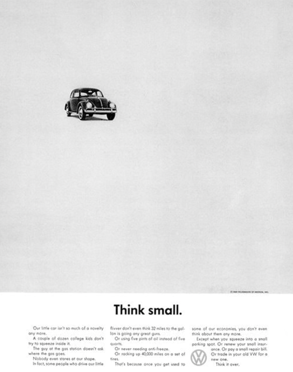 Scale is not a concept that I have thought about much. It is a concept that relies on juxtaposition, unlike other visual elements like shapes and colors that might be able to stand alone. On the other hand, scale is all about comparison. Something cannot be small or large by itself, only in comparison to something else, or in the case of this advertisement, compared to the space around it. The use of empty space to create scale to convey the message of this advertisement (“Think Small”) is very intriguing to the reader, who might expect a “normally” scaled car on an advertisement.
I also am really fascinated by color theory in general. There are so many different ways to analyze color, and though Dondis calls color a universal concept, I think it’s also very interesting to view color from different cultural or societal perspectives. I liked how Dondis further broke up color into three dimensions: hue (the color itself, i.e. red, yellow, and blue), saturation (the purity of the hue from gray), and brightness (from light to dark). Because there is so much variation in color, breaking analysis down into these three dimensions is very useful. I think the use of color is extremely prominent in branding and logos. For example, McDonald’s chose their colors of bright red and yellow precisely because they stimulate feelings of happiness and excitement.
-
Example Commentary
Here’s an insightful response to the assigned readings from Week 1 - etc., etc. If you edit this post in Prose and click the Meta Data button, you’ll see it’s been given the Week 1 tag. Readings for other weeks will show up as available tags too, as we get further along.
(By the way, here’s the url for downloading the open access edition of the book Digital_Humanities (PDF). It’s a very useful introduction to Digital Humanities: Open Access Version of “Digital_Humanities”)