[chxchen] Commentary 1: Dondis, Scale and Color
Dondis’s A Primer of Visual Literacy covered the fundamental aspects that we can break the analysis of visual design into. Out of the ones Dondis discussed, I was most drawn to scale and color.
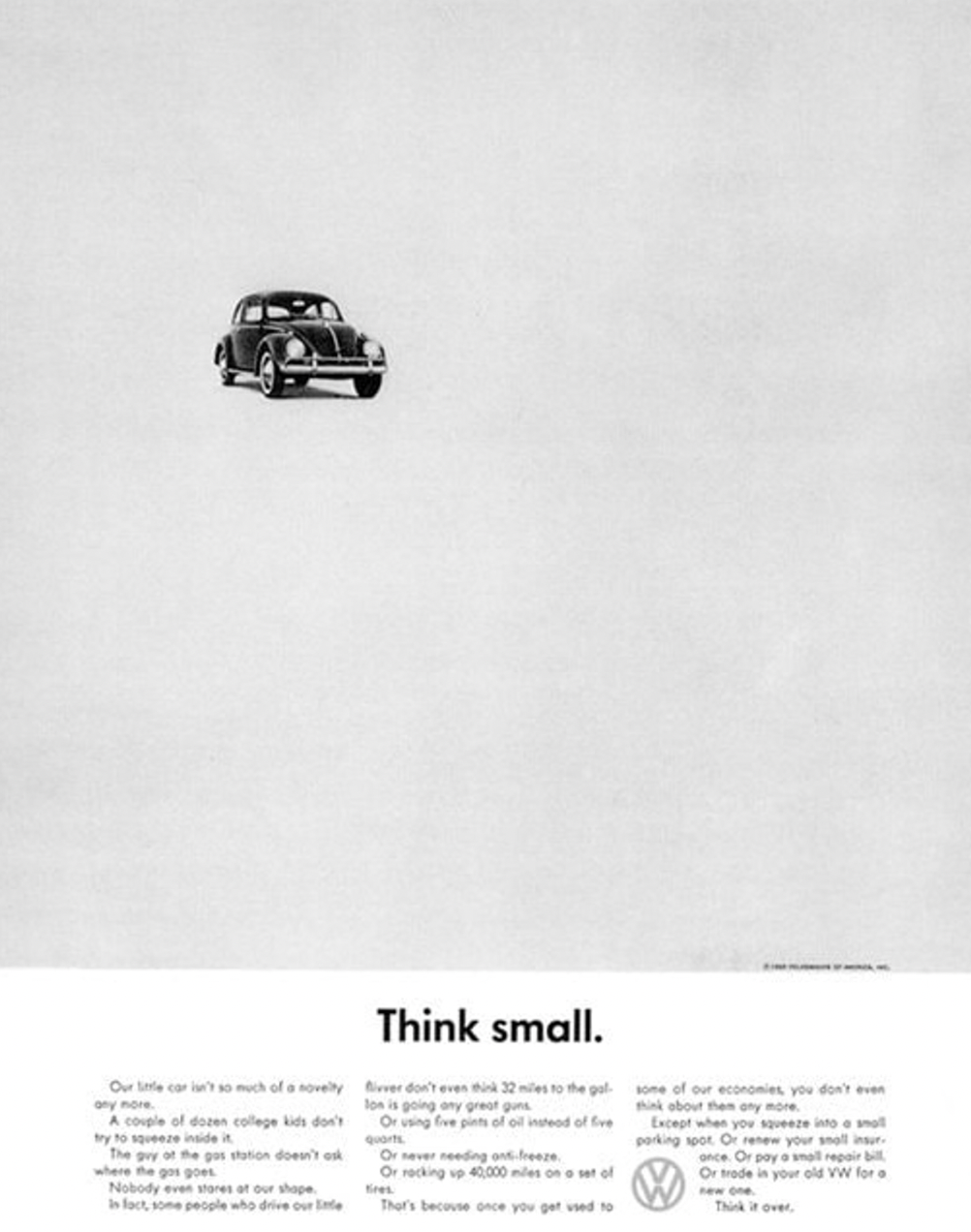 Scale is not a concept that I have thought about much. It is a concept that relies on juxtaposition, unlike other visual elements like shapes and colors that might be able to stand alone. On the other hand, scale is all about comparison. Something cannot be small or large by itself, only in comparison to something else, or in the case of this advertisement, compared to the space around it. The use of empty space to create scale to convey the message of this advertisement (“Think Small”) is very intriguing to the reader, who might expect a “normally” scaled car on an advertisement.
I also am really fascinated by color theory in general. There are so many different ways to analyze color, and though Dondis calls color a universal concept, I think it’s also very interesting to view color from different cultural or societal perspectives. I liked how Dondis further broke up color into three dimensions: hue (the color itself, i.e. red, yellow, and blue), saturation (the purity of the hue from gray), and brightness (from light to dark). Because there is so much variation in color, breaking analysis down into these three dimensions is very useful. I think the use of color is extremely prominent in branding and logos. For example, McDonald’s chose their colors of bright red and yellow precisely because they stimulate feelings of happiness and excitement.