Design Exercise One - Marina

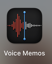
The logo for the voice memos apple app consists of just lines and two dots. The logo is essentially a snippet of a voice recording (upon further research the recording it’s modeled after is someone saying the word “apple” which makes a lot of sense). This is effective as one knows what to expect when they open the app - they are greeted by the same visual inside the app as they are outside. The red and white colors in the waveform show the progression of the wave which creates a sense of movement and vitality. The vivid blue line showcases a sort of “pop” indicating its lively/present sense as well. The app logo and the display inside the app are simple, intuitive, and familiar. To the point of the readings - multiple dots make a line (has a sense of direction and purpose) - here multiple lines still maintain a direction and purpose - they showcase a past, present, and future.
Reference: https://apps.apple.com/us/app/voice-memos/id1069512134