Design Exercise 1 - Isabel Báez
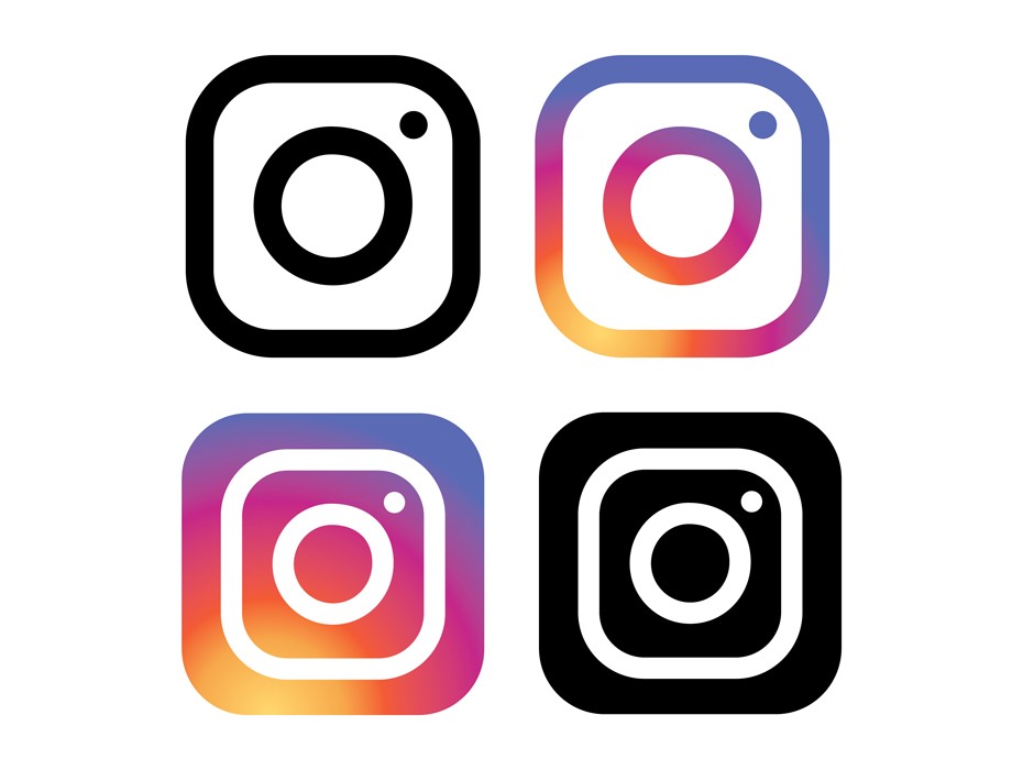
Instagram’s newest logo design is the most simple: composed of a series of colored dots and lines. This new simplicity gives it much more versatility and allows it to become more iconic and marketable. Regardless of its few components and their simplicity, it effectively showcases the image of a camera, which is a core representation of what the application does: photo and video sharing amongst millions of people. Instagram’s camera logo is direct, to the point, and effective in showcasing the company’s purpose.
There is the main circle in the center, which represent’s the camera’s lense, the dot in the corner, which represents the flash, and the enveloping rounded square, which represents the overall camera structure. We can also highlight the difference between the inverses of the design. When the lines are white and we have the black background, the design seems more compact. This illusion is similar to the one discussed by Dondis when it came to tones, how different uses of color can alternate the image of two identical structures.
The original design for Instagram was created in 2010, as a depiction of an old polaroid camera. It was meant to signify nostalgia and memories, and was therefore a nod to the past. Although the new design is still inspired by these values, its simplicity has allowed it to become more universal. Not all users used polaroid cameras in their life, or even remember them. Therefore, with the new logo, more individuals recognize the icon for what it is: a camera. This is an example of how the fundamental combination of lines and dots can elevate a design’s effectiveness.
Source: https://blog.logomyway.com/instagram-logo/