[chxchen] Assignment 1: Expressing Your Name
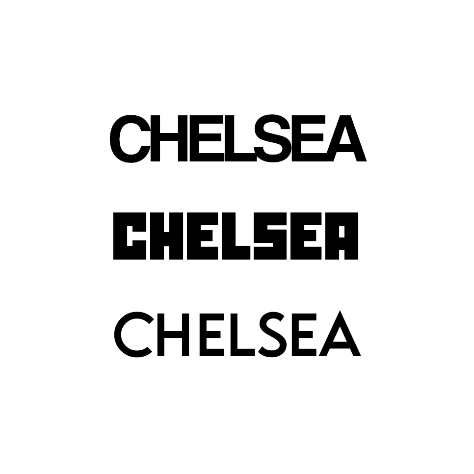
1. Helvetica: The first font I chose was Helvetica – when I first started gaining interest in visual design, I religiously used Helvetica (specifically with low font spacing). It’s a very simple font, but I think when used well it’s very clean and serves its function well, which I hope reflects myself.
2. Squarely: My second font is called Squarely and it’s a font I downloaded for a video game creating class last year. I love how the vibes of this font reflect a sort of indie/creative game, which I really enjoy.
3. Moonrise: My third font is called Moonrise and it’s the last font I downloaded to use in a thumbnail. I like this font because it looks pretty simple at first, but there’s slight variations in the height that make it interesting.