Design Assignment 2.3, Hanu Park
Final
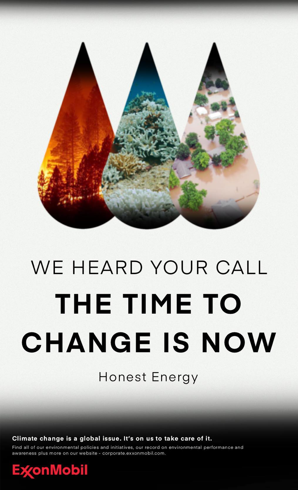
In my revision, I wanted to clarify the reason why I was targeting ExxonMobil. In my original ad, the point was too broad and could be interpreted many ways. This is not always a bad thing, but seemed out of place for the project at hand. Instead, I decided to pivot away from choosing an issue with such wide symbolism and narrowed down to a more specific criticism. I also severely updated the graphics from the last draft. I said I was going to lean towards more graphic illustrations for my revisions, but I changed my mind in order to challenge myself to handle photo-realistic graphic design better. Overall, I find that the finished product looks much more like an ad than my draft, and the mood of the ad matches the company overall.