Design Assignment 2.1, Hanu Park

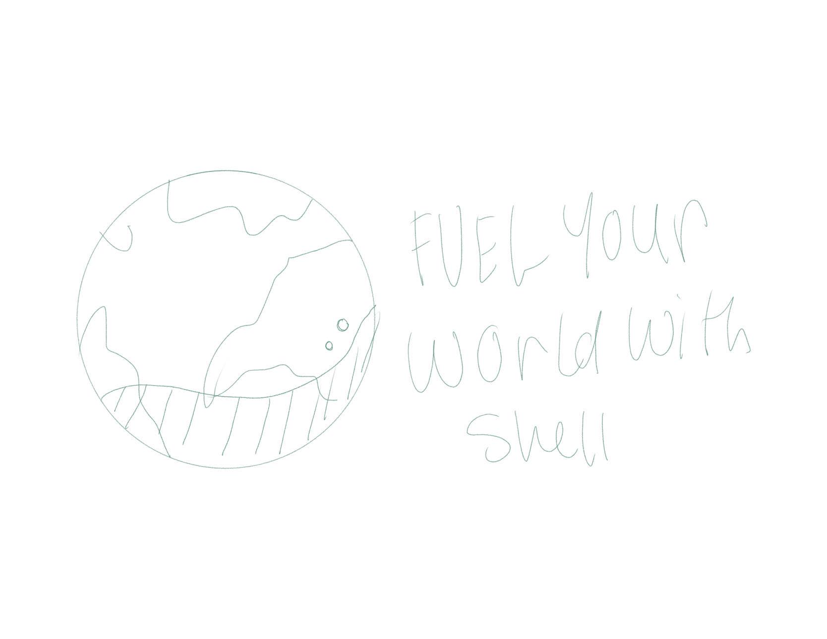
Again, I started with a simple sketch. In this draft I wanted to flesh out the ideas of why a consumer might actually believe this could be a real ad, and why upon closer inspection it’s not. I did not want to have a busy screen, since it’s supposed to feel corporate and polished, so I left out detail and texture that did not need to be there. This is especially true because I am writing for a fuel company.