Subversive Ad Revision - Meenu Singh
In my ad revision, I implemented some of the suggestions mentioned during class last time, such as bringing the logo further towards the top and increasing the spacing between the logo and text for greater emphasis, removing the white line.
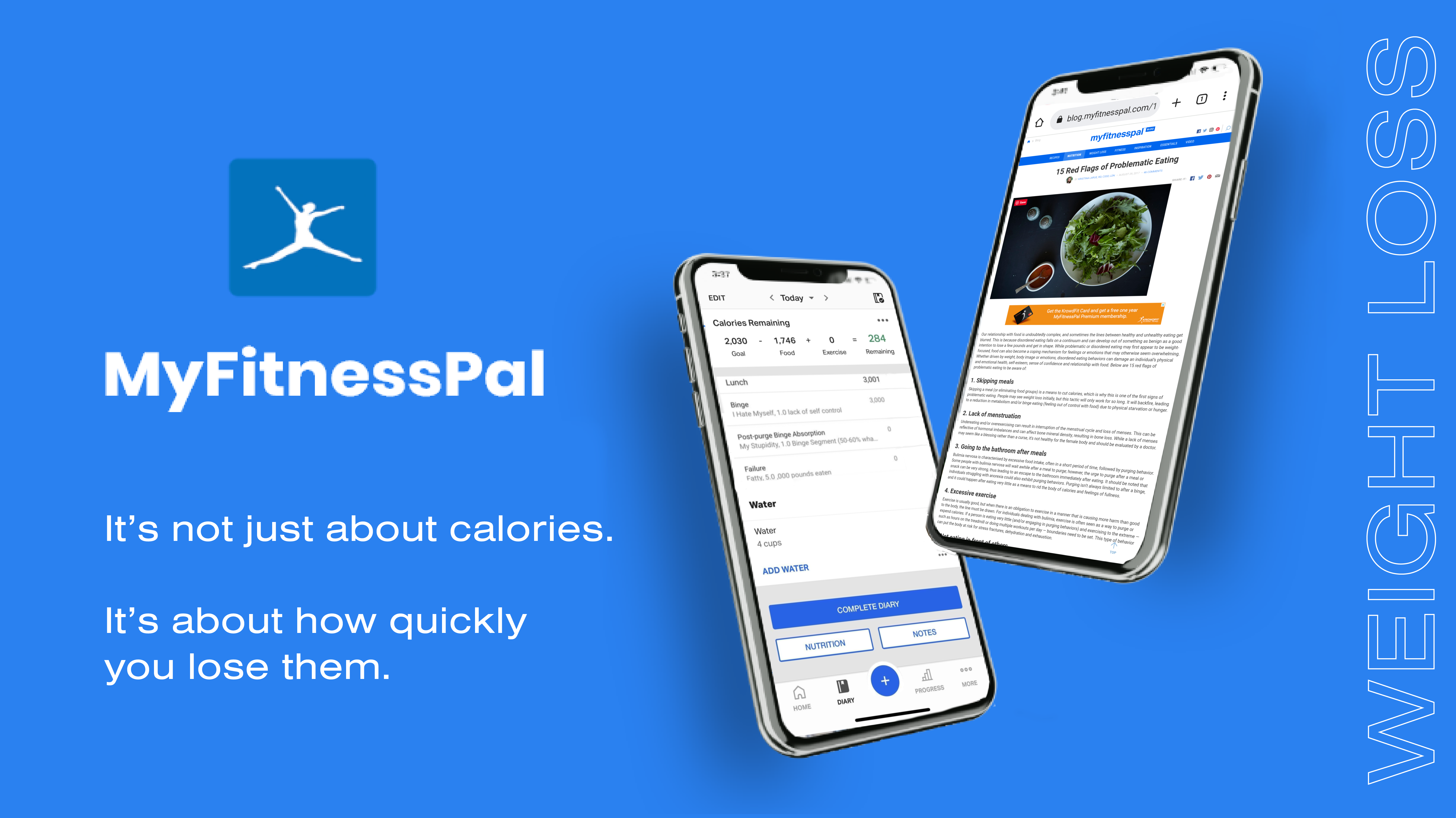
I wanted to make the connection to eating disorders more clear, so I changed the images on the phone screens to be more subtly pointing towards problematic eating patterns encouraged by MyFitnessPal. On the first phone, it shows MyFitnessPal’s eating diary, but I combined a regular diary entry with a more problematic entry where the user is criticizing themselves and speaking negatively about not meeting their weight goals. On the second phone, I have a picture of a user looking up eating disorders on myfitnesspal’s blog website.
Another aspect I played around with was the weight loss line on the right. I increased the spacing between letters so it would fill up the entire height of the image to look more dramatic. I played with a couple different option for the borders, but decided I liked the thin white border and the double meaning of the unhealthy weight loss nature of the app being something that you might initially miss, but it becomes more recongizable after you see it.