[chxchen] Design Exercise 1: MTA Map
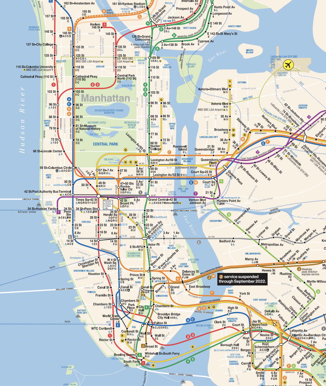
An example of an effective design that uses lines and dots is the New York City subway map (MTA map). On the MTA map, dots are used to represent stations, and their proportionality helps readers estimate the distance between them, similar to what Dondis states, as “Two dots serve as handy tools for measuring space in the environment or in the development of any kind of visual plan”. This is particularly important for a map as the distance proportionality is very important to readers in carrying out its function effectively. In addition, the representation of the dots as filled in or not also convey important information to the reader – express versus local stops. The contrast in color of the not filled in dots is more disruptive to the reader, representing the more disruptive stops that all trains stop at.
The other important component to the MTA map are the colored lines connecting the dots that represent the paths of the subways. These lines add form and direction to the map and intuitively draw the users’ eyes to some path. A line is a “dot in motion” according to Dondis, and these lines represent the motion of the subways while the dots represent the stopping. The texture of the lines is also of note – they are bold and smooth, suggesting the reliability and never ending motion of the subway system (whether this is accurate is another point). Finally, as Dondis states, the lines represent “the juxtaposition of two tones” – the lines stand out against the background of the map, juxtaposing the underground nature of subways versus the aboveground map.