Design Exercise 1 - Meenu Singh
Two Dots
 Source: https://images-na.ssl-images-amazon.com/images/I/51AbCN3UgJL.png
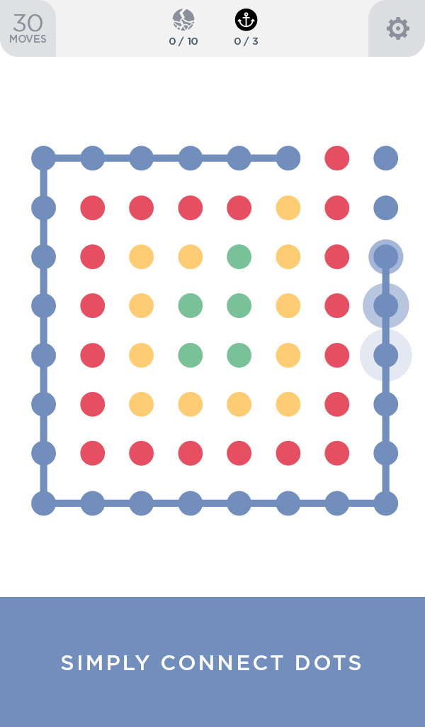
One of the first examples of effective use of dots + lines is the mobile game Two Dots. The entire premise of the game is to connect dots of the same color using lines. Many of the levels reflect and emphasize this premise through their design. There are no other obvious design features within each of the levels and so all of the user’s attention is drawn to the dots on their screen which are evenly spaced in a grid like pattern. When the user begins to make connections between the two dots, the other primary visual feature is revealed: lines of the same color as the dots you are connecting. The evenly spaced grid of dots conveys a straightforward message without any instructions necessary: connect the dots. The spacing between the dots invites the users to draw connections between them using lines. Overall, I think the visual design of this game is effective because it uses the basic graphical elements of lines and dots by relying on their simplicity to convey meaning and purpose.