Design Exercise 1
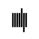
The MIT Press logo was designed in 1965 by Muriel Cooper. Cooper used seven lines to represent “mitp” as books on a bookshelf.

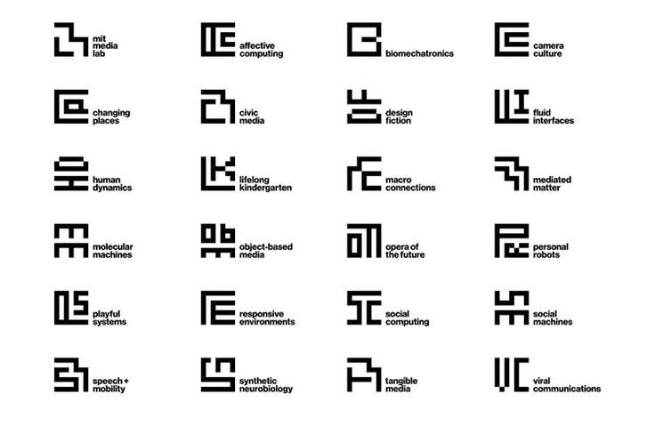
Cooper was also a pioneer of design at the MIT Media Lab. She designed the visual identity for the MIT Media Lab which also only uses lines and a tight grid system.

Only using lines, her designs feel contemporary and communicate the innovative yet interdisciplinary research of MIT + the MIT Media Lab.