Design Assignment 1.2, Hanu Park
Tentative Final
edit: Sorry, I forgot to upload my analysis in regards to the Dondis chapter 6 reading.
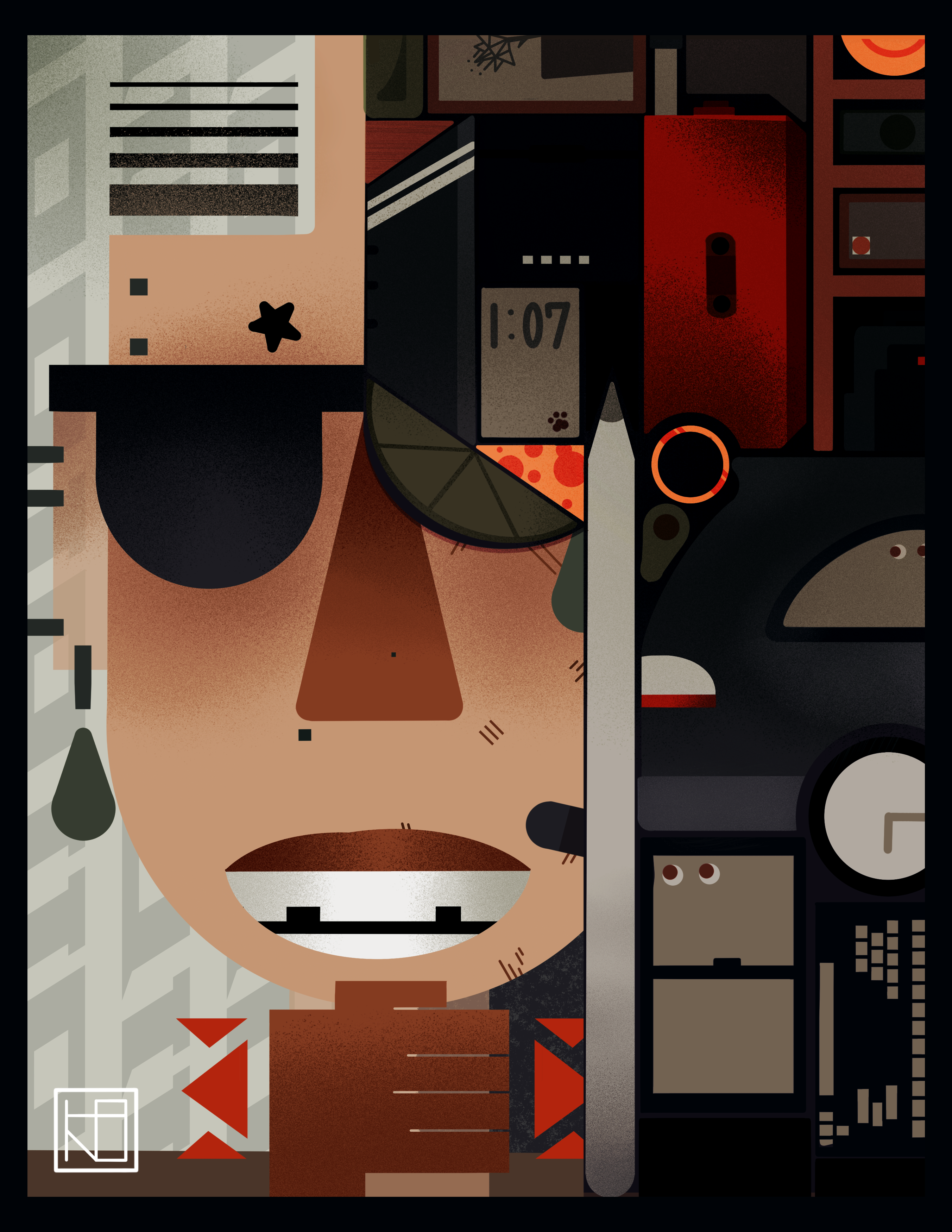
Balance
I talked about this a little in my 1.1, but I used the idea of balance in my self portrait to convey different aspects of myself. Having distinct sides, but necessarily symetry, serves to create domains of ideas on the page that compartmentalize different ideas.
Fragmentation and Unity
Within the right side, I fragmented the shape of the hair into different items that relate to me. I liked the idea of fragmentation within the hair form to create a unified shape. I liked the idea of Fragmentation because it would introduce a level of detail that contrasts the simplified left half.
Sharpness and Diffusion
Similarly to Fragmentation and Unity, I wanted to implement both ideas into the piece. The texture I added to many of the shapes looks like diffusion, but only within the borders of its own item. I like the way this looks because it adds texture to the piece. Examples of it can be seen on the suitcase and the upper left corner.
Flatness and Depth
As discussed before, I wanted to go for a 2D-3D look, similar to Kroger’s current branding. With the use of shading I feel like this effect has been achieved, but not in a way that takes away from the magazine cover flatness I was aiming for. For example, it can be seen on the car, the hand, and the teeth.