Commentary
-
Micro/Macro Readings
The examples Tufte gives in Chapter 2 of Envisioning Information all contain immense amounts of data. In the axonometric map of midtown New York, there are labels for ever single street/avenue, depictions of every building/tree/etc. When the viewer steps back they can maybe identify larger buildings, but mostly see a big picture of the layout of Manhattan, but then they can also move closer and see the individual buildings that are distinct from each other. Tufte points out that the micro/macro technique allows viewers to see all the data at once, instead of spread over multiple diagrams or pages, making it easier to draw conclusions and make comparisons. Viewers also have the option to look closer and see individual data points. When describing the stem and leaf diagrams, Tufte writes, “the same ink serves more than one information purpose.” The “same ink” shows the message of the data set overall, and also the individual data points and what they represent.
The Vietnamese Veterans Memorial example resonated with me the most. It was really interesting that the critical design decision to order names by date of death instead of alphabetical order made such a big difference in the way people interpret the memorial and information. Ordering the names by date allows the data to tell a story and gives more meaning to each individual name, while still retaining the impact of the immense number of names all together.
-
Tufte chapter 2- micro/macro
Macro design allows the viewer to have more freedom of interpretation, taking in an overall theme, concept, or data set that is conveyed well and easily understood (arranging blocks of text in a specific shape could be an example of this). The micro elements of the design are what allow the reader to dive deep into the nuances of the piece and have a more personalized and rich experience of the information presented (for example, using different textures, fonts, or clarifying text). If used together, these can make a design multi-leveled, profound, and complex; easy to navigate yet detailed and thorough.
One of the examples of effective use of micro/macro design that I found really interesting was the Vietnam Veterans Memorial in Washington D.C From a far, this piece looks like a black long wall with grey texture, however, when you look up close, you can discern the names of the dead soldiers that lost their lives during the Vietnam war. Both of these combine to display both the magnitude of the deceased and the individuality and value of each fallen soldier.
-
Tufte Reading Chapter 2
In this reading, Tufte discusses the principles and challenges of visualizing data complexity, particularly in a way that facilitates both a clear macro-reading and micro-reading. It seems that one key principle Tufte focuses on is the importance of properly organizing fine, complex detail to exhibit the overall picture clearly—”to clarify, add detail”.
We can see in the example of both the midtown Manhattan map (Constantine Anderson) and the Map of Paris (Bretez-Turgot), that the dedication to depicting cityscapes in precise, exquisite detail in an orderly way produces new opportunities for readings, as well as challenges/questions. Some new opportunities for readings include allowing readers to get an essence of the city at a glance (for manhattan, we see many high rise buildings and some greenery; for paris, we see more consistent heights of buildings and many waterways) as well as allowing readers to zoom in on the fine information in specific parks, windows (creating an opportunity for readers to develop their own personal stories about the data). Some challenges that come with the “to clarify, add detail” strategy include cost of time, resources, resolution, which are seem to be the tradeoffs with clarity of a design according to Tufte.
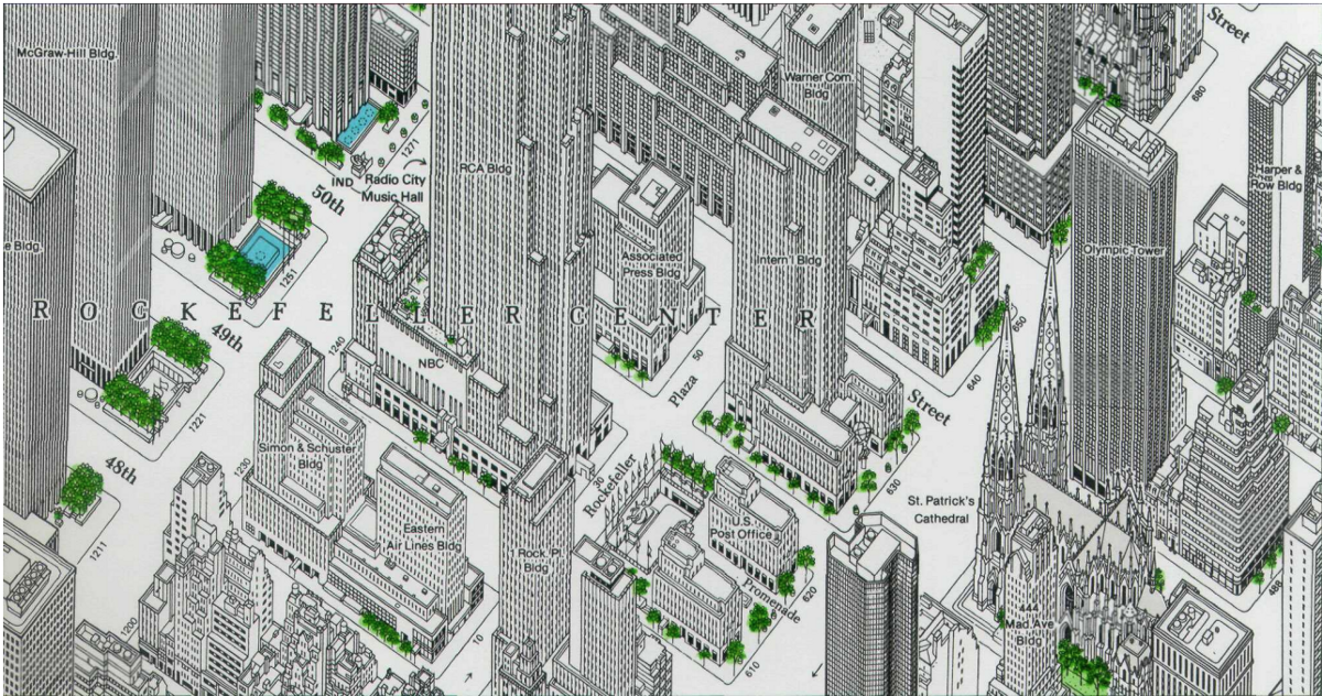
This also brings about questions regarding some assumptions that Tufte might be making about the viewers of the design. “High-density designs also allow viewers to select, to narrate, to recast and personalize data for their own uses. Thus control of information is given over to viewers, not to editors, designers, or decorators.” It appears that Tufte is in favor of sharing all the possible data in a clear, organized way with the viewer, and to make the viewer do the hard work of analyzing the information-thick world. Although humans have the capacity to do this work, I wonder is it always helpful to share the richest possible properly arranged data with a viewer, and when is it better to guide the viewer by not share every part of a high density dataset? (In the case of the manhattan map, is the fine-detailed map helping a viewer beyond providing an interesting, personal experience? what about if the viewer wishes to navigate based on this map?)
Tufte’s comments about how the simpleness of data + design ≠ clarity of meaning reminds me of his comments on chartjunk—Why does Tufte seem to prefer and find high densities of (well-organized) numerical data clarifying, but despises and find less numerical/more illustrative data extraneous and cluttering?
-
Smallest difference to the biggest impact
The main perspective that speaks volumes from this reading is how the smallest difference in design can make the largest difference in meaning. Maya Ying Lin’s Vietnam Memorial offers a powerful example. By listing the soldiers’ names alphabetically, their story doesn’t manifest as profoundly. Alphabetically, the memorial turns into a list, but by reordering, it gives families and visitors a better understanding. Hunting through names of a loved one becomes reminiscent of searching for a soldier on a battlefield, but you have zoom in on the names. Combining micro/macro features makes a kind of treasure hunt for viewers. There’s more detail to be uncovered, and more of a story to unfold the closer you look. Impressionists utilized this concept at the turn of the 20th century; the further away you are from their paintings, the more of an object you see. The closer you get, the better you can appreciate their brushstrokes and the detail of their paint. In the attached example, the art is an eye. However, a wedding tale can be seen within the pupil. This artist strives to tell Wedding Days using the eyes of guests. To Tufte’s point; a closer perspective offers another facet to an overall story. Howeverm like the map of New York, if you zoom out, the details fade away to the larger narrative.
 (Peter Adams-Shawn)
 -
Micro/Macro Data Complexity
Tufte’s primary argument in this chapter is to “add detail to clarify” for many types of data complexity. At first, this seemed to go against what we had read about chartjunk and designing to capture the essentials, but it was clarified for me when he wrote “Clutter and confusion are failures of design, not attributes of information.” I think the examples he examines lend themselves particularly well to this paradigm, but I don’t know if it’s always generalizable. For the maps he examines, because maps are fully continuous and the scale can be decided on, the scale and data labeled on it can always be chosen to capture as much data as possible without being overwhelming or cluttered, and we see this executed really well in the Tokyo mesh maps. This technique also works really well when the data points cannot be summed up or summarized, such as with the Vietnam Veterans Memorial, where every name is a full life that was lost, so simply laying out every single one communicates scale without trivializing any soldier. While all these examples use the principle well, I worry that the advice is misleading because often it is hard to create a data-rich visualization while also communicating a specific point. If the data is just being published for wide use and can allow interactivity, detail is incredibly useful, but often data visualizations are made to communicate a specific idea which can be lost in high levels of detail. Still, this point is important to keep in mind to ward off instances of over=simplification, and make visualizations as dense as makes sense for every given story.
-
micro and macro
In this chapter, Tufte discusses an unconventional approach to improving fidelity of information design: “add detail to clarify.” This principle challenges the age-old adage of “less is more” which assumes that the effectiveness of a design hinges on its readibility, which in turn means simplicity. Tufte’s argument, however, is not to uncritically cram more information onto a graph - resulting in designs which are confusing and unreadable – but to thoughtfully integrate details into the larger purpose of the design. As he eloquently states in the chapter, micro information “provides a credible refuge where the pace of wisualization is condensed, slowed, and personalized”. The power of micro/macro design is its ability to contextualize the micro reading in the macro reading. He provides a series of examples in the chapter. The first one of which is an intricate drawing of New York City where even the individual windows on the skyscrapers are painstakingly laid out. This design is still recognizable from a distance, hence a macro reading. However, upon closer inspection, personal narratives may be interwoven into the minute details of the visual design – the line of sight from your 23rd floor office window to the St. Patrick’s Cathedral, the feeling of being engulfed as you stand on 49th street past the NBC building. These are all stories which can be read into the micro information of a micro/macro design. He further discusses the infamous Vietnam War Memorial. From a distance a seemingly granite slab with blurred gray etchings, the names of each casualty in the war may be inspected upon a closer look.
This principle introduced by Tufte is especially effective in the realm of map design and can reason why tools such as Google Maps have become so embedded within our digital landscape, deftly interweaving the macro design of maps with micro information.
-
Effective Embeddings of Micro and Macro Designs
In this week’s readings, I’lll be focusing my discussion on Chapter 2 of Edward Tufte’s “Envisioning Information,” which delves into how effective micro and macro designs help to enforce both local/global comparisons. One particularly powerful example I resonated with was the Vietnam Veterans Memorial – having visited it in the past with my family, Tufte effectively put into the words the underlying feelings and sentiments that I had when seeing it for the first time. For example, the memorial is a powerful reflection of leveraging both effective and macro design. From afar, the black granite yields a physical manifestation of what 58,000 soldier deaths equate to, whereas close up, the broad sweeping granite resolves into individual names – with each soldier having a contributing and individual mark. The intentionality of having the downward gradient also aids in the metaphorical meaning, with the names of the dead rising “higher and higher.” Another interesting point Tufte discussed was the notion of how “clutter and confusion are failures of design, not attributes of information.” In a previous reading, one of the questions I asked was whether there was a limit to the number of dimensions that could be effectively mapped. Based on these readings, Tufte would likely argue that no dimension is too hard to map, and that a desire to display multi-faceted complexities is deeply embedded into the social fabric of human connectivity. This can also be seen in Shinkansen graphical time-table, as despite looking extremely convoluted at first, the creators were able to convey the highly complex structure of the railroad system as an aggregate of systemic patterns (as seen upon a close micro viewing).
-
Tufte Chapter 2
I was fascinated by what Tufte writes on page 49: that all the micro/macro designs presented in the chapter so far strained the limits of printing and the threshold of what the human eye registers. One advantage of such boundary-pushing visuals is to make the “information-thick worlds” (50) in which humans live accessible and manageable—or if not manageable, then measurable. Every window in the chapter’s opening New York map example can be visually registered and counted, if one were so inclined. Even someone who looked out at that self-same view from some imagined skyscraper window all their lives could not aggregate the data of windows’ number and position. If visual memory is weak, as Tufte says, then these micro/macro examples present memory condensed, all present at once—and somehow making that vast amount of simultaneous information intuitively readable.
-
Tufte - Chapter 2 Commentary
From our reading this week, I would like to reflect on the design of the Vietnam Veterans Memorial. At first glance, it’s just a list of soldier names, but the more I understand the concept, the more I love it! It is an excellent example of how to depict micro and macro details. The macro story is manifesting in the massive structure of the memorial. That vast number of names shows the soldiers that this country had lost in a war. The extended design depicts the duration of the war and the chronological order in which these men were lost. As a visitor, walking along the structure reminds us of time and how many soldiers were lost during the duration of the war. For a macro experience, visitors get to read the names of those soldiers, connect with them and relate to the time they lost their lives. I saw many photos of families pointing at the names of their lost ones and connecting with that memorial. It serves as a living structure of the cost of wars, but also, some people feel proud for the sacrifice their loved ones made for their country.
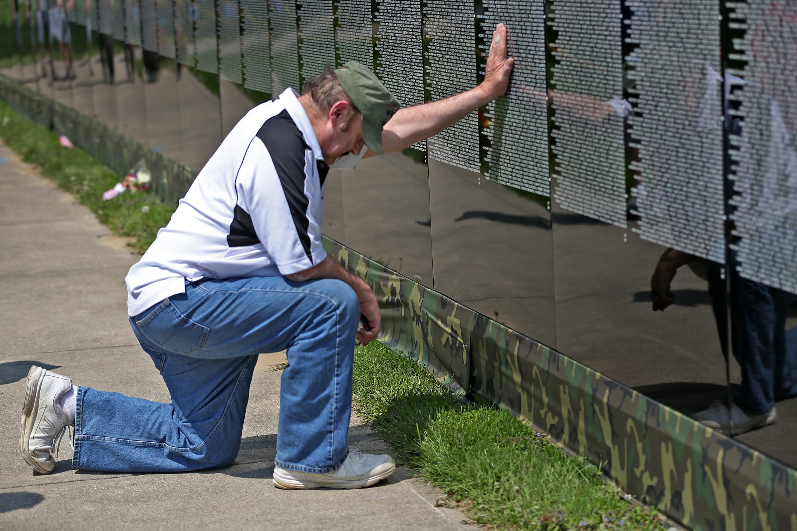
Other aspects that contributed to the macro experience of the memorial are the locations and material used. The site is close to other essential monuments giving this structure significance. In addition to that, the material is shiny and reflective, reflecting the other important structures nearby, making them part of the design. I also feel the reflection of visitors on the stones when mirco reading the list provides a personal experience and connection that is special to each visitor.

-
Tufte Ch. 2
For this reading, Tufte analyzed micro/macro readings and data complexity. I found the examples extremely interesting as Tufte used them to back up his point about complexity not detracting from the design’s legibility.
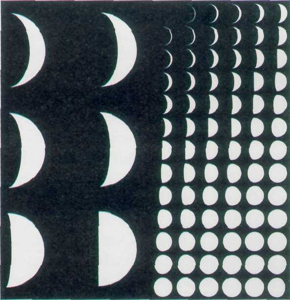
One of the examples I would like to bring up is the Lunar Phase Poster. It depicts an interesting comparison between the boiled down version on the left and the more complex data of the moon’s phases on the right. As Tufte mentioned in the reading, the complex data actually contributes to a better understanding of the moon’s phases. Oftentimes, when we look at data like the simplified moon phases, we lack the full context of information and have to make our own implications. This increases the chance of inaccurate information transmission. The more complex depiction also allows us to clearly see how the moon slowly phases in its different stages. I found it helpful to see multiple small images of the changing moon instead of just six large moon phases. With the six images, I felt it overly generalized the moon phases. Another interesting point to consider though was whether or not the simplified version was more readable to the audience. I agreed with Tufte’s point that “simple” does not immediately mean better readability. In the case of the moon phase example, the simplified version was actually less readable in a sense since I wasn’t able to immediately know what it was trying to convey. However, I think that simplified designs can sometimes be better than complex data displays. It depends on how efficient the complex data is displayed in order for us to have the greatest effect. If used without a clear sense of organization, the loads of data can create clutter, such as the names on the Vietnam War Memorial (if alphabetical, there would be many people with the same names which would be confusing).
-
discrete vs continuous
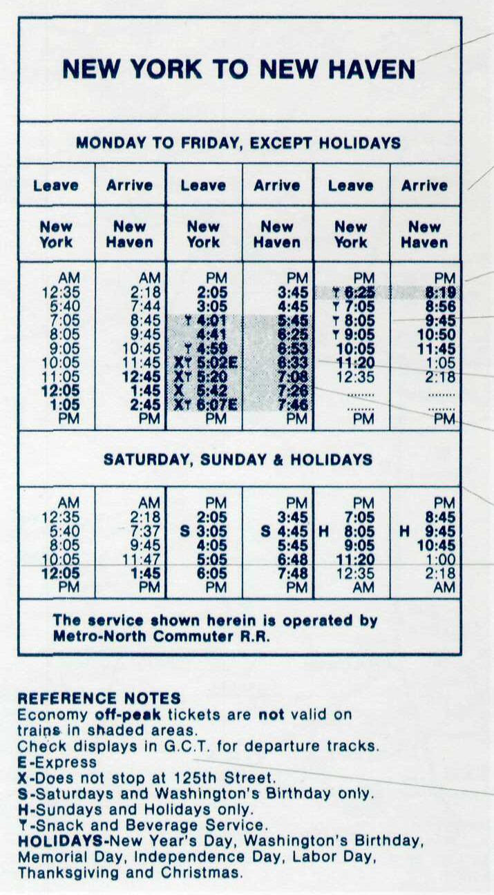
In this reading, Tufte dives futher into exploring the potential of visual design to transmute the narratives of space and time. What I found to be especially interesting is dichotomy between discrete and continuous conceptions of information. He begins the chapter by discussing the findings of Galileo, wherein discrete observations of stars surrounding Jupiter were docuented. However, despite the intelligence of the astronomers of the time, the leap into constructing a continuous narrative of planetary movement was not pioneered until over a century later. This brings into question the element of tension between discrete and continuous data, and how traversing the axis of these two affects the narratives we tell in information. Tufte further explores a series of train schedules. The first, is a table of discrete information only having information on the arrival and departure of a train between New York and New Haven. He discusses the shortcomings of this design, and presents versions which have improved on this framework of displaying discrete times.
However, a graphical timetable is also presented wherein the train schedule is stretched along the physical geography it traverses, deftly stretching the narrative of train movement into three dimensions.
Questions:
1) In the examples brought up by Tufte (ex. planetary movement, choreography, train timetables), is the use of discrete data or continuous data more effective in “envisioning information” and creating a narrative of space and time?
2) Is having a graphical aspect of design generally helpful for envisioning information? WHen is it not?
-
Tufte Chapter 6 Comments and Questions
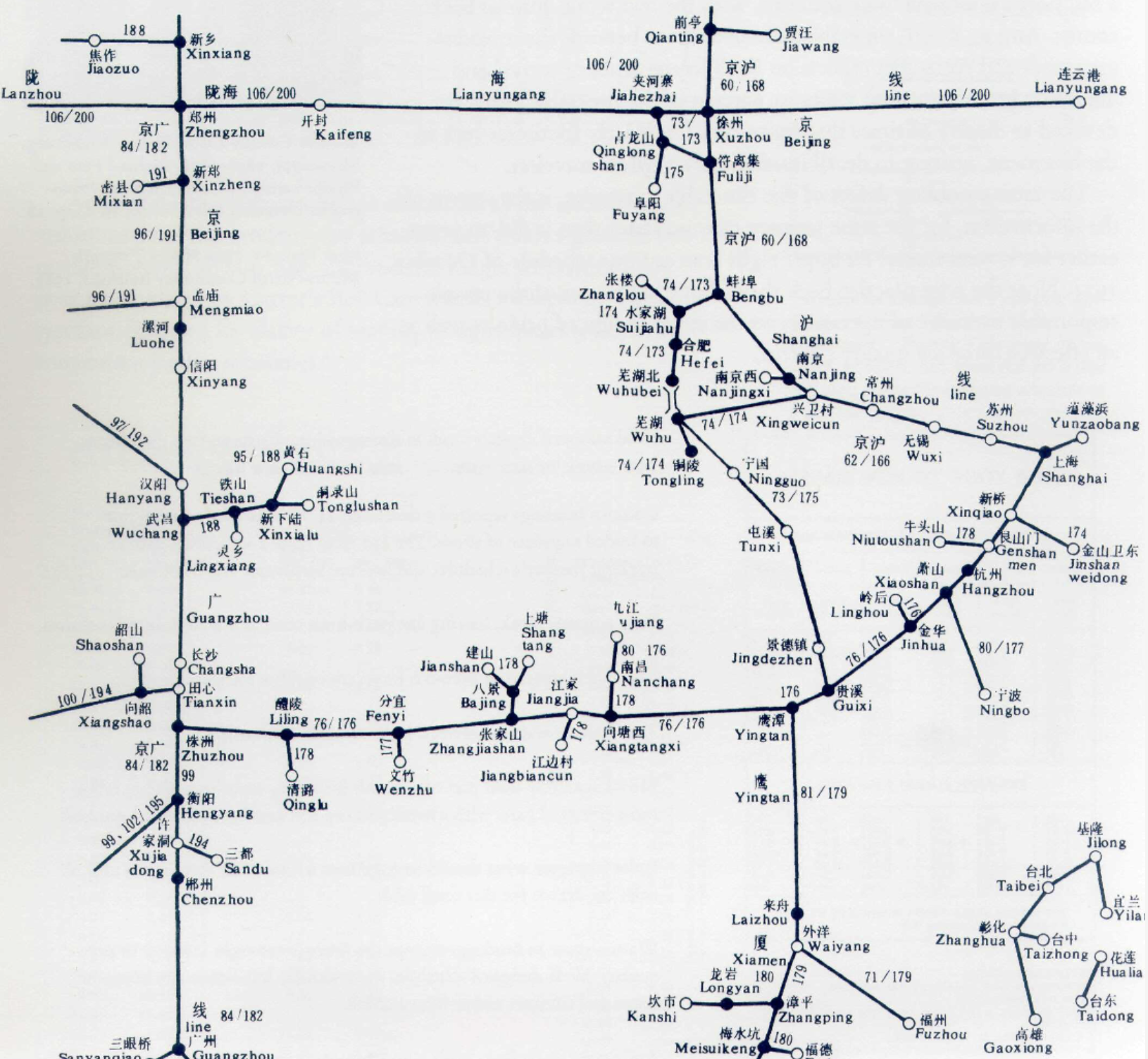
In this reading, Tufte discusses how space interacts with time, using particular examples of various transportation schedules. It is interesting how Tufte uses timetable design to illustrate his points about envisioning data, but it makes a lot of sense to use the example of timetable design given how timetables usually include large amounts of dense numerical and spatial data and figuring out how to organize the data for a general audience. I was really surprised by the design of the 200-page timetable for the railroads of China—particular to the designer’s dedication to maintaining the full spatial relationships of the towns. Looking just one page at a time at a section of the railroad routes, the lines that connect various stops make the map seem very clearly organized and it appears helpful to have the distance between each stop actually reflect the real distances in China.
Questions:
However, I wonder if we consider the general every day user of a train timetable in China
1) Is this dedication to preserving the spatial relationship/directions actually helpful for navigation (since train riders probably care more about the number of stops than the exact direction and distance between stops)?
2) This also brings about the question about the tradeoffs for when is it worth it to accurately display the spatial relationships (eg. using 200 pages to illustrate the railroads with very fine accuracy) vs. when is it okay create a design that gets the overall point across for time/space relationships without being very granular?
-
Tufte - Chapter 6 Commentary
I was most interested by the narrative aspect of depicting time; from Galileo’s moons to the graphical train schedules, each diagram tells a story about the intended or normal operation of movement over time. In “flatland,” all moments are simultaneous—all continuous and reliant on the previous moment’s accuracy. (Obviously more true for planes and trains than, say, moons…) How does narrative storytelling enhance the authority of these designs? The “visual instant” as Tufte calls it includes many normative assumptions, most strikingly to me in the example of the dance step diagram: prescritpions of correct movement and timing are present, but so are prescriptions for dress, for the gender presentation of the two partners, of how to wear your hair and hold your body. Clearly many of those prescriptions are outdated, but it made me wonder, what other subtle prescriptions and ideologies are baked into graphical representations of time? Or instance, the efficiency and expedience of the train schedule prescribes that one should move between metropolitan areas, rather than any other kind, and move with the greatest speed possible toward another urban center, thus establishing priorities of time and emphasizing cities as areas of activity and movement.
-
Tufte Ch. 6 Comments
In this reading, Tufte discusses space and time. From this chapter, I gained a few new insights about the time/space relationship. Tufte presented various examples of designs where movement over time was expressed. This showed how space and time can be depicted in such different ways: either segmented out in a grid time table, continuous movement of a line, and abstract zigzagging and representations of movement steps. Movement becomes an abstract concept that can be translated from the 3-dimensional world to the flatland design while maintaining the transitions over space and time. Another interesting thing I noticed was how the depictions often had to visualize something that we do not necessarily see in the same way normally. For example, in the dance notations, the figures are limited in their space. They are frozen as an illustration, but simultaneously, they are used to show something that translates over time. The lines in the drawing on the “floor” track the dancer’s movement, but it is a different visualisation than we normally see in real life. While we see a dancer’s body lines and shapes in the 3D world, the notation diagram breaks it down into a series of lines and symbols.
Questions:
-
How must designers consider balancing accurate depiction of movement versus visual aesthetic? For example, in the New York to New Haven timetable, there is a difficult balance between being straightforward to viewers while also avoiding ambiguities.
-
How are symbols integrated into the designs to fully convey space and time (like movement)? What leads designers to use these symbols and how do we ensure that the viewer understands it? I found it appealing to look at the dance notations, but it would require more information for me to fully understand it.
-
-
Exploring Narratives of Space and Time
This reading on Tufte discussing narratives of space and time, and I found it particularly useful for clarifying how to work with them as graphical dimensions and providing various examples of interesting ways of using them. Because it was the most applicable graphical combination, Tufte focuses a lot on timetables, which are interesting because they are so ubiquitous they are almost taken for granted. Yet, by comparing many different ones, we can see that a lot of them ignore or collapse space, often to the detriment of the visual appeal. Tufte picks apart an overcomplicated timetable, and the side by side clarity with the better designed version makes it clear that good design can help untangle these dimensions. I think the most interesting timetables examined were some of the ones that didn’t collapse space, and instead depicted time on one axis and space on another. These maps of space-time are really cool conceptually, and I feel like they offer a lot to explore in terms of design spaces, so I’m excited to think more about them and potentially utilize their ideas in our final project.
Questions
- Do visual representations of things like time fundamentally help viewers think about the information differently? Would a different set of metaphors or starting concepts applied in creating a visualization lead to a change in the way the viewer thinks about it?
- Are there new ways to encode more information into the same amount of space? Is this a thing that technology or culture can improve on or is it inherent to the brain?
-
Applications in the Narratives of Space and Time
In this week’s discussion, I’ll be talking about Chapter 6 of Tufte’s Envisioning Information, focused on the narratives of space and time. One of the more intriguing elements of this chapter was on the discussion of how certain design elements can contribute to an effective or not effective timetable. For example, Tufte hones in on the challenge of developing these timetables – given that they contain large arrays of “fussily annotated numbers, thick information densities, type and image together, and multivariate techniques for narrating what is a four or five variable story.” As a result, there is a dire need to provide an intuitive and self-interpretable format as seen with the China Railroad Timetable and Czechoslovakia Air Transport Company Schedule. Both of these designs use a simple arrangement of circles and lines to deconvulute a mass array of information. In contrast, the New York to New Haven Timetable serves as a negative example of timetables, with a lack of purpose in the distribution of space and efficiency in the display of information. This goes to show that even data that isn’t “chartjunk” needs to be displayed properly, and utilize principles rooted in design and dimensionality reduction. Two additional questions I had from the readings are 1) The author mentions the power of having “the same picture, but many stories.” How do we strike a proper balance between having a clear cut and guided narrative itinerary without offering too much room for interpretation (to the point that it detracts from the desired underlying message). 2) Is there an upper bound to the number of dimensions that can be effectively reduced and convey in a time-table? It seems that as the number of dimensions increases, the barrier to understanding also tends to increase proportionally.
-
Questions from Tufte's Chapter 6
What elements learned from Dondis techniques for visual communication make dance notation so effective and in what ways do they aid in the representation of space and time? (Depth, activeness, symmetry, balance, etc.)
How do we go beyond representing a range of motion to representing a specific trajectory in a static image? In other words, how can we clarify direction and/or start and finish?
-
Narratives of space and time - more is more?
In Chapter 6 of Envisioning Information, Tufte gives many examples to show how movement can be represented in the flatland. The corkscrew diagrams of Jupiter’s satellites provide much more information than a column of Galileo’s discrete illustrations of the satellite positions, since the satellites are constantly moving, so it makes sense that their movements would trace a continuous line. I found the redesign of the New York/New Haven train schedule extremely informative and really demonstrated how design elements can make data more easily digestible. Tufte points out each specific design failure in the original timetable, and corrects them in the redesign. What other elements of visual communication from Dondis could we apply to the timetable to make it even more effective?
I thought it was very interesting that sometimes showing just a little more information can make it easier to understand a graph, such as the example of the Chicago/Atlanta airplane schedule, in which the two edges of the graph overlap in time, so that the viewer can see a complete day of travel no matter when they begin. It makes me wonder why there are not more maps that repeat elements to show each country in its entirety.. maybe because most maps are extremely eurocentric. It was also interesting that sometimes making information too dense to decipher can be a useful design choice, such as in the example of the Hoboken/New York bus schedule, where lines that are too close to distinguish tell the viewer that the bus is extremely frequent and that they need not worry about the exact times the bus arrives or departs.
Personally, I found the graphical representations of dance movements all quite difficult to understand, probably because it is so hard to document all the possible ways the body can move and I was overwhelmed by the amount of graph-specific notation to remember. I think that dance movements and routines can potentially be effectively represented in conjunction with music by 3D models (either physically or digitally), but I wonder if there is an optimal and not cumbersome way to show dance and music together in the 2D space.
-
Tufte's Color and Information
In Tufte’s “Color and Information”, he highlights a few rules for good practices in design all revolving around the use of color. These rules focus on conveying information in a way that is effective and easy for the reader to comprehend and find visually pleasant. One of the quotes that stood out to me during the reading was “so much visual excitement, so little data” when describing ineffective/excessive color usage, ehich is exactly what we want to avoid.
I never really though about the effectiveness of grey backgrounds, but when thinking of Tufte’s first and third rule of using bright colors with dull background tones (as opposed to having multiple bright colors next to each other clashing) I realized that it produces really effective results by conveying only the data that is important. The second rule also relates to this in terms of how separating bright colors with white only makes the contrast worse by emphasizing their contrast.
All of Tufte’s rules seem to relate back to visual cohesion. For example, the fourth rule communicates how having large enclosed areas of two different colors breaks up the image. However, if these different colors are intermixed, the message does not get lost. This goes hand in hand with the use of gradients and value scales, especially in maps.
-
Tufte Chapter 5 Color and Information
Reading Tufte’s chapter on “Color and Information”, I think Tufte makes a really interesting point when he lists the two requirements which would make using multiple signals effective (ie. the need for it and the appropriate choice of design technique). This framework for deciding when to use multiple signals to encode the same information would be really helpful to apply to our own designs, not just for mapmaking. Just looking at the examples, it seems like the strategy of multiple signals can create a really sturdy design/communication but at the same time has the potential to go too far and clutter the design space. These ideas reminded me of the Spiekerman reading on typography. Similar to how it is helpful to use different types in order to convey different meanings or personalities but to keep in mind that too many different types can be visually confusing, too many different colors and signals may work to communicate more ineffectively. Additionally, when Tufte discusses Byrne’s colors in “Elements of Euclid”, especially when he talks about using 4 colors that provide maximum differentiation, it also reminded me of the Spiekerman reading and readers were able to match different fonts with different shoes/personalities.
-
Tufte and Color
I love the idea that Tufte puts forward at the beginning of this chapter about color as measurement—that something about the intuitive human sensitivity to color allows us to use it as a system of measurement. Rather than dealing in simply color-coded absolutes, like in Burnham’s simple map on pg. 4. Although I’m not consciously aware of the hue, saturation, and value inherent in every color I see, the contrast between two different shades of blue or intensities of the same blue has an immediate, tactile effect. Tufte uses the word “enliven” to describe colors’ effect, and I think that’s as good a word as I can think of: there is a living, dynamic sense to the intuitive understanding of color that can support and enhance more “flat” data.
-
Color & Information Tufte Ch. 5 Commentary
In this excerpt from Tufte, we explore the different uses of color and how it holds information. It was interesting to learn about how best practices evolved based on the effectiveness of the design. Many of the best practices seemed to center around the idea of making something easy to process and creating a sense of balance. Examples like William Henry Toms after Thomas Badeslade, Chorographia Britannica or, A Set of Maps of all the Counties in England and Wales . . . (London, 1742), plate 18 and Thomas Badeslade, A Compleat sett of Mapps of England and Wales in General, and of each County in particular . . . (1724), pen and ink, and watercolor on vellum, leaf 35 (recto) contrasts various practices and highlights the development of effective color use and theory. In a way, this reading reflects our past reading by Dondis where color was discussed as something that could carry meaning and represented something. In the examples here, color is a carrier of information and depending on its application to the design, it can make it easier or harder for the audience to process the information. It was also interesting to explore the criteria of failure when using color, where generally, if colors overwhelm each other, it is a failure. Tufte discussed the importance of context for color as the way we view a color changes with its surroundings.
-
Tufte Ch. 5 Commentary
In this week’s reading, Tufte talked about color and multidimensionality. This relates directly to our Dondis reading. They both emphasized how color is a practical element in visual design to portray more dimensions to objects, paintings, or data. Tufte supports this by providing an example of a scatter plot with clusters of different colors. Without the colors on that flat plane, we couldn’t have noticed the groups the emerged in the dataset. Another aspect of color is the variations it provides through the different hues and tones. However, according to Tufte, this is not an effective tool used alone. He suggested using other cues in addition to colors such as size or shape to make the variations more visually powerful and precise.
-
Color Context
One point Tufte makes that stands out is arranging colors so they trick the eye. In his example of a brownish square looking like deep gray due to it’s proximity to white, he highlights just how easily color can trick us into seeing or missing details. On the flipside, the same color can look extremelty different or carry different meaning based on its surroundings (as seen withh the blue squares). This resonates because it’s easy to think of changes in color or hues as isolated. However, depending on the surroundings or context of that color, it can vary in its delivery of information. The “harmony” of the main color of an image can altered by the context it’s been placed in.
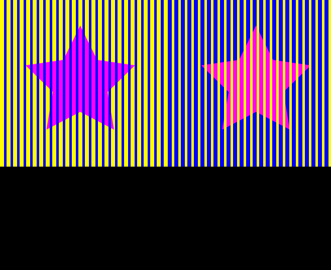
This gif reveals just how defining a color’s surroundings are. Despite the two stars being identical, they look very different from one another. This is important because in application, the designer must not abstract colors out of their design but think about the entire piece’s color unity. Tufte mentions screen vs. paper. The same pink star on a stark white background versus a pink star on a toned-down screen background may bring different meanings to a viewer. Thus, we need to take context of the design’s color into consideration.
-
Fundamental Uses of Color in Information Design
In this week’s discussion, I’ll be discussing Chapter 5 in Tufte’s Envisioning Information. In particular, he focuses on the fundamental uses of color in information design and how it can aid or sometimes detract from the aims of a piece. For instance, one particular example that stood out to me was the General Bathymetric Chart of the Oceans, which conveys ocean depths and land heights in 21 steps. Rather than making a statement about the color solely, it serves as a clear statement about the geography with every color mark serving a purpose (ie. to communicate attitude, longitude sea or land, and depth or altitude). This resonates the central principles found in the Dondis readings, where color has the ability to “separate worth informationally through symbolically attached meaning.” Interestingly, Dondis also focuses on how colors have a strong emotional affinity for each individual, and I’m curious whether Tufte would consider these emotions to detract from the aims of a piece aimed at conveying very logos-focused pieces. On the flip side, Tufte also points out how color in the wrong context can result in a “failure” for design. For example, he cites Oliver Byrne’s 1847 edition of Euclid’s Geometry, which he argues the reader spends too much time “puzzling over an alphabetic macaroni of 63 encoded links” between diagram and proof. This points toward a broader discussion of properly conveying one’s desired goal when incorporating both text and images, which is what we saw in Chapter 6 of the McCloud readings. McCloud focused on categorizing how to best incorporate text and image, and how an additive combination approach can better serve to amplify the desired message (rather than in Byrne’s case, where the texts and mathematical symbols fail to synergize). Finally, I also found Edward Imhof’s discussion particularly interesting, with regard to the 4 rules governing the role color plays in cartographic science. It echoes much of what we found in Dondis’ visualizing information where form is very much affected by content and content is affected by form. It also raises the question of how universal his rules are, and whether there is a certain degree of interpretation or subjectivity involved?
-
color and information
In this reading, Tufte incisively discusses the capacity for thoughtful use of color to effectively capture information in design. Similar to Dondis’s analysis, Tufte describes how color choice impacts the overall message of a design, however, does not delve into the intricacies of Dondis where they describe the effect of changes in hue, saturation, brightness, etc. Rather, the core of Tufte’s argument is that, “The fundamental uses of color in information design (are): to label, to measure, to represent or imitate reality, to enliven or decorate.” He structures the chapter by going through principles established by Eduard Imhob in Cartographic Relief Presentation. The first two principles discuss the minimization of color damage by avoiding color clutter, where bright and light colors are placed closely adjacent to each other. The use of loud colors overwhelms the viewer and adds noise to the design, harming it’s ability to effectively communicate with the audience. Tufte points out that the use of primary colors with neutral colors is therefore especially effective as they provide maximum differentiation. The third principle describe the use gray in design as it is “the prettiest and most versatile of colors” highlighting brighter colors and consequently highlighting information.
-
Color and Information Best Practices
In the Dondis readings, he laid out the fundamental elements of visual design, of which color was one of many. One of the issues that Tufte addresses is that often, color is added to data visualizations for its own sake rather than having a specific purpose which obfuscates the data. As with the notion of chartjunk in other manners, I enjoy Tufte’s ideal of purpose behind all visual aspects, including the choice of color and inclusion of color itself. I also think the focus on contrast was important and pairs well with Dondis’s comments on it, as without thinking about how the colors play off of each other, a whole piece can be noisy or jarring. While there are many different ways to make a successful piece, there are just as many ways to fail, such as by picking colors or a palette that are jarring when next to each other, or by not having enough contrast when color-coding, which can make it hard to extract information from a piece. In terms of artistic background, I enjoyed the comparison to Mondrian pieces, but I think there is inspiration to be drawn from many different art movements, some with more radical choices in color and shape that could still be made pleasing to the eye. While I think nearly all of Tufte’s advice is good, one drawback I see is that a lot of his advice is very prescriptivist, which homogenizes the work of the designers who follow him. While this may result in well-crafted pieces, it also makes them less interesting than those who try something new and are constantly pushing the boundaries.
-
Envisioning Information
In chapter 1 of Envisioning Information, Tufte describes the challenges of representing multi-dimensional (more than 3 dimensions) information in a “flatland” or 2D space. Some strategies he provides for making this task easier include using symbols/icons to compress more data, and including multiple dimensions of data along a single axis in the 2D space. The strategy that Tufte focuses most on in chapter 1 is that of small multiples, which uses repeating design structures to provide another dimension of information and encourages local comparisons. Tufte writes, “this constancy of design allows viewers to focus on changes in information rather than changes in graphical composition.” I think the graph of air pollution in california conveys idea of small multiples the best because it doesn’t have too many multiples, so it is not overwhelming, and it is also easier to see the differences across time periods because the individual graphs are relatively close together and can be viewed all together.
-
Tufte - Chapter 1
Tufte’s first chapter was deeply instructive in how many dimensions and data points can be organized and represented via the two-dimensional medium of a graphic or map. The example that stood out to me as most jarring was the map of air pollution; I think part of the reason for that was the map-like nature of the graphic and the automatic—or at least initial—reading of the conical structures as shapes in the landscape. Of course, reading the caption, that question’s cleared up and I can recognize the various axes of the graph and understand it as reflecting pollution levels, rather than graphical depictions of land. But it was interesting to me how closely the two graphic strategies appear and how different the data is that they represent. My first impression was of the representation of something physically and perceptibly occupying space, which is not true: what’s represented is in the graphic is nothing that human perception can reproduce, unlike recognizing the contours of a map. Data transformed in this way from imperceivable to scalable seems far more intriguing to me even than the sunspots example. In the case of the pollution graph, the imperceptible is made into an entirely new form that feels intuitive on first glance.
-
Tufte Chapter 1 Comments
Tufte gives a lot of interesting insight in how to represent multiple dimensions of data on a flat 2-D medium. One of the examples that I found very successful in conveying multiple dimensions of data are the graphs of three air pollutant in southern California. The use of small multiples was very effective because once I understood one design, since the structure was repeated for the other images, I got a sense of familiarity and easily was able to comprehend the other images, which gave even more information on the time of day in which the air pollution is happening. Also, I really like the representation of space and amount of pollutant in this map, as it makes it pretty clear by the heights and locations of the bars where the concentration of pollutant is and how high it is.
One example that Tufte used to describe why chartjunk is generally undesirable was the “Diamonds are a Girl’s Best Friend” graph. I agree that the chart has design beyond the bare minimum, however I still think this chart is effective. I can very easily see the trend of the data and the stylistic choices of the graph and the image of the woman makes the data very memorable and I appreciate the creativity to connect how data looks to real world scenarios. I personally think that Tufte might be overly emphasizing the need for charts and graphs to be high information and show a high density of data. For example, I think it’s actually really difficult to determine trends in the japanese weather chart and that there is almost an information overload. Depending on the use case, I think preparing the data and taking averages or doing other kinds of transformation is wise to do before trying to communicate every single point of data to a viewer.
-
Escaping Flatland Commentary
Tufte presents the different approaches to using flatland visualizations through various examples. One of the examples that first caught my attention was Kellom Tomlinson’s “The Art of Dancing”. This example used realistic perspective to extend out of the bounds of flatland design. However, it also mixed in multiple depictions of movement: one way was the anatomical movement of the figures themselves and the other was the line path of where the figures were going to move. I think this was one of the successes of this particular design since it adds dimensionality to a static, flat medium. I did find that the information carried by this design was slightly unclear though since the lines on the floor can be interpreted as scribbles. This design expects the viewer to understand the visual representation when in fact, it seems somewhat ambiguous without additional information.
Another example that was interesting was “Color Coordination”, redrawn from Yumi Takahashi and Ikuyo Shibukawa. Here, colors were used as supplemental visual information, differentiating the shirts from each other. Although three-dimension isn’t used in this design, the uniformity of shape and differences in color create an attractive design. This also allows the viewer to easily scan through the overall design and to attach onto the only difference: color.
-
EE Tufte
Two main points from this reading greatly inspire me: turning natural science into 2D and repetition to draw one’s eye in. From the planetary allignment to sunspots to carbon monoxide readers, this piece delves into effective ways science can be depicted. With the solar system, the 2D image reveals the gears and technology all in one straight line. This allows readers to see every planet in the system without becoming confused due to the convolution of multiple moving parts. Crucially, this draws me in because I want to imagine the planets circling each other and the gears turning, but I can picture it because of the simplicity of the drawing. To the author’s point, however, the original meaning of the work does get lost. Rather than focusing on the planetary interaction, this piece brings my attention to the incredible machination.
With repetition, whether it’s sunspots all in a line, varrying colored t-shirts all together, or a comparison of celebrities wearing the same outfit in a magazine, repetition effectively draws attention as well. It reminisces childhood games of “spot the difference” while also being satisfying to the eye. Drake recently used this technique with his album art: the same emoji in different colors alligned in a grid form. These small multiples give us much to observe without forcing us to scroll or flip tthrough pages.
-
Dimensionality and Chartjunk
The Java railroad line example Tufte brings up is one of the most dense visualizations I’ve ever seen. While it’s far too complex for the average person to use, it accomplishes its goal by compressing a lot of data into a visualization that can be understood along multiple axes and used for multiple purposes. Tufte’s focus on dimensions is a good framework, because fundamentally all complex visualizations have to figure out how to map their axes, and showing complex graphs gives examples of alternative structures to do this. I also think this graph specifically is a good example of the idea that a designer must design for a specific audience, as if the designer was sticking to the conventions used for informing the public, they may have simplified too much. The designer used every bit of available space, and this may have been made even more important due to the fact that this was classified document that may have been needed to be transported often. This stands in sharp contrast to the chartjunk that Tufte refers to, which adds extraneous detail and space. While these ornamental things may seem fun, they distract the viewer from the content and often can even obfuscate the data.
-
Chartjunk or Art?
Tufte gave valuable insights into how designers can escape the limitations of flat displays. He shared examples of data stories that expressed multiple dimensions on a simple plane, such as newspapers or reports. My favorite example is the criminal activity chart supplied by counsel. I am not sure if I want to call this a chart, though, as it is a table. Tables are the best representation of data with multiple dimensions and could give so much information in just one glance. They also invite users to read them horizontally and vertically. However, one problem with tables is scale. When there are multiple rows, there is a need for aggregate views that are provided through other types of charts such as bar or pie charts.
There is one point that I can’t entirely agree with Tufte about. It’s his strong position against “chartjunk”. To the author, adding irrelevant visuals to charts that do not represent data is distracting and disrespectful to viewers. He gave an example of the “Diamond were a girls best fired chart”. To be honest, it was one of my favorite charts in that chapter! I loved the story, the play with curves, and the title! I feel it is disrespectful to call such effort “junk!” Data stories are visual, and it’s wise to blend in different representations. One side represents the data, and the other side is representative of the context or culture. This makes the design space much more creative and enjoyable!
-
An Escape from Flatland
In today’s discussion, I’ll be focusing on Chapter 1 from Edward Tufte’s “Flatland,” in which he identifies how all communication between the reader and makers of an image must be conveyed on a 2D surface - thus necessitating the escape from “flatland.” One particular example that struck me was the graphic timetable for a Java railroad line (Soerabaja-Djokakarta). In contrast to typical railroad maps which are very simply laid out, this graphical timetable is able to convert the three spatial dimensions of our daily world into one train relevant dimension. Upon first interpretation, I was easily lost by the complexity of the data presented, however it soon became a puzzle to figure out what parts corresponded to what. I found this especially captivating, for example, where the left margin of the timepoint represents a profile of the valleys and mountains crossed by the rail. This subtle detail provides a further nuance that isn’t captured in conventional maps, and epitomizes how the complexity of a 3-dimensional space can be converted effectively onto a 2D “flatland.” The design also suits the function, as this “16 variable schedule served as an internal planning document for the Java Railroad.” On the other hand, Tufte also identifies how the lack of these design principles can serve as the downfall for “chart junk” labelled pieces. For example, he points out Peter Blake’s “God’s Own Junkyard,” in which a whole building was distorted into a duck. Rather than having the work be open to self interpretation, this piece instead seeks to attract and divert attention by means of “display apparatus and ornament.” These negative features are factors that I will definitely be attune to for the future projects such as the mapping experiences project.
-
Viviana Envisioning Information
The example from the Envisioning Information reading that stood out to me the most as interesting and effective was “The Art of Dancing” because it incorporates many of the elements we have been talking about that add depth to a design. For example, the shadowed floor breaks away from the 2D flatness of a page and adds perspective and angle. The symmetry between the dancers created tension and draws you into the center of the page. Additionally, the representation of music, movement, and dance on the floor through overlapping and smooth curved lines adds fluidity, airiness, and movement. All of these elements help the design to “escape flatland” and achieve a more realistic and profound message.
A not-so-successful example that also stood out to me was the “chartjunk”. Where Tufte says “Cosmetic decoration, which frequently distorts the data, will never salvage an underlying lack of content.” Which deprioritizes the data in exchange for a cliche image that does not contribute to the content of the design. The information is unclear, hard to read, and clearly not the main focus.
-
Although the trends of of pictorialization, informalization, emotivization, and dynamicization are used by van Leeuwen and Djonov to explain kinetic typography, the concepts of these four trends have all been described in various chapters of Mccloud’s Understanding Comics that we have read before. Although not explicitly described using the same terms, chapter 2 of Understanding Comics explains how symbols convey more meaning visually than plain text, just like how pictorialization in kinetic typography can convey more meaning about the word or phrase. McCloud uses the Big Triangle of reality, meaning, and the picture plane to place symbols and pictorialization in the center, between meaning and reality. In chapter 6 of Understanding Comics, McCloud explains the progression over time of writing towards a more colloquial style, which can also be described as informalization. In a similar way, this informalization can also be represented as moving from the reality and meaning corners of McCloud’s Big Triangle towards the center. Emotivization brings us back to chapter 5 of Understanding Comics, in which McCloud shows how visual elements can convey emotion without telling us and explains the expressionist art movement when artists wanted to convey feelings through their work that can’t be seen in real life. The connection between van Leeuwen and Djonov’s trend of dynamicization and McCloud’s Understanding Comics is not as clear as the other three, but McCloud does always seem to cover how people naturally progress towards movement and change over time, in search of a way to convey more meaning without losing too much of reality, towards the center of the Big Triangle.
-
Semiotics of Kinetic Typography
The ideas of pictorialization, informalization, emotivization, and dynamicization relate to other concepts we’ve explored in other readings. I found that pictorialization reminded me of the Cohn reading because the examples of the word “circular” going around in a circle shape or the word “help” vibrating to convey a sense of fear reminds me of conceptual metaphors. Specifically, the “circular” example is reminiscent of the english idiom of “going around in circles” and the “help” example is related to the english phrase of “trembling with fear”. Both examples seem to rely on familiarity with these phrases + external context.
Emotivization seems to be related to the Spiekermann reading, especially the part where he gives readers the opportunity to experience different typographies by changing the color of the reading’s type, or when it became light on dark type, or when the type changed dramatically. This experience helped me to understand more deeply how typeface changes what kinds of emotions and how messages are communicated. Additionally, the reading talked about how certain typefaces are instantly recognizable and association with a brand or activity, so this association could bring about instant nostalgia or connection to a certain emotion one might have about a brand/activity.
Informalization calls back to many of the concepts that Mccloud covered in the chapter where he presented the framework with Picture and Words on either side of a balance beam. Whether in comics or another area of design that involves both picture and words, the balance words and pictures as well as how they interact and work together really affect what information is being conveyed. For example, the connection between the words and an image in a comic might be critical to understanding how a character is really feeling + the nuances. Dynamicization reminded me of the NYTimes article about Durer for some reason. Perhaps it was because this week’s reading talked about how cultural trends contributed to the “cultural preparation” of kinetic typography. And I thought of how self-portraiture has a long history and it kind of primed our generation/culture for the concept of a “selfie”.
This grammar of kinetic design and dictionary of common kinetic typography concepts seems open up many avenues of creative new ideas that designers did not have access to before when either the designers were stuck thinking statically or when the audience didn’t have the proper visual vocabulary and familiarity with non-static designs. However, I think this grammar and dictionary might result in constraints due to software systems that make design possible having a lag since people can always be creating new ideas or concepts, but then the software has to be updated with new features that allow additions to the rules + grammar.
-
Kinetic Typography
Semiotics of Kinetic Typography bridges what we’ve been working towards with nuggets of knowledge we’ve learned along the way. Pictorialization strongly connects with Spiekerman’s discussion of typeface. He made the point that a “Y” can mirror someone with their arms outstretched with joy. Although that’s not what “Y” repesents always, that similarity (and design idea) demonstrates how pictorialization can add greater meaning to information (words). Along that line, there is also a large connection between pictorialization and McCloud’s point on text and visuals working together. Individually, we have an idea of rope and what “Ahoy” means. However, when the two are combined, they form a fun look and convey more meaning than when they are separate.
In some ways, Informalization mirrors the vagueness achieved through simple comic characters. In the comics, the character is left less filled in than their surroundings so we can put ourselves in their shoes. With informalization, the words used are less complex so we can empathize with the host; we think of them as our personal friend. In both instances, reader or listener is given room to project their own feelings and sense of self into a situation. Emotivisation elaborates on this connection by enhancing feelings throughh visuals. To Spiekerman’s point, by changing the color and thickness of a typeface, we convey deeper meaning like joy or anger or hesitation. Dynamicization gets at what we hope to accomplish with our projects. By enhancing the movement, we strive to capture our reader’s attention. After we’ve drawn their notice, the movement will hhopefully add to our poem’s meaning.
By utilizing this “grammar,” we can utilize ideas about how movement currently connects with verbs in order to enhance our own animation. By using prior-made rules, but inserting our own movement, we’re able to capitalize on finding the middle ground with something that looks fresh.
-
Kinetic Typography Comments
The concepts of pictorialization, informalization, emotivization, and dynamicization are intertwined with past concepts that we have read about in various ways. Pictorialization seems to relate to one of our McCloud readings where we explored the connections between text and images. It was interesting to see how the text itself could become imagery in a way and convey something to the audience. Informalization reaches more to the audience to create associations and take context in order to understand the full meaning. Emotivization leads to creating an environment for the audience and conveying something more than meaning. It becomes a feeling. These ideas were also reflected in the Spiekermann reading, where fonts were analyzed on what they can portray. Dynamicization provides change and movement to type, becoming a part of visual information that we absorb.
A grammar of kinetic design allows type to become something beyond just the meaning of the word/s. By using kinetic typography, more information can be translated to the viewer and certain meanings that cannot be relayed through words becomes accessible.
-
kinetic design
This paper discusses the development of kinetic typography, wherein words are imbued with meaning beyond simply the text they are, becoming visual metaphors through the process of adopting elements which extends into the realm of more than simply just sight. Informalization is the process of expressing the idiosyncrasies of everyday human communication into language. As with any communication technology, a loss of formality in its practice is a natural development through its establishment as a normal medium in the expression of language. In a similar vein, emotivization describes the subjective quality that is inherent to the practice of writing.
Throughout the class, we have discussed how we may effectively communicate to an audience through the use of various visual elements. Kinetic typography is one of these elements which becomes significant in its metaphoric capability which allows it to challenge the boundaries of written text through the elements of pictorialization, informalization, emotivization, and dynamicization.
I found the most interesting aspect of the paper to be the discussion of how the development of kinetic typography software within a blackbox is somehow antithetical to its aims as it strictly codifies the practice of kinetic typography to adhere with the intentions of software developers. However, kinetic design may be harnessed if we were provided with tools that have greater degrees of freedom in how text is designed and moved. In poetry, which subverts traditional language structure for the purpose of artistic expression, kinetic design may greatly extend espressive capability of the poet through, as the paper stated, “restoring to writing the expressiveness of speech that derives from tempo, rhythm, intonation and voice quality.”
-
The Power and Influence of Kinetic Typography
In today’s discussion, I’ll be focusing on Theo Van Leeuwen and Emily Djonov’s discussion on kinetic typography. In particular, they focus on animating typography with a sense of personality, where modifications of different features could convey a “speaker’s tone of voice.” Their discussion on pictorialization, the use of simplified pictures often intermingling with letter forms, resonated with Scott McCloud’s discussion of the broader categories to which words and images combine in comics. For example, the presence of emoticons can often serve to convey further emotion or substitute in for the emotion left out in text. Leeuwen and Djonov’s discussion on informalization also reminded me of the Spiekermann reading focused on looking at type. Both authors empathize how typography has a certain personality, that of which can be modulated through changing different features (ie. Font width, length, style, etc.) The concept of emotivization dovetails well with our discussion on Neil Cohn’s work “The Semantics of Chicago Union Tribune Advertising,” where emotion can serve as a powerful tool to capture either the reader or the designer creating a media. Dynamicization focuses on the fact that whatever “static must become dynamic,” which relates to our Dondis’ readings of how visual elements can contribute to a sense of “movement” which is more often implied than actually expressed. A grammar kinetic design focuses on describing kinetic typography as a “language with a lexicon and a grammar.” As such, being cognizant of the state of a process can be instrumental in crafting animated movements in typography. For example, a powerful example of an effective movie title sequence can be seen in the Marvel franchises’ introductory. In particular, it leverages both a familiar theme song as well as scenes from past MCU movies to convey a dynamic sense of movement and upbeat feel for the audience. The transition from the silhouetted movie-frames to gun metal font is also an effective use of kinetic typography.
https://www.youtube.com/watch?v=2SkMUjilx_M
-
Kinetic Typography
Van Leeuwen and Djonov, in their essay, pursue a historicized sense of kinetic typography and its technicalities in how kinetic typography achieves its effects. Their opening description of kinetic typography is almost synesthetic, with an impressionistic sense of verbal tone conveyed by, for instance, color contrast. However, they very explicitly pin down shortly afterward that they had had a similar theory about smell and impressionistic, individualistic experience—only to realize that smell was in fact a structured “language” that was refined the organized by experts into units of organized meaning. The part of the essay I found especially impactful was the discussion of technical guidance and limitations as being in the hands of software developers. This analysis felt borderline Latourian—ie, users are trained into behavior by technology. (I also found it a little funny that in talking about technicalities and constraints, the journal editors couldn’t decide if they believed in the Oxford comma or not.) The boundaries of such an artform of kinetic typography coincide with technical boundaries, in a way that calligraphy never would (outside of obeying traditional forms). But those boundaries also help to define the evolving set of meanings that can be transmitted and understood through experimentation and repetition.
-
Kinetic Typography - Jumana
The author argues that the main innovation drivers to introduce kinetic typography are the concepts of pictorialization, informalization, emotivization, and dynamicization. These concepts relate to other ideas we have explored through the multisensory experiences to provide meaning. Specifically, what we have discussed in our comic readings and typeface design—writing boom in comics, instead of drawing an explosion. The writing becomes the picture, embodied with the scene’s dynamics, emotions, information, and context. In this case, as the author puts it for informationalizaton, “make the text rather than the speaker say it!”
The author explains that language has resources for expressing accurate or inaccurate statements. The same is for pictures, they show a representation of real things that look unreal, and the opposite is true. The grammar of kinetic design might open up new venues for creativity. We can see and read the meaning of things through language. We rely on the grammar of things connected together into meaningful wholes. Images are like grammar. They can construct, persuade and send messages. In a related article by the same author, he claims that the grammar of visual design is no longer inverted by artists but by software designers. He explains by giving an example of Computer-generated images representing what their creation has made available. So any kind of new imagery is dependent on that.
 The split in the text represents the split in the personality of the character.
 -
Different elements of Kinetic Typography
During this week’s reading kinetic typography was defined through the concepts of pictorialization, informalization, emotivization, and dynamicization. All of these concepts relate to previous readings we have discussed on the techniques and strategies that transform typefaces to have a deeper meaning and sense of completion.
To dive in more specifically, pictorialization reminded me of picture and text combinations on “Understanding Comics”, since in kinetic typography, the typefaces take the role of both the picture and the text and “express meaning both lexically and kinetically”.
Informalization and Emotivization reminded me of the Spiekermann reading on typefaces, where it discussed how a specific tone or emotion is evoked through details in the letters, by changing width, font, size, and other subtle or evident characteristics. Emotivization aims to have the typography become something that is “believed and felt, not just understood”. So for example, for a round soft font to be collectively portrayed as welcoming, soft, safe. Informalization is used as a “technology to enhance text with speech-like expressiveness” which is really getting at reclaiming the non-verbal and informal cues that are inherent to speech but not necessarily present in text to aid in the essence of the message behind the typography.
Finally, Dynamicization, adds a sense of movement, liveliness and just overall character to typography that can mimic our own human emotional responses. Like for example, the case when the word fear is animated to shake to emulate our shaking when scared.
All of these different elements contribute to creating a new language with its own grammar that can be universally understood and applied to tell stories.
-
Comments on Semiotics of Kinetic Typography
I appreciated this reading because I had never considered kinetic typography as its own medium, but it’s clear from this reading that it has its own ways of communicating meaning that are worth analyzing. Pictorialization as discussed in this reading relates strongly to McCloud’s idea of the Big Triangle, specifically the axis between reality and pure meaning. By mixing pictures with letter forms and making the text move in ways similar to things we can recognize in the real word, we are shifting text left on the triangle. This opens up a whole world of possibilities, as once text is free to move around the triangle it can also be moved upwards to be closer to the picture plane and be more abstracted for its own sake. The simple act of pictorialization allows artists to flood in and explore the opportunities inherent in kinetic typography. Informalization can be connected to the reading we did on morphic semiotics, as all text inherently engages with the viewer in a certain context. Through informalization, we can change the way the reader interacts with the text and their mental representation of it, opening the doors to brand new ways of thinking. Emotivization can be connected back to the section of the McCloud reading on synaesthetics, representing the other senses through image. Through emotivization, kinetic typography can invoke an array of meanings far beyond what text can do alone. Dynamicization is also the most similar to McCloud’s idea of completion, but while comics can invoke movement between frames, kinetic typography actually can move, allowing it to communicate more through its motion. A grammar of kinetic design can allow new venues for creativity as it allows for the construction of additional meaning by combining different elements, as opposed to the current lexese where the items can only represent meaning individually.
-
Barthes and Sontag - response
I was focused in my reading in the underpinnings in both Sontag and Barthes’ writing about photography’s relationship with reality—or at least, our perception or experience of reality. Barthes speaks from a corner drenched in phenomenology, where Sontag is far more formal and technical as a critic. However, both dig at the underlying sense that the photo retains a greater claim on the subject’s being than the subject itself, in varying senses.
One subject that Sontag discusses is experience—say, a tourist on vacation. The report of the image makes the experience of the trip real—preserves and reifies it, and, as Sontag observes/warns, supplants the actual doing of the trip by simple virtue of outlasting it, but being more permanent and more easily referenced than memory itself. She opens her argument with the example of Plato’s cave: a realm where images were understood to be reality. In her conception, “images that have virtually unlimited authority in a modern society are mainly photographic images, and the scope of that authority stems from the properties peculiar to images taken by cameras” (153).
Barthes approaches the same point with his more mystical and self-centered philosophy: his experience of being photographed becomes his baseline for the philosophical argument he makes that the Photograph is a spectral borderland that could easily embody Death, but also that it ferments a sense of adventure (which would be an argument familiar to film critics of early documentaries in which a sense of being there was so central to the experience of the film). Barthes writes, The Photograph (the one I intend) represents that very subtle moment when, to tell the truth, I am neither subject nor object but a subject who feels he is becoming an object…I am truly become a specter” (14). In Barthes’ estimation, the Photograph’s claim on reality is intertwined with his ideas of his own consciousness: “I instantaneously make another body for myself, I transform myself in advance into an image. The transformation is an active one: I feel that the Photograph creates my body or mortifies it, according to its caprice” (10-11). Sontag states far more plainly: “photography’s progress has made ever more literal the senses in which a photograph gives control over the thing photographed” (157). Again, the thing photographed could well be an experience, reified to an image.
Barthes and Sontag both work with the slippery moment of thingness involved in photography: the instant of preservation and representation that has such an authoritative hold on reality for the viewer. Sontag has a number of beautiful extrapolations on this theme, including a favorite of mine where she draws on Balzac’s “ghostly” theory (that would get along very well with Barthes’ “spectral” one) to describe any person as an “aggregate of appearances” (159). But most explicitly, she drives home this reality-image relationship with a technical-level statement: “The mechanical genesis of these images, and the literalness of the powers they confer, amounts to a new relationship between image and reality” (158). This is, in effect, the image-world of the chapter’s title: the supplanting of an image’s authority over experience, the image’s ability to lay greater claim to reality than experienced “reality” itself.
Neither Sontag or Barthes are being necessarily alarmist; both seem fascinated by the authority and power of an image, even eager to perceive the range of photography’s power. Barthes’ mention of feeling inauthentic in photographs of himself, though, is telling. What is in the photograph, after all? It isn’t Barthes, but it is the only way a reader like me will ever physically encounter him. In all effect, the image of the man has become the reality.
In terms of title sequences, I am a huge fan of how the title cards for The Green Knight (2021) create a sense of space and of transformation from instant to instant. Unfortunately, they are also unique in that they are scattered throughout the film, and I could only find a brief moment of them in this clip:
https://www.youtube.com/watch?v=hF3c0rIJujA&t=10s
You can get a sense of their stylization via the onscreen text in this video however:
https://www.youtube.com/watch?v=yI189R6JyYI
-
photographs
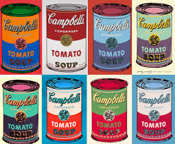
In the passage, Barthes discusses the philisophical underpinnings of photography as having deeper roots than that of simply capturing a moment in time, the act of capturing a photograph having significant influence over the consciousness of the “spectator” distinct from the photo’s subject and photographer. Barthes terms two core elements of photography: studium, the relationship between the photograph and the context in which it was captured and puntum, the personal relationship with the prospective observer. The discussion in these last chapters reminded me of Andy Warhol’s work in reprinting photographs. I had always thought these pieces of work to be quite unrefined and meaningless. What is there to be gained from a series of soup cans? However, throughout this reading, I thought about how these photographs were so impactful due to how distinctly present studium and punctum were. Studium in highlighting such an iconic commodity as the Campbell’s soup can and cementing it in a point in time and punctum in how these commodities are so pervasive in our personal lives that they inadvertently become a part of our individual consciousness.
The series of photos evoked almost a sense of otherworldliness in immersing the spectator immediately in a narrative Gerz crafted related to the photo. However, the associated texts did not simply describe the photo, but positioned it as a snapshot in time of a broader story occuring in the background. Some of the works of the French wall I found to be a bit confounding, especially the first couple of ones, which were more abstrac. However, I found the last couple to be similarly intriguing as the text spun a story with no premise as if capturing a narrative in a moment in time, similar to the function of photographs.
-
words and pictures
I had not thought about how both art and writing, two practices with fundamentally same aims were so separated in both practices today. We take it as a given that writers and artists are different. Although both dedicated to the pursuit of communication and tapping into our shared human experience, these disciplines are often viewed isolated pursuits rather than ones that are intertwined. For the concrete poetry design project, this reading has lead me to think more deeply about how to develop a dialectical relationship between the words of the poem and the fonts and design that I choose. Rather than simply choosing design elements which relate to the poem, I will consider how these design elements can have meaning in their own right equal in significance with the words of the poem.
-
McCloud Chapter 6
The main takeaway for me comes from a single word: “Complementary.” I can convey all the meaning I need to with an image that tells the whole story (is a photo not 1000 words?), and I can tell an entire story with paragraphs and sentences. However, it’s when neither is completely filled that an interesting story can unravel. By showing fragments, such as the pouring streets rather than wet rainboots, the reader can place themselves in that soaken environment. By amplifying a specific fragment, such as a creepy look, our sense of “creepiness” can be attained. As McCloud describes, I tend to think of masterful writing and art as separate calibers. A beautifully written essay can use figures and photos in it, but the language takes center stage. Challenging this opinion is what I take away from this reading. A result can be more than the sum of its individual parts. This image from a Harry Potter black-out poem quite literally takes renowned writing, adds imagery of a character, and finds new meaning within the words on the page. By utilizing a children’s book, we don’t expect the dark moment that haunts the character drawn on the page.
-
McCloud Ch 6 commentary
In this chapter, it was interesting to see the transformation of how humans have used text and imagery. McCloud described the various approaches to combining the two together. It was interesting for me to observe the various ways I can utilize text and images to create a certain message. One of the points that really pulled me in was how text and images can help finish each other’s meanings, be independent from each other, supplement a broader idea, etc. I think this topic will be important to consider for my future projects as I can utilize one or both to create a certain feeling and meaning simultaneously. I think I can explore approaching text less literally when using it with images. It is easy to just choose the shared meaning between image and text as opposed to experimenting with parallel combinations, which are less straightforward.
-
Synergy of Text and Image
In today’s discussion, I’ll be focusing on Chapter 6 of Scott McCloud’s “Understanding Comics.” First and foremost, I thought the chapter was beautifully written, with the images powerfully complementing the associated text (and vice versa). McCloud begins by abstracting comics as a sort of orphan child in the greater scheme of media, constantly alienated and seen as a stepping stone toward other media forms. What I resonated most was his description of how comics have “firmly identified with the art of storytelling,” where words and pictures intertwine to tell a greater story than any individual component could alone. One particular takeaway I got was the importance of conveying one’s desired goal when incorporating both text and images, specifically through identifying which broader category to which words/pictures combine to portray (Word-specific, picture-specific, duo-specific, additive combination, interdependent, etc.). For instance, I dealt with a strikingly similar situation when deciding on what role text should play in my subversive advertising. In my first draft, I embraced what McCloud what consider “duo-specific,” where the words and picture sent essentially the same message. However, in my final draft, I aimed to make it leverage a more “additive combination approach,” where the words served to amplify and elaborate on the associated image. Finally, one additional take-away I got from the text was the how only showing fragments of a particular scene or text can provide greater levels of abstraction or expression. As such, I plan on incorporating many of these themes in my future in-class projects as well.
-
Show and Tell with McCloud
As usual, I strongly appreciate how the format complements the content in Understanding Comics. It’s interesting to be able to analyze the format of the book itself with the content of the chapter itself, seeing the different ways McCloud interplays the text and image, even though he normally relies on text to explain more complicated details. The relationships between the text and image that McCloud applies to comics can also be directly applied to thinking about visual design, as most designs include both pictures and words working with each other to communicate something. Perhaps the most interesting thing that McCloud does that I can apply to my own practice is fixing one of the two elements and seeing what that enables in terms of freedom to experiment. While often visual design makes sure the image and text match each other, when one is communicating the primary message the other can reinforce it in more experimental ways, which is something I want to play around more with. While its much harder to do in a clean way compared to comics, I do also think there’s some elements of storytelling that can be worked into my design more than they currently are.
-
Show and Tell... And sometimes only show!
In chapter 6, MaCloud discussed the beautiful relationship between pictures and words. He explained the critical effect that words have on pictures. According to him, words may distract from the signals in the picture, or they might provide us with a richer message full of expression. The decision to use words and pictures depends on the author’s direction and vision. Leaving pictures with no words shows the reader a moment in the comic left to their interpretations. From our previous readings, I feel leaving out words and using pictures only is a brilliant idea. A great example is the Chicago Tribune ad campaign. If we think about it, it’s easier to say that a person is angry, but it’s much harder to show that, especially in comics.
-
Ali - McCloud Ch. 6 Response
McCloud’s history of language, as a journey from the pictorial to the sonic, is vastly simplified and abstracted—which does additional work to prove his point even before he brings up the technical aspects of comics storytelling. McCloud deploys a compelling narrative that encloses all of human history (if history is defined as what is recorded) in the space of a few pages. Naturally, we know there must be more to this history. But as we move further into the chapter, and examine in retrospect how McCloud’s words guide us to link together the images in the chapter’s opening, we feel how the instinctual linkage of one pane to the next, the impulse to build a story, is a demonstration of what he explicates later on. While this balance may not be the focus of the chapter necessarily, this simplified delivery of history in iconic images does a lot of work to illustrate the point McCloud ultimately makes: meaning-making is a process of balance and instinct, where images and words cover the same territory, but each ceding exactly the right amount of authority to the other.
-
Reflections on Barthes and Gerz
Barthes reading, particularly his thoughts in chapter 5, were very compelling and relatable. Barthe shares that when he knows he is being photographed, Barthes has many considerations for how to pose for the lens and reflects on his honest struggle with a sensation of inauthenticity. I think many people including myself can probably understand this kind of thinking/area of concerns when they realize they are the subject of a photograph. Barthe adeptly describes this tension we feel as an intersection of 4 forces: the one I think I am, the one I want others to think I am, the one the photographer thinks I am, and the one he makes use of to exhibit his art. Perhaps one of the reasons for this struggle with inauthenticity is the worry that this a motionless photograph will not capture the shifting altering idea of “myself”. If a subject of photograph experiences these tensions, I wonder if writers and artists also experience similar feelings and struggles with capturing something in a stubborn medium?
Additionally, I found chapter 9 very interesting, as it reminded me of our discussion and reading on conceptual metaphors and blending in “The force of change”. One of the insights from our class discussion is that sometimes an image will rely heavily on familiarity with a specific cultural context or language. This seems to be true in the images of nicaragua by Wessing as well—that a viewer can still enjoy or be drawn to a photograph + composition but their experience is different than if they understood the history and the rebellion.
I really appreciate the wide variety of Gerz’s work—some pieces are only words, some are only photographs, and many have both photographs and words that interact with each other or work together to create meaning. I find it really interesting that many of the words included in Gerz’s work read somewhat like a caption describing the photograph/the photographer’s account of what happened while taking the photograph; however, the caption becomes part of the art piece itself and seems to help explain why the art genre is called story art. Additionally, Taking a look at Gerz’s work, I can’t help but think about our Assignment 3, and wonder if story art artists would find the option of animating their art helpful for more fully conveying their message when not constraint to a motionless medium?
-
McCloud Chapter 6 commentary
McCloud’s reading presented a both a compelling history of the relationship between text and image but also a helpful few distinct ways that artists can combine words and pictures. I really appreciate the parallels/deeper roots McCloud points out between 1) how children read picture books but as they grow older tend to read books with only words and 2) how historically pictures predate the written word by a large margin but most modern writing has lost resemblance to the visible world.
There are many insights from McCloud’s reading that I will try to take with me when approaching future design work including assignment 3. One framework that I find helpful is the balance with Pictures and Words on either side set within the triangle chart with the 3 points being resemblance, meaning, and the picture plane. This framework helps me think deeply about the balance and how pictures and words can work together.
Additionally, I like how McCloud presents the chart but also mentions that things are ultimately best left to the creators’ instincts, which I think will help me trust my intuition for the balance of words and picture in my future designs. Also, I really like the option of Montage where words are treated as integral parts of the picture and I think the concept and seeing the combination of words/pictures as being interdependent will be helpful for assignment 2.
-
Interplay of Text and Image in Gerz's Work
A lot of the theoretical basis for the relationship between text and images comes from our McCloud reading. There he laid out how text is the purest symbolic abstraction of some concept, whereas images act immediately and directly to communicate their meaning. Because they act at different speeds and cause people to receive ideas differently, pairing them together can communicate things that neither can on their own. Here, beyond the individual meanings of the text and the images in Gerz’s pieces, the framing of the two side by side creates meaning in the gap between them. The viewer is forced to extract meaning from the piece as a whole that neither text nor image alone would ask of them as they are used to both mediums in isolation. I know I personally darted back and forth between the text and image multiple times, and switched between treating them separately and together, generating many stories and possibilities because the framing of the piece demanded it.
-
Further Reflections on Barthes
The Barthes reading was so compelling because I think most people don’t think deeply about the implications of the photograph, so reading a deep analysis of it brings active thought about it to the forefront. I immediately related to the struggle to pose, as it feels so artificial, and I nearly never look good in any picture that’s not a candid. One thought that came to mind throughout the reading was thinking about how Barthes would analyze the proliferation of photographs in modern society, and specifically the selfie. In most of his writing, he seems to rely on the fact that the photographer is different from the subject, but that’s true as much in the modern day. When he examines the photographer’s concern about avoiding death in the image, I think applying this frame to selfies creates an interesting viewpoint where the person taking the photo is deciding to make an active benchmark of the past, in a sense condemning their current image in order to preserve it. In addition, by taking it themselves, they take ownership of the image fully, eschewing Barthes’s concerns about ownership and being fully responsible for the creation of still identities of themselves.
-
Camera Lucida 5-10 and Gerz commentary
At the start of the reading, Barthes discussed people’s reactions to being photographed. I found it interesting to contemplate how we often are more artificial while still considering photographs the most “real” art medium. Barthes also talked about how the photographer themselves seek to make things seem more alive in photographs as opposed to representing death. I think this approach is commonly used by most people when they consider photography and what they believe is a good photograph or not. We often try to avoid anything that is lifeless seeming in a photograph and choose to highlight growth/life instead. Another topic Barthes touched on was the idea of us perceiving different photographer’s works. Although we might gravitate towards a specific work, that does not mean we like all of an artist’s work. Barthes showed through his thoughts that photography is something that can be appreciated in both a beautiful, unexpected way or the most monotone, regular way. I find this fascinating since I feel like I generally think the more unique, the better, but Barthes points out the appeal of things that do not stand out.
In these works by Jochen Gerz, text and image complement and support one another. It was interesting to notice how my mind used the text to expect something out of the image or vice versa. I realized that I began to use it as a precursor before viewing the next thing, and it affected what ideas I thought of when viewing the overall piece. However, Gerz takes us in an unexpected direction when I move from text to image. The photographs he selected are not literal carriers of the textual information. Instead, I found that it replicated more of the background emotional experience as opposed to visual exactness.
-
Picture and text combinations
In chapter 6 of “Understanding Comics”, the four types of text and picture combinations that interested me the most were: interdependent, word-specific, picture-specific, and montage.
In interdependent combinations, pictures and text work together to form a more cohesive and thorough understanding of the character’s feelings, like an internal monologue. I very much appreciate the fact that the combination of pictures and text creates a message that, as the author describes it, “neither could have conveyed alone.”
In word-specific combinations, the pictures bring the reader’s attention towards a certain aspect of the text by emphasizing specific fragments of a scene. This method allows more attention to detail in the story through a pictorial zoom-like effect of whatever is being described.
In picture-specific combinations, the words serve as a soundtrack to the pictures in the scene. This creates almost the same effect as a movie or video format, encouraging the reader to think about the sounds and images being portrayed.
In montage combinations, words are essential to the picture composition. There is certain liberty to this style, given that the author can experiment more with the orientation, boldness, and movement of the text. Instead of keeping text and picture as separate elements, they meld together to form a different experience for the reader.
-
Photography, image, and text
What stood out to me the most in Roland Barthes Camera Lucida was his discussion about the dissociation of consciousness from identity that occurs in photography. It is so common for everyone to pose for pictures (often in the same way) that I do see how we are taking away the spontaneity and authenticity of the photograph by putting on a mask that imitates ourselves or becoming the version of ourselves that we think is worthy to capture on camera. I think this also relates back to the concept of a photo creating an “adventure” like Barthes mentions, in the sense that photos are not animated themselves yet they create a reaction that animates the viewer. When pictures are more staged or fabricated, this feeling fades as we are not as curious to figure out the intricacies of has been captured.
Interestingly, in Jochen Gerz’s work, text is being used to clarify and provide more direction to the story being told from the image. It is not an obvious connection though, the text is subtle and a bit hard to understand. I feel like we automatically expect the text combined with an image to be an explanation or almost clarification of what we are seeing, like the descriptions of paintings in a museum. However, Gerz’s work is not trying to do that; the text and image are almost separate entities that each contribute some originality and artistic expression in different ways.
-
Essence of Photography and Role of Text
In this week’s discussion, I’ll be focusing on Roland Barthes’ Camera Lucida (Chapters 5-10). I was particularly struck by the section where Roland discusses his journey to learning “at all costs, what Photography was ‘in itself.’” It is quite interesting that Roland humanizes photography, as if to imagine it as a distinct entity who needs to be understood. Additionally, Roland adds to that how a specific photograph is never immediately or generally distinguished from its referent, however instead deeper thought or reflection is needed to contextualize the photograph with its greater surroundings. This alludes to our broader discussion of the importance of contextualization as found in McCloud or the Dondis’ readings, where a myriad form of media have a predisposition to a certain interpretation. One question I had was whether Roland would still consider “candid” photos as part of this greater “transformation” in advance of an image. He argues that there is a certain degree of inauthenticity/imposture he suffers in the face of photography, however candid photos seem to walk a fine line with his understandings.
Adding to this discussion, Jochen Gerz provides a further nuanced take on the interplay between photography and text. Upon first viewing, Gerz’ work seemed to display the “normalcies of daily lifestyle.” However, upon reading the accompanied text, I gained a deeper understanding of the particular moment captured by Gerz’’s work. This gave me a much greater appreciation for the work that would have otherwise gone unrequited. A series of his photos that particularly caught my attention was his series on individuals viewing the Mona Lisa. It is unclear at first glance whether this was a series of attempts trying to capture the Mona Lisa at the Louvre, or rather photography intended to capture the people surrounding the artwork. The associated text seems to suggest the latter, where he aimed at capturing the awe and enamored nature of individuals viewing the painting for the first time. Overall, it seems (in this particular piece), text serves as more as an accompaniment that provides further contextualization for the piece in contrast to other forms of media (ie. print advertisements) where text is an integral aspect of the design considerations.
-
Image-World
Something that resonated with me while reading the chapter Image World from Susan Sontag’s work On photography is how we take photography these days for granted. The fact that photographs are the only window for me to see how my grandparents looked like, how life was before and compared to how it is now, how people from other places look like. All this is information that we would have never received without the help of photography is now ubiquitous and easily accessible. It is also interesting to observe how democratizing photography is. In the past, only a few from a particular class were able to have a portrait. Now everyone and anyone can enjoy taking and sharing photographs (see image bellow).
 Photography provides us with a more accurate representation of reality!
 -
typefaces in commercial design
Although I’ve grown up in a time when variability in fonts is pervasive, I don’t think I’ve thought much about typefaces until recently when I became more interested in the merits of well thought out design. As discussed in the reading, we all seem to intuitively understand some fonts to be more suitable for some purposes than others. Curvier and more rounded typefaces evoke a sense of frivolity as well as a degree of modernness. These typefaces are now quite pervasive in many tech startup websites to convey a sense of modernness contrasted from the traditional use of serifed and sharper fonts in past companies. This is most prominent in the transition of Google from a serifed logo to one that was more understated and playful.
Walmart has similarly undergone a transition to a more casual typeface in contrast to their past all-caps logo which evoked a sense of boldness.
I’ve also discovered through some interest in website design that mixing serif and sans-serif fonts is an appealing combination due to the contrast of the formal nature of serif fonts with the more casual and sleek look of sans-serif typefaces.
(sorry for some reason i was having issues with publishing…had to rewrite this)
-
Type in Spiekermann
In this reading, it was interesting to analyze how type can both follow ingrained rules AND novel creativity to convey a message. As we grew accustomed to certain designs for things such as newspapers and telephone fonts, we often do not think particularly hard about the true design quality and just accept what is familiar. It was eye-opening to have Spiekermann point out our automatic reaction of forgetting to notice that some designs are not perfect and can be made better. Spiekermann also showed examples of fonts that matched to a certain style or emotion. We use the design of type to create a reaction from the audience, which was fascinating to think about.
 The font used for the Harry Potter logo is an interesting example of a font type that is linked to a specific style. The shape of the letters brings to mind mystery and something old with history. This font has also become iconic, so even when typing different words, we recall what it was originally used for.
 -
Erik Spiekermann
The quote “What you see is what you get – trust your eyes, not the scientific measurements” stands out as my main takeaway from this reading. It’s not inherent that doubt == thin oranger == thick lines. We have come to associate the explosiveness of discontent with wider more confident lines and thinner less restrained type with Joy. Scientifically, a scripted “Y” doesn’t reflect someone with their hands outstretched in happiness. It’s oureyes that make connections,alongwith the fusiform face area of our brain that helps personify the typeface. In this KFC ad, they are apologizing for a chicken shortage. The tyepfaced used, although integral to the company, utilizes the thicker and more “agressive” lines to convey the sentiment of the mistake. On the flipside, the McDonalds arches are rounded and “happy” (pun intended). Because of their friendly arch-like nature, the company can twist them into graphics that are inviting.
.jpeg)
-
Viviana- type faces
The main takeaway for me from the Spiekermann reading was how much typefaces impact our reading experience, yet how little we think about or analyze the typefaces we encounter on a day to day basis. For example, it is crazy to me how we have only used a single font for most books, making the reading experience not much different that it was many years ago. Additionally, his point about the inefficiency of newspaper typefaces made me reflect on the times I have complained about its weird formatting but never really questioned it. Finally, the “match the shoe to the type face” exercise was a very clever way of suggesting that our typeface recognition and association is almost instinctive and universal. We are so used to identifying patterns and creating meaning out them that the subtle or apparent differences in types (different widths, serif or sans serif, all caps or lowercase, rugged edges or clean lines) evoke a collective emotional response.
-
Typefaces and Personality
In the font-to-shoe matching puzzle, I matched 4 of the 6 fonts to the same shoes as Spiekermann, but the remaining two fonts I felt had different styles from what Spiekermann chose. It’s interesting that in general, people can agree on the “personality” of a font, but certain fonts can still evoke different feelings from different people. A designer can never be sure what feelings the viewer will have from the font they have chosen, and can only base it off past uses of the font and their own opinions. There are general associations made with each classification of typefaces, for example, serif fonts are reminiscent of newspapers and old-school print styles, while script fonts are more quirky and pleasant. However, even within the various typeface classifications, there is still so much room for variation: a more regular script typeface can feel polished and fancy, while a more handwritten-style script typeface feels more casual.
-
Typeface
I appreciate the author’s approach in using familiar images to illustrate the idea and meaning behind typography. The author clearly described the distinction between practicality and aesthetics. This reading is an excellent example of why a typeface is an essential element of a successful users experience (UX) in any domain. As a not-experienced typefaces designer, I often find myself looking at the fonts used in similar products when building products. Another critical aspect of choosing fonts is the information hierarchy on pages. Titles are more legible given their sizes, so there is more space for designers to use whimsical typefaces. However, content should be a more readable font as the size is much smaller.
 In this example, we notice the use of two typefaces. The details of thee even are written using the more legible typeface.
 -
Typeface and Identity
The emotive weight of fonts is something that’s been on my mind for years. In my previous life as a publishing intern, I worked on a book about Bodoni which opened my mind to deep historicity of font design, and that insight continued through everything from page design for my college magazine to designing my wedding invitations. One fascination I’ve always had with “handwriting” fonts. I experimented making a few when I was younger; I wasn’t using the depth of context and historical bases that Spiekermann describes. I was simply trying to transfer a sense of personality and authenticity to my computer projects, pre-touch screen. On the far side of the spectrum, I now work with a very strictly limited set of fonts for each of my various projects: one for the literary magazine I intern at, one for MIT and another set specifically for MIT SHASS communications. Identity through fonts becomes inflexible at a certain point. I think we are seeing this repeatedly in our ad projects: certain fonts work with certain brand identities and associations, simply through repetition. The non-serif Netflix font I’ve been working with is immediately familiar to me in combination with a dark gray background. Familiarity gives these brand-specific fonts a kind of authority, like the 1937 Empire font created for Vogue is subtly but clearly associated with the magazine type. It’s an immersive, affective tool for influencing a reader’s experience—as long as the font retains its basic functionality re: readability. The JOY example, for instance, was less than evocative for me simply because the letters weren’t as self-evident as they could have been at first glance.
-
Spiekermann on Typefaces
I really enjoyed reading this chapter by Spiekermann, particularly the parts when readers have the opportunity to view/experience the different typographies that Spiekermann discusses. When the type of the reading itself changed colors, or became a light on dark type, or the type changed dramatically, I understood more deeply how the type face changes what kind of message is communicated.
Additionally, I found the first few examples at the very beginning of the chapter really interesting because typography was instantly recognizable to me as being from a book or newspaper before I even read a single work. I started to look around for typefaces that were designed for a particular purpose and the example of a special type (ITC Weidemann) for bibles is something I noticed in my traditional bible. However, I also own modernized version of the bible (by Alabaster Co.) that has the look of a magazine, and I expected the typography to also follow how modern fonts are often san serif. But to my surprise, the designers at Alabaster Co decided to actually keep the recognizable ITC Weidermann as the type.
Lastly, the point about how typographic features such as large x-heights and wide counters are no less slaves to fashion than the perpetual changes in skirt lengths determined on Paris runways brings about a question I have related to previous readings. Is there a reason some types are more pleasing to our eye than others? Perhaps there is some psychological reason, whether related to Gestalt or grouping, that makes some typographic features more pleasurable to look at.
-
Spiekermann on Fonts
I really enjoyed how the book used its own typesetting and font choices to demonstrate the points it was trying to make. I think Spiekermann did a really good job showing how different fonts serve different purposes and connote different emotions. In terms of practicality, I think one issue I’ve often had with fonts is that the defaults that come with a lot of programs are either hard to search through or not actually that distinct. Though the book provides many good examples, I wish it had gone more into the details of how designers actually find and select fonts, as it seems like even with the broad font classifications Spiekermann provided, it would take far too long to search through all the fonts in one of those groupings to find the one that suits your design best. One of the uses of a font that most stands out to me is Facebook’s logo, which is either the whole word or just the f from the logo, and the fact that it’s so distinct and they kept it so long shows that simplicity and a good font choice has longevity. Interestingly, it seems like it’s not fully a font of its own, and was developed fully in house, though sources say it’s most similar to Klavika Bold. Thus, as with many things, this good design was custom tweaked to fit its purpose as well as possible.

-
Response to Spiekermann
The emotive weight of fonts is something that’s been on my mind for years. In my previous life as a publishing intern, I worked on a book about Bodoni which opened my mind to deep historicity of font design, and that insight continued through everything from page design for my college magazine to designing my wedding invitations. One fascination I’ve always had with “handwriting” fonts. I experimented making a few when I was younger; I wasn’t using the depth of context and historical bases that Spiekermann describes. I was simply trying to transfer a sense of personality and authenticity to my computer projects, pre-touch screen. On the far side of the spectrum, I now work with a very strictly limited set of fonts for each of my various projects: one for the literary magazine I intern at, one for MIT and another set specifically for MIT SHASS communications. Identity through fonts becomes inflexible at a certain point. I think we are seeing this repeatedly in our ad projects: certain fonts work with certain brand identities and associations, simply through repetition. The non-serif Netflix font I’ve been working with is immediately familiar to me in combination with a dark gray background. Familiarity gives these brand-specific fonts a kind of authority, like the 1937 Empire font created for Vogue is subtly but clearly associated with the magazine type. It’s an immersive, affective tool for influencing a reader’s experience—as long as the font retains its basic functionality re: readability. The JOY example, for instance, was less than evocative for me simply because the letters weren’t as self-evident as they could have been at first glance.
-
Response to Spiekermann - Ali
The emotive weight of fonts is something that’s been on my mind for years. In my previous life as a publishing intern, I worked on a book about Bodoni which opened my mind to deep historicity of font design, and that insight continued through everything from page design for my college magazine to designing my wedding invitations. One fascination I’ve always had with “handwriting” fonts. I experimented making a few when I was younger; I wasn’t using the depth of context and historical bases that Spiekermann describes. I was simply trying to transfer a sense of personality and authenticity to my computer projects, pre-touch screen. On the far side of the spectrum, I now work with a very strictly limited set of fonts for each of my various projects: one for the literary magazine I intern at, one for MIT and another set specifically for MIT SHASS communications. Identity through fonts becomes inflexible at a certain point. I think we are seeing this repeatedly in our ad projects: certain fonts work with certain brand identities and associations, simply through repetition. The non-serif Netflix font I’ve been working with is immediately familiar to me in combination with a dark gray background. Familiarity gives these brand-specific fonts a kind of authority, like the 1937 Empire font created for Vogue is subtly but clearly associated with the magazine type. It’s an immersive, affective tool for influencing a reader’s experience—as long as the font retains its basic functionality re: readability. The JOY example, for instance, was less than evocative for me simply because the letters weren’t as self-evident as they could have been at first glance.
-
A Deeper Look at Type (Spiekermann)
In today’s discussion, I’ll be focusing on Erik Spiekermann’s chapter on “Looking at Type.” When reading the passage, I was particularly struck by the subtle nature of how there are certain expectations for typefaces that we have and associate for certain readings (ie. newspapers, bibles, or corporate documents). Additionally, the text uses the analogy of how we need different shoes for different purposes (ie. dancing, running, climbing) just as type needs to “dress up sometimes” or be “comfortable.” This alludes to the broader discussion of each typeface having a personality, and dovetails well with McCloud’s discussion of how the usage of lines can evoke certain emotions. For example, typefaces at their very essence are a consortium of lines, and hence it is interesting how individuals associate certain emotions with different fonts. One prominent example where I see the selective use of typefaces can be seen in print/billboard advertisements. For instance, Pepsi often uses capitalization and bold fonts that help to elicit a sense of excitement and adventurous spirit. Finally, other examples are font-associations that we have on a daily basis and can be seen with companies like Google or Facebook (Product Sans and Helvetica, respectively).

-
Viviana Camera Lucida
Roland Barthes’ Camera Lucida sparked some immediate reaction out of me especially surrounding the perception of photographs versus appreciating the act of photography. One of the most memorable quotes for me was “A photograph is always invisible: it is not it that we see.” The fact that the photograph is rarely distinguished from what it represents, seems strange to me. How can a form of art be reffered to as invisible? Do we really perceive a picture of an object as the same as the object itself? Barthes discusses that it takes an addition level of awareness, reflection, and skill to be able to overcome this instinct and see past the photograph to appreciate the act of the photography. The operator, target, and spectator, all play a different role in the artistic appreciation process “to do, to undergo, to look” respectively. The photograph means something different to all of them; for the operator, it is more closely linked to the vision through the camera lense, whereas for the spectator, it is more about the result from the revelation of the picture.
-
Response to Barthes
Barthes’s writing on photography is richly focused on senses and perception: where is the photograph in the process of photography? He reflects in the reading that the photograph as a medium is not necessarily perceived; it is an intermediary, ie as Barthes says “no photography without something or someone” (pg. 6), which Barthes calls a “fatality”—which is a very interesting word to focus in on. As Susanna wrote, Barthes writes that the self never coincides with the imagery. I’d like to pair this point with Barthes’s comment about subtlety in photography and how the realization of subtlety is reliant on the hand of a master. In all these of these points—the “fatality” of invisibility, the metaphorical absentia of the subject, and the difficulty of subtlety—the process of photography is dissected, but each aspect of the process retains a sense of mysticism in a way. The simplicity and immediacy of perceiving photographs is deeply misleading in Barthes’s writing. The very process of perceiving a photographic subject—who may, like Barthes, have been trying to radiate an unreadable smile—makes immediate and invisible the process of how such a smile is captured “exactly” as-is. I think the danger lingering on the flip side of Barthes’s argument is the conviction that what you see is what there is to see or what you see or what you get. The obviousness of photography is a great threat to the depths of its meaning—for example, the sense that eyes have seen the Emperor, in Barthes’s example. But in that example, Barthes despairs that no one else can see the transitive sense of Napoleon. This danger of perceiving of photography as a flat record of self-evident “reality” is an emotive and imaginative failure in Barthes’s argument.
-
reflections on photography
This almost freeform rumination on the philisophical groundings for photography by Barthes reminded me of The Picture of Dorian Gray by Oscar Wilde. In this story, Dorian Gray, a man of extreme physical beauty, is the subject of a strikingly realistic portrait by his friend Basil. Acutely vain and deceitful, he chooses to “sell his soul” in order to retain his youthful physique. The portrait then becomes the embodiment of his soul and becomes increasingly more mutated and grotesque as Dorian tunnels deeper into hedonism. In Barthes’ writing, he discusses the true meaning of photos. Oftentimes, we consider photos to be a frozen frame to reality. Barthes challenges this notion by stating “‘myself’ never coincides with my image; for it is the image which is heavy, motionless, stuborn…‘myself’ which is light, divided, and dispersed.” This asks us to consider whether photography is the truest reflection of reality or in fact the most fraudulent. In The Picture of Dorian Gray, the most stunning realization of the story is the dire disconnect between the Dorian of the portrait Dorian himself, adeptly conveying the age-old adage that “looks can be deceiving.” The physical reality that’s captured by photos is therefore often at odds with the truth of reality.
-
Photography as an Adventure: Implications of Camera Lucida
In today’s discussion, I’ll be focusing on Roland Barthes’ “Camera Lucida: Reflections on Photography” and in particular the section on photography as an adventure. Barthes powerfully states, “the principle of adventure allows me to make photography exist. Conversely, without adventure, no photograph.” I was particularly struck by how photography was described as a network of “essences,” where material and regional essences come together to define the piece as a whole. This brings to light a broader discussion of the importance of context, as seen with McCloud’s discussion on comics as well as the various Dondis’ readings. The passage also seems to frame pathos as a negative trait when viewing photography, as if sentimental values cloud our judgement when exploring the formal ontology of photographs. One could argue that these sentimental reasons for viewing photography are just as valid as those involved with ethos or logic. Finally, one question that also came to mind is with regard to the subjectivity of interpretation. Just because Barthes wouldn’t bother to see certain photographs “as an image,” does this necessarily imply that all others would as well? And to push that thought further, can the principles he described when analyzing photography help to explain potential dichotomies in interpretation?
-
Lucida Week 5
In my commentary, I’m addressing some of the comments by my colleagues. A common theme is a distinction between how viewers perceive photographs. Barthes expressed, “A photograph is always invisible: it is not that we see.” According to the author, there are two ways to perceive photos: critical and the other is expressive. We can see that through the examples he provides and how each has its own meaning. That view in photography stems from the fact that Barthes is not a trained photographer. Technique and rule-based photography is not part of his approach. Barthe’s approach is more about what’s being photographed than it is “how to photograph”.
-
Comments on Barthes
Barthes’s investigations of the true nature of photography were really interesting, as I realized that I never thought really hard about what it is outside of pure content and composition. The notion that photos resurrect the dead feels like it comes very directly from the fact that he wrote this after his mother died, but in a way it is interesting to think that there really is no other method we have for purely capturing a moment visually, which is a major part of the experience of being in that moment. I enjoy how he immediately dismissed the cinema as well, as there is not the same sense of capturing a moment, and it feels much more pure to analyze the Photograph as an object instead. He starts to establish the semiotic framework around photos, but I’m excited to read the next chapters to see where he takes it.
-
Comments on Barthes 1-4
Throughout these 4 chapters, Barthes seeks to find the true description of photography. It was interesting to see how Barthes walked through his analysis of what photography truly is. His attempt at classifying photography exposed the disorder of what photography is or can be, but one point that he raised was how photographs are rarely ever separately perceived from its referent (ie. what it represents). What does a photograph do? It is both infinitely reproduceable and a singular moment. Barthes also says photographs are invisible as the referent adheres to the photograph. We find it difficult to separate ourselves away from what the photograph represents to actually view the photograph as itself. One thing I contemplated however when I read the section where Barthes discusses his inner conflict about photograhy (pg. 7 of the reading) was whether we really need to separate the referent from the photograph. In a sense, I realized it is people’s automatic reaction to take the referent first. It is interesting to realize how someone perceives photography depending on their role as photographer, audience, or subject.
-
Camera Lucida
In Camera Lucida, Barthes writes, “A specific photograph, in effect, is never distinguished from its referent (from what it represents)” and comments on the “fatality” of people’s inability to see the medium, seeing only the subject of the photograph. This reminds me of the painting the Treachery of Images by René Magritte, which shows a pipe with the the words “ceci n’est pas une pipe” (this is not a pipe) underneath. Although Magritte’s work is a painting instead of a photograph, it carries the same idea that people often think of an image of an object as the object itself, instead of as an image. I sometimes feel that photography is a means of conveying an idea rather than an art form because the photographer arguably plays a small role in the chemical and physical creation of the photograph, and focuses more instead on capturing the subject at a particular moment, or composing the subject of the intended photograph in reality. However, the ability to convey an idea through the image composition can be considered an art as well.
-
Barthes' Camera Lucida
Roland Barthes’ reflections on photography were fascinating, starting with his question of “What did I care about the rules of composition of the photographic landscape, or, at the other end, about the Photograph as family rite?” It was really interesting to read about how Barthes didn’t seem to care much about the technicality of taking photographs, or with the historical/sociological contexts of a photograph. Instead, Barthes seems much more captivated with how photographs make a Spectator feel when engrossed in the subject, for example how Barthes was so amazed when he came to the realization while looking at a photograph of Napoleon’s younger brother that “I am looking at eyes that looked at the Emperor.”
I didn’t realize why he didn’t care much about the techniques of photography until he shares in chapter 4 that “I am not a photographer, not even an amateur photographer: too impatient for that.” Out of the 3 practices that Barthes says photography can be the object of, Barthes has only practiced to undergo (being the observed subject) and to look (the subject observing), but he doesn’t have experience in the practice of to do (being what he calls the Operator). Since one of Barthes’ reasons for not practicing the ‘to do’ for photography is that he is too impatient, I wonder what Barthe might think about modern day photography (how high quality cameras are easily accessible from smartphones and the photos are immediate to view or print) and if he might be more compelled to investigate the Operator experience now?
-
Metonymy v Metaphor
This reading examines three similar but differing relationships. Metonymy: one thing standing for another concept, Metaphor: understanding one concept in terms of another, Blending: mapping two concepts into a different concept where one doesn’t stand for another. Out of these three techniques, metaphor stands out as the easiest to grasp. In our daily lives, we tend to use metaphors to describe processes to others as a form of easing a communication bridge. Metonymy appears different in the way that it is more literal; something concrete standing in for another. This Coke and Pepsi example conveys the brand’s messaging using a kind of Metonymy. Clearly, the Pepsi is trick-or-treating dressed as something “spooky” (i.e. a worse beverage). Although this example is literally something standing in for another item, the Pepsi is also like one of us dressing up for Halloween. We understand Pepsi’s humor in terms of an action we take on Halloween. Another Coke example conveys more of a metaphor. In this image, two people’s hands come together to form a Coke bottle. The original ad ran the messaging that CocaCola is for anyone and everyone. This metaphor reveals two different individuals coming together (allusion to hand-holding relationship) in the spirit of Coke.

-
Metonymy, Metaphor, and Conceptual Blending
The three principles of metonymy, metaphor, and blending are all very similar and an example can use multiple or all overlapping principles. However, I think that metonymy is the most effective, specifically when using the part to reference a whole, because it is most directly related to the actual semantic meaning being conveyed, so the viewer does not need to infer as much. Because the part of the whole is being shown, the viewer is given a clue as to what larger idea is being communicated. For example, in the Absolut Mandarin ad, the vodka bottle is shown with a juicer, which symbolizes the freshly squeezed orange juice used to make the vodka, implying that Absolut Mandarin vodka is flavored with real juice, as opposed to other brands that might use artificial flavoring. In contrast, metaphors require knowledge outside the realm of the idea being conveyed, such as the metaphors from George Lakoff’s paper which Neil Cohn references in A Force of Change.

-
Metonymy, Conceptual Metaphors, and Blending: Cohn Reading
For these three principles in the Cohn reading, I found that they are all based around the idea of human thought taking information and making inferences. Of the three principles, metonymy felt the most effective. Metonymy enlists representative objects to convey meaning in a visual way. It was interesting to see how Cohn breaks down each of the Chicago Tribune examples to show what type of inferences we can make just based on looking at the object. Conceptual metaphor and blending both felt like they needed deeper context in order to understand the visual representation that was being conveyed. I found that without reading Cohn’s explanations, I would have misunderstood some of the Tribune strips that used conceptual metaphor or blending.

 This advertisement use the symbols of a shower and road to convey the general idea of a favorite listening spot for music. It also intertwines Spotify’s symbol into the icon. The series of advertisements take from various “spots” to show the breadth of activities where you can listen to Spotify music. It conveys the message that music is available anywhere.
 -
Metonymy and Metaphor in Ads
Although often conceived of as literary devices, metonymy and metaphor when employed thoughtfully become powerful tools for visual rhetoric. Their usage has become so commonplace that we often overlook their imbedded existence in the media we consume. The example in the reading, therefore, was distinctive in the simplicity of its design which emphasized the use of metonymy and metaphor through presenting a variation of the first panel image in the third panel by adding, reducing, or altering an existing element. The examples below similarly employ the metonymic part-whole relationship and the mapping capacity of metaphors, but in design that is more complex.
As an advertisement for World Kidney Day, this first image displays a broccoli manipulated into the shape of a pair of kidneys with the message “Eat right for them.” written below the image. The broccoli therefore represents the act of healthy eating as well as vegetables as a whole. Its manipulation into a pair of kidneys further emphasizes the message that eating vegetables such as broccoli will improve the health of your kidneys.

This advertisement by Pepsi also presents a blending of conceptual metaphor and metonymy by insinuating that “consuming Pepsi will make you come to life.” The IV drip represents life as IV drips are often associated with one’s physical health. By filling it with Pepsi, the advertisement constructs the metaphor that “Pepsi will make you come to life.”

-
Metonyms, Conceptual Metaphors, and Blending
Out of the three different principles, I found metonyms particularly compelling—It was really interesting to see how simple additions, like adding a red clown nose, or simple reductions, like removing one character, can communicate a much more complex idea that extends beyond just the addition or reduction of an object itself. For me, the other two principles were still effective but sometimes relied on connections and knowledge I didn’t have. Since conceptual metaphors involve understanding a specific experience/metaphorical schema and translating that visually, it seems to rely heavily on familiarity with common phrases or idioms of a specific language like “carrying a heavy load” or “climbing the corporate ladder”. To me, the reliance on the knowledge of a specific language’s expressions makes conceptual metaphors seem slightly less effective and harder to discern especially for people don’t speak the language.
For example, even as a conversational chinese speaker, I didn’t quite fully understand this visual conceptual metaphor, as I’m unfamiliar with the chinese idiom it refers to, until I learned the meaning of 对牛弹琴:

Likewise, since blending requires understanding two domains and mapping them both onto a new “mental space”, it could be similarly difficult for a viewer who isn’t familiar with either domain or doesn’t comprehend how it maps together.
-
A Force of Change Analysis
In today’s discussion, I’ll be focusing Neil Cohn’s “A Force of Change,” which dives deeper into the semantics of Chicago Tribune Advertising. In particular, he identifies three key characteristics: metonymy, conceptual metaphor, and blending that collectively aid in the construction for the short visual panels – ultimately creating a “causative force” in reading the Chicago Tribune. The section on metonymy resonated with me the most, where Cohn describes how one reference is used to stand in for another related concept. For example, this effect is also seen prominently in advertising, such as in Barilla’s New Year ad. Here, we can see that the sphagetti noodles are symbolically representing fireworks – at first glance, they seem to be strikingly like true fireworks when in fact they are individual noodles. The power lies in its simplicity, where it pushes the viewer to think critically, and situate itself to “the broader connection that it involves.” In this case, it associates eating Barilla pasta to a celebration and an eating experience bursting with flavor.

-
Metonymy in Chicago Tribune
It is interesting how in the Chicago Tribune newspaper strips, the principles of metonymy, conceptual metaphors, and blending all involve some sort of reduction, addition, or alteration of elements to convey a specific expression.
For me, the most effective principle was that of metonymy. A metonymic reference is when one element is used to stand for another broader concept. As Cohn says in the reading: “The metonymic element has some sort of related connection to a broader conception that it invokes.” For example, when walking past this sign, even though it’s just a baguette, the audience can interpret it as representing a bakery.

There are so many ways of implementing metonymy to convey different ideas. For example, in the strips, the red nose was an added element that represented comedy compared to the eliminated element of the person standing in the snow to represent them no longer having to wait for the bus. These are two different techniques, but they each work in their own way. Another principle that I thought was interesting was backformation, where the reader can only make sense out of the first image when they see the last one, therefore working backwards to create meaning. Even though it can be a little frustrating to the reader not really understanding the full picture right off the bat, it can work towards creating a moment of cleverness and realization for the reader.
-
Metonymy, Conceptual Metaphors and Blending
I enjoyed reading this week’s piece that looked at metonymy, conceptual metaphors and blending across a three-panel stirps from a campaign by the Chicago. With metonymy, simple addition or reduction of elements can convey a lot of information to the reading. For example, reducing one person indicates that this person is no longer part of the group without saying that. Another interesting concept is the use of backgromation to elicit information from previous panels in the strips. With metaphor, one could use simple icons or symbols to indicate a conceptual metaphor, for example, using the metaphor of hot fluid in a container to indicate a state of restlessness and disruption.
 Figure: Einstien hair to indicate smart!
The reduction could also be used metaphorically; for example, show a person chained to something then removing that person from the picture portrays a metaphor of freedom. Metaphor and metonymy could be achieved through blending in which different mental models are mixed together to signal meaning—for example, using metaphoric iconicity, blending iconic images to describe and scene metaphorically, as shown in the figure with Einstien hair.
-
Metonyms, Metaphors, and Blending
I’ve always been fascinated by metonymy, and I thought this reading had a good analysis of how it showed up in the various comic strips in this ad campaign. I wish it had spent more time on what metonymy accomplishes in visual design, rather than only talking about how it was used. If I had to say myself, metonymy allows the designer to refer to a larger concept or group that might otherwise be hard to depict visually, enabling clearer design that’s still referring to things people care about. In addition, I think that forcing the viewer to make the connection of what the metonym is forces them to be more connected to the design and may even make them feel clever or excited once they make the connection. Conceptual metaphors apply in much the same way, and are very effective when used properly. Here, rather than strictly referring to an object, a conceptual metaphor enables the mapping of concepts and big ideas onto these short panels, allowing viewers to extract more meaning out of a limited space and again generalize what the comic is saying, but with something more idea oriented rather than referring to a specific object. Blending isn’t a concept I’ve heard about before, but I think it’s an interesting framework for analysis, as it enables analysis of both the original frame and whatever new concept is being referred to at the same time, rather than only trying to figure out the meaning that the designer may be trying to map. I think the image below is interesting to analyze because a good analysis of it should use some of these concepts. Here, the metonym of the hand shape refers to the entire body, and even more broadly, the millions of bodies of hungry children. The blending here is done by the design of the fork itself, which is still functionally a fork but resembles an outstretched hand and thus evokes both food and donation at the same time. It is only in this blended space that having this object refer to World Food Day makes sense, as its an event specifically to bring awareness to world hunger, and thus referring to only charity or food more broadly would miss the meaning and potentially be inconsiderate.

-
Texture and Dimension - Dondis
Texture
Texture enriches the visual experience by specifically evoking another sense, touch, by exhibiting variations on the surface of a material Though texture frequently serves as a stand-in for touch, texture can either have actual tactile qualities or be purely an optical experience; Likewise, texture can be recognized by either touch or just sight or some combination of both.
In Jan van Eyck’s painting “Arnolfini Portrait”, though it is a 2 dimensional image, there is an implication of touch/the hope of a tactile experience, particularly in the texture of the clothing that the couple is wearing. Just looking at the texture of the fabric and furs, we can observe the heaviness of the green fabric that the woman is wearing as well as the softness of the fur trim on both the wardrobe of the man and woman. In this case, texture of the dense fabric and expensive fur helps to communicate the opulence and luxury of the couple’s life and family, helping to give visual clues to who these people are.
Dimension
Like texture, dimension aims to represent the qualities of three-dimensions on a two-dimensional visual format. Since dimension only actually exists in the real world, in art, dimension is frequently dependent on illusions and implying depth with the help of our two eyes, which create stereoptic sight. Some of these techniques include manipulating light and shade through “chiaroscuro” to produce depth, or by using vanishing points to follow the many rules of perspective and how large objects should be if its a certain distance away.
One example of techniques for dimension is Pablo Picasso’s cubist style—this is his painting called “Portrait of Dora Maar”. Picasso replicates the 3-dimensional person and environment onto a 2-dimensional plane in a way that looks like multiple angles/perspectives of the face all displayed at once. In a sense, Picasso wasn’t intent on creating a convincing illusion of the third dimension, but often painted on a flat canvas and strongly suggested a third dimension.
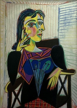
-
Durer's Self Portrait
The most compelling part of Durer’s self portrait to me is his full frontal orientation. The article mentions that since it’s 1500, people don’t have access to flat mirrors yet, which means firstly that people would very rarely have an opportunity to see a full frontal image of themselves and secondly a lot of math is required to paint a self-portrait that is full frontal from a reflection on a convex class. However, nowadays, people use mirrors and take front facing selfies on a daily basis and are now familiar with their frontal self image, and would most likely miss historical context and the reference to Christ’s frontal paintings.
Also, I find it interesting that Durer’s prints were very famous but of a very different style. While this portrait floats in time and space almost, the prints are almost always set in a very situated, detailed background. Therefore, this self portrait seems to capture more than just the detailed visual qualities of the scene/person, but seems to communicate more of a purpose. The article mentions that Durer, like many artists who were products of the renaissance, wanted to be seen as more than just a craftsman, but as a scholar, theoretician, an individual with overflowing creative potential. This self portrait encourages viewers to focus on Durer’s eyes and hands, which are the tools of an artist and this gift of art seems to be what Durer is indicating as his very identity.
-
Viviana The author of one's own life story
One aspect about self-portraits that Jason Farago highlights in his article is the fact that they are a historical development; they were invented and not self-evident. The meaning behind the very first self-portraits had never crossed my mind before reading this article. For example, I had not wondered what it meant for someone to deem themselves worthy of being depicted and brave enough to develop such depiction, thus, becoming the author of their own life story. Albrecht Dürer was very self-aware and clear on the power his creative uniqueness held. The way he identified all of his works with his monogram illustrates a sense of confidence and ownership over his intellectual property and overall presence. I think we can all benefit from taking more ownership and pride in ourselves so that we can represent our essence more clearly.
-
Viviana Gestalt Psychology and Morphic Semiotics
Gestalt Psychology is a prime example of how crazy it is that the human eye can automatically group things together or create order even when it is not inherently present. Our mind’s obsession with patterns can dictate how design decisions are perceived. For example, the law of closure allows us to complete shapes even when they have gaps, and the law of similarity and the law of proximity both allow us to separate design components into groups that create new meaning.
I found it interesting how morphic semiotics emphasizes that signs come in systems, meaning that the context in which signs are interpreted is an integral part of the experience. It’s no longer just a two-concept picture of the “signifier” and the “signified”, different signs have various connotations to the people who interpret them. The role of the “interpreter” becomes essential to explore. Having a more well-rounded and in-depth awareness of the many elements that contribute towards giving a sign meaning can make design concepts a lot stronger and more effective.
-
Viviana Depth, Activeness, Spontaneity, and Simplicity
Out of all of the visual communication techniques Dondis mentions in chapter 6, the ones that caught my attention the most were depth, activeness, spontaneity, and simplicity.
Depth adds perspective, it allows the viewer to put the design in an environmental context. It is interesting how dimension is understood through the use of light and dark and makes the piece closer to imitating life.
As a dancer myself, I always appreciate movement in design. Activeness reflects this motion through elements that suggest energy and life. This makes designs more dynamic and entrancing by setting a scene.
Spontaneity is impulsive and free. This sense of liberty is directly related to expressing emotion more thoroughly through design. With this technique, the viewer can truly follow the designer’s stream of consciousness in the piece.
Simplicity alludes to the concept of “less is more”. Sometimes a message can be most clearly expressed by stripping it down to core elements that channel directness and singleness. This sense of order removes complications and overly elaborate details and focuses solely on the message or feeling the designer is trying to get across.
-
Semiotics and Gestalt Theory
One idea Prof. Harrell describes that I found interesting is how semiotic spaces can help reveal values embedded within systems, whether it be systems in which the signs are observed in or created in. After reading about the Youth Against Racism in Europe example, I started thinking about all the signs that I might see/create on a daily basis and their many associated systems that I never really think that much about. Those signs could have one meaning for me, yet the same sign could have an incredibly different meaning for another, perhaps due to being situated in a different system (ie. hand gestures in different cultural contexts) or from being incorporated with other signifiers (ie. letters becoming words, and words put together to become sentences).
Also, I found the semiotic triad to be quite fascinating—one question I had about the notion of “unlimited semiosis” is that I wonder why observers tend gravitate towards one or a few interpretations of a sign when according to Peirce’s semiotic triad, an observer can interpret a particular representament/object relationship in an innumerable number of ways? Gestalt Theory seems to be a possible answer to my last question of why certain interpretations of signs are favored over the unlimited number of possible interpretation. Perhaps in accordance with many of the gestalt psychology laws, in particular the Law of Prägnanz, observers tend to favor the simplest and most stable interpretations. Going back to Pierce’s semiotic triad, gestalt theory seems to make assumptions about the interpretant in the triangle, particularly that the interpretant is human and that generally, human perception of the whole of a sign is different from its parts. I wonder if or when it might be interesting or even appropriate in a design to flip this assumption, ie. perceiving a sign for its parts instead of the whole.
-
Semiotics and Gestalt
Harroll describes how the same idea can be conveyed in multiple different ways and forms, using symbols or text or a combination of the two. And even if they are representing the same idea, they can give the viewer a different connotation or feeling because of the choice of symbol/words. It’s also quite interesting how the symbol can have very different meaning when placed in a different context, which relates to Gestalt’s law of proximity, in which elements placed closer together are perceived as a coherent object, instead of as individual and separate objects.
-
Semiotics and Gestalt Psychology
Harrell begins by discussing morphic semiotics, a subset of semiotics which draws on mathematics to more precisely describe the structure of signs. I thought the way he used the example of Brawn at the Bazaar was very illustrative of the many concepts he was talking about, especially contrasting it directly against eBay’s user interface rather than an abstract app. In thinking about ways to apply the ideas to my practice, I think explicitly thinking about the deconstruction of a user’s representation into the specific constructs trying to be captured serves as a useful place to start no matter what is being designed. Specifically, the focus on how different representations enable different things (like the greater than operator only working on numeric representations) is more broadly applicable to deciding the best path forward in a design thinking frame.
In regards to the gestalt psychology principles, I have encountered them before, so they’re not new information, but it’s always nice to be reminded of them and have them at the top of the mind while designing. I thought the website did a cute job of demonstrating each of the concepts, and I found the Law of Prägnanz the most interesting. I wonder what the farthest you can push a concept is before the brain stops being able to simplify it, and what that would look like.
-
Semiotic Morphisms
In the reading, Prof. Harrell claims that representation mappings to different semiotic spaces imbues distinct meaning to signs. This conjecture is crucial to the practice of subjective computing which seaks to manifest the holistic experience of individuals in the physical world into the digital realm. An example of this is the use of parody, a common artistic technique which becomes a form of semiotic morphism through subversion of often well-recognized signs or symbols to convey subjective meaning. Below, is a parody of the famous painting the Mona Lisa. Lauded as perhaps one of the greatest works of Leonardo Da Vinci, defacing the familiar piece with features of the Joker, a modern-day cultural icon, emphasizes the message of irreverance for established power structures and convention associated with the Joker.
The ability to personalize social media profiles is also an example of semiotic morphism as users are able to change the representation mappings of their profile picture, biography, feed, etc. to express their individual characteristics and dictate how they choose to present themselves digitally.
-
Gestalt Laws
The Law of Prägnanz both affirms and contradicts our class discussion from last week. We discussed how often the word”satisfying” appears with well-balanced and symmetrical designs. However, many in the class also contend that an assymetrical shape can better excite and delight onlookers. As an audience, we almost crave an unexpected symmetry. Although we feel more satisfied with a perfectly alligned form, we don’t want to come accross as bored or catered to. The Law of Continuation permeates into scientific forms as well as graphic designs. An increasing trend in the scientific community seems to be the use of R-related programming to make continuous and curvier (versus sharper-edged) lines in scientific journal papers. Although we may not initially connect technical writing with Gestalt Psychology, we can see that these laws emerge in a plethora of arenas within our engineering-filled lives.

https://ychef.files.bbci.co.uk/976x549/p093h41c.jpg
-
A Deeper Dive into Semiotic Morphisms & Gestalt Psychology
In today’s discussion, I’ll be first focusing on Fox Harrell’s discussion on a concept known as morphic semiotics, which lays the foundation for the analysis of subjective computing systems. One section that resonated me the most was the on the basics of semiotics, where Harrell provides a potent example of the broad “social salience” in semiotics through the swastika symbol. While it serves represents the achievement of enlightenment in Jain religion, it also serves as broad sweeping representations of the German Nazi party. This dichotomy reinforces the notion of the multilayers meaning of signs, and how these alternate meanings can have strikingly different connotations in different settings. One additional example I researched into was was the Hook ‘Em horns symbol used to represent the mascot of the University of Texas (longhorns). However, this same symbol interpreted in Europe often refers to satanism. These differences in the meaning of signs reveal what Harrell discusses as “phantasms”, where each meaning involves shared epistemic and image spaces.
The second reading focused on Gestalt Psychology, which references the notion that “the whole is different from the sum of its parts.” Under this framework, there are six laws that govern human perception: proximity, similarity, good continuation, closure, prägnanz, and figure/ground. The law that resonated with me the most was closure, which involves the mind’s subconscious filling of missing information to construct the entirety of the shape. For example, this can be seen in image below, where we see a soccer ball despite the lack of the boundary lines. The importance of this framework may lie in our brain’s desire for order, and this can be achieved through perceiving the object as continuing in a smooth fashion all the way around.
-
Commentary on Gestalt and Harrell Readings
From looking through the Gestalt website, it was interesting to think about the different visual habits that we have. Oftentimes, humans naturally perceive things a certain way and it was fascinating to see how Gestalt psychology’s 6 laws explained it. I think that this is also extremely important to keep in mind as we create designs since people will view designs with their built-in view/natural tendencies.
One of the points I found interesting in the Harrell reading was his point on how signs lack meaning without context. Harrell brought up about how different contexts and different individuals can create different interpretations of the symbol. The way humans associate a sign with a specific meaning is interesting. We use signs to convey something in a more visual setting, but the meaning is actually conferred upon by our pre-existing notions or how we relate the visual with the meaning.
-
Dondis Chapter 6 Reading
Dondis discusses many fascinating visual communication techniques in chapter 6, but the four techniques that resonate with me the most were balance, juxtaposition, activeness, accent.
Balance - I’m glad Dondis pointed out how balance doesn’t mean axial symmetry or static-ness and how balance can be achieved both with symmetry and asymmetry. I think balance really appeals to my own human desire of wanting things to be stable and this idea that each action should have a reaction as a counterpart. I think when there is a center of suspension between two weights in an image, it brings me a sense of centering and peace, or at least when there is not this center, it can feel upsetting.
Juxtaposition - Similarly to balance, juxtaposition really resonates with me because it emphasizes this idea of “having a counterpart”. I find that I’m drawn in as a viewer when I find two or more stimuli interacting with one another or slightly different in some way which causes me to naturally compare the components. I feel that humans are relational beings, and so the technique of juxtaposition really emphasizes this idea of relationships between visual cues—that they aren’t just individual and random but that they are part of a bigger whole/relationship with other cues.
Activeness - I think activeness appeals to me because it generates a sense of movement and dynamics which really catches my eye. To me, the motion that this technique represents helps to communicate even more to me than what is directly on the image because there is this sense of what happens before and after, which is really interesting to figure out and imagine.
Accent - This technique appeals to me because as Dondis says “little of the atmosphere of neutrality is disturbed by the technique of accent”. I like how accent creates the ability to add or highlight something without disturbing the overall atmosphere of the image. Additionally, similarly to activeness, I think accent creates a sense of dynamics/motion and while my eyes are looking at the image, it gives my eyes a path to focus on or direction to move in.
-
Visual Techniques: The Communication Strategies
In Dondis Chapter 6, I found it interesting to see how content and form interacted along with the artist and audience. Dondis presents multiple visual techniques and pairs them up to show the two sides of these design principles. The four techniques that appealed to me were balance/instability, simplicity/complexity, understatement/exaggeration, and activeness/stasis. I found these techniques interesting since they often are components that I consider when I create designs. It is amazing to see how each technique can convey a different meaning to an audience based on whether I choose one side or the other (ie. simple design vs. complex design). I have also realized that often, I tend to prefer certain sides of a technique more than the other.
Balance provides a sense of satisfaction and completion, which is often a dependable design component. However, instability offers surprises and can create more interesting designs. In a similar fashion, simplicity can be eyecatching in a calm way and it centers on a main focal point. Complexity can be visually stimulating, but there is less of a focus on one specific aspect. Understatement is subdued and more of an implication, which can speak to the audience and allow them to develop ideas that are guided by the artist’s design. Exaggeration allows boldness and is immediately obvious to the viewer though, which offers an alternative that directly communicates with the audience. Activeness creates life to a design, conveying something that is not truly “moving”. Stasis brings the viewer into the frame, which allows a sense of peace and singularity.
-
Visual Communication Techniques
The techniques for visual communication that Dondis describes in chapter 6 are all quite interconnected and related. For instance, the opposition between symmetry and asymmetry is very similar to that of balance and instability. Symmetric designs are often well-balanced, while asymmetric ones can feel unstable. Yet at the same time, there are many asymmetric designs that are still balanced. I am often most attracted to asymmetric and balanced designs because the asymmetry creates intrigue and draws me in, while the balance makes it such that the asymmetry is not unsettling and uncomfortable.
-
Effective Visual Techniques
In this Dondis reading, what I found the most striking in his writing before the breakdown of the many techniques was his discussions on how the form assists and transmits content, and the shapes and colors directly translate to emotions. Using this framework, it will be helpful to analyze design both on its visual appeal along with its ability to convey its message in a “what you see is what you get sense” before any of the actual content is transmitted.
Of the visual design elements, I was most drawn to transparency/opacity, unity/fragmentation, balance/instability, and predictability/spontaneity. Transparency and opacity was compelling one that I don’t see applied too often in most visual design, but I apply a lot in my own work. Because most computer graphics are generally sharp but I enjoy trying to make my images more naturalistic, I use a lot of layered transparency to allow textures and subtlety to build up. Unity and fragmentation appeals to me mostly because it’s not something I often think about when putting elements together, as visual design always feels like an effort to try and make everything a unified whole. However, occasionally embracing fragmentation enables a whole new world of opportunities for placement and eye-catching design that I want to take into account more in my work. Balance and instability is fun to play with because we often think of them only as applied to real objects, but there’s still a strong sense of visual balance at play between all objects. It seems interesting to try and play with scale and transformations between every object in a given design to see where tension can be created with instability and which objects are better off simply being balanced. Predictability and spontaneity were exciting because of the energy that spontaneity can bring into the work. Predictability is often needed as the grounding, so viewers know what to expect and how to interpret incoming visual information, but throwing off their expectations with spontaneity is what I dream for as a designer, and hope to be able to build skills in.
-
Dondis' Analysis of Visual Techniques
In today’s discussion, I’ll be focusing on four techniques, the juxtaposition between fragmentation vs. unity, and understatement vs. exaggeration. For the former, it’s striking to see the similarity to Gestalt principles where parts can come together to form an unified whole. While unity often creates a Zen-like feel of satisfaction, fragmententation creates a sense of wonder and inquisition. This is seen potently through the work of Micaela Lattanzio, an artist who cuts portraits into miniscule pieces and re-assembles them into a unique composition. In particular, the physical fragmentation also manifests in this piece to represent the metaphorical fragmentation of the person’s identity. For the latter, understatement vs. exaggeration is also an effective modality for visual design. In particular, both can serve to provide critical underlying commentary on the basis of technique. For example, in a world of constant information overload, understatement-based ads in particular can serve as a breath of fresh air and also push the viewer to think deeply about the issue at hand. For instance, this is seen in the following WWF for Nature ad, which powerfully shows how the current exploitation of the ecosystem is resulting in devastating effects on marine animals. On the flip side, exaggeration is also frequently seen in print advertisements, as seen with the Cheeze-it ad. In doing so, the ad uses exaggeration to emphasize the intense flavor packed in the small square-shaped snack.
-
Communication Strategies
The four strategies for effective visual communication that I would like to discuss are somewhat related, in my opinion. If we look at the concept of symmetry vs. asymmetry and regularity vs. irregularity, they are both essential concepts to the balance of the content. While there is beauty in axil balance and uniformity, one could achieve more potent messages and compelling visuals by breaking the symmetry and uniformity of the objects on any medium (canvas, sculpture, etc.). Another related concept from today’s reading is predictability vs. spontaneity. Patterns that suggest an order or meets viewers’ expectations are more predictable; if those patterns are scattered and portray no clear structure, they are viewed as spontaneous and unconstrained. Finally, another concept that I found interesting is transparency vs. opacity of the objects. While some art pieces are opaque by nature, the placement and color of content in those pieces convey an important message about transparency. Showing the color of the background through an object in the foreground communicates a transparent object; concealing the background with that object signals an opaque object.
-
BETA (Bal,Eco,Tra,Acc)
Balance, Economy, Transparency, and Accuracy resonate with me the most. Balance between the weight of a design often appears “satisfying” or “aesthetic.” Subliminally, balance can make a viewer feel calm or alleviate their agitation. The subconscious will recognize the thoughtfulness places in the balance of a design, and most times associate a positive emotion with that piece. One of my former bosses firmly believed balance has a true power in quickly making a potential customer feel good. A large shift in my own designs has been in utilizing whitespace-especially in my presentation slides. Whereas three years ago I would have utilized intricate shapes and patterns, large words covering ~10% of the slide space now dominate. Designs that lean on economy draw my attention because they let the subject speak for itself, oftentimes contributing to the power of the subject. Transparency not only allows for a play in concealment, but a contrast in dimension as well. The juxtaposition between transparency and opaque elements can really come across as fresh, modern, and eye-catching. Photo and shape transparency collaborations also allow for text to cover an image more easily. In turn, we’re more able to convey 1000 words with an image, while still having the capacity to add important text. Accuracy allows controversy. Many may claim the moon-landings are fake due to a fish-eye lens. Others question the reality of GoPro videos with the invisibility of the connected stick. Accuracy lets us push the boundaries of reality with perspective. Harnessing that power can lead to dramatic and emotion-provoking work.
-
Self Portrait - Farago
.png)
Something can certainly be said about the inaccessibility of art and how it has historically been exclusively marketed towards and regulated by the upper class. Self portraits, thus, had mostly been for and by the elite.
-
Fine Line
This reading raises the crucial question of where can we find the line between narcissism and art? The New York Times article highlights Dürer’s connection between himself and divine portraits as well as the extreme amount of time the artist would have had to look in the mirror. On the one hand, Dürer’s self-portrait ushered in an unprecedented level of detail within renaissance painting. We could call his work simply photograph-like. On the other hand, the artist’s pious motif in lighting and placement liken him to Christian works. We could call that conceited, and at the time, some may have gone so far as heretical. In today’s world, selfies often provoke the same question. Do we take the photos for ourselves, or to make ourselves front and center in an image meant to convey our status online? Dürer pioneered monogram branding. In a similar fashion, many students carry laptops labeled “Dell.” We may be quick to look judgmentally on Dürer’s trademark-like labeling. However, it was that very approach that fostered successful self-brand identifiability and quality-control labeling. If an idea stems from vanity but has a lasting impact, does that make it a “good” idea? I would argue yes, and the reading takes a critical look into the evolution of this concept.
-
Durer's Self Portrait
Farago mentions that Durer never made prints of his 1500 self portrait or showed it to the public in any exhibitiion, meaning that the self portrait was created for his own viewing and purposes. It’s interesting how Durer depicted himself in his self portrait not as how others saw him or not necessarily realistically, but to show the way he saw himself. Perhaps it is Durer’s ideal version of himself painted aspirationally, or perhaps Durer was just a narcissist.
-
Self-Portrait Evolution
Seeing Dürer’s development through his self-portraits over time was the most compelling part of this piece for me. While it is obvious that the quality of the art would improve over time, what really strikes me is the way it seems like he captures his personality shifting over time. While his teenage self-portrait seems withdrawn and timid, he seems to grow in confidence and stature over the years until he depicts himself in a regal outfit with a pose inspired by artistic depictions of Jesus. It feels very human to see the artist gain confidence and stature using a medium that people today feel so strongly familiar with, and gives us a strong tie to the past. While people taking selfies don’t assign as much significance to simply taking a picture, the pose and clothing the person is wearing can often provide a similar framing as the Dürer pieces, showing changes in personality and self-image over time. The Dürer paintings make clear how every choice brings its own meaning to a self-portrait, as depicting yourself is an intimate and vulnerable experience.
-
Self-perception in self-portraits
In Jason Farago’s article, he first concentrated on the self-portrait from 1500 by Dürer. Farago brought up major points of the self-portrait and how that conveyed a certain feeling and sense of reality. Dürer used techniques such as symmetry, shading, and texture to create an impression to the viewer’s senses. But beyond the experience for others, Dürer’s self-portrait was a representation of how he viewed himself. It carries a development from his earlier self-portraits and shows his evolution as he ages. I found it interesting how Farago discussed that self-portraits were fairly uncommon and that Dürer created self-portraits at a much higher frequency than many other artists. He was regularly observing himself and thinking of how to translate his view of himself into an art work. Dürer was percieving himself and he adapted his portraits as his view changed. With the body positioning of the self-portrait from 1500, Dürer created a change from his previous works and it signified a change in his self-perception.
-
Capturing the Self
A signature or an initial is a huge part of the artist’s identity; however, most artists did not sign their work back then. The artist’s person was seldom a deserving subject of representation during the medieval age and the early decades of the Renaissance. What fascinated me in the examples given in the article is how Botticelli positioned himself in his paintings as one of the crowd. Nevertheless, you would notice him immediately looking at what we feel is the “lens” of the painter—looking at us, the viewers of the painting, separating himself from the scene. This sends an entirely different signal to us; it tells us this person has some authority or ownership of this piece of art. Another aspect that caught my attention is the inscription. This serves to brand and differentiate the artist. The language the artist chooses to inscribe, the position of the inscription, and the content all serve as portraits of the artist through his own art.
On a side note, while I enjoyed reading this article by Farago, I found the medium uncomfortable (the flow and the journal as I have to be a paying customer to read). I think the idea was to make readers pause and reflect on each small paragraph by looking at the painting. However, I felt the concept of enforcing how I read through continuous scrolling was unnatural and disruptive. It’s just my opinion, as I’m sure many people enjoy “scrollytelling”.
-
Renaissance Reflections: Capturing the Self
In today’s discussion, I’ll be analyzing Jason Farago’s New York Times article on the development of self-portraits. He begins by pointing out the common misconception that self-portraits have always been a self-evident form of capturing the self. Instead, he challenges this ingrained claim and instead contends that it was part of a long standing development. In particular, he focuses his discussion on Dürer’s self-portrait (1500). I found particularly interesting the specific visual elements that spoke to the author’s claim of the painting as “supremely arrogant” and with the “unapproachability, of a holy icon.” In consistency with Dondis and McCloud’s discussion on the role lines play in evoking particular emotions, we see similar motifs present that help to convey this tone (ie. powerful strokes, symmetry, intricate details, etc.) Furthermore, I also noticed how Dürer’s progressive series of self portraits over time show a greater direction and confidence. For example, all of the earlier works show side views of himself, whereas the prominent piece shows a “interpellating gaze” and front-on view full of conviction. It is also interesting to see the connection Farago makes with modern day selfies, since those are typically associated with whimsiness and spontaneity – rather than the seriousness and prowess found in the Dürer self portrait.
Outside of the content of article, the graphical design of the presentation was also very powerful and complemented the discussion on Dürer’s self-portrait – with each section of the article zooming in to a specific area of interest. Finally, one lingering question that I had was, what about Dürer’s artistic training or upbringing resulted in his experimentation with self-portraits?
-
Concept of self and development of symbols
McCloud explains in chapter 2 how the simplicity of icons makes them easier for people to understand and relate to. People can more easily relate to conceptual characters/images, and less to more realistically drawn characters, because it lies within the world of concepts, in which people’s identities also exist. it more closely resembles the conceptual idea of themselves. One interesting point that McCloud makes that I had never thought about before is how we never truly see our own faces. When we tell our faces to make a particular expression, we don’t know exactly what we look like, but only have a vague sense of our expression based on the other people around us.
One idea I found quite interesting in chapter 5 is how an image can take on symbolic meaning the more it is used, in the same way that written language was developed over time. He gives the example of visible smoke lines being used to depict fumes from a trash can, and how everyone can understand what these wavy lines mean even though they do not exist in real life, since the trash smell wafts upward in a similar way to the smoke. I also thought it was very interesting how the Japanese evolved different symbols for various expressions that other cultures may not understand or even recognize, because these symbols were developed in isolation from other cultures.
-
Color and Movement - Dondis
Color is measured by its three dimensions - hue, saturation, and brightness. Although every color can be represented by its unique combination of hue, saturation, and brightness (along with other color systems), colors are relative when viewed by the human eye. Neutral colors appear cooler when with warm colors, and warmer when with cool colors. Color is an important element of visual communication because they easily symbolize and evoke strong emotions. Every person has their own relationship with color, everyone sees color in their own way. A certain color may evoke an emotion in someone because of a particular experience they have tied to that color.
Matisse uses unrealistically saturated colors in his painting Dance, yet they evoke elements of nature: the upper part of the background is blue like the sky, and the lower part is green like grass/ground. The dancers are painted in a contrasting and warm red that makes them stand out from the background.
Movement is something experienced in real life, but typically only implied in visual form. Although many visual arts are static, there is movement in the way a person perceives something. Looking at something is not a static activity, the eye is constantly scanning the page, scene, or environment for information to further understand the situation. Movement can be used as an element of visual communication to guide the eye and lead the viewer to take in content in a specific way or order.
The angled lines circling the two figures at the center of the Vertigo movie poster create a feeling of movement, to make it seem as if the figures are swirling as well as to give the viewer a feeling of vertigo.
-
Unconscious Connection
Personalization stands out to me through chapter 2. McCloud emphasizes how removing physical details of a figure allows the reader to insert their own emotions and beliefs into a scene or character. Concepts, rather than set-in-stone truths become more explorable through the simplicity of a cartoon strip. By doing this, the audience can identify more with the characters and insert themselves into the more detailed scenery/ plotline. As we mentioned in class, there is a difference between art and design, and I contend that intention is a part of that. McCloud investigates how cartoon authors do utilize our subconscious to draw us in and allow for that personalization. It’s not a simplified version of a person just for aesthetic; clear intentions to immerse readers in a personalized experience exists.
Chapter 5’s main point on line thickness also conveys a deeper truth about our psychological connection to a plotline / character. If asked whether I thought a thick line reminded me of a horror character, I would say no. However, when shown Dick Tracy or Spiegelman’s character, I do connect the thick dark lines to a more sinister event. It’s the artists’ ways of engaging our subconscious that allow the success of the story. Similarly, I wouldn’t have initially believed that jagged and more “scary” lines would connect to an older crowd. However, Marvel’s shift in line architecture to cater to their more mature customers reveals just how prevalent marketing is. By shifting the style of the exact same artistic medium (lines), a company understood how to better connect to their readers and sell their success.
-
Texture and Dimension - Dondis
Texture
Unlike the other elements, texture is the visual element that often suggests the qualities of touch, another sense. Texture can be appreciated by either sight or touch or both together, but the visual and tactile elements, while similar in meaning, differ in value. This element can be emulated through small changes in a material’s surface, but modern societal norms have choked the usage of our tactile sense, causing most people to understand that art must be seen, not touched, like the expensive paintings in an art gallery. Thus, texture has generally been reduced to the illusion, the implication of touch, as shown below. We cannot touch this image, but we can make assumptions about how it would feel beneath our fingers.
Dimension
Similar to texture, dimension relies on illusion to suggest three-dimensions on a two-dimensional image. To suggest dimension, artists rely on effective use of perspective, particularly with vanishing points, to imply that objects and parts of the objects depicted in an artwork are farther away. In works of art that are three-dimensional, such as architecture and sculpture, artists must be able to visualize, plan and construct their artwork in full dimension. This often involves thinking of the final work in various views, such as how it would look from the top, side, or bottom. Below is a photograph depicting use of perspective to imply dimension.

-
zSelfie and Self Expression
We have so internalized the modern conception of self that we now consider it an axiom that the individual experience is inherently subjective and unique. For that reason, the selfie assumes vast implications through its ability to reproduce instantaneous images of ourselves in any physical context. In some ways, this ability exacerbates the individualist tendencies of the western mindset. However, despite the criticisms which can be made of the inherent egocentricism which plagues personal technology bubbles, the ability to express the complex inner workings of individuals through self portraits remains deeply consequential in developing raw, human connections not only in our personal relationships, but more broadly in humanity’s shared artistic vocabulary. There is no wonder then why the most well-liked images on social media are often self portraits.
-
Versatility of Cartoons
Chapter 2: Honesty of Ideas in Cartoons The cartoon, a medium which is often dismissed as embodying childish naivete, may be appropriated as a sophisticated tool for the expression of ideas – critical to the aims of visual design in communication. Although easily overlooked for its lack of complexity as an artform, the merits of the cartoon lies in its capacity for abstraction. Its simplicity results in a capacity to reach a greater audience, allowing for the viewer to imbue subjective meaning to cartoons. McCloud states that the cartoon is a form of “amplification through simplification.” In other words, cartoons accentuate the crucial points of ideas and filter out any noisy details which may cause confusion. There is therefore no doubt as to why children, with the nebulous nature of their identities, are drawn to cartoons, a medium which may be the most truthful to the expression of ideas.
Chapter 5: Manifesting the Invisible with the Visual The abundance of information which may be communicated through sight broadens visual design as means of conveying information to all five senses. McCloud introduces the advent of expressionism as a style which more honestly reflected subjective human experience as a precursor to the use of pictures to evoke the invisible with the visible. Lines, one of the most simple visual elements, can critically define the meaning of the drawing either by conveying mood through its texture or sensory information based on its context (e.g. lines for smelliness).
-
Key Insights: McCloud reading (Masking and Symbols)
From Chapter 2, I found McCloud’s comments about the differences between the character and environment intriguing. By seeing the juxtaposition of the realistic background with the iconic character, it translates a contrast between the two. The simplicity of the character allows viewers to easily relate to them and fill in the gaps in order for the character to “become” like ourselves. On the other hand, the realistic background does the work for the viewer and the viewer can feel like they experience everything through the character. It is interesting to see how iconic characters are structured to be more relatable and reach an audience that seeks to experience through the character.
In Chapter 5, McCloud discusses the usage of symbols to convey the invisible. It is interesting to see how certain symbols are now immediately recognizable as certain actions, feelings, thoughts, etc. Although some symbols are specific to certain cultures, people undeniably pick up on symbols and learn them. These combinations of lines, dots, and shapes become a descriptor; something for viewers to understand and relate to. We give them meaning and although it is not something we see in real life, it provides a visual concept.
-
Assignment 2 - McCloud
In chapter 2, McCloud talks not only about how cartoons often simplify the real world but also about two consequences that I’ve never consciously realized before. First, he suggests the idea of amplification through simplification, which now makes a lot of sense to me why cartoons are often a lot more recognizable to me than real faces. It’s interesting that when we eliminate so much detail and noise, that we can be left with focusing on specific details and signal. Additionally, McCloud talks about why he draws himself in a simple style with mainly just lines and the effect (or lack of effect) it would have on a reader. I realize that the simplification of his character helps me focus more on his message than figuring out who he is as a messenger and helps prevent the context of who he is/my judgment of him to change the way I perceive his message.
In chapter 5, I thought it was interesting that even though the reading/comic is in black and white (and McCloud mentions the “power of line, shape, and color to suggest the inner state of the artist and provoke the five sense”), I was still able to understand the intended emotions/senses through just the lines and shapes without color. Looking through the various examples from different comics that McCloud shows, I was surprised at how just changing the thickness of a line, the angle at which it is drawn, and other properties of a line, it gives a comic a distinct feel from another comic and one is able to produce an huge diversity of sentiments/convey a full range of emotions.
-
Amplification through simplification
The concept that stood out to me most in chapter two of Understanding Comics was that of masking. The idea that through simplification one can identify more with pictures and symbols rather than with a more realistic or detailed representation. Seeing yourself in cartoons or comics is a universal experience because the elements incorporated have less detail. This makes them more recognizable as a concept rather than a specific version of whatever it represents. An interesting example that was brought up in the chapter was that of the sword. A simple version of a sword can be considered an extension of the character that possesses it, but, if the designer wants to represent it as something foreign, the act of adding more detail “others” the object so that it becomes less of a concept and more of an actual sword that is unique and exists. In terms of chapter five, I really enjoyed the explanation of how lines carry expressive potential and can serve as visual metaphors. Just the direction, width, or texture of a line can deliver meaning to the viewer and evoke certain emotions. These subtle details like curves, ragged edges, and sharp turns help emphasize the tone the designer wishes to portray.
-
A Closer Lens into Comics
Chapter 2: In section 2, McCloud examines the vocabulary of comics and the universal characteristics/influence that comics have on humanity. He poses a powerful question in that, “why is our culture so in thrall to the simplified reality of a cartoon?” From young children to adults, comics have truly integrated into all aspects of society. Notably, he points out the somewhat ironic nature of cartooning as a form of amplification through simplification. For example, this is seen prominently in political cartoons – ie. President Obama is constantly depicted with exaggerated-sized ears and Trump with a plump orange face/distinctive hairline. In doing so, this supports his notion that when we abstract an image, we’re not so much eliminating details as we are honing in on specific details.
Chapter 5: In Chapter 5, Living in Line, McCloud discusses the myriad ways by which comic artists play on the readers’ emotions. One area in particular that captivated me was the differing usage of lines to convey a specific moods. For example, cartoons such as Donald Duck often use gentle curves to express childhood innocence and whimsies. This is especially meaningful in conjunction with Dondis’ discussion of lines, where seemingly inanimate strokes can communicate strikingly human emotions. These further hint at the “invisible” and often subconscious mechanisms by which cartoons can exert influence on our understanding.
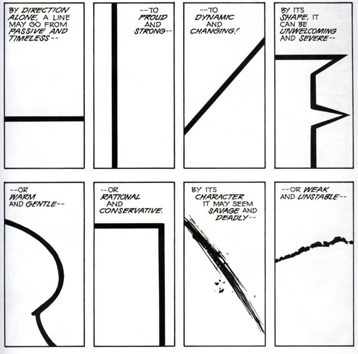
-
The Line and Color
The Line
The line is one step above in elemental complexity from the dot, imbuing it with more suggestive capability in visual design. Although often conceived in terms of its more linear qualities when used in technical disciplines, the line’s usage is not bound by clearly defined rules. It is a creative tool which may be employed for juxtaposition, texture, movement, etc., clearly conveying information by stripping design to its most skeletal meaning. The sketches of William Steig, oftentimes almost grotesque in nature, demonstrate the capacity of the line in conjuring the mood of a fantasy scene as well as defining character personalities (as seen in many of Steig’s picture book drawing – most famously, Shrek). In the picture below, a group of clowns dance merrily to the music of a chicken and dog. The drawing seems a bit crude at first glance. However, its beauty lies not in a demonstration of technical acumen but in the creation of distinct personalities for each character from each facetious linestroke.
Color As Dondis states in the piece, color is the element which appeals most to our emotions. There is a reason why we are asked when we are young “What’s your favorite color?”. Color is inextricably tied to how we perceive of ourselves and our surroundings, having cemented itself in cultural iconography as a representation of shared experience. Fauvism was a 20th century artistic movement which emphasized the use of often bold and highly saturated colors in impressionistic drawings to evoke a strong emotional response from the audience. The example below is one of the most famous works by Henri Matisse, Woman with a Hat. Rarely in the painting does Matisse employ colors which would naturally occur in physical reality, instead choosing to accentuate the somberness of the woman’s expression with hues of blue and green.
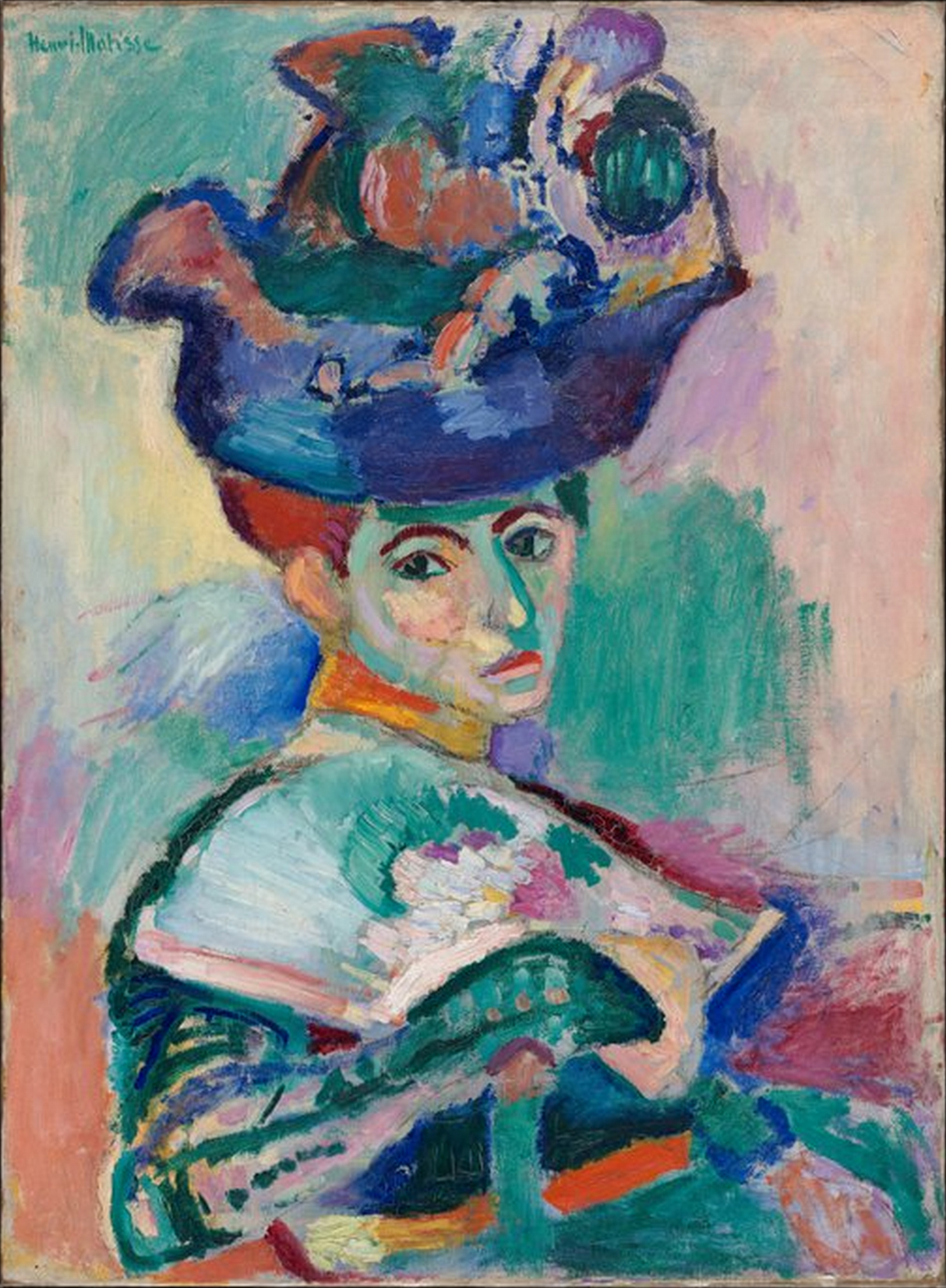
-
Types of Abstraction and Synaesthetics
One of my take-aways from chapter two is the crucial distinction McCloud makes between iconic and non-iconic abstraction. This forms the basis of Scott McCloud’s big triangle, where he is able to place all comics (and all visual art in fact), and serves as a useful set of axes. Iconic abstraction moves visual communication closer to becoming the pure idea, which is epitomized in its final form by a word representing the object. Non-iconic abstraction moves visual communication more towards the realm of art, where the shapes and lines depicted represent themselves. Finding the right balance of both iconic and non-iconic abstraction is crucial to visual design, as too much iconic abstraction risks overwhelming the viewer with text (assuming they are not in a medium like a book where that is expected), and too much non-iconic abstraction risks the viewer not actually receiving whatever message or idea is trying to be conveyed. However, there is also the risk of too little abstraction in either direction. In many cases, iconic abstraction helps generalize the concepts and ideas being conveyed, and especially when text is used, it makes sure the meaning is clear and delivered concisely. Non-iconic abstraction is useful for the flare that makes a message stand out and is often part of what we think of directly when we imagine good design. McCloud’s analysis of synaesthetics was my key takeaway from chapter 5. As with Dondis drawing the connection between texture and feeling, by showing how nearly every sense can be communicated visually, McCloud makes clear just how much shared visual language we have built up. While not something I was thinking about before, I believe many good designers explicitly take into account what other senses they are evoking with their designs. Each sense has its own sensations that each carry their own connotations and feelings, so by drawing on them through visual stimuli, designers can access whole new worlds of meaning with which to communicate.
-
Iconic Characters and Expressive Lines
One form of iconic representation is cartooning the characters and creating a split between the main characters from the background and other roles in a comic. By doing so, the readers can mask themselves in a character regardless of the setup. In a way, the characters become more identifiable without compromising the complexity of the scene. The masking effect is the reason I’m drawn to traditional Japanese comics. A character’s expression goes from confused to mad then happy, all by using a few different lines in the character’s face. As Scott nicely puts it in his book, “One set of lines to see, another set of lines to be”. Characters like Chibi Maruco chan and Saitama from One punch man are expressive yet straightforward and relatable. On the other hand, irrelevant or evil characters in manga are shown with so many details to make them stand out and intentionally make the reader objectify and distinguish them.
 Figure 1: Notice how the main character is iconic with less details than the villian. Also notice the background details and shapes in the background, creating a split between the main character and the scene.
In chapter 5, the author talks about the use of lines and shapes in communicating emotions. One concept that resonated with me is the representation of the visible and invisible worlds. Let’s take as an example the iconic representation of cartooning. A face is an abstract object; adding lines and shapes in the expected positions on the character’s face, such as sweat beads from the forehead or tear shapes from the eyes, indicates a familiar and visible emotion (fear or sadness). However, when those shapes are placed away from their expected position, say behind the character, they hint at an invisible world of the character, an inner state of some sort depending on the scene. This style is seen in Japanese comics (manga), in which some characters would go to a monologue or some other reality.
-
Color and Movement
In today’s discussion, I wanted to highlight movement and color as two important elements of visual communication. Dondis describes movement as one of the most dominant visual forces in the human experience. He goes on to say that the implied action in fixed and unmoving pieces allow us to identify rhythm within them and categorize them as dynamic. Moreover, Dondis explains that colors have the strongest affinity to emotions. He describes color as having three dimensions: hue, saturation, and brightness. Hue being the color itself, saturation the relative purity of the hue in relation to gray, and brightness the scale of light to dark.
This painting by Janice Aponte captures the essence of a traditional Puerto Rican Bomba dancer through mainly color and movement. Even though the painting is static, movement is evident. Organic brush strokes in every which way bring it to life and visually represent the fluidity, strength, and presence of the dancer. The colors incorporated do a step more to convey the vibrancy and happiness of such a joyous dance. The piece mainly has primary colors in high saturation and brightness, making them simple, eye-catching, and vivid. The oranges and reds bring warmth and power, while the contrasting white of the dancer’s clothes make her focus of the piece and emphasizes her movements. All of these elements together contribute to illustrate the dynamism and liveliness of a dance through a static picture.
-
Shape and Movement
 Figure 1
To reflect on this week’s reading, I would like to talk about visual communication through two elements, shape and movement. Shape is one of the core components of visual communication. In its simplest form, it’s a line that represents meaning (shape). The basic shapes are circle, square, and triangle. Each shape, with its characteristics such as the angle, roundness, and sides, is perceived differently. Squares signal dullness and honesty, circles represent warmth and protection, and triangles portray action and tension. For example, in the Pixar animation Soul, the character designers of the counsels chose more round and flowing shapes to represent a loving and caring counselor with feminine features. On the other hand, they picked square and sharp edges in designing a dull cynical character with masculine traits. ( See figure 1)
 Figure 2
The other aspect of visual communication that caught my attention is movement. In the case of still objects, motion can be portrayed by tricking the precipitation of the viewer through manipulating elements of visual design. For example, artists use different perspectives and angles with varying light intensity to modify the dimension. In the form of actual movements like we see in motion pictures, a series of still images with slight changes are played one after the other to provide a sense of natural movements. This phenomenon is called persistence of vision.
To express this element more tangibly, let’s go back to the counselors in the animation Soul. We can see that they are a form of wire sculptures in a 3D world. Figure 2 shows how the 2D wire characters existed in the 3D environment. To create movement and expression to those shapes, the character designers relied on shadows and light directions to provide variations to their designs which they handed to the animators (Figure 3).
 Figure 3
References
Dondis, Donis A. A Primer of Visual Literacy. Cambridge, MA, USA: MIT Press, 1973.
Image Sources
- fig1: https://i.pinimg.com/originals
- fig2: https://bloximages.newyork1.vip.townnews.com/
- fig3: https://lumiere-a.akamaihd.net
-
Impact of Color and Movement in Visual Design
In today’s discussion, I will be focusing on two of basic elements found in Donis A. Dondis’ discussion of the elements of visual communication – color and movement. Dondis first and foremost associates color with the emotion, from happiness to sadness to anger. She emphasizes the dimensionality of color, where it can be defined and measured through 3 factors: hue, saturation, and achromatic. One of the most potent uses of color that resonated with me was viewing “The Scream” by Edvard Munch. Notably, there is a sharp contrast between the the saturation of the colors, with the exaggerated reds/oranges found in the sunset vs. the dull blue/greens/purples used for the foreground. This likely serves to show the intensity and drama within the painting. There is also a subtle contrast between complementary colors, red and green, and orange and blue – creating further juxtaposition and complexity.
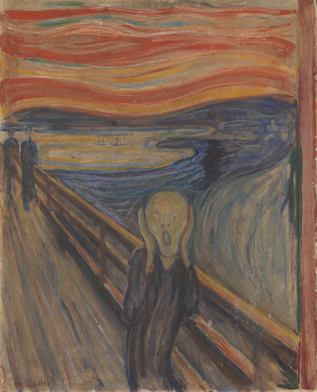
Another visual design element that I found particularly interesting was movement. Dondis emphasizes how implied action is projected into a static representation through both “psychological and kinesthetic” means. One example of this can be seen in Hokusai’s “Under the Wave Off Kanagawa,” which is a woodblock print as part of the Thirty-Six Views of Mount Fuji collection. In particular, the piece has an asymmetrical composition, with the wave towering over the entirety of the image. By using this isolated moment where the looming wave is about to crash upon its victims, it creates a powerful “persistence of vision” and depicts the vigor of Mother Nature.
-
Dondis Scale and Texture
Dondis introduced scale as the process of visual elements modifying and defining each other. Starting like this instead of directly invoking size is useful, as good visual communication takes into account the scale of all dimensions of each visual element, not simply its size. A core feature about scale in visual communication is that it often communicates importance and where special attention should be paid. While size and font weight are two of the most direct ways scale can be used to draw attention, others like putting a saturated color on an unsaturated background can achieve the same effect. However, implied within focusing on scale as a basic element is a sense of balance, which is important to keep in mind as otherwise the media may be overwhelming or may not get the point across. In an art piece I saw recently at The Broad Museum, scale was used really well to draw attention to everyday objects and the viewer’s own body by simply creating a massive kitchen table and chair set.
Dondis also introduces texture as the visual element that directly correlates to touching. I thought this was interesting, as I often think of the two as being in different domains, but by creating the direct comparison, it is easier to understand how to use texture in more compelling ways. Texture can often be more visceral than other basic elements, as shown by Dondis’s anecdote about people being scared of touch in the 5+ Comingo Pavillion. Due to this, we can directly evoke sensations like heat if we use a fire texture, which can be useful for more deeply impacting a viewer in many forms of visual communication. We can see an example of this in the trend of skeuomorphism in app design that occurred a few years ago. Many apps used the texture of leather to evoke the feeling of it and to remind people of the quality of a good leather-bound notebook. Included below is an example of what these types of texture choices look like.
-
Color and Tone
In this discussion, I will be concentrating on Dondis’s descriptions of color and tone. Dondis first pointed out the strong relation that color has with emotion. Each color has a meaning, which adds to the importance of having an effective use of color in visual design. Dondis broke down color into three dimensions: hue, saturation, and achromatic. These three features of color work together to form a certain quality in the final design. One example that uses color as a focal point is Composition with Red, Blue, and Yellow, 1930, oil on canvas, 46 x 46 cm by Piet Mondrian. Mondrian uses the primary hues (yellow, red, and blue) along with black lines and a white background. The equal saturation of the colors creates a sense of the modern two-dimensional. It creates a high contrast, allowing each color to stand out for the viewer to focus on. Although seemingly simple, it compartmentalizes each color, allowing the viewer to experience multiple emotions linked to each of the primary hues. This encourages an immediate comparison of the colors and how they are both separated and a whole within the painting.
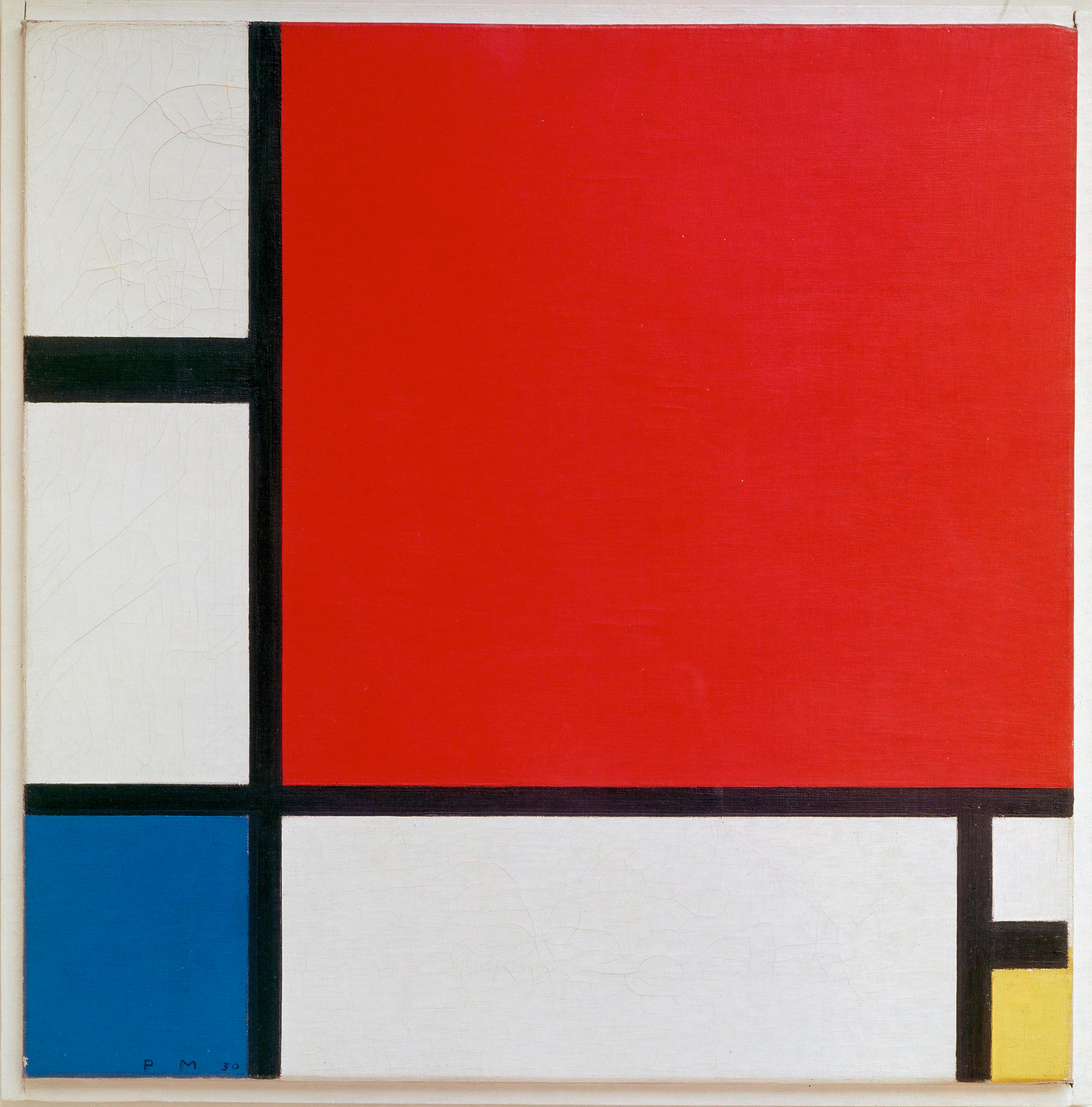 The second element I chose to discuss is tone. Dondis describes tone as the intensity of darkness or lightness. He distinguishes between natural tone and artificial tone, highlighting the differences it can create because of their respective mediums (true light in nature and pigment, paint, etc. in articial designs). Tone aids with complex visual information and although limited in artificial settings, it brings the sense of reality through juxtaposition of tones. For the example of tone, I selected a fashion illustration by Valentino Garavani. It uses both light and dark tones to create a sense of dimension, allowing clients to imagine how the clothing would drape on their bodies. This helped illustrate the fullness of the jacket and weight of the fabric. I found this example interesting as well since it did not use any colors to bring out the realism and instead just used tones to convey reality with the viewer. It allows the viewer to see each component of the design and highlights certain areas while keeping other areas in shadow.
-
Example Commentary
Here’s an insightful response to the assigned readings from Week 1 - etc., etc. If you edit this post in Prose and click the Meta Data button, you’ll see it’s been given the Week 1 tag. Readings for other weeks will show up as available tags too, as we get further along.
(By the way, here’s the url for downloading the open access edition of the book Digital_Humanities (PDF). It’s a very useful introduction to Digital Humanities: Open Access Version of “Digital_Humanities”)