Type in Spiekermann
In this reading, it was interesting to analyze how type can both follow ingrained rules AND novel creativity to convey a message. As we grew accustomed to certain designs for things such as newspapers and telephone fonts, we often do not think particularly hard about the true design quality and just accept what is familiar. It was eye-opening to have Spiekermann point out our automatic reaction of forgetting to notice that some designs are not perfect and can be made better. Spiekermann also showed examples of fonts that matched to a certain style or emotion. We use the design of type to create a reaction from the audience, which was fascinating to think about.
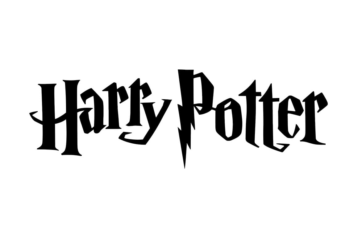
 The font used for the Harry Potter logo is an interesting example of a font type that is linked to a specific style. The shape of the letters brings to mind mystery and something old with history. This font has also become iconic, so even when typing different words, we recall what it was originally used for.