Tufte Reading Chapter 2
In this reading, Tufte discusses the principles and challenges of visualizing data complexity, particularly in a way that facilitates both a clear macro-reading and micro-reading. It seems that one key principle Tufte focuses on is the importance of properly organizing fine, complex detail to exhibit the overall picture clearly—”to clarify, add detail”.
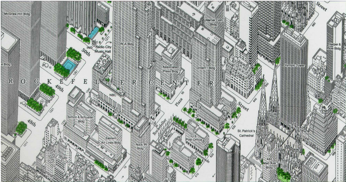
We can see in the example of both the midtown Manhattan map (Constantine Anderson) and the Map of Paris (Bretez-Turgot), that the dedication to depicting cityscapes in precise, exquisite detail in an orderly way produces new opportunities for readings, as well as challenges/questions. Some new opportunities for readings include allowing readers to get an essence of the city at a glance (for manhattan, we see many high rise buildings and some greenery; for paris, we see more consistent heights of buildings and many waterways) as well as allowing readers to zoom in on the fine information in specific parks, windows (creating an opportunity for readers to develop their own personal stories about the data). Some challenges that come with the “to clarify, add detail” strategy include cost of time, resources, resolution, which are seem to be the tradeoffs with clarity of a design according to Tufte.
This also brings about questions regarding some assumptions that Tufte might be making about the viewers of the design. “High-density designs also allow viewers to select, to narrate, to recast and personalize data for their own uses. Thus control of information is given over to viewers, not to editors, designers, or decorators.” It appears that Tufte is in favor of sharing all the possible data in a clear, organized way with the viewer, and to make the viewer do the hard work of analyzing the information-thick world. Although humans have the capacity to do this work, I wonder is it always helpful to share the richest possible properly arranged data with a viewer, and when is it better to guide the viewer by not share every part of a high density dataset? (In the case of the manhattan map, is the fine-detailed map helping a viewer beyond providing an interesting, personal experience? what about if the viewer wishes to navigate based on this map?)
Tufte’s comments about how the simpleness of data + design ≠ clarity of meaning reminds me of his comments on chartjunk—Why does Tufte seem to prefer and find high densities of (well-organized) numerical data clarifying, but despises and find less numerical/more illustrative data extraneous and cluttering?