Tufte Ch. 2
For this reading, Tufte analyzed micro/macro readings and data complexity. I found the examples extremely interesting as Tufte used them to back up his point about complexity not detracting from the design’s legibility.
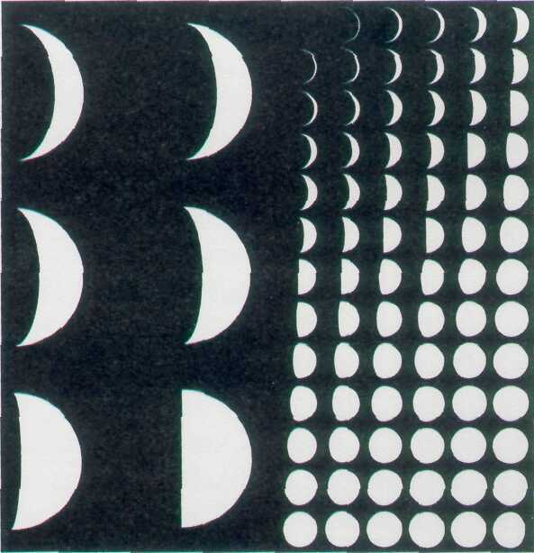
One of the examples I would like to bring up is the Lunar Phase Poster. It depicts an interesting comparison between the boiled down version on the left and the more complex data of the moon’s phases on the right. As Tufte mentioned in the reading, the complex data actually contributes to a better understanding of the moon’s phases. Oftentimes, when we look at data like the simplified moon phases, we lack the full context of information and have to make our own implications. This increases the chance of inaccurate information transmission. The more complex depiction also allows us to clearly see how the moon slowly phases in its different stages. I found it helpful to see multiple small images of the changing moon instead of just six large moon phases. With the six images, I felt it overly generalized the moon phases. Another interesting point to consider though was whether or not the simplified version was more readable to the audience. I agreed with Tufte’s point that “simple” does not immediately mean better readability. In the case of the moon phase example, the simplified version was actually less readable in a sense since I wasn’t able to immediately know what it was trying to convey. However, I think that simplified designs can sometimes be better than complex data displays. It depends on how efficient the complex data is displayed in order for us to have the greatest effect. If used without a clear sense of organization, the loads of data can create clutter, such as the names on the Vietnam War Memorial (if alphabetical, there would be many people with the same names which would be confusing).