Color and Tone
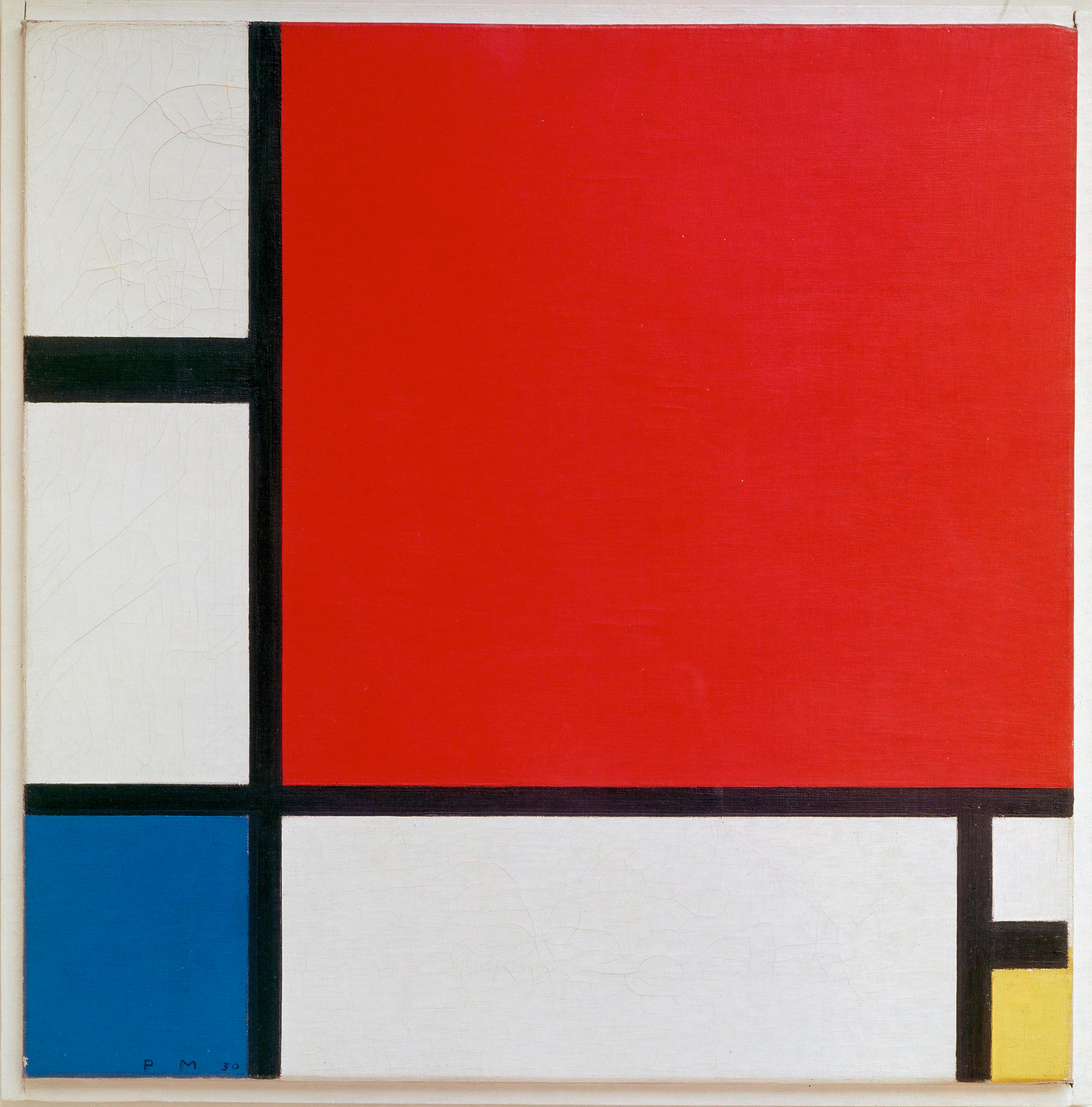
In this discussion, I will be concentrating on Dondis’s descriptions of color and tone. Dondis first pointed out the strong relation that color has with emotion. Each color has a meaning, which adds to the importance of having an effective use of color in visual design. Dondis broke down color into three dimensions: hue, saturation, and achromatic. These three features of color work together to form a certain quality in the final design. One example that uses color as a focal point is Composition with Red, Blue, and Yellow, 1930, oil on canvas, 46 x 46 cm by Piet Mondrian. Mondrian uses the primary hues (yellow, red, and blue) along with black lines and a white background. The equal saturation of the colors creates a sense of the modern two-dimensional. It creates a high contrast, allowing each color to stand out for the viewer to focus on. Although seemingly simple, it compartmentalizes each color, allowing the viewer to experience multiple emotions linked to each of the primary hues. This encourages an immediate comparison of the colors and how they are both separated and a whole within the painting.
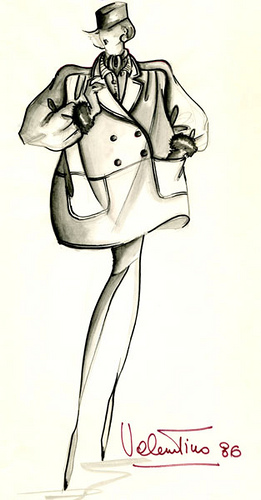
 The second element I chose to discuss is tone. Dondis describes tone as the intensity of darkness or lightness. He distinguishes between natural tone and artificial tone, highlighting the differences it can create because of their respective mediums (true light in nature and pigment, paint, etc. in articial designs). Tone aids with complex visual information and although limited in artificial settings, it brings the sense of reality through juxtaposition of tones. For the example of tone, I selected a fashion illustration by Valentino Garavani. It uses both light and dark tones to create a sense of dimension, allowing clients to imagine how the clothing would drape on their bodies. This helped illustrate the fullness of the jacket and weight of the fabric. I found this example interesting as well since it did not use any colors to bring out the realism and instead just used tones to convey reality with the viewer. It allows the viewer to see each component of the design and highlights certain areas while keeping other areas in shadow.