Dondis Scale and Texture
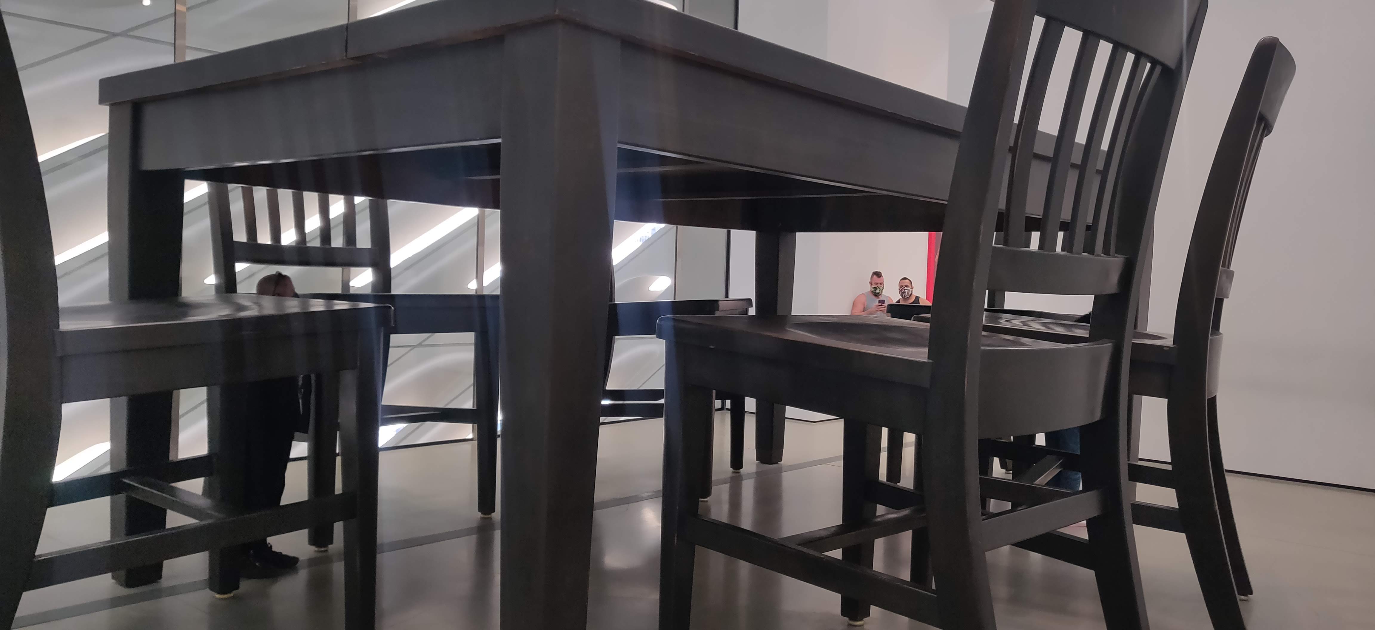
Dondis introduced scale as the process of visual elements modifying and defining each other. Starting like this instead of directly invoking size is useful, as good visual communication takes into account the scale of all dimensions of each visual element, not simply its size. A core feature about scale in visual communication is that it often communicates importance and where special attention should be paid. While size and font weight are two of the most direct ways scale can be used to draw attention, others like putting a saturated color on an unsaturated background can achieve the same effect. However, implied within focusing on scale as a basic element is a sense of balance, which is important to keep in mind as otherwise the media may be overwhelming or may not get the point across. In an art piece I saw recently at The Broad Museum, scale was used really well to draw attention to everyday objects and the viewer’s own body by simply creating a massive kitchen table and chair set.
Dondis also introduces texture as the visual element that directly correlates to touching. I thought this was interesting, as I often think of the two as being in different domains, but by creating the direct comparison, it is easier to understand how to use texture in more compelling ways. Texture can often be more visceral than other basic elements, as shown by Dondis’s anecdote about people being scared of touch in the 5+ Comingo Pavillion. Due to this, we can directly evoke sensations like heat if we use a fire texture, which can be useful for more deeply impacting a viewer in many forms of visual communication. We can see an example of this in the trend of skeuomorphism in app design that occurred a few years ago. Many apps used the texture of leather to evoke the feeling of it and to remind people of the quality of a good leather-bound notebook. Included below is an example of what these types of texture choices look like.