Color Context
One point Tufte makes that stands out is arranging colors so they trick the eye. In his example of a brownish square looking like deep gray due to it’s proximity to white, he highlights just how easily color can trick us into seeing or missing details. On the flipside, the same color can look extremelty different or carry different meaning based on its surroundings (as seen withh the blue squares). This resonates because it’s easy to think of changes in color or hues as isolated. However, depending on the surroundings or context of that color, it can vary in its delivery of information. The “harmony” of the main color of an image can altered by the context it’s been placed in.
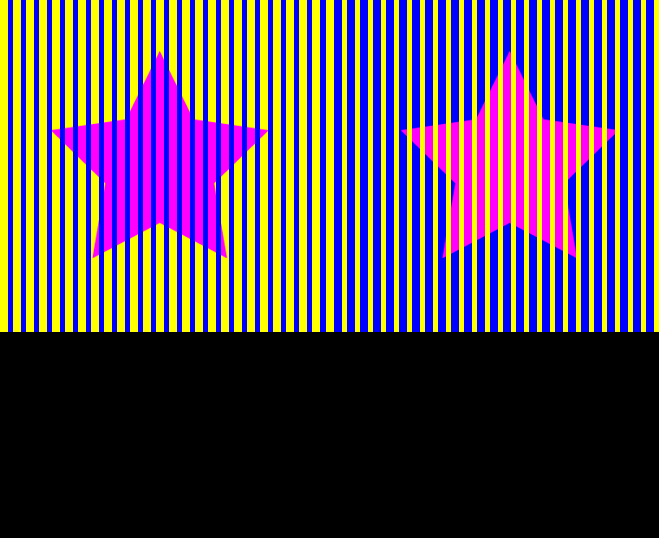
This gif reveals just how defining a color’s surroundings are. Despite the two stars being identical, they look very different from one another. This is important because in application, the designer must not abstract colors out of their design but think about the entire piece’s color unity. Tufte mentions screen vs. paper. The same pink star on a stark white background versus a pink star on a toned-down screen background may bring different meanings to a viewer. Thus, we need to take context of the design’s color into consideration.