Spiekermann on Typefaces
I really enjoyed reading this chapter by Spiekermann, particularly the parts when readers have the opportunity to view/experience the different typographies that Spiekermann discusses. When the type of the reading itself changed colors, or became a light on dark type, or the type changed dramatically, I understood more deeply how the type face changes what kind of message is communicated.
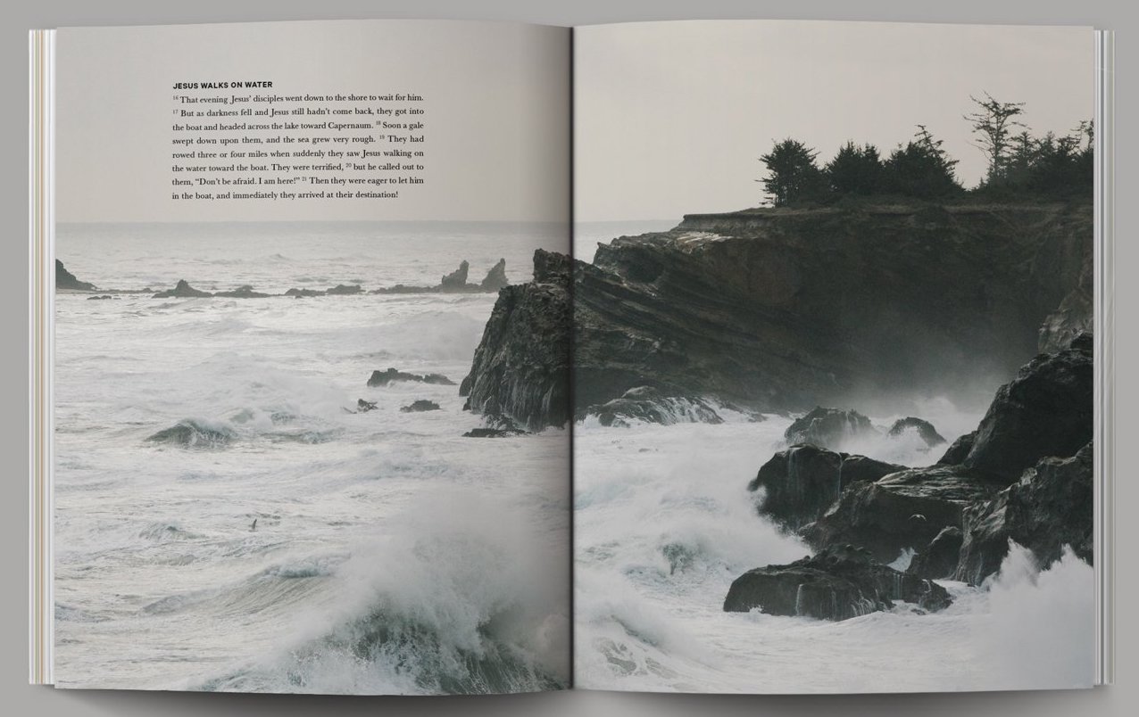
Additionally, I found the first few examples at the very beginning of the chapter really interesting because typography was instantly recognizable to me as being from a book or newspaper before I even read a single work. I started to look around for typefaces that were designed for a particular purpose and the example of a special type (ITC Weidemann) for bibles is something I noticed in my traditional bible. However, I also own modernized version of the bible (by Alabaster Co.) that has the look of a magazine, and I expected the typography to also follow how modern fonts are often san serif. But to my surprise, the designers at Alabaster Co decided to actually keep the recognizable ITC Weidermann as the type.
Lastly, the point about how typographic features such as large x-heights and wide counters are no less slaves to fashion than the perpetual changes in skirt lengths determined on Paris runways brings about a question I have related to previous readings. Is there a reason some types are more pleasing to our eye than others? Perhaps there is some psychological reason, whether related to Gestalt or grouping, that makes some typographic features more pleasurable to look at.