Tufte Chapter 6 Comments and Questions
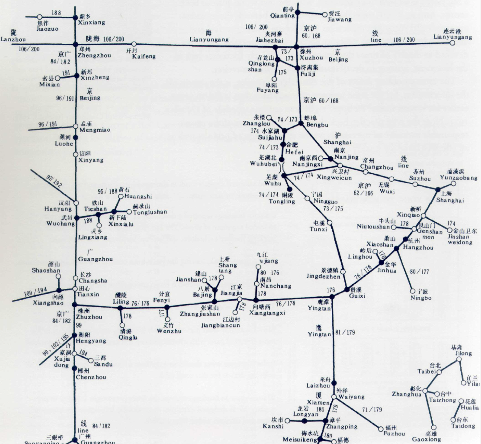
In this reading, Tufte discusses how space interacts with time, using particular examples of various transportation schedules. It is interesting how Tufte uses timetable design to illustrate his points about envisioning data, but it makes a lot of sense to use the example of timetable design given how timetables usually include large amounts of dense numerical and spatial data and figuring out how to organize the data for a general audience. I was really surprised by the design of the 200-page timetable for the railroads of China—particular to the designer’s dedication to maintaining the full spatial relationships of the towns. Looking just one page at a time at a section of the railroad routes, the lines that connect various stops make the map seem very clearly organized and it appears helpful to have the distance between each stop actually reflect the real distances in China.
Questions:
However, I wonder if we consider the general every day user of a train timetable in China
1) Is this dedication to preserving the spatial relationship/directions actually helpful for navigation (since train riders probably care more about the number of stops than the exact direction and distance between stops)?
2) This also brings about the question about the tradeoffs for when is it worth it to accurately display the spatial relationships (eg. using 200 pages to illustrate the railroads with very fine accuracy) vs. when is it okay create a design that gets the overall point across for time/space relationships without being very granular?