Erik Spiekermann
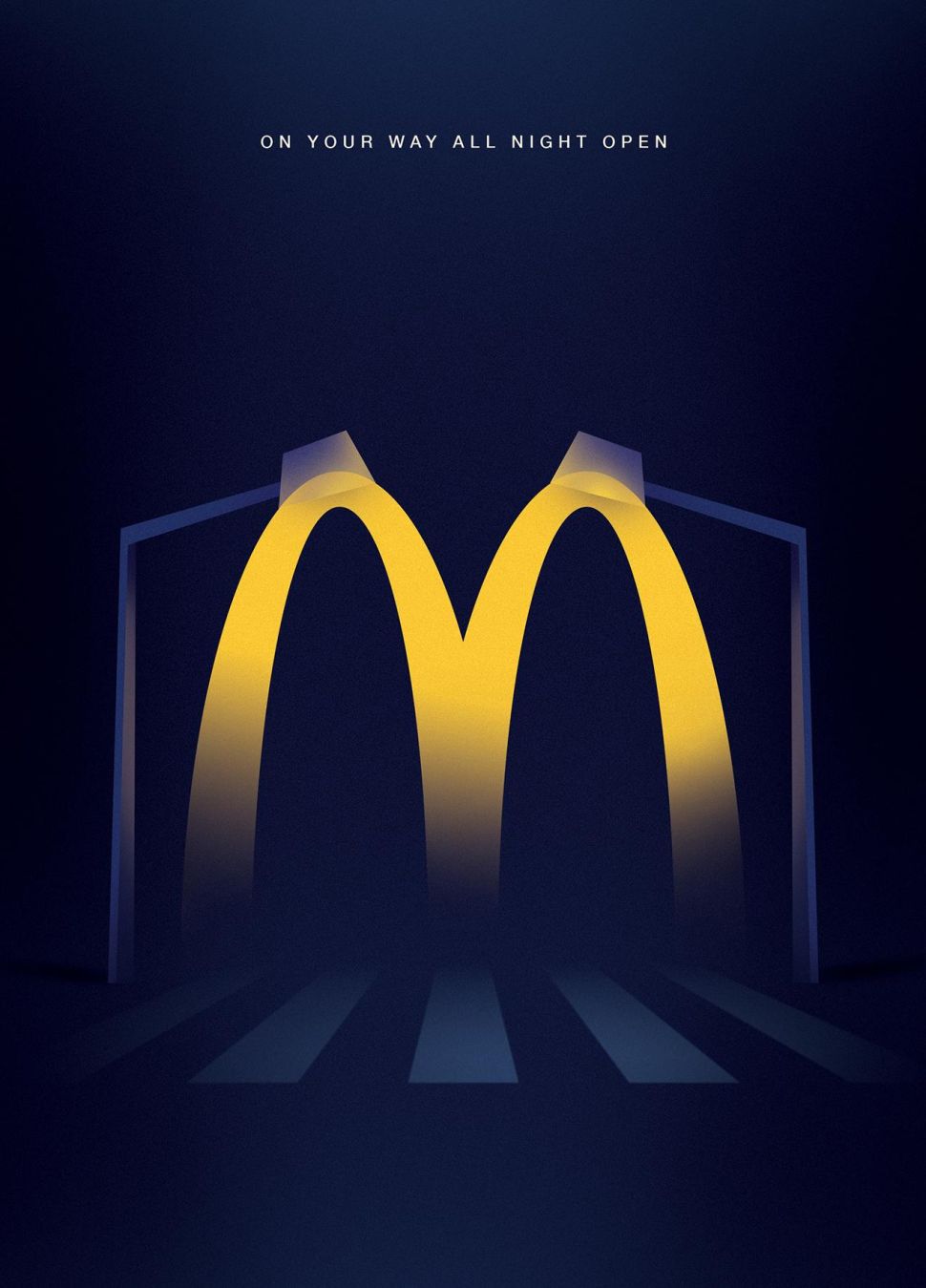
The quote “What you see is what you get – trust your eyes, not the scientific measurements” stands out as my main takeaway from this reading. It’s not inherent that doubt == thin oranger == thick lines. We have come to associate the explosiveness of discontent with wider more confident lines and thinner less restrained type with Joy. Scientifically, a scripted “Y” doesn’t reflect someone with their hands outstretched in happiness. It’s oureyes that make connections,alongwith the fusiform face area of our brain that helps personify the typeface. In this KFC ad, they are apologizing for a chicken shortage. The tyepfaced used, although integral to the company, utilizes the thicker and more “agressive” lines to convey the sentiment of the mistake. On the flipside, the McDonalds arches are rounded and “happy” (pun intended). Because of their friendly arch-like nature, the company can twist them into graphics that are inviting.
.jpeg)