Impact of Color and Movement in Visual Design
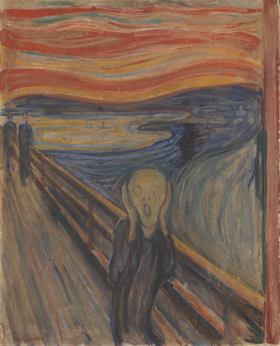
In today’s discussion, I will be focusing on two of basic elements found in Donis A. Dondis’ discussion of the elements of visual communication – color and movement. Dondis first and foremost associates color with the emotion, from happiness to sadness to anger. She emphasizes the dimensionality of color, where it can be defined and measured through 3 factors: hue, saturation, and achromatic. One of the most potent uses of color that resonated with me was viewing “The Scream” by Edvard Munch. Notably, there is a sharp contrast between the the saturation of the colors, with the exaggerated reds/oranges found in the sunset vs. the dull blue/greens/purples used for the foreground. This likely serves to show the intensity and drama within the painting. There is also a subtle contrast between complementary colors, red and green, and orange and blue – creating further juxtaposition and complexity.

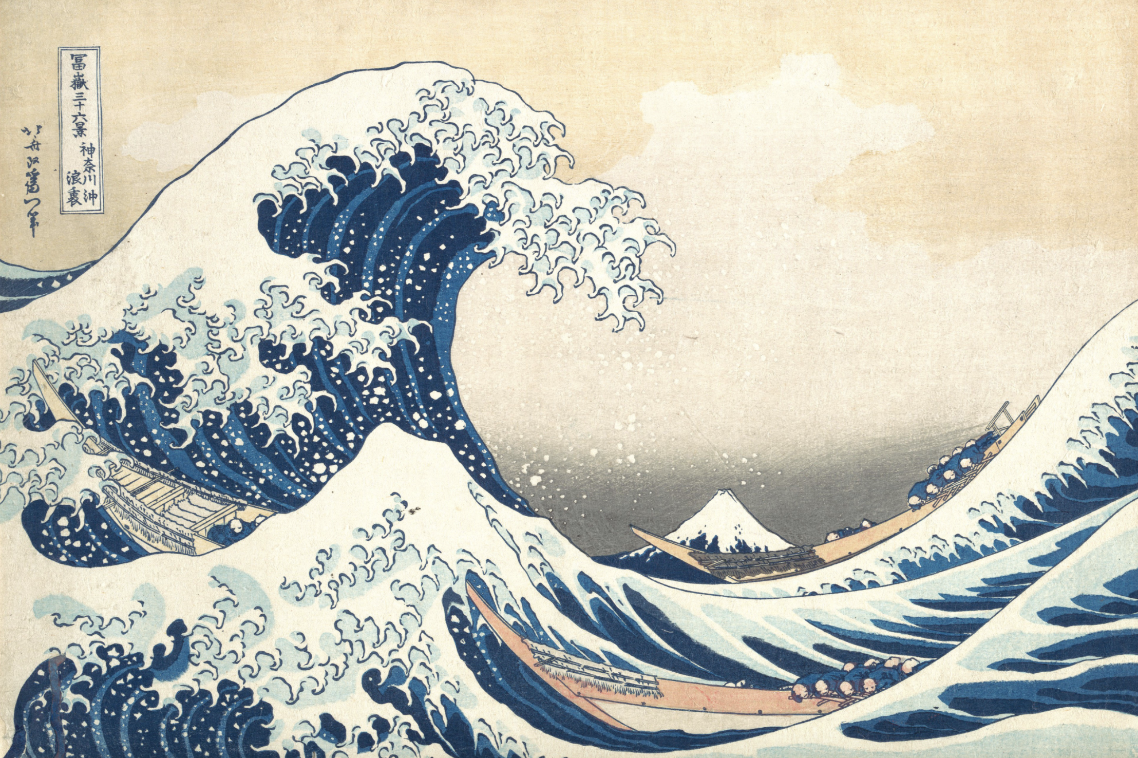
Another visual design element that I found particularly interesting was movement. Dondis emphasizes how implied action is projected into a static representation through both “psychological and kinesthetic” means. One example of this can be seen in Hokusai’s “Under the Wave Off Kanagawa,” which is a woodblock print as part of the Thirty-Six Views of Mount Fuji collection. In particular, the piece has an asymmetrical composition, with the wave towering over the entirety of the image. By using this isolated moment where the looming wave is about to crash upon its victims, it creates a powerful “persistence of vision” and depicts the vigor of Mother Nature.
