A Deeper Look at Type (Spiekermann)
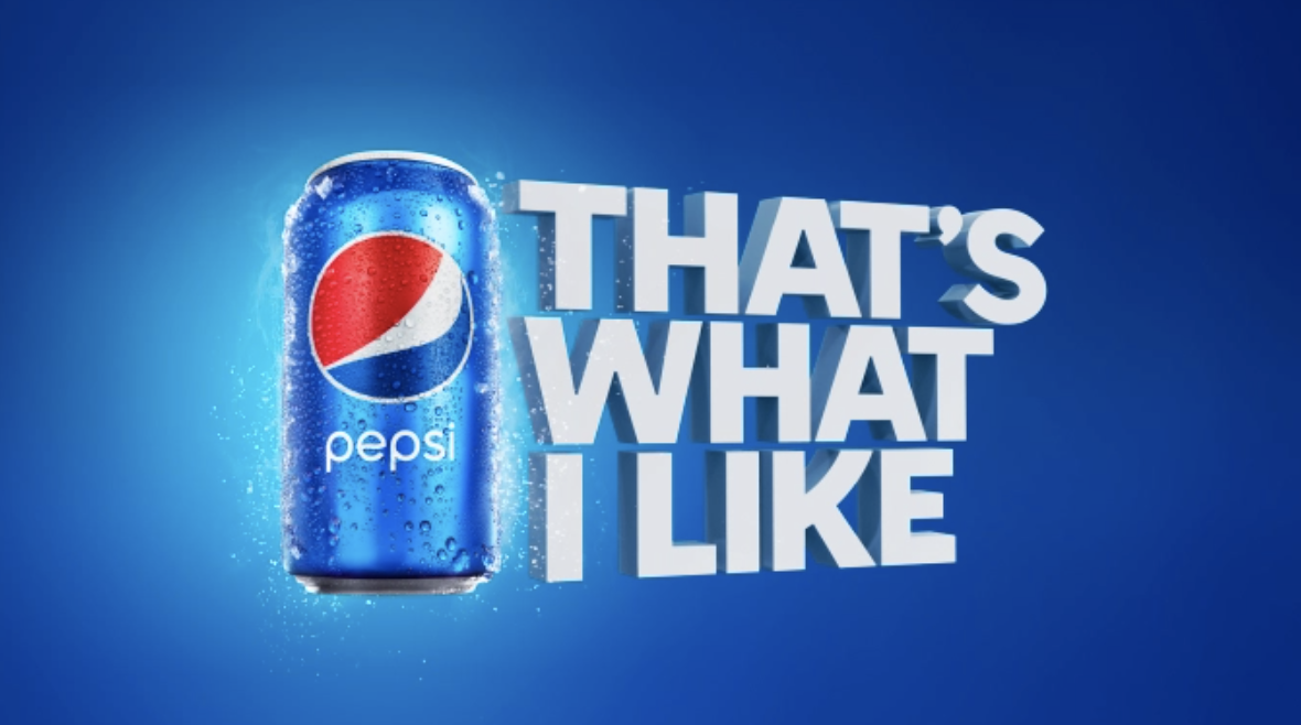
In today’s discussion, I’ll be focusing on Erik Spiekermann’s chapter on “Looking at Type.” When reading the passage, I was particularly struck by the subtle nature of how there are certain expectations for typefaces that we have and associate for certain readings (ie. newspapers, bibles, or corporate documents). Additionally, the text uses the analogy of how we need different shoes for different purposes (ie. dancing, running, climbing) just as type needs to “dress up sometimes” or be “comfortable.” This alludes to the broader discussion of each typeface having a personality, and dovetails well with McCloud’s discussion of how the usage of lines can evoke certain emotions. For example, typefaces at their very essence are a consortium of lines, and hence it is interesting how individuals associate certain emotions with different fonts. One prominent example where I see the selective use of typefaces can be seen in print/billboard advertisements. For instance, Pepsi often uses capitalization and bold fonts that help to elicit a sense of excitement and adventurous spirit. Finally, other examples are font-associations that we have on a daily basis and can be seen with companies like Google or Facebook (Product Sans and Helvetica, respectively).