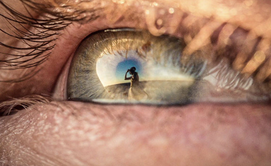
Smallest difference to the biggest impact
The main perspective that speaks volumes from this reading is how the smallest difference in design can make the largest difference in meaning. Maya Ying Lin’s Vietnam Memorial offers a powerful example. By listing the soldiers’ names alphabetically, their story doesn’t manifest as profoundly. Alphabetically, the memorial turns into a list, but by reordering, it gives families and visitors a better understanding. Hunting through names of a loved one becomes reminiscent of searching for a soldier on a battlefield, but you have zoom in on the names. Combining micro/macro features makes a kind of treasure hunt for viewers. There’s more detail to be uncovered, and more of a story to unfold the closer you look. Impressionists utilized this concept at the turn of the 20th century; the further away you are from their paintings, the more of an object you see. The closer you get, the better you can appreciate their brushstrokes and the detail of their paint. In the attached example, the art is an eye. However, a wedding tale can be seen within the pupil. This artist strives to tell Wedding Days using the eyes of guests. To Tufte’s point; a closer perspective offers another facet to an overall story. Howeverm like the map of New York, if you zoom out, the details fade away to the larger narrative.
 (Peter Adams-Shawn)