Subversive Ad Update - Daniel Zhang
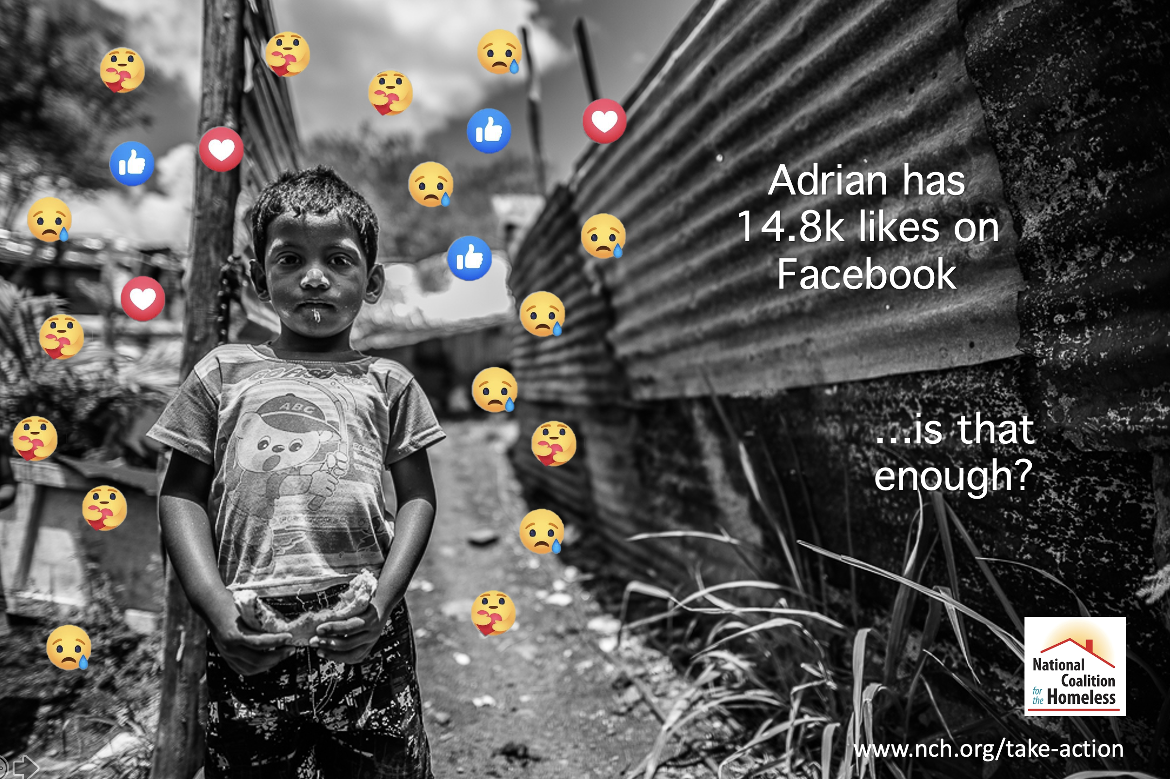
For my revised draft of the subversive advertising project, I incorporated much of the feedback from the class discussion. The goal of my subversive ad remained the same, to communicate the fact of how social media platforms often make us complacent to taking action on social issues - where a like or tweet often substitutes for change making. As suggested by Professor Fendt, I changed the black and white emoticons to color, as well as removed the silhouette of the individual on their phone. These changes further helped to focus the narrative on my desired message. I also went ahead and changed the text and font as suggested by my fellow classmates. Originally, both the font and the text itself were very blatant in their conveyed message - in a sense detracting from the subversiveness. As a result, I instead opted for a more subtle approach for both, altering the font to be that of Facebook’s and decreasing the size that it occupies on the ad. As discussed in the Spiekermann readings, fonts play an important role in shaping our impressions of the ad itself. Hence, these revised ads were designed with that thought in mind. Finally, I changed the “sponsor of the ad” to the National Coalition for the Homeless instead of the upside-down logo of Facebook, which help give clarity to an organization that would likely run an ad of this nature.