Subversive Ad (Ethan)
For my design, I decided to focus on Uber’s exploitative labor practices and the bad dynamic it creates between drivers and users where the drivers have nearly no power. Because they are at risk of losing their job if their rating drops too low, they are almost fully beholden to the user and the algorithm serving them rides.
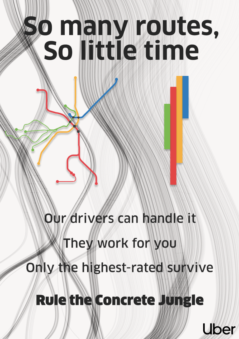
Some of the advertisements which appeal the most to me are relatively flat and simplistic tech ads, so I tried to emulate some of them through this design. I also wanted to draw inspiration from Uber itself, as despite disagreeing with their business model, I think their design language is professional and using its credibility to benefit this subversive ad seems smart. This was primarily done through the use of its font, but also the relatively black and white color scheme was chosen to intentionally mimic.
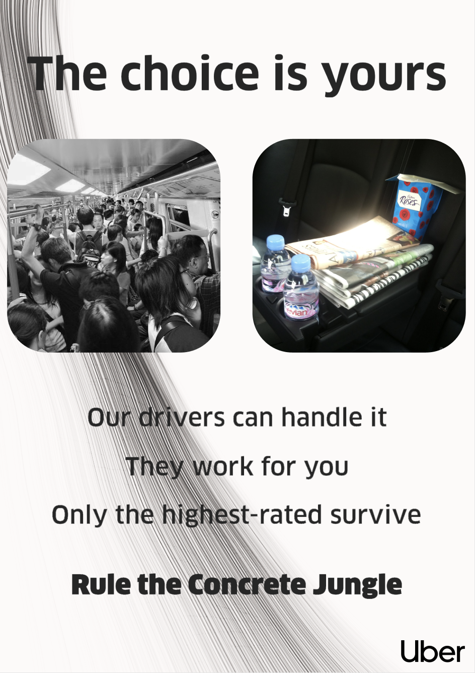
Despite lifting from Uber’s design language, because the assignment wanted us to use images, I intentionally included the only color in the poster in the image representing Uber’s appeal. The glimmering newspaper and empty seats are in sharp contrast to the densely packed bus, which intentionally had both its saturation and contrast turned down to make it as unappealing as possible. In addition to the image manipulation, the background was also chosen to make the left side seem more cluttered than the right, providing a sense of movement to the right that is meant to steer the viewer even further into choosing to ride with Uber. Initially, I misread the assignment and both created a version of this ad that didn’t use any images, and a separate ad that was based on a previously existing amazon ad, both of which are attached below.