envisioning information
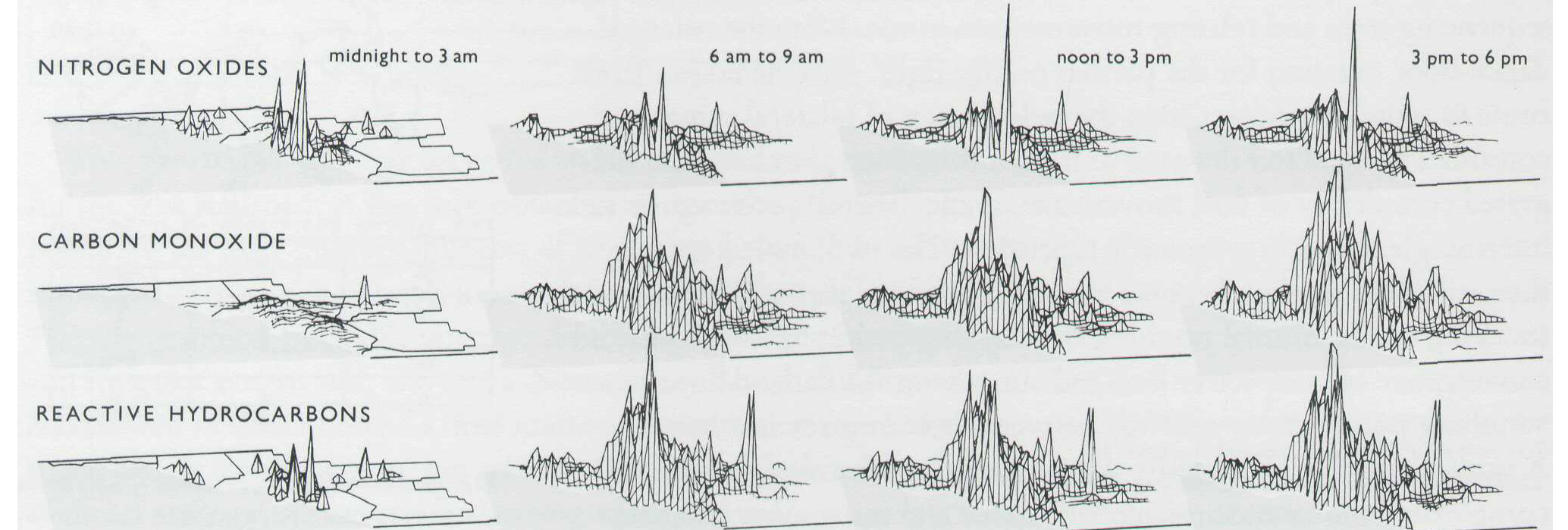
Deceptively simple, this representation of pollution within California over the dimensions of time and physical space effectively abstracts a dense collection of data into a display which utilizes what Tufte refers to as a “small multiple,” wherein an interpretation of “one slice of data” may applied to the rest of the data. This is achieved through reusing the same design structure with different sets of data. As can be seen in this example, the same structure of representing levels of pollutants as physical points in space over the locations in which these measures are taken allows the viewer to extrapolate understanding of one slice of data into the other 11 maps. This manifestation of a data measurement into a physical space therefore concretizes what is seemingly an abstract concept.
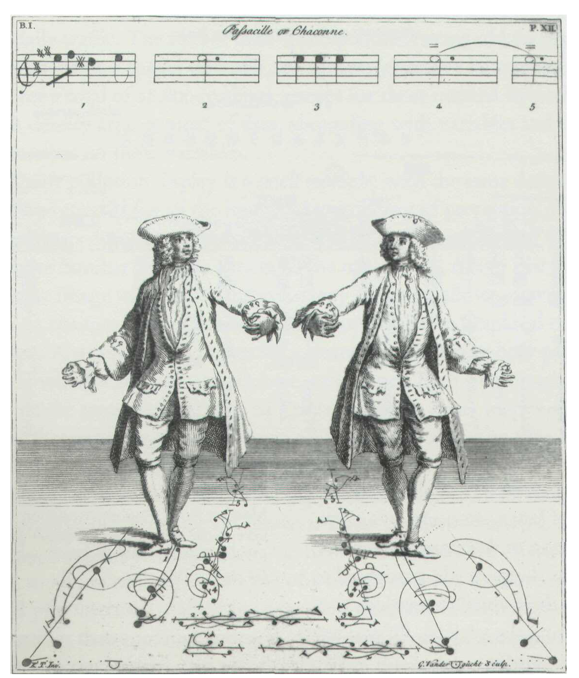 I also found this flattening of physical movement into a two-dimensional image to be fascinating as I had never considered how motion was represented prior to video or step by step diagrams. A rather complicated dance is abstracted into a picture highly dense in information. Pictoral symbols representing different dance moves span across a trajectory outlined on the floor beneath the two dancers. Not only does this diagram convey the general character of the dance but also the more intricate details necessary in recreating it.