Assignment 2 Updated
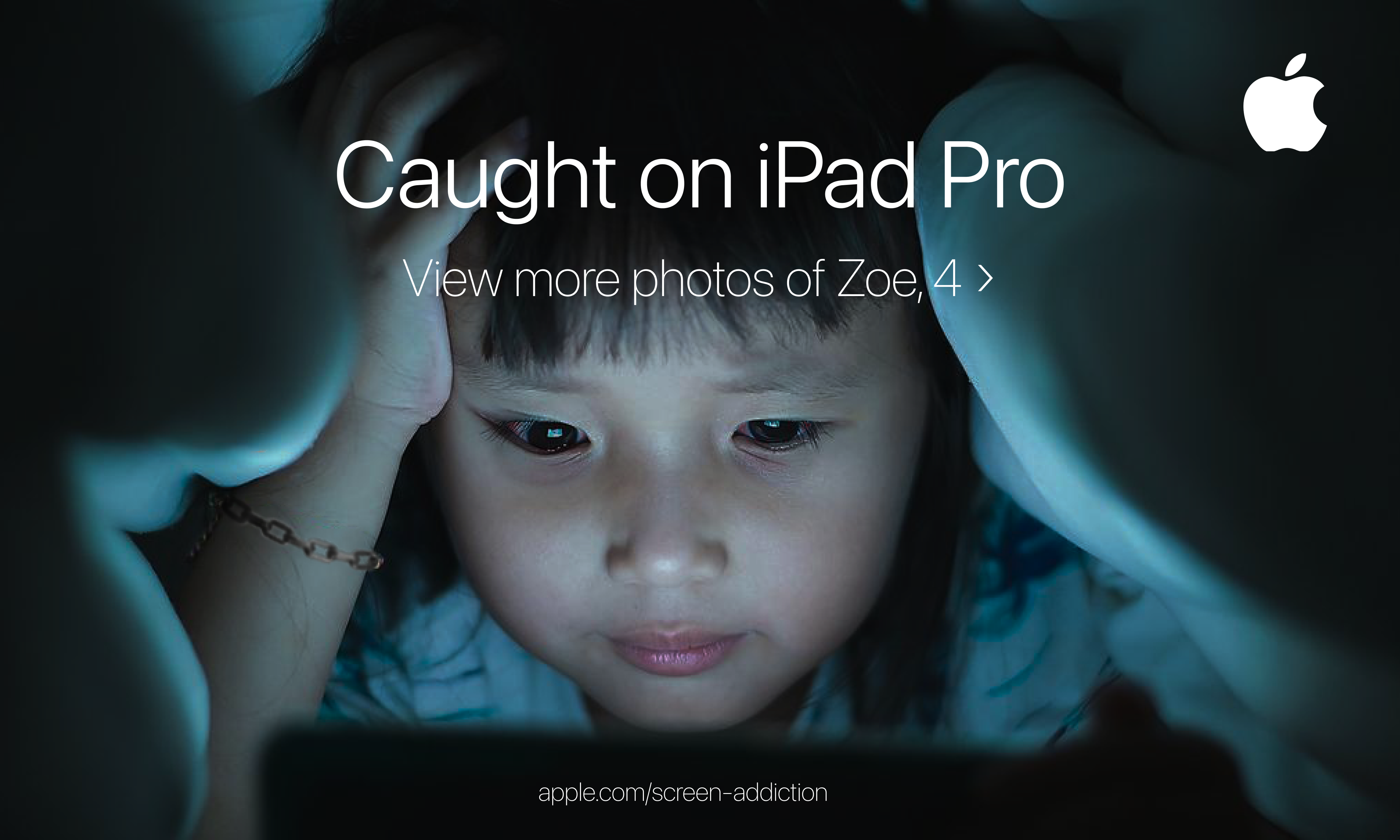
For my revision, I decided to pick my second subversive ad to iterate on because after hearing the in class feedback, I realized the second idea could incorporate many more meanings. First, I found a higher resolution version of the image and used photoshop to make the child’s eyes subtly more red and to make her look slightly more tired. Additionally, I tried to photoshop the bracelet on her arm into a chain-like bracelet, suggesting an additional meaning of being “caught” which is being trapped by screen addiction. Lastly, to make the ad look more like an Apple ad, I changed the thickness of the typeface to more closely match Apple’s “Shot on iPhone” campaign, which had the subtitle thinner than the heading.
Previous iteration: