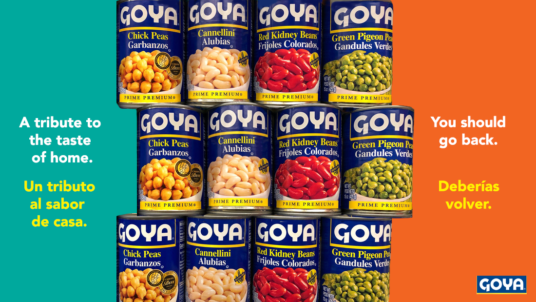
Viviana-revised ad
 For my revised ad, I decided to make minimal changes focusing on fixing the quality of photoshop editing. The main change was having the top of the middle row of cans lay on top of the bottom of the top row of cans so that it more closely resembled a true stack. I also cleaned up the edges of the right-most and lefmost-cans.