Subversive Ad Update - Ethan Nevidomsky

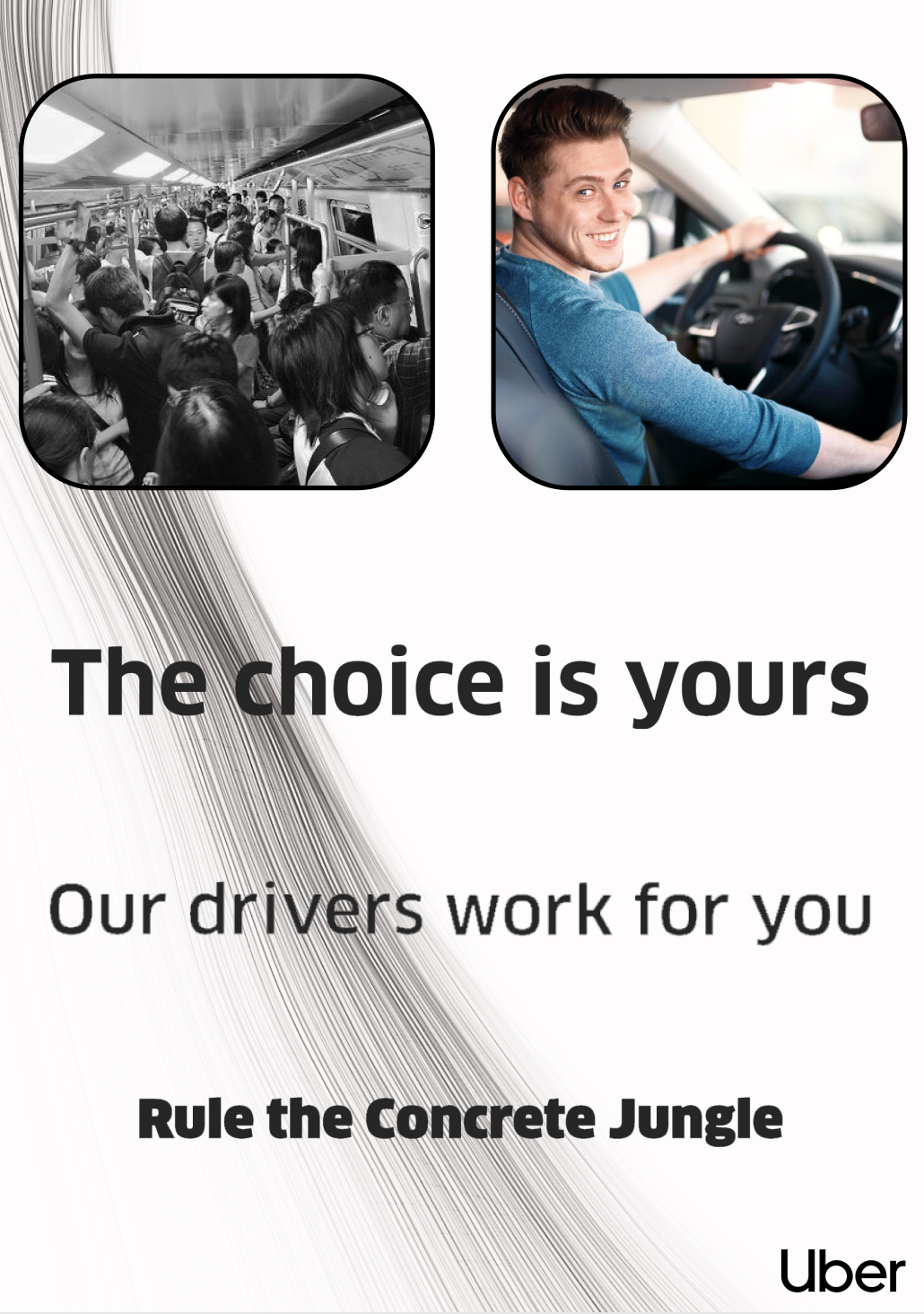
For my revised version, I primarily made changes based on the feedback I got in class. I changed the image to a picture of an actual driver, to both draw attention to the workers and to better represent the product as a whole. I also added borders to the images to help them stand out and moved them to the top of the ad so they draw the eye and allow the text to flow together. I also reduced the amount of text and made it more subtle, so the ad is less obvious and more appealing at first glance, though it is still subtly subversive.