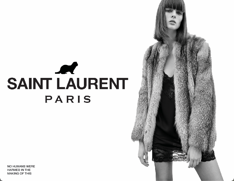
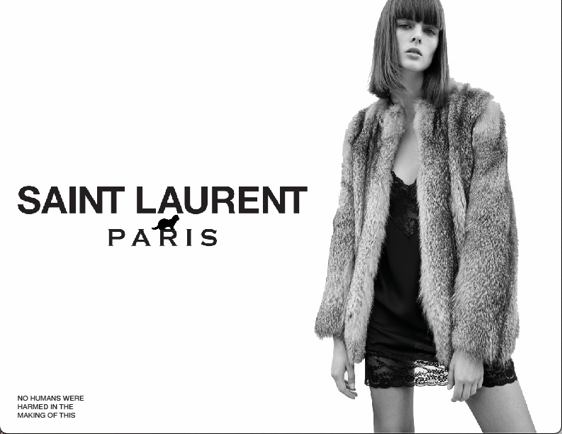
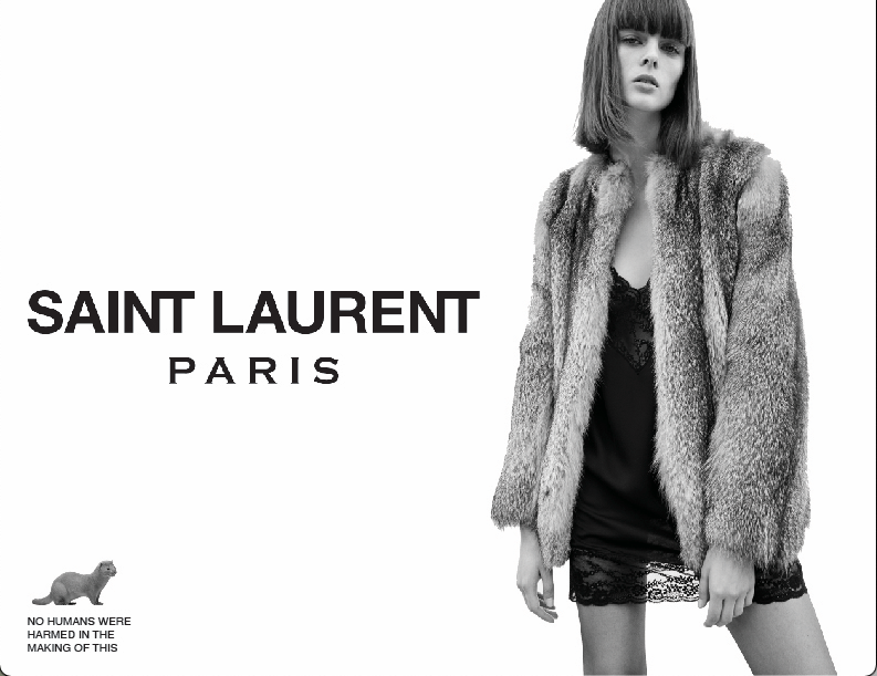
Bernice Project 2 Ad ver 2

For the revision of my ad, I mainly played around with the placement of the mink. I wanted to incorporate the mink more seamlessly into the logo and make it feel like a part of it. There were a few different variations that I tried, but I ultimately liked the version with the mink above the logo. The other versions are below. I did also make the mink fully black instead of just a black and white image. This helped make it more integrated with the logo.

