Ali - Concrete Poetry
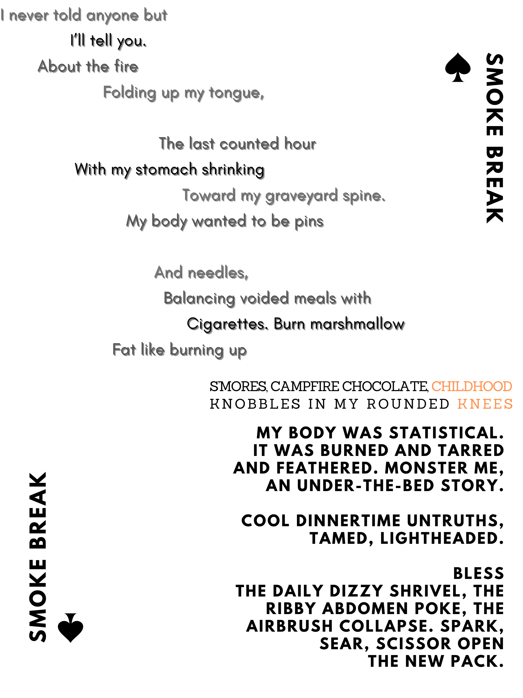
I adapted a poem I wrote about my bad habits during undergrad: so trigger warning for disordered eating and body image. I tried to use shape and color to mimic the shape of cigarette and rising smoke. Once I had the layout I thought it looked a bit like a playing card so I added the title and spades to mimic that layout. I don’t know that it actually adds to the meaning of the design—but then I was thinking that it could speak to the kind of cyclic routine that I was trying to write about. I left it in for the draft to get feedback. Generally I tried to use color, spacing, and font to differentiate between different materials of the smoke, cigarette, and ash.
