typefaces in commercial design
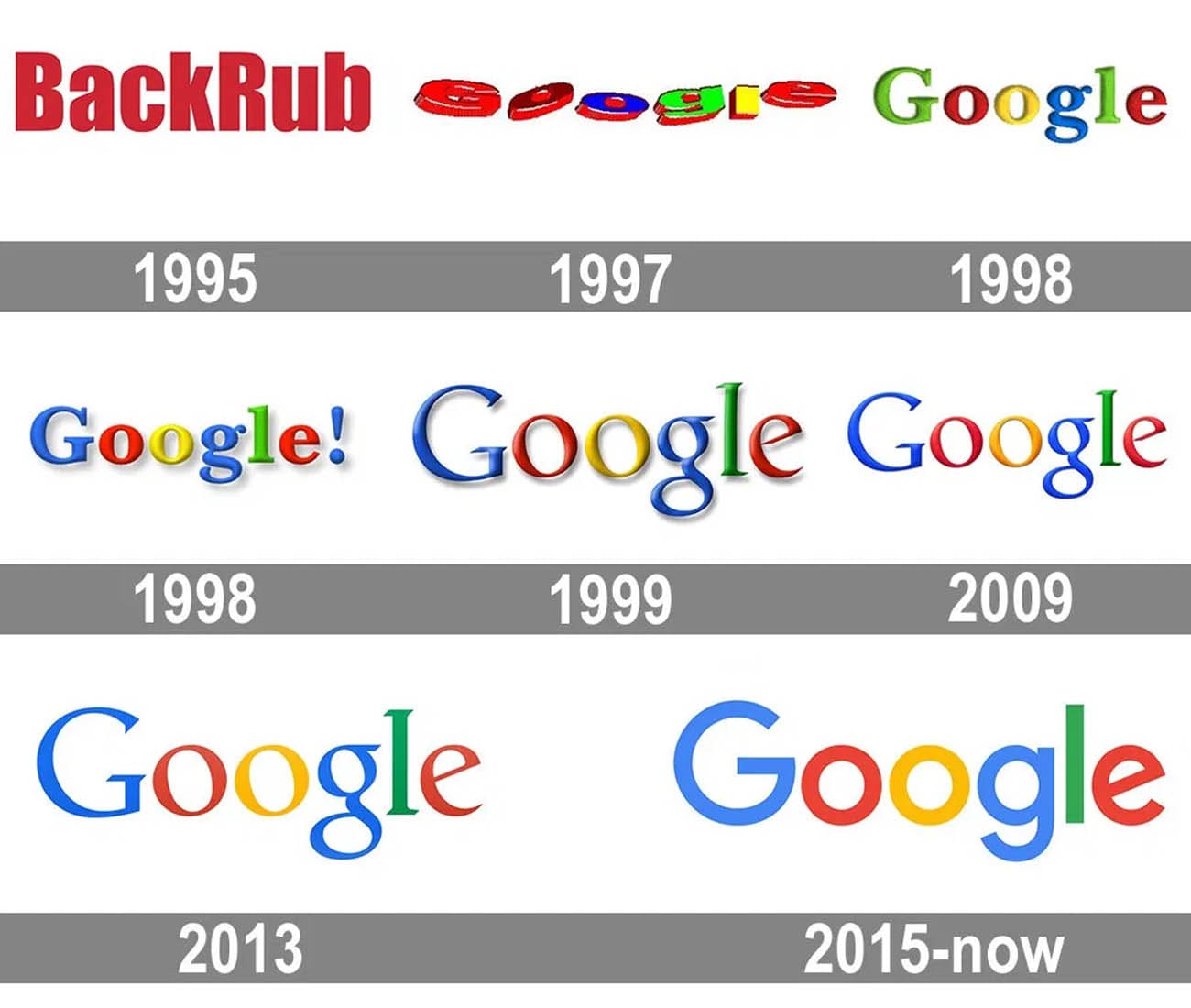
Although I’ve grown up in a time when variability in fonts is pervasive, I don’t think I’ve thought much about typefaces until recently when I became more interested in the merits of well thought out design. As discussed in the reading, we all seem to intuitively understand some fonts to be more suitable for some purposes than others. Curvier and more rounded typefaces evoke a sense of frivolity as well as a degree of modernness. These typefaces are now quite pervasive in many tech startup websites to convey a sense of modernness contrasted from the traditional use of serifed and sharper fonts in past companies. This is most prominent in the transition of Google from a serifed logo to one that was more understated and playful.

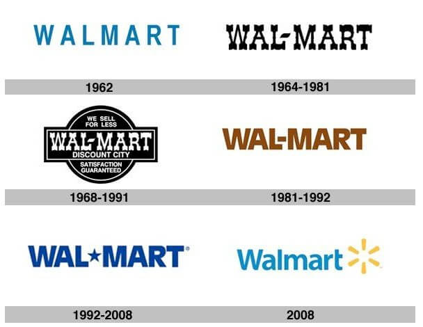
Walmart has similarly undergone a transition to a more casual typeface in contrast to their past all-caps logo which evoked a sense of boldness.

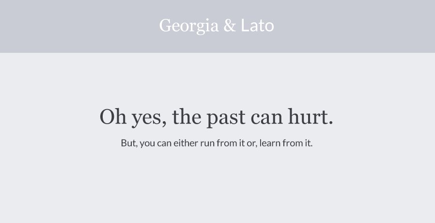
I’ve also discovered through some interest in website design that mixing serif and sans-serif fonts is an appealing combination due to the contrast of the formal nature of serif fonts with the more casual and sleek look of sans-serif typefaces.

(sorry for some reason i was having issues with publishing…had to rewrite this)