Color and Movement - Dondis
Color is measured by its three dimensions - hue, saturation, and brightness. Although every color can be represented by its unique combination of hue, saturation, and brightness (along with other color systems), colors are relative when viewed by the human eye. Neutral colors appear cooler when with warm colors, and warmer when with cool colors. Color is an important element of visual communication because they easily symbolize and evoke strong emotions. Every person has their own relationship with color, everyone sees color in their own way. A certain color may evoke an emotion in someone because of a particular experience they have tied to that color.
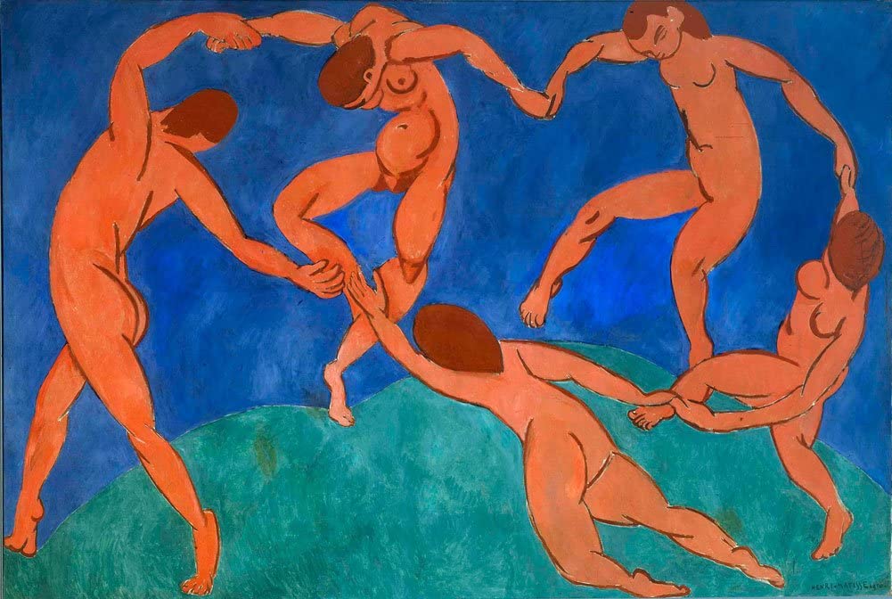
Matisse uses unrealistically saturated colors in his painting Dance, yet they evoke elements of nature: the upper part of the background is blue like the sky, and the lower part is green like grass/ground. The dancers are painted in a contrasting and warm red that makes them stand out from the background.

Movement is something experienced in real life, but typically only implied in visual form. Although many visual arts are static, there is movement in the way a person perceives something. Looking at something is not a static activity, the eye is constantly scanning the page, scene, or environment for information to further understand the situation. Movement can be used as an element of visual communication to guide the eye and lead the viewer to take in content in a specific way or order.
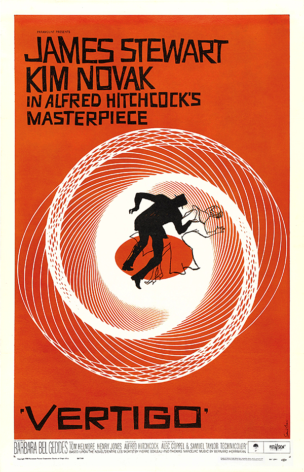
The angled lines circling the two figures at the center of the Vertigo movie poster create a feeling of movement, to make it seem as if the figures are swirling as well as to give the viewer a feeling of vertigo.
